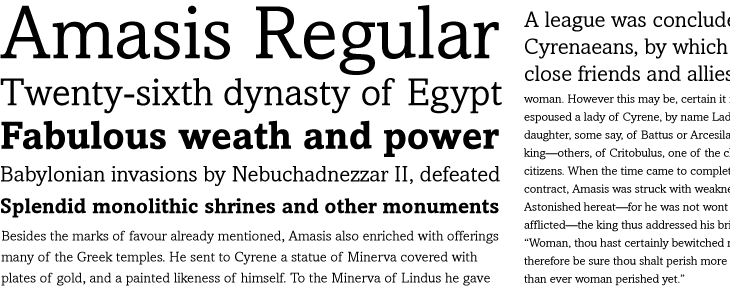
I have a new favourite typeface. I’m a bit partial to slab serifs (a long time fan of Egyptienne) but projects that call for them don’t come up all that often. I was looking for a new face for a client’s project on FontShop the other day and, lo, Amasis was featured right there on the home page — it’s an Egyptian (hey, the clue is in the name) but with strong humanist characteristics and, while it also looks lovely at display sizes, its real strength is to stay perfectly readable as body text. So yes, it turns out it was also perfect for the client’s project, and I’ve bought a couple of the weights for myself.

Amasis Regular and Bold. Some text from Wikipedia, other bits from Herodotus’ Histories.
Amasis was designed by Ron Carpenter in 1992 and is available from Monotype directly, from FontShop (where I got it) and of course, other quality typeface establishments.
