The Wired App

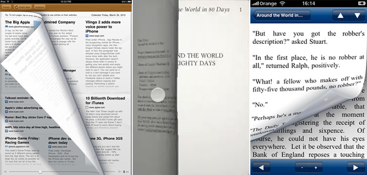
I’ve been following with some interest (especially after my e-reader post) the reaction to Wired’s iPad app. To say that it’s polarised opinion is an understatement and a half, and there have been a hell of a lot of confident-sounding assertions and assumptions about all aspects of how to take a magazine from print to screen, a few of which have got me thinking. The first of those things is:

Print designers vs. screen designers

There is this idea that there are print designers and screen designers — you are one or the other, you can’t be both, or neither, or some hybrid. This is a false dichotomy. I am a designer. I design for print, and I design for screen. I’ve also designed for ink on paper that wasn’t printed at all but applied with a pen. I’ve designed for paint on canvas (in a sense, it’s still designing). I design for a number of media, but it doesn’t mean my having skills with one precludes my having skills with another, and this is what gets me about this taking-magazines-online argument — it’s a form of ad hominem attack to begin with a dismissal of a piece of work for screen because the designer normally works in print. Ad hominem is a dreadful and ultimately sterile way to attempt to win an argument or ‘score points’. Focus on what has been made, first.

Some single pages from the Wired app.

You can’t bring print conventions to screen

I’m generalising with that title somewhat, as no-one is saying quite that. Oliver Reichenstein wrote an excellent piece on some of the print conventions that have been used in the Wired (and other) apps and how they don’t work. I agree with what he’s said, but perhaps not to the same degree. He presents many assertions as hard fact, as absolute truth, and I simply can’t accept them as such. Generally, yes, multi-column layouts can make a piece harder to read, and in the Wired app they rapidly become tiresome and distracting, but that’s not an effect limited to on-screen reading — I’ve found some newspapers and printed magazines hard to read for exactly this reason, but I’ve read stuff on screen just fine too, and the opposite (and conventional understanding) is true too. Wired’s use of multiple columns feels jarring, and in most cases throughout the magazine I’d like to just read the page as a single column of text. His other points on signalling, ornamentation and mixing fonts are largely true, but again, they’re not the entirety of the truth. It’s a matter of how skilled you are as a designer whether you make each thing work or not. Hard rules are true until you discover all the exceptions, and when dealing with human behaviour and preference I think it’s pretty much all exceptions.

Remember which magazine we’re talking about here

This is the kicker for me. I’ve read a lot of comments recently expressing the fear that the Wired app will not only start a trend for how they do things, but establish conventions. Possibly, but as pretty as it was, and as much of a wow-factor it had, the web today doesn’t look like Praystation (if you can remember that far back). Wired’s print magazine has always experimented with new ideas, from printing articles in spot varnishes, metallic and fluorescent inks, setting all the type on spiral paths and all sorts of fun, crazy things that make the damn thing impossible to read, but it was Wired. That’s a big part of what it’s always been about. To complain that the Wired app isn’t a paragon of usability is to complain about bears’ lavatorial habits spoiling your walk in the woods.

The future of magazines

I don’t know how magazines are going to develop and change for on-screen reading. The production values (and costs) of the Wired app are incredibly high — video, animations, complex interactive illustrations all cost a lot of money to make but don’t provide much ‘body’ to a magazine — you still have to produce a lot of editorial content as well. Most magazines will find such a high cost with such a low apparent return unsustainable, just as most print magazines aren’t full of expensive paper stocks and printing techniques. So don’t expect that to become a trend, instead they’ll be special features, just as a CD on the cover or a pull-out section is in the print world. No, I think most on-screen magazines will be dominated by long articles of fairly plain text interrupted with advertising, just as print ones are now. I’d like to see some better means of delivering advertising on-screen than we have now though — I find flickering and flashing adverts unbearably distracting and can’t imagine paying for any magazine that uses them in its articles, so I’d hope for something more respectful and dignified.

Whatever happens, and whatever conventions we end up with, I suspect that the reality will be at once quite wonderful if you stop to think about it, but disappointingly dull and prosaic on first impressions. I doubt we’ll have a wow moment from it, which is, I think, kind of the point.

On Turning The Page

I’ve been thinking about pages, print and scrolling for a while, mainly because I’m a designer and it’s part of my job, but also (I have to admit) because I quite fancy getting an e-reader of some kind. I’ll say right now I’m not going to write about any particular gadget, nor do I care which is best, which is more open, which is morally better, which one is approved by the People’s Front of Judea or the Judean People’s Front or whatever, right now I’m just thinking about one particular aspect of the technology: the page metaphor.

I’m writing this with full knowledge that there are some truly excellent articles out there about this very subject, this one in particular, which you might want to read too. Thing is, while people are talking about digital books, the talk is about the printing, transport and warehousing costs and trees it’ll save, and there’ve only been a few scant mentions of how the form of your everyday novel or reference book could change. Any discussion on form has been about the premium-quality books, the Alice for iPad style remakings, the ones that make new and playful uses of the page-as-screen, and there will be some truly wonderful digital books made, we know there will. However, it’s just taken as read that for all the other books that a bunch of text will be squeezed into an arbitrary set of pages of arbitrary size, like making sausages out of text. We’re not doing these books justice with this tired old page metaphor.

What’s so good about pages?

There are some functional and aesthetic reasons we might like to use pages for a long text. The main functional one that I can see is that we get a handy idea from pages where we are — they are numbered. To return to the book later we need only remember a single number and we can find that page again and carry on where we left off. That’s a great idea, but it breaks, and breaks badly if you were to change the text size, or to carry on reading on one device from where you left off on another. I think as these are two big advantages of digital books, we can’t easily ignore them. Fortunately placeholding is pretty easy on a digital book. It simply remembers where you were and loads the book up at that point.

Yes, I know my metaphor has holes in it, like a huge Hampton Court Palace shaped one. Just bear with me, OK?

So, what about aesthetic reasons? Well, here I like to compare it to architecture, specifically building materials. In years past, and here I’ll emphasise I’m assuming quite an early sensibility, if you built your house with cut and dressed stone, it marked you out as being a pretty wealthy and (presumably) classy individual. If you built your house out of brick, it just said you had a house made of brick. It might be a nice house, but it’s a house made of brick. Nothing wrong with that, you understand, but hey, it’s not stone, and brick was something associated with industry, with commerce and with houses built on a massive scale for factory workers. So houses were built out of brick and then given a coating of render which was then scored and moulded to look like stone. It didn’t really fool anyone, so while it didn’t mark you out as wealthy, you could at least appear to be classy, and that’s important to a lot of people.

And so to books. The equivalent in my metaphor of a stone house is an actual professionally set, printed and bound dead-tree book. They’re the kind of book that is made to store Great Works; the dictionaries, philosophies, histories, plays, religious texts, the physical manifestation of all human knowledge that can be set on a page. No wonder people place great store in the idea of a printed book, for the past couple of centuries they’ve been the acme of Stuff That’s Worth Keeping. Of course, now we have perfect-bound (ha!) books produced in the millions and I don’t think even I could be accused of snobbery in saying that most of them are from the category of Tedious Drivel than Great Work, but there you go, we still have this idea that printed books are so very special, better than any other medium.

Your typical red brick terraces. Moss side, photo by Gene Hunt.

So, what of the brick house in my belaboured Victorian metaphor? This, to me, is a scrolling page of text on a screen — pretty much the kind you’re reading right now, and do on any website. Yes, it’s called a web page but it is at least a true digital page in that it can be any length, any width and be as static or dynamic as you want. It is a product of the digital age, and while the code we use to describe its content may still be inadequate and subject to billion-dollar playground fights it does the job pretty well. The reason I liken it to the brick house is that there’s nothing really wrong with it but it hasn’t the cachet, it’s associated with the mass-produced red brick terraced house in some mill town somewhere — it’s commercial, it hasn’t the sense of permanence, it’s just a this’ll do commercial pragmatism about it. Of course, just as there are astoundingly beautiful brick buildings there are beautiful web pages, but it’s all about how these things are commonly associated in people’s minds.

And so to our prettified house. The brick one with the rendering on the outside made to look like stone. It can be built nearly as cheaply and quickly as a plain brick house, but it just looks so much better (well, more fashionable) and will sell for a load more cash. It’s got the association of quality in people’s minds but very little of the cost. And here we find the metaphorical equivalent of nearly every damn e-reader on the market right now. Loaded with serif fonts because printed books use serif fonts, sepia-toned backgrounds because printed books go a bit brown with age, with justified text because… and yes, here we get to it. Justified text! For crying out loud. They’re justifying text on a small screen with such an appallingly crap set of algorithms that sometimes it’s like looking at two lists of words against opposite margins — sometimes there might be a few words floating about in the middle somewhere but in all cases the reading experience is dreadful. I’ve only heard of one app that has a decent algorithm for hyphenation and justification, but even so I think the easiest (and given the size of the screen, the best) option for justification is a setting called OFF. For a particular erudite complaint about all this, check out Stephen Coles’ article for the FontFeed.

Early Edition, Eucalyptus and iReading Classics.

Then we get to the real fake-Georgian pediment over the front door, the overly-shiny brassy door furniture, the PVC window frames, something that infests reading software rather than dedicated e-reader hardware (but is no less annoying for it): yes, it’s the page turn animation. Oh how these software producers love their page turn animations. They might not make a big deal about their font selection, their crappy justification algorithms or even the number of books you can buy through their store, but they will always make a great big bloody feature of their sodding page turns, even the app I pointed to above. Even if an app doesn’t have these damn things, you get the impression they’re working on adding them. In a book, an actual dead-tree book, you don’t notice turning the page because it’s just part of what a book is. That’s how you get to the next bit of text. The whole idea of pages bound like that is an artifact of a particular printing technology — it’s the nature of the delivery medium, not the message. So when we have a digital book, we’re using technology that has its own set of conventions, its own restrictions and its own freedoms, and every bit of digital technology has some means of moving through any arbitrary content: a keyboard has cursor keys, page up and page down keys, a mouse has a scroll wheel, laptops have trackpads with scroll areas, and smartphones have touchscreens, joysticks or D-pads. But no. Those aren’t good enough. They’re not booky enough. You’re going to be reading Ullysses on this thing, War and Peace, The Illiad with this thing for crying out loud! You can’t sully things like that with a scroll wheel! You’re supposed to be imagining reverentially turning the thick, musty, ancient pages in some great national library somewhere, worshipping at the altar of Knowledge! Never mind the story! Never mind leaving you free to just read! No, every 250 words, perform the gesture, watch the animation!

Just let me scroll, please? I’ve been reading stuff off the screen seriously for what, 15 years? More? Scrolling is fine, you know.

I guess you could assume I’m not a fan of the current state of e-reading software. I hold out a lot of hope for it though. I think if the Instapaper (say) people went and made a full e-book reader I’d be very happy indeed. Of course, there may well be an absolutely blindingly-good bit of software out there that was made by someone who cares about simply reading but I don’t know of it — I assume someone will write one eventually. For iPad/iPhone please. If you know of one, please do let me know.

Make More Money

I saw this a couple of weeks ago and I reminded myself of it with my look-at-me post, then didn’t get around to finish writing about it. I really like Kenn Munk‘s designs, they’ve got a real historical feel to them, and remind me of Civil War-era state and privately-issued money in the US. I like the idea of using stamps to print money yourself — I’d love to have a go. I think the only thing I’d suggest adding is a bit of red somewhere, like a serial number or something, but that might just be because I like black and red in print.

Make The Type Bigger

I’ve been thinking for a little while that the text on Ministry of Type is maybe a tad too small, making me guilty (perhaps) of that terrible designers’ conceit, small type syndrome. I’ve been designing sites for clients lately with much larger text, around the 13-15pt range, and coming back to my own site with its small text gives me a bit of a jolt. So here goes, bigger text, and a switch to FF Dagny Web Pro from FontFont, delivered via Typekit. I like FF Dagny a lot for its own characteristics, but I have to admit I’m fond of it too because it reminds me of Univers and Folio. Of course, if either of those two Linotype faces were ever to be available for online embedding (ice-skating through Hades, anyone?) there’s no guarantee they’d actually work well in the browser anyway. Perhaps right now type designers at Linotype are working on web versions of their entire back catalogue?

Oh, and yes, I was thinking of this when I wrote the title.

The Elastic Mind

I was browsing through the AIGA Design Archives and was attracted right away to this book cover for Design and the Elastic Mind. Irma Boom designed the cover and the beautiful lettering was done by Daniël Maarleveld, you can see more of his lettering and some background info here (thanks to Sean Kelly for the info). I’ve been experimenting with creating letters from guilloches, so I wanted to look a bit closer at how the designer had done these. It’s pretty interesting, though I’m guessing it’s software filling paths with a basic guilloche than any kind of mathematical derivation of the letters themselves. It’s still very attractive and effective, and I’m wondering what software was used to make it — exploring Excentro I’ve not seen any path-filling options — so I shall ask.

I had a look round for more info on the book, and found that it’s supporting an exhibition of the same name at MOMA. There’s a website devoted to it including this Flash ‘interactive’ thing, which grandly introduces itself thus:

The exhibition highlights designers’ ability to grasp momentous changes in technology, science, and history—changes that demand or reflect major adjustments in human behavior—and translate them into objects that people can actually understand and use.

Now, after a while poking around on the site I can say that it’s somewhat lacking in that regard. The typography is unremittingly dreary; a set of very long lists set in microscopic low-contrast text with odd arrows that imply function but give none, bullets all over the place and thoroughly opaque labelling of everything. There’s an animated overlay that briefly shows images from the extended info for each of the list entries (which of course obscures the title and brief intro to it), and traces lines to other things that it’s apparently related to. You can click each of the things and find some actual interesting information in there, and some really nice imagery, but the sense of confusion never really goes away, you’re left with questions — where am I in the site, what is this, what are these connections for and about? If the intention is to show that there’s loads of stuff out there, that it’s hard to read and that finding out about any of it is an onerous task and that following the connections between things is baffling and involves you having to do work to even find out what it is and is connected to, then the site is a blinding success. And what is it with those arrows?

Shame really, because the book cover is quite lovely.

Schriftguss AG

Kris Sowersby tweeted a link to this specimen page, and it’s quite lovely. I wonder how much whoever made it was intending it to be a play on words for English readers - gutrot being anything but good in English, and you’d certainly hope that you didn’t encounter anything red as a direct result of it. As it were. Possibly. Probably not though. It’s a lovely page, but all the others are worth having a look through - specimen books are always good for time travelling a few hours into the future. Shame there’s not more pages in the set, though I recalled (somehow) that Martin Schröder had posted up some pictures of a Schriftguss AG specimen book, amongst other things.

The Principality of Liechtenstein

This post falls squarely into an imaginary new-to-me category, as it’s apparently been around since 2004 and I’ve never ever seen it before. I’m not sure how, I’m convinced I’ve looked at stuff related to Liechtenstein in the last 6 years, and this is exactly the kind of thing I like. So yes, the other day I was emailed a link to the portal of The Principality of Liechtenstein with a message to have a look at their ‘new’ brand (I think my correspondent may have seen it here on Creative Roots). I’m wondering whether the brand just hasn’t been promoted much — or maybe I’ve just missed it. That website doesn’t do it any favours that’s for sure. Anyway, big surprise: it turns out the brand was designed by Wollf Olins, so I can only assume that their work from 2004 must predate whatever decision they made to push ugly and huh? as brand virtues, as this is rather lovely.

The type is essentially made from dots (an idea I love) and this presents a nice twist on that, using stages on a morph between a flower and a star, theoretically including a circle as one of the steps. According to the brand documentation, the flower represents the agrarian roots of the Principality, the circle is the financial side and the star is ‘industry’. I’m a little unconvinced by that, as I’m pretty sure that industry wasn’t the endpoint in Liechtenstein’s development, nor was finance merely a step along the way. Perhaps it’s best thought of as a device to indicate the range of things you can find in Liechtenstein. Regardless of that, it makes for a pretty story and an attractive logo. The overall effect is of something encrusted in diamonds (or at least Swarovski crystals), though looking at it again I’m reminded a little of early-20th Century theatre illuminations, the old ‘name in lights’ thing. Certainly the associations are of glamour and wealth, which seems to suit the Principality just fine.

The crown is a nice touch as well, and if I’m honest was what caught my eye at first — one of the perils of using a crown as your own logo I guess. Again, as is apparently unavoidable with country branding, the elements of the crown have particular meaning related to aspects of how Liechtenstein would like you to think it thinks of itself as having (sorry). Made of symbols for nature, dialogue, finance, industry and rootedness the crown works well and forms a recognisable little device when used on its own or with the abbreviated LI mark. The component symbols are used across brochures and other materials as a rather refreshingly retro pattern. I doubt I’m alone in being reminded of 1970s wallpaper, but all in all it works well and compliments the other decorative elements — the flowers, mountains, trees and (especially) that nice illustration of Vaduz Castle.

Rautendelein

Martin Schröder recently posted about the small amount of the beautiful Rautendelein script he has, and asked if anyone could shed some more light on it. He knows it was most recently cast by TypoArt, and all I’ve been able to find (thanks to a native German-speaking friend) is this entry on Google Books, listing the face as being produced by Schelter & Giesecke (which became TypoArt when it was nationalised by the East German government in 1946).

It’s a lovely face, and like Schröder I’m impressed at the casting, and like he says it must be incredibly easy to lose those delicate overhangs, and a real pain to have to lock all the sorts together with those little notches. So, any ideas, anyone? He can be contacted here.

Hatch Show Print

Andy Polaine recently tweeted a link to this video on David Airey’s site about Hatch Show Print, a letterpress shop established in 1879 in Nashville, Tennessee, which is still operating. The manager, Jim Sherraden, has strong views on how to run the shop, with a motto of “preservation through production”, the idea being that all the equipment, all the blocks, everything, is still used regularly, even if it’s for one print. Sherradden regards the shop as a living museum; everything is letterpress, and done by hand, and interestingly:

we don’t introduce new typefaces because I don’t want to pollute the integrity of the archive.

I’m glad someone is doing this. I’m glad that this style, so American, is being maintained, that these wood blocks are being used for printing and not for decorating someone’s wall, and that these presses are still operating and being maintained. I’m glad someone’s doing this, because I don’t think I’d want to. I know I’d find myself craving new typefaces, screenprinting, digital print, variety. So yes, I’m glad someone’s doing this. Someone else.

Some stills from the video. Look at all those wood blocks. Wow.

Gnuf

One of the design sites I read regularly is Fubiz, and on there I recently read this post on Daniel Carlsten’s work for the new gambling site, Gnuf. I’m rather fond of the type and iconography of playing cards (as I’ve posted before), so a new identity using many of those themes is going to get my attention, especially as Carlsten has designed a typeface for Gnuf based on them. Looking at how the whole identity works on gnuf.com, I like how he’s not tried to ‘smooth out’ the type, keeping the instead the odd widths and shapes of the letters and numerals and their exaggerated, oddly-placed serifs. I guess there are free fonts out there that do the playing card thing well enough, since the theme hardly requires fine kerning or balance, but it’s unusual and worthy of comment to see it as part of a nicely integrated identity like this. It’s worth checking out the rest of Carlsten’s work too, there’s some lovely work in his portfolio.