The Playing Card

The other week Grain Edit posted some photos of these 1970s playing cards produced by El Al and beautifully illustrated by Jean David. They depict Kings, Queens and Heroes from Israel’s biblical past, and come as a boxed pair of sets with an illustrated cardboard sleeve. I had a look around for some clearer photos so I could get a better look, or even a good source of info on Jean David, but there’s not much out there at all. I did, however, find an eBay auction for a set of the cards, so I got my very own set - eventually, and they really are lovely:

El Al playing cards, Illustrated by Jean David

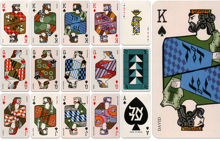
The cards are indeed beautiful and are also nice depictions of the biblical characters - wise Solomon with his scrolls, Jonathan with his arrows, Samson with his jawbone, etc., and reflect the tradition of representing the legendary or historical characters on cards. There is a nice nod to the Paris court tradition of playing card characters by keeping the depiction of David as the King of Spades. Of the other traditional biblical characters, Sheba replaces Rachel as Queen of Diamonds and (unsurprisingly) Judith is replaced with Esther as Queen of Hearts. Julius Caesar is an obvious one to leave off (far better to show Solomon), and instead of the sometimes-shown Judas Maccabeus as Jack of Clubs there’s another leader of a revolt, Bar Giora. I guess it’s hard to choose such a small number from all the people in Israeli history, but if you’re going to show Bar Kochba, you have to show Bar Giora too. Perhaps.

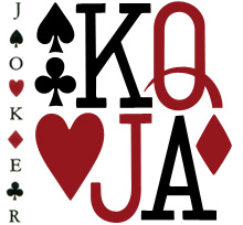
Beyond the history lesson, looking at them got me thinking about the type used to identify individual cards in general. The individual numbers and letters work very well on the card, and are pretty much standard for all cards, but put them together and you see that there’s not much consistency between them at all. As a set, they’re discordant, drawn on a whole different scale to each other, the curve of the J appears exaggerated and incredibly wide compared to the Q, and the K’s slab serifs are enormous, but individually, they each work just fine. I’ve seen playing cards motifs and designs implemented as branding and packaging (such as this rather nicely branded wine), and I notice now that they never used the actual type style from the cards themselves - obviously, designing characters to sit alone is a different art to designing them to sit together.

While I’m on the topic of characters sitting together, it’s a shame (and surprising) that the type for the names isn’t kerned, and more so that it’s the King David card where this is most obvious. Fortunately, apart from Bathsheba, the names of the others are pretty forgiving and the lack of kerning isn’t very noticeable. Still, it’s surprising that that was allowed through, given the overall quality of the cards.

Modern standard card designs. These are from a House of Lords deck.

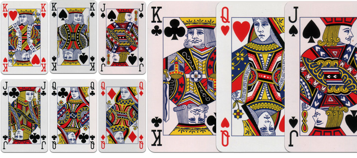
I dug out my standard set when I got the El Al ones so I could compare them. There’s something quite comforting about how they’re familiar they are, but I was wondering how standardised they really are. Looking at the set above, which is a fancy-schmancy House of Lords set and comparing them to a cheap £1 set from a newsagents, there is a fair bit of difference in the quality and the detail of the drawing, although many of the design elements are consistent; for comparison, I’ve put a queen card from each next to each other here. I had imagined there would be a bunch of royalty free EPS files that you could buy or download and slap on your cards, but perhaps not. One thing that seems to be important for standard cards is that all the characters have to look really, really tired and unhappy, a convention I’m glad to say wasn’t followed with the El Al cards.

Feed Your Type Addiction

Sigurdur Armannsson has published his type-related RSS feeds, and it’s quite a list of typographic goodness. I already follow quite a few of these, but I’ve added a fair few more of these to my RSS feed, and the only thing stopping me adding the whole lot is the fear I’ll never do anything but read them for the rest of my life. I’m honoured to say I make the list, so if you like the kind of things I write about, you may find a bunch of other things that interest you here too. Go and look!

Spacesick

I got sent a link to Spacesick’s photostream this morning, mainly for these fantastic ‘novelisation’ covers of movies. I especially love the Close Encounters one. That, and the Temple of Doom one I want as posters. It’s the attention to detail that makes them special, the scuffmarks on the covers, the ‘repairs’ with yellowed Sellotape, as well as the quality of illustration. Great stuff. Make sure you have a look further back in the photostream too, as there’s plenty of great work in there, like this, and this. Delicate souls, easily offended by sketches of partial nudity, might not want to click that last one.

Close Encounters of the Third Kind, Vacation, Shaun of the Dead, Return of the Killer Tomatoes, Charlie and the Chocolate Factory, The Temple of Doom and Sixteen Candles.

Via @stephenreid via @tagliners, and also on grainedit.

Latinotype

I found the Latinotype site the other day via NOTCOT, and I’m rather taken with some of their faces. I’m particularly fond of Fidel Black, which I think I’m going to suggest for a rebranding project coming up soon;  Biotech, which with its chunky and square lowercase is like a print-suitable cousin of Verdana Bold; and Regia Sans, because, well, I just like it. Go and take a look at the rest of their faces, and perhaps click Comprar on a few of them.

Grid Systems

Antonio Carusone mailed me to announce his new project, The Grid System, a site (obviously enough) about grid systems. Now, I don’t normally post about things from mailouts or press releases, but since I’m particularly partial to a good grid and I’ve already found a couple of useful things on this site that I’ve found interesting and even bookmarked, I reckon I’d end up writing about this anyway. So, go and have a look.

What did I bookmark though? Well, Syncotype for one. It’s a bookmarklet, i.e. a bit of javascript you can bookmark and then run on any page you’re viewing, that overlays a baseline grid on your page. I have an 18px baseline grid on this site, which often ends up being broken by images I post not having a multiple of that as their height. It’s certainly something I could solve with a bit of extra javascript of my own (or even something server side) to ensure the height of a containing element of an image is indeed a multiple of 18px or a round number of ems, but I’ve not got around to it yet.

Also, there’s the problem of whether such automatic measures are even appropriate. For a while I cropped and trimmed all images to a set of heights to match the baseline, but sometimes it just doesn’t fit the image and I found adding extra padding to the container (a paragraph tag in this case) actually spoiled the vertical rhythm of the page. I decided that as this site is a single column that it would be the apparent vertical rhythm that was important, rather than the real one. I wonder how other people solve the problem? Or even if they do…

Art from Barrels

I’ve been following this series of articles by Johnson Banks about their Art from Barrels project for Glenfiddich. The aim of the project was to get across the length of time it takes to make a barrel of Glenfiddich Single Malt, and the end results are pretty interesting. I haven’t got all that much to say about it, especially as the articles explain it all pretty well, other than to say I’ve discovered I like sandblasted letters in charred wood:

Connections

Funny how coincidences arise. I found both Mario Feese’s Air Lines and Chris Harrison’s Internet Maps at about the same time and was struck by how recognisable the continents are, and, as I’m fond of maps I thought I’d compare the two images. On the Air Lines map, most of the continents are rendered as a ghostly but fairly accurate outlines, with South America rendered as a beautiful abstraction, right to its tip. The Internet Map is obviously somewhat different, with almost all the connections between cities in rich countries; Africa barely exists and the tip of South America is shown with a single faint line, whereas North America and Europe are smothered in a riot of lines. I overlaid the two maps onto each other and I noticed an interesting thing about the Internet Map, which I describe below.

So, to align the maps I needed to use various groups of cities that appeared in both maps; using the southern hemisphere to get the horizontal scale right - there are sharp points for cities in South America, southern Africa and Australia, and in the northern hemisphere I used San Francisco, LA and Tokyo to get the vertical scale. Thankfully, both maps are using the same projection.

Everything pretty much lines up nicely, except there’s that node in the Gulf of Guinea which I originally thought might be some satellite uplink affair at Sao Tomé, maybe a huge data haven I’d never heard about. However, after lining up a map of Africa with both maps it turns out to be nowhere near any land at all. In fact, when I was trying to mark the point on Google Maps, I realise this big data interchange point (the biggest in Africa!) is at 0.0°N, 0.0°W, which is a suspiciously default sounding location. Maybe in the data that Chris Harrison used there are a few unknowns, with their locations set to null, and these connections should be shown elsewhere? If they were removed, Africa would be even more ghostly.

Branding Polaroid

Just saw a link to this site on Coudal about the rebranding of Polaroid, written by Paul Giambarba, who did the rebrand. It’s a fascinating read, and I might post more about it, but the bit about the pre-1957 logo caught my attention. I was looking at the old logo, and wondering why they’d done the ‘a’ like that, and that with the kerning on the other letters it made it look like two words: “Pola roid”. The ‘r’ is a bit odd too. Seems that those weren’t the only problems with the logo identified by Giambarba:

Polaroid is reversed, or dropped-out, from a red patch in a mangled version of a typeface called Memphis. The true Memphis lower case “a” has an upper serif to distinguish it from an “o,” but close inspection will reveal that the upper serif has been removed from the Polaroid “a.” Thus the brand name could be easily misread at quick glance as Poloroid. Of all the counterproductive things one can do in commerce, this was outrageously stupid, especially when spending considerably to launch a new line of products. Paul Giambarba
At top, the pre-1957 Polaroid logo, in the middle, the word typed in Memphis and kerned tightly and at the bottom the same word, but with the upper serif of the ‘a’ removed.

I think that the word looks a load better with the serif. Still, Giambarba had already dismissed the typeface as ‘unreadable’, so the logo was clearly up for bigger changes than the reinstatement of a serif and the demangling of the ‘r’. Go and read the rest of it, it’s worth it.

November 4th

Well it’s finally here. The actual day of the US election. I don’t really want to write about it, it’s been on TV, in the press, online, everywhere, for two years and I can’t wait for it to be over - I’m sure it’s got more coverage on British TV than any of our own elections ever has. It’s been at such a level of saturation that I, as someone who lives outside the US, a British citizen, someone who hasn’t been actively following the election, can look at this (rather nice - snippet at right) bit of typography and recognise pretty much all the stories it represents*. However, there are some compensations; there’s been a big focus on graphic design this time around, though seemingly only on the Obama side of things - to the extent that that Shepard Fairey poster is the subject of much parody.

The Obama campaign branding is of such incredibly high quality and consistency I’m hoping there’ll be a book about it - they must have had to use so many suppliers over the campaign, if not for artwork then printing, set building, copywriting and typesetting. To ensure a consistent quality and tone for such a long time over such a wide distribution is quite an achievement.

Anyway, now that the day is finally here, and with the full knowledge from my site stats that about 40% of my readership is from the US, I urge those of you from that country to get out and vote. The biggest threat to democracy is people thinking that the election is already won - it isn’t. So vote. I hear the turnout may be record breaking - let’s hope it is, and it inspires lazy British voters to get out there when it’s our turn. And to make this post a bit more related to type, some lovely posters to get you in the mood:

Posters from Monoscope, Supermarket, Things Are Fine and Tomorrow Partners.