Darka

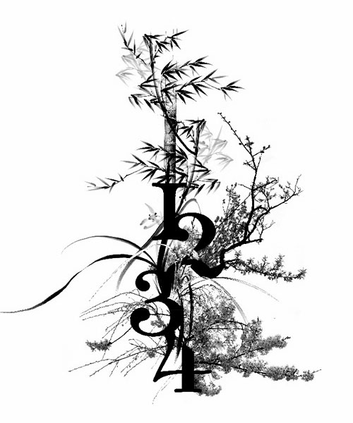
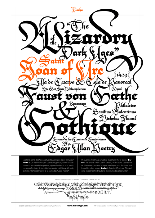
So yes, as mentioned elsewhere, Typographica released their favourite fonts of 2006. The face that immediately caught my eye and made me go “Ooo!” was Darka, a new interpretation of Blackletter type by Gabriel Martínez Meave. Some of the capitals could be used as cadels in themselves, they’re so beautiful, and a lot of the letterforms have a real calligraphic flamboyance. I have a love of blackletter types and of calligraphy in general, so Darka seems right up my street. The thing is, even though the site says the font can be bought from FontShop, it’s not on the site at all. As soon as it is, you can be sure I’ll be buying it. Until then, I’m stuck with the sampler PDF and a bit of copy’n'paste to play with the letterforms.
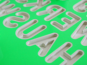
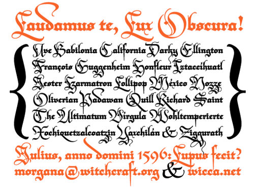
From the site:

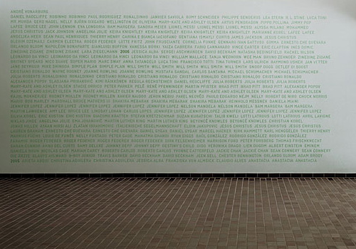
The second page of the PDF sampler:

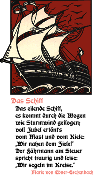
And, I couldn’t resist. Not sure about the “Ty” kerning though, but I think to make that work nicely I’d have to redraw part of the T:

A Bitmap Opentype?

I came across Fontself today (via 30gms), and it looks like a promising project. From what I can tell, it’s like OpenType, but for bitmap fonts, but looking at it I’m wondering how much of each letter is rendered procedurally. It certainly implies that there is some procedural stuff going on there, but they won’t come out and say either way and most of the comments are in French (I’m still learning). Take a look at the examples page to see the state of the project.

Wow 10 from Artless

This is beautiful. I found it on artless, which is a site that’s not updated very often, but when they do it’s always worth the wait. Thing is, I wish they’d explain their stuff a little more. What is this, what’s it about? I feel stymied by my lack of knowledge of Japanese.

Beautifully Simple Signage

I came across the hi site today via Computerlove. There’s some great work on there, but one in particular caught my eye, this very simple and effective signage treatment. The back is painted with a UV-reactive paint that causes the shadow behind the sign (which are mounted at a distance from the wall) to have a greenish glow. My limited German leads me to understand the writing on the wall below are the names and interests (Chuck Norris?) of the new student intake for a particular year, though I couldn’t be quite certain.

Beautiful Lettering

Another one I had to do some clever re-Googling for. A while back I was sent a link to Si Scott’s portfolio site. Once you get past the mystery-meat navigation, you’re in for a treat.

You know that floral, bling style that’s been so popular lately that it’s rapidly becoming a cliché? Well, this guy is the master of it - so much so I wouldn’t lump him in with the rest of them. I think his work is too finely executed to be called a cliché. Check these out.

Blackletter Treasures

The sampler for Moderne Schwabacher

After reading this thread on Typophile about a new beer label I did a quick search for Hartwig Schrift (the original type for the label) and found this site. It’s got a collection of resurrected blackletter types some of which I’ve seen before, others which I’ve never seen, like Jaecker-Schrift. Some of the fonts are genuinely available for free, but others aren't, so check which is which before using any of them, and buy a license for any you need to. There are some real gems in there, amongst the dodgy ones.

Eth from Jaecker-Schrift

This capital Eth from Jaecker-Schrift for example is really quite compelling. The composition of the diacritic brings to (my) mind Suprematism, or Kandinsky - it’s that dot, almost like a full stop hidden in the character and balanced by the verticals - so perfect! As in the sampler on the page, I’d be tempted to use it as an ornamental ‘D’ as after all, it’s so ornamented it goes far beyond a normal Eth that you couldn’t tell the difference anyway. I’m also thinking of creating a set of similarly ornamented caps to use as cadels with the font. I have a thing for cadels too…