Part of my job involves developing websites in multiple languages, and earlier this week the decision was made to produce an arabic version of a particular very flash-heavy website we did. It’s going to be an interesting challenge, as the website in question is one of those that emulates the action of turning pages in a book (needless to say it’s a pure marketing ‘teaser’ style website) and so the entire site will need to be reconfigured to right-to-left reading and page turning. Anyway, those are fairly straightforward technical details and shouldn’t take too long. What really occupies my time is selecting a new typeface for the site - we use Arno Pro for its wide range of language support, especially Cyrillic and Greek, and so the new arabic face should work well with it. And lo, just this evening I find Palatino Arabic in the Type Director’s Club 2008 winning entries. Perfect.
I like drawing the ampersand. It’s the character that when you’re designing a typeface seemingly gives you the greatest artistic freedom. It’s big and swooshy, with lots of room for playing with curves, swirls and if you’re feeling special, lots of fine, delicate lines. But why? Why does this, and no other character, allow so much freedom? Well, the ampersand is hardly ever used in body text any more. It used to be - Gill used it frequently to adjust line length* when setting text - but modern usage has it pretty much limited to combining pronouns in titles, company names and credits. So when we design an ampersand, we can design it with a general assumption that it’ll be used in display sizes and weights, and we can fill it with beautiful refinements and detail, knowing that any uses at body sizes will be rare enough not to be a serious problem. Well, perhaps. There are plenty of typographers who feel that the ampersand should again be used in English as a legitimate replacement for the word ‘and’, and mourn the demise of it in common use. After all, until relatively recently the English language was considered to have 27 characters in its alphabet, with the ampersand right after z. A good thread to read on the topic is here.
Another great link via Ace Jet 170, this article on the Font Feed about lining, tabular and old-style figures. I’m a fan of old-style figures anyway, and prefer to use them in most of my work as I find them much more readable, even for numerical data. Still, I suspect I’m somewhat disnumerate, so having the extra ‘word shape’ provided by old style numerals is going to be helpful for readability. I was also raised at a time when maths books were also set with old-style, and somewhat contrary to the example in the Font Feed example, so were most recipes I saw.
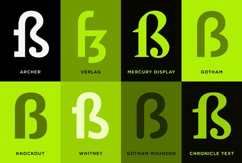
Favourite to draw that is… Two interesting articles I’ve followed links to on the H&FJ site recently are the ones about the Sulzbacher Eszett and the Pilcrow (and Capitulum) (via Kottke and Ace Jet 170). It seems both come up in people’s favourite characters to draw. I like drawing the ‘3’ myself, both in ink and with beziers, but drawing the eszett is like a super big extra special bonus ‘3’ with soft curves, sharp edges, stressed strokes… lovely. Some people I work with have eszetts in their surnames, and it disappoints me that after a few months of blank incomprehension from some of the less linguistically capable* they replace it with a double-s. A real shame.
Office doodles testify to the popularity of the letter R, perhaps because it synopsizes the rest of the alphabet in one convenient package (it’s got a stem, a bowl, serifs both internal and external, and of course that marvelous signature gesture, the tail.)
I think I’ll chime in with Kottke and ask to see some of these office doodles!
* I’m ashamed to say this can be summed up as, “mostly British people”.
I’m feeling pretty glad right now that I have the perfect project where I can use this new script face. It’s an astonishingly complete script, with 4280 glyphs in each weight, covering Latin, Greek and Cyrillic. I don’t know of any other script that comes close. I work on projects where the work is localised into many European languages, often including Greek and Russian, so having typefaces and type systems that work for all of them makes life a hell of a lot easier. We make heavy use of Arno Pro nowadays for that very reason, but I was thinking we needed a script face to back it up on this particular project. I think Champion Script Pro fulfils that role perfectly. The “making of” blog post is fascinating, as is the set of examples on the Parachute site itself. I’ve nabbed a few examples for Latin, Greek and Cyrillic as a taster. Beautiful:
Typographica’s annual review of type releases has just been published, and I’m very pleased and honoured to have been asked to contribute to it! There are fantastic reviews of 2007’s notable releases on there, so go and take a look. My review of Meta Serif is available here. Thanks to Stephen Coles for asking me, and for the nice compliment in the link!
What is an apostrophe? What is a quote mark? Are they curved, or can they be straight? It’s hardly a question on everyone’s lips, but it’s certainly raised the ire of people on this site, Apostrophe Atrophy(via Daring Fireball). With the link text on DF, I was fully expecting the usual suspects of grocers’ apostrophes - potato’s, orange’s, apple’s and the like - and instead finding a set of “straight” apostrophes and quotes in place of curved ones.
Call them what you will, “straight”, “dumb”, “ambidextrous” or whatever*, the apostrophes and quotes shown on the site appear (from the ones I saw) to be otherwise grammatically correct, which is reassuring. The point of the site however, is to say that it is entirely incorrect to use a straight quote or apostrophe instead of curved ones. Is it though? A comment by Michael Beiruit garnered this response:
Michael Beirut linked to us on Design Observer. He says that if people understood the difference between its and it’s he wouldn’t care what kind of quotes they use. Our opinion is that if you are setting type you should know about the correct kind of apostrophe and ALSO [sic] know about proper grammar. We have never shown html [sic]** text before, but when the site is for designers, you would think they would take the time to use the correct apostrophes and quotes…
All very true, and yet we have this, on MetaFilter. I’ve reproduced some comments here in case the page goes away:
I always turn off “smart quotes” in Word. I think it looks pretentious.I agree! Up with the “dumb quotes” backlash!I agree with the smart quotes issue. But the apostrophe thing… sometimes a dumb apostrophe looks better.Smart quotes are the fastest and easiest way to make your web page look like garbage on half the computers that visit, particularly since most designers use cute PHP tools that replace the dumb quote with the Unicode or Windows-font smart quote characters rather than with an HTML entity.
So there are people who would rather use straight quotes, for aesthetic, ease-of-use, technical and even social reasons, and their reasons do have some validity. But why do we have straight quotes at all? If they’re incorrect, where did they come from? Well, perhaps rather obviously, it’s a compromise created by the lack of space on original typewriter keyboards (more specifically, lack of space inside the typewriter for the extra workings for more keys). There wasn’t room to have an extra dedicated key for left or right quote/apostrophe marks, so a single key was used for a new “ambidextrous” set of quotes and apostrophes. As typewriters were a way of getting words hammered onto a page; faster than a scribe, easier to read than most people’s handwriting and always consistent, no matter who was doing the typing, this compromise was acceptable. If you wanted to publish your words, you would send it to a printer where typesetters would take your words and use their typographic skills to make them readable and (hopefully) beautiful.
With the advent of word processors that do everything except what you wanted to do, people are used to picking a font, typing their stuff and printing it out. The operative word here is typing. The keyboard still only devotes one key to the two symbols, and they are used for mathematical primes, feet, inches, minutes, seconds and arc as well as quotes and apostrophes. It’s up to the program you use to work out the context and hopefully replace it with the correct typographic entity. Of course, not everyone agrees that this is desirable:
For the better part of the twentieth century, the distinctive forms of typewriter type (notably its single-character width and unstressed stroke) characterized the immediacy of thought: getting the idea down without dressing it up. Now that computers have replaced typewriters, most word processing programs default to Helvetica or Times Roman (or their derivatives) as the typographic expression of simple typing. [...] As a typographer, you should recognise the difference between typing and typesetting. Time and usage may ultimately make Inkjet Sans the expected typeface for letters. For now, however, on paper, typewriter type is still the best expression of the intimate, informal voice - direct address. Imitating the formalities of typesetting in a letter is always inappropriate because it suggests an undeserved permanence - the end of a discussion, not its continuation. John Kane, “A Type Primer”, p85
So why the problem? Why do some people prefer straight quotes? Perhaps it has something to do with how the symbols are perceived. If you type something and the program you’re using changes it, then your first reaction may well be one of resentment, “How dare this program claim to know better than me!?” If what it changed it to is better, for example, a spelling correction, then you will accept it and move on. However, if it made what appears to be a superficial change, a stylistic correction, then it is more likely your resentment will remain, and you’ll go looking for that know-it-all option in the program preferences and self-righteously turn it off. I’ve done stuff like that before, and I doubt I’m unique with it! Curved quotes are perceived as ‘proper’, the kind of thing that people who publish things for money would do, people who care about such details. To use them in your work might make people think that you are one of these people, and we end up with the first quote above: curved quotes are pretentious. Think how this consideration would influence companies when they create their advertising, their billboards, their brochures and leaflets.
There are also a few technical reasons for preferring straight quotes - the main one being that they exist in “low ASCII” and no special codes or character encodings need to be used to show them. This is important consideration when programming, but is just a convenience for the lazy when creating (say) web pages. I keep my browser encoding in UTF-8, and frequently come across pages where the encoding is different from mine and the page hasn’t been put together properly with this possibility in mind. I’m left looking at a page with loads of question marks and “unrecognised character” marks everywhere. There’s no excuse for getting it wrong accidentally. Most word processors will automatically replace the straight quotes with curved ones, and for online editing, most CMS tools will automatically insert the correct HTML entities so that the symbols appear consistently on all browsers, and will usually handle (say) Word’s smart* quotes perfectly well too.
In the end, I would say that of course it is always preferable to use type correctly, but typography is the servant of meaning, not the master. If straight quotes, however much of a modern bastardisation of type they may seem, enhance the meaning of a piece (or if curved quotes would distract the reader), then you must use them. Otherwise, don’t.
From Pride and Prejudice, on the low-ASCII and straight-quoted Gutenberg Project.
* I absolutely refuse to use the terms “smart quotes” or “dumb quotes”.
** Capitalising ‘also’ but not ‘HTML’ is unfortunate, for a site so apparently devoted to correct typographic usage.
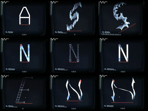
I just found a link to this odd thing on NOTCOT. It’s essentially a synthesiser control panel for changing the forms of glyphs in a typeface, but instead of just changing sound, it treats the strokes as a kind of ‘play-head’ for creating sound, rather like a groove in a vinyl record. As you change the glyph, you change the sound, and vice versa. Also, what you do to one glyph will be done to all the others.
Now, my first impressions after looking at the results are to say that this is an evil device born of the unspeakable nether regions of mythological demons - I mean, to do this to type? They’ll be kicking puppies next! However, I’ve since watched the video and I think there may be some interesting things in there, say, altering the stress on type, adding some interesting brush strokes and the like, but that what you get would be a starting point for any kind of type project. I wouldn’t ever use any of the results as they are. Besides, the noises the thing makes are stunningly annoying. It’s no wonder most of the results are so hideously ugly, you’d end up with a seriously bad headache and a foul temper after a few minutes of using it.
There is one good thing about it though: the display interface. It reminds me of graphics from Star Wars, or the info-screens in 2001: A Space Odyssey. Any moment you expect a Ti-Fighter to come in and start blasting vertices from the bastardised remains of the glyphs:
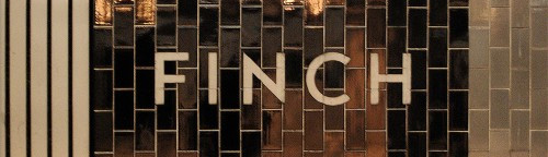
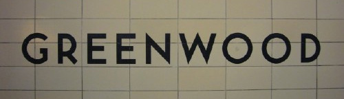
I’ve had this page open in my browser for weeks now, demanding that I say something about it. Joe Clark writes a comprehensive critique of the state of typography on the Toronto subway system, from great beginnings to the chaos of today. From the introduction:
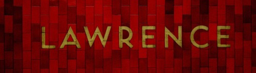
You might not expect something typographically unique to come out of Toronto, a B-tier city that stands in the shadow of A-tier cities even in the minds of some residents. But the margins are where originality can thrive, and the typography of the Toronto subway is a prime example. It is also an example of subverting, ignoring, and actively destroying a special typographic heritage - quite an achievement considering that the type involved is almost a foot high and permanently sandblasted into subway walls.
The article goes on to describe the poor state of information design for signage across the subway system, provides comparisons with New York’s system and shows us what can happen to type when people really don’t care (check out the letterspacing on Leslie, about halfway through the article). It makes you appreciate, even more, just how good London Underground’s type system really is.
The appalling thing is that the original type in Toronto’s system was really rather good, I love the R especially - it is, dare I say it, cute. See some more examples from the article below, then set aside half an hour or so and go and read the article.
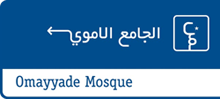
I’ve had this link stored for a little while now, waiting for me to explore further and write about it. I was initially taken by the use of arabic script to form directional signs (at right) and downloaded the beautifully designed and illustrated thesis by Luigi Farrauto. It’s well worth a look, even if you don’t read Italian. There’s a Q&A in English too:
Which are the main differences between the typography of arabic countries using arabic script and the one of non arabic country using arabic script? I find that there is more typographic freedom within the Arab world that outside of it. There is a perception, or maybe that’s just how I see it, that Westerners are more focused on fully calligraphic styles for Arabic typefaces, and so they are unaware that we need other typefaces to suit our daily life. Calligraphic styles are great but you can’t set a dictionary in 5 pts size with that.
That’s what I noticed about the sign in the first place - clean, sans-serif (as it were) arabic type. OK, anyone who watched a news broadcast in 2003 would most likely have seen motorway signs written in arabic, but the films crews were hardly focusing on the finer details of the typography.
Lam-Alef ligatures
How has been faced the problem of vertical ligatures in typography? Opentype provides us with GSUB (glyph substitution) lookups that can exchange a string of characters by a pre-designed ligature. That means that there is a large number of ligatures to be designed, and I’m not a fan of that. In my Naskh style typeface, I kept only horizontal stacking and so I have no ligatures except the Lam-Alef. I find that simpler to read and clearer.
This is also interesting. There are fonts that have been designed with loads of ligatures, but I guess sometimes, less is more.


