Travel Brochures

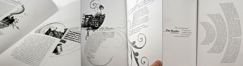
One of these days I’ll write about this tracing things compulsion I seem to have. A few people have asked me to elaborate on it, and I will. Thing is, I fear it’ll end up being a mammoth article and I want to give it proper attention, so until then, I procrastinate, by tracing more things. One thing that I’m sure I’ll write about is the temptation to ‘improve’ the original design and lettering. I normally avoid it just so that I can understand the original more clearly, but as I describe below, sometimes I have the impulse to re-imagine the design.

Coudal (I think) linked to this great collection of travel-related designs, which is full of beautiful and inspiring examples of lettering and illustration. I’m still working on a couple more, but I’ve just completed these two. The first is a brochure in Czech advertising Vienna. The text, very loosely interpreted, comes across as, “Vienna, for any season” (you could also say “Visit Vienna, in any season”, perhaps).

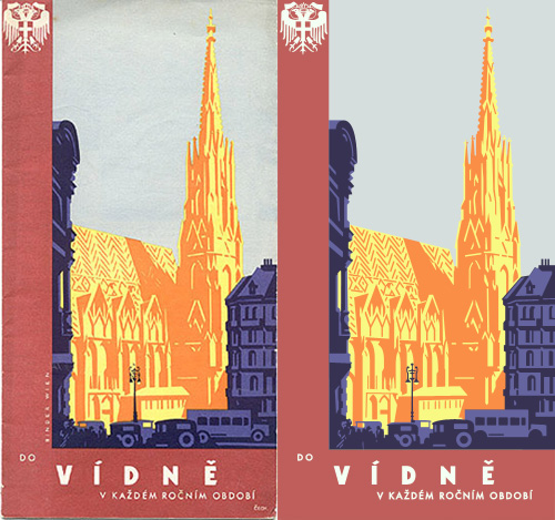
“Travel brochure to Vienna (Vídnĕ in Czech), circa 1934.  Signed Steyrermühl, Wien.  Published by the Foreign Tourism Bureau, City of Vienna”. Description and original courtesy of David Levine, from here, my tracing on the right.

The re-imagined design, for a possible poster.

I love the atmosphere of the image; the street shaded and dark, with St Stephen’s Cathedral bathed in warm evening sunlight. It’s just the kind of scene that would enthrall any tourist, and because it’s an illustration it can be happily idealised and stylised to perfection. I love also the way that the heavy traffic is shown too, perhaps as an indication that this is a up-to-date bustling city with all the conveniences the modern tourist of yesterday would require? Tourist brochures today avoid showing traffic at all if they can help it, instead you see ancient buildings connected by gardens, or, say, an open pedestrianised plaza. Funnily enough, this is exactly what is in front of the cathedral today.

After I traced the brochure, I realised that I would like to modify it a bit to create a poster, or at least something less like a brochure, while keeping the same sense of the era and original intention of the design. I trimmed the red border and rearranged the type, being careful not to ‘over-perfect’ it - there is something special and arresting about the slight wonkiness of the type on these old prints, something I’m trying to keep. The new design is just to the right here. Click it for a larger version.

The second one I’ve traced is this odd, but appealing, brochure for the Deutsche Luftpost. It shows three planes in front of the German heraldic eagle against a strangely flat but stormy-looking sky. The planes interest me by having no apparent means of propulsion - normally in illustrations there is a sketchy circle to show where the propellors are, but here, nothing. The eagle is also interesting by having such a prominent tongue. I looked up other examples of the emblem, and unsurprisingly I ended up with a set of images very similar to the ones I saw while researching the coat of arms of Vienna (at the top of this article). None had such a dramatically large tongue though…

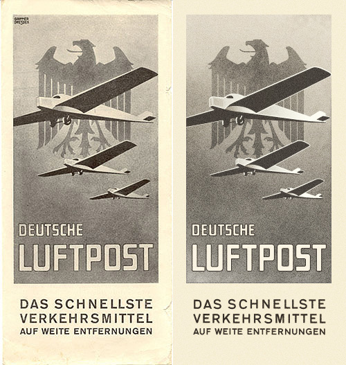
“Brochure for ‘Deutsche Luftpost Das Schnellste Verkehrsmittel auf Weite Entfernungen’, circa 1930”. Description and original courtesy of David Levine, from here, my tracing on the right.

When You’re Strange

This is a fantastic piece of illustration and lettering. Well worth watching. It’s all good, but some of the illustrations that I find noteworthy are the pavement-level view of walking feet (0:27), the yellow and black spread (1:04) and the multiple mouths (1:54).

<object width: 500 height: 281><embed http://vimeo.com/moogaloop.swf?clip_id=2354261&server=vimeo.com&show_title=1&show_byline=1&show_portrait=0&color=&fullscreen=1 type="application/x-shockwave-flash" allowfullscreen="true" allowscriptaccess="always" width: 500 height: 281>

People are strange from Denis Fongue on Vimeo.

Chocolate Research Facility

This caught my eye a while back, on NOTCOT, and it turns out there’s a whole range of packaging with it which is all pretty nice. I prefer these ones though, they’re like some cross between newspaper wrap and utilitarian shopkeeping units - it reminds me of how supermarkets sometimes design their own-brand ‘basics’ ranges, which (almost) always end up looking far better than the non-basics stuff. I’m not sure about the treatment of the two Os though, the counters look more like funky bullets somehow. Have a look at the rest of the Asylum site too, there’s plenty of interesting stuff on there.

Grid Systems

Antonio Carusone mailed me to announce his new project, The Grid System, a site (obviously enough) about grid systems. Now, I don’t normally post about things from mailouts or press releases, but since I’m particularly partial to a good grid and I’ve already found a couple of useful things on this site that I’ve found interesting and even bookmarked, I reckon I’d end up writing about this anyway. So, go and have a look.

What did I bookmark though? Well, Syncotype for one. It’s a bookmarklet, i.e. a bit of javascript you can bookmark and then run on any page you’re viewing, that overlays a baseline grid on your page. I have an 18px baseline grid on this site, which often ends up being broken by images I post not having a multiple of that as their height. It’s certainly something I could solve with a bit of extra javascript of my own (or even something server side) to ensure the height of a containing element of an image is indeed a multiple of 18px or a round number of ems, but I’ve not got around to it yet.

Also, there’s the problem of whether such automatic measures are even appropriate. For a while I cropped and trimmed all images to a set of heights to match the baseline, but sometimes it just doesn’t fit the image and I found adding extra padding to the container (a paragraph tag in this case) actually spoiled the vertical rhythm of the page. I decided that as this site is a single column that it would be the apparent vertical rhythm that was important, rather than the real one. I wonder how other people solve the problem? Or even if they do…

Art from Barrels

I’ve been following this series of articles by Johnson Banks about their Art from Barrels project for Glenfiddich. The aim of the project was to get across the length of time it takes to make a barrel of Glenfiddich Single Malt, and the end results are pretty interesting. I haven’t got all that much to say about it, especially as the articles explain it all pretty well, other than to say I’ve discovered I like sandblasted letters in charred wood:

Infographics

Two of my favourite animations of all time are the advert H5 did for Areva, and their Royksopp video. I can watch them over and over again; they’re so good. So I went to the H5 website recently to see if there was anything else they’d done like that, and found the video for Alex Gopher. I’m sure I’ve seen it before somewhere, but it was a long time ago and I hadn’t made the connection it was done by H5 too. It’s available to view on YouTube, but you can see it on H5‘s (all flash) website by clicking ‘films’, then ‘clips’, then ‘alex gopher’.

Anyway, I like things like this, where the label is the thing itself, and it reminds me of the National Geographic trailers for Seconds from Disaster that I linked to before. I’m thinking it would be amusing to remake Powers of Ten in this style - zooming into the word ‘galaxy’ to see it made up of widely spaced words like ‘star’ and ‘nebula’, and so on, down to the sub-atomic level, with everything its own label.

Screen captures from ‘The Child’

Screens from the Areva advert, the Royksopp video, and this rather good public information film by Japan’s Ministry of Agriculture, Fisheries and Food.

Talking of labels becoming the object itself, there was a short film, I think on the Sci-Fi channel, about a post-apocalyptic future where the apparently normal, happy, consumerist lifestyle everyone leads is in fact an illusion. There are many layers of unpleasant illusions underneath the ‘nice’ one to stop people trying to break free and see the real world. I particularly remember the ‘real world’ in the film as being made up of cardboard boxes labelled with the name of the object it was supposed to be, and a big barcode (the name set in Helvetica, natch), with one scene showing a load of cardboard boxes labelled as ‘Black Leather Briefcase’ going through some device (gotta love sci-fi) and emerging fully-clad in the illusion of black leather briefcases. I’m sure the film is nowhere near as good or as profound as I remember it, but does anyone know what it was?

56 Leonard

I was clearing up a load of saved links on my desktop and rediscovered this site about 56 Leonard. I saved it last week because of the rather nice typographic representation of the building on the site, which unfortunately flies past pretty fast and doesn’t appear to exist in any of the literature. Still, a few screengrabs and many refreshes later (horribly distorting their stats I’ve no doubt) I put together a decent resolution image of the whole thing. It’s not the prettiest building out there, but it does look like a fun, futuristic place to live, some of the apartments have remarkably large outdoor spaces, and it has an Anish Kapoor sculpture wedged under a corner of the building too. It’s a nice idea, and something that the initial animation does explain very well (the rendered videos on the site explain it too).

(Via cityofsound)

It’s A Heinous Act

Hallmark has some very nice trailers for its programmes, usually with great typography, and always with perfect grading. They’re very fond of them too, so you tend to see them several times throughout a programme - something that can easily drive you nuts if you’re not quick with the mute button. Still, they look nice.

This particular one, for Law and Order, uses the nice technique of placing text set in Didot into various scenes in New York. The point of view changes as the text builds up and enhances the 3D in-world effect, and as it does, dribbles of grime (blood?) trickle down from the words. It’s all very nice, but what, I say what is this I see?

The proper Didot apostrophe, and the improper one.

A prime*, used as an apostrophe? A heinous crime, if ever there was one! Someone call the cops! Thing is, you’d have to deliberately turn off “smart quotes” in After Effects to get that symbol to show, and not the correct one (at right). So why?

Perhaps, and here’s a thought, perhaps they did it like that to echo the dribbles in the animation? That would make it an artistic decision, and not an ignorant mistake. I do hope that’s what it is, as the rest of the sequence is rather pleasant: