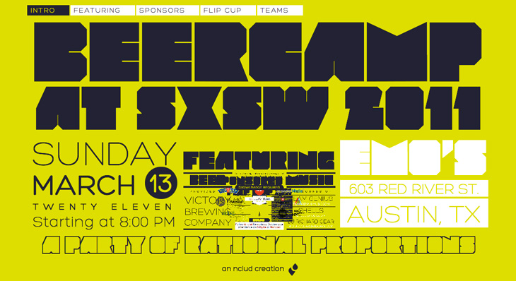
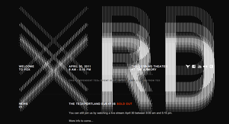
These two sites each transform the common, straightforward act of scrolling into amusing visual effects. The Beercamp one uses a page-within-a-page idea, with a smart little in-joke right at the lowest level, instantly recognisable to anyone who’s seen that film. The zooming effect works really rather well and seems perfect for a small site like this. The TEDx Portland site is interesting in that the broken-CRT visual effect actually interferes with the text somewhat — you have to scroll more than you might do normally before the text (ahem) ‘below the fold’ is readable. That might be irritating, but it’s well done enough that it leaves you with more of a, “oh, that’s fun” feeling instead. Well, it does for me. Your mileage may vary.
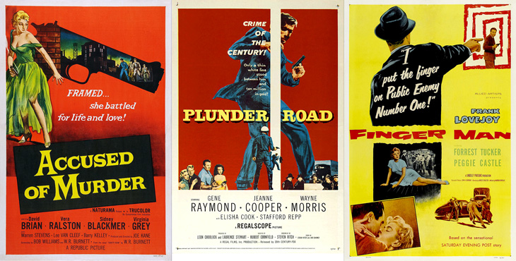
Andy Clarke (aka @malarkey) tweeted a couple of links to Where The Danger Lives, a site on crime films, which has reviews and in-depth info on classic crime and noir films, studios, and recently, a countdown of the best posters used to advertise the films. Each poster has been restored and cleaned up so you can see it clearly (with links to a decent size larger version to look at) and an illuminating analysis of the design and how it fits the film. It’s all pretty impressive stuff so far (I’ve only read a few of the posts as of writing this), so go and take a look.
What would Das Kapital, The Iliad or Faust look like if they were printed on a single page? What about Macbeth? This set of four posters by All The World’s A Page can show you exactly that. Oddly, they’re simultaneously both compelling and repellent — the concept, the flow of text, the exposed structure (especially in Macbeth) and the beautifully consistent and even colour give you a sense of wow, look at that, while the sheer scale of them, the obvious difficulty in reading them feels intimidating, even slightly upsetting. Not too upsetting, I might add; I bought two as soon as I saw them. I can’t wait for them to actually print Ulysses too…
This caught my eye on the Lovely Ligatures Flickr group — it’s a piece of client work by the talented bunch at Like Minded Studio. So much of their work is just the kind of thing that has me looking closer, perhaps with a touch of chagrin that it wasn’t me that did it, there’s so much incredibly detailed work going on there. Go and take a look at their site to see more of their work.
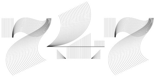
I’ve had these lined numerals by Steven Jockisch bookmarked for a while — too busy tweeting and working to get a decent post up here I guess. They remind me of a few things I’ve seen, which made me wonder whether I’d posted about them (or a similar project) before, but it seems not. Noted for inspiration.
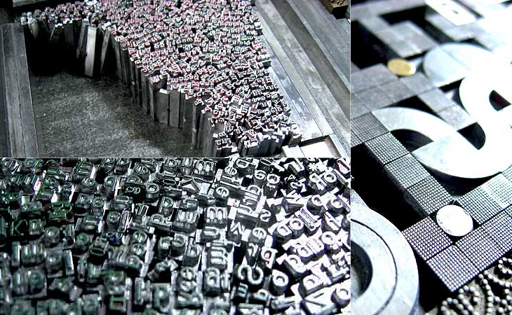
I’ve posted about Martin Schröder’s blog before, but with the images he’s been posting of his recent work I think it’s worth another link. I love the ‘making of’ pictures he puts up, showing how he builds the type in the forms, all that gleaming metal is quite something special:
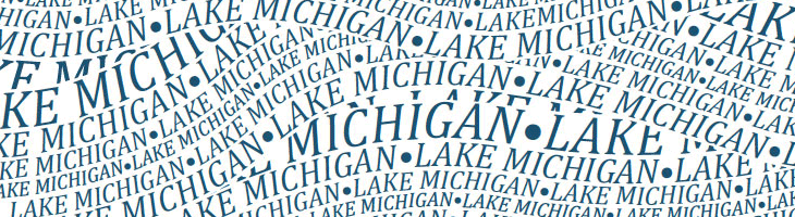
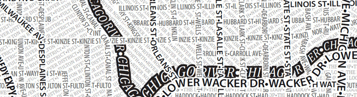
I like the idea of typographic maps, from the fairly abstract ones by ORK to the impressively detailed linocuts by Andrew Webber, so it’s nice to see another approach, especially when there are some clever little touches. These posters from Axis Maps show maps of Chicago and Boston made entirely from type, using a technique that is fairly straightforward and which could risk producing a rather dull result, but Axis have created textures and used typographic colour to create an interesting set of images. The overall effect is pleasing, and I think if there was a New York or London version I’d be tempted to get one. A couple of details showing some of the effects I like — using a heavy stroke on type to create the dark line of a river and the overlapping curved text to create the waves on Lake Michigan:
An obvious solution perhaps, but it works rather nicely.
One little niggle though. As much as I like and admire Museo, I don’t think it works as a titling face on these maps, not at this size, and not in this context anyway.
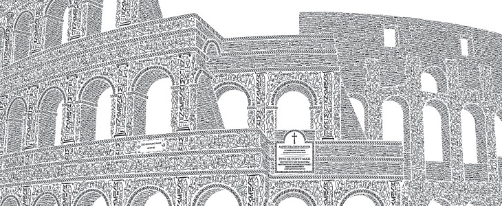
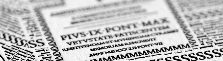
This is a very belated post, but one I’ve been meaning to do for a while. Cameron Moll’s Colosseo Type poster is a joy to behold. The level of detail in it is astounding, using type to create textures, patterns and outlines to illustrate the Colosseum. The piece is letterpress, and took over 250 hours to create; it’s set in Goudy Trajan and Bembo Pro, and interestingly, some glyphs recreated using tracing and redrawing:
Additionally, glyphs have been recreated based on the work of master Italian calligrapher M. Giovambattista Palatino, as featured in Libro di M. Giovambattista Palatino Cittadino Romano, published in Rome around 1550 AD.Cameron Moll
Belated or not, it turns out now is a good time to post this as Moll is having a sale of not just this, but the Salt Lake Temple poster and the EPS of the traced glyphs from the Palatino book (one of which is up at the top right). So yes, 25% off, and you get a free glyphs poster with one of the larger posters. Excuse the sales-y tone, but I think these posters are worth every penny; they’re lovely on screen, but as physical objects they’re quite beautiful.
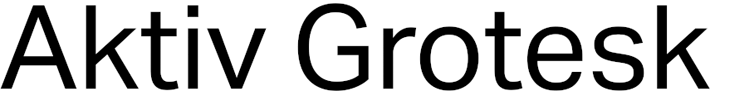
A few months ago I went to BrightType 2010 at Brighton University — two talks, one by Richard Rutter and another by Bruno Maag — which I meant to write up at the time but sadly never got around to. One thing that stuck with me was Bruno Maag’s 5 minute rant against Helvetica where he compared it unfavourably to Univers and decried its overuse and the unthinking adoration given to it. Apparently Maag likes to include a bit of a rant like this in all his talks, but it was new to me and quite refreshing. Basically, Bruno Maag detests Helvetica, and has designed a new face, Aktiv Grotesk, to kill it off.
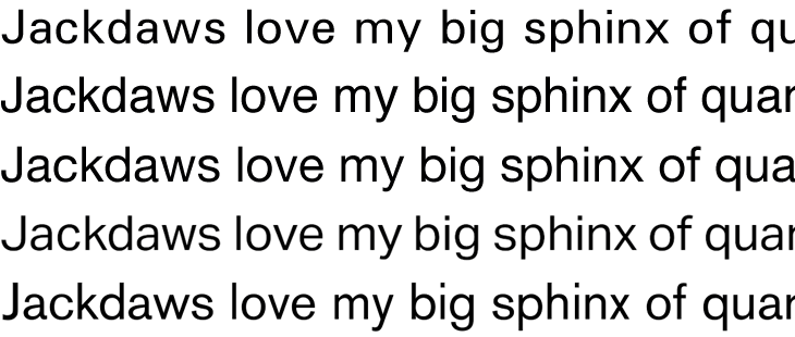
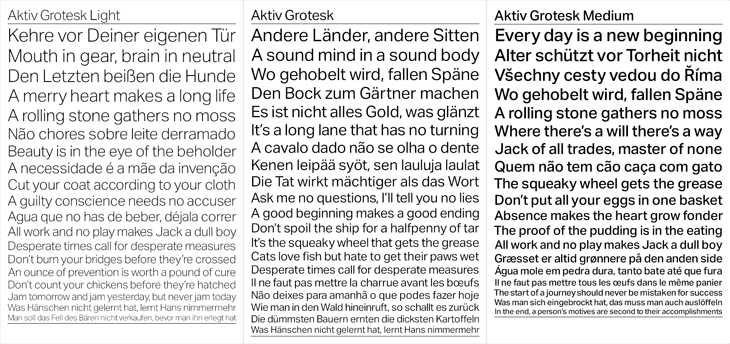
The new face is designed both to correct the apparent flaws in Helvetica and as a new, warmer, friendlier Univers. I guess I’d need to spend some time with it to know how it feels in use, but first impressions are pretty good. Univers is one of my all time favourites and Aktiv Grotesk has much of the same feel, though I’m not sure it really feels friendlier. I always thought Univers had a lot of character and was pretty friendly already, so I’m surprised Maag described it as ‘cold’. I guess it depends on your associations. Comparing Univers*, Helvetica, Helvetica Neue, Aktiv Grotesk and Akzidenz Grotesk is pretty interesting. You can immediately see that while there’s a connection, Aktiv Grotesk is is definitely an entirely new face — the counters are more open, possibly due to the squaring off Maag mentions; the strokes are sophisticated and refined, more like a display face; and the whole thing has a beautifully even colour:
* Admittedly my version of Univers is pretty crap, not that I’ve found much better available online.
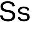
There are a few oddities in it though. In particular, that ‘s’ is just plain odd. In context, above, it fits in mostly OK, but it appears to lean backwards. It feels unstable. Both the Helveticas and Univers have S’s that come to a satisfactory finish at both ends, and Akzidenz Grotesk has that chunky flare at the ends of the stroke to balance it out, but Aktiv Grotesk just tails off a bit. It feels, dare I say it, a bit like Arial.
This statement surprised me a bit:
“Being a Swiss typographer, it’s always been Univers. Even in my apprenticeship we didn’t have Helvetica in the printshop. Then I went to Basel school of design and of course in Weingart’s workshop it was Univers, never Helvetica. Then I come to England and there’s all these designers using Helvetica! The Macintosh had just come out and Helvetica was on every single machine. Everyone was so fascinated with it … I never understood that.”Bruno Maag in Creative Review
Really? When I was growing up I remember that when there were sans serif faces they were either Univers or Folio. My uncle was a typesetter and designer and I remember the books of Lorem Ipsum set in Univers he used to chop up and paste into layout comps. It was never Helvetica. But then, these were the cold, damp provinces, so perhaps things were different in that London, you know, where they had computers and all that clever stuff. Maybe.
So for what it’s worth, I think Aktiv Grotesk is a real winner of a face (that ‘s’ notwithstanding) and will be pretty nice to play with and use professionally, but I doubt it’ll unseat Helvetica as the sans designers turn to. As a high quality font and with its Swiss typographic credentials, it does stand a chance of eclipsing Univers though, which would be a shame.
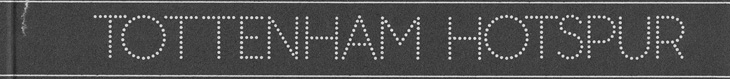
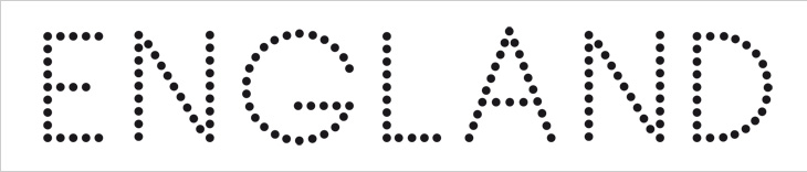
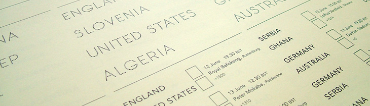
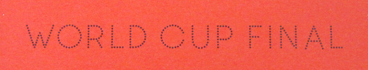
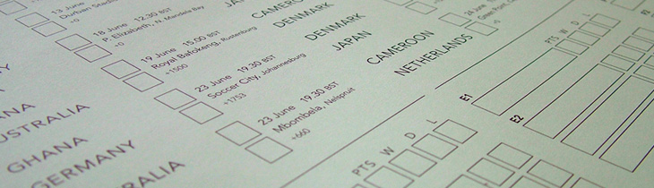
I wasn’t expecting to have anything to write about that was football-related, even during such a big event as the World Cup, but wonders never cease. When Benjamin Prescott mailed me about a personal project to create and sell limited edition World Cup wall charts he’d designed I had a big of trouble thinking what it was for — I’m so out of touch with such things. I mean, yes, I’ve a theoretical knowledge of the offside rule (something that’s talked about as if it’s one of the Great Mysteries of the Ancients) and yes, I played it at school, but the whole yelling-at-the-tv, wearing team colours and flying the flag kind of thing always passed me by. Still, I know enough people who like it all (so I can ask), and as it turned out I was just re-reading the email when I noticed I was sat right next to one of the wall charts, and a lovely thing it is too! What really interested me in it was the recreation of the typeface from Subbuteo scoreboard references — I like lettering and illustrations made from dots anyway so this was a nice find, and it works well with the Avenir used on the rest of the chart too. The wallcharts are limited edition, so I hope I’m not too late in writing about them and you can still get one if you want one.
An original Subbuteo reference and a sample of Prescott’s redrawing.