The Xerox Star UI

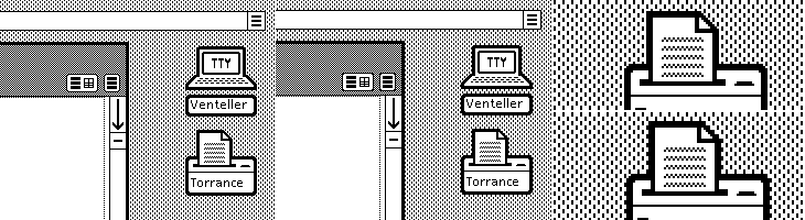
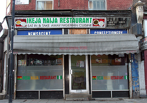
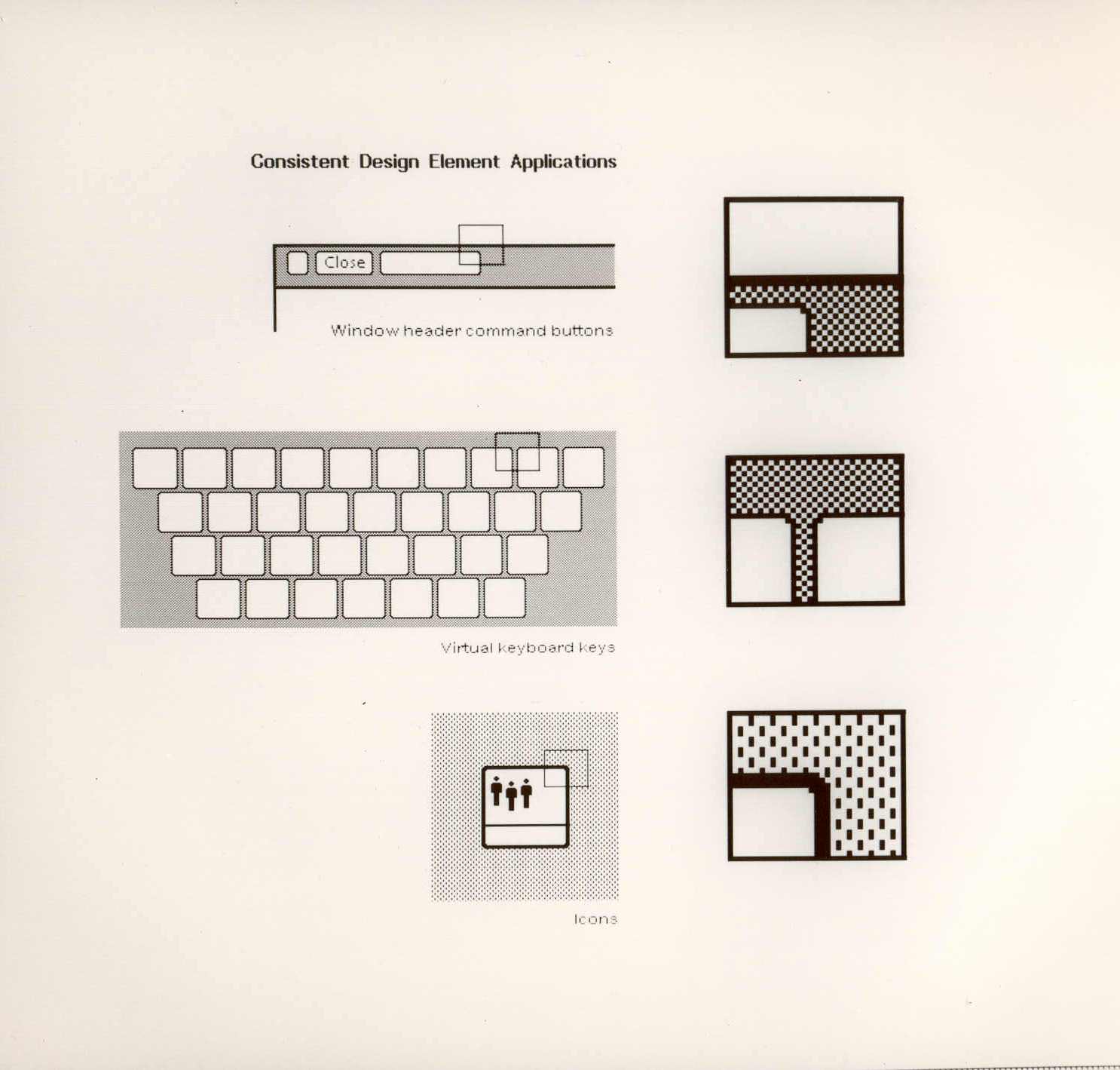
A couple of weeks ago ISO50 linked to this set of polaroids of the Xerox Star user interface on Digibarn, and I’ve been looking back at them on and off since. The UI has some interesting little details; it was designed for a two-colour display, so used a couple of dithered patterns to create the grey shading on the desktop background and window titles, which in turn created a few problems for the designers. To get a neat, crisp interface, icons and windows have to be sized and positioned on the background so that the black and white dots don’t interfere with the outlines and create a kind of blur or eye dirt effect. The polaroids show some of the design notes and instructions for doing this; it’s a lovely illustration of the attention to detail they employed to make the best of a technological limitation. Rather than recreate them directly (you can see the originals here, and here) I’ve redrawn a bit of the UI here, with ideal alignment on the left and detail top right:

The difference a pixel makes.

If I’m to get preachy (and ranty) for a moment, I think it’s a task any designer should attempt as part of their education - what you learn from designing for such a restricted display helps with all sorts of design tasks later; you learn what causes a lot of those visual disruptions and artifacts that you catch from a quick glance or out of the corner of your eye. It may be subtle, but it’s the kind of thing that reduces the overall apparent quality of your work, the stuff that marks out your work as being standard (read: mediocre) or exceptional. If you feel you shouldn’t get precious about such things, perhaps graphic design isn’t your thing.

How the icons are laid out on the desktop. The big flaw I see in this design, still not fully solved in desktop UIs today, is the display of longer filenames when displaying icons in a grid. They’re either truncated or hideously force-wrapped. Ouch.

As others have noted, the UI at first seems remarkable for its apparent modernity, the conventions it uses are still ones we use today; with a graphical update to it you’d get a reasonable facsimile of any windowed GUI of the past few decades. The designers at Xerox clearly did a remarkable job, addressing so many design problems at once, with solutions so good that almost three decades of development haven’t significantly improved on them. We could throw up our hands as a result and say that this is clearly it, that nothing new can be done, but apart from being depressing, this would miss a couple of important (to me) points:

  1. The hardware configuration of a desktop computer has barely changed - we still use a mouse (or equivalent), a keyboard (however fancy and bristling with hotkeys it is) and a screen (whatever the technology, it’s still a 2D array of pixels)
  2. We haven’t changed - we’re still human beings.

Essentially, we are still the same configuration of limbs and sensory organs using the same configuration of display and input devices. It’s when we change either of those configurations that we see where all the real innovation has been. Adaptive and assistive technologies are developing faster and faster as component prices fall and previously isolated innovators are connected and share information online, and in tandem with this we see the spread of input technologies that enable methods such as touch, voice and gesture. We can hope that these technologies become widespread enough to change the design of the traditional desktop, or even make it obsolete, and that leads me nicely onto…

A futurist digression

Heading off into the realms of the futurist for a moment, I think a lot of attention has been given to display-related technologies such as 3D/holograms, but not even sci-fi has come up with anything really remarkable with the idea - oh sure, you can create a hologram of a keyboard, or a touch screen, but those merely address matters of convenience: you don’t have to store the thing when it’s switched off. The interfaces we see in films are mostly still all about manipulating pictograms. What I’m really interested in are the kinds of interface that use our other senses, interfaces that seem less flashy and appear almost mundane such as vibration (as in mobile phones), things like the sleep indicator on Apple computers and potentially most importantly, speech.

Forget flying cars, we’ll know it’s the future when we can talk to our computers, just like in Star Trek, but hopefully not quite like in 2001: A Space Odyssey.

Dazzle

Coudal (I think) linked to this the other day. It’s a collection of designs for dazzle camouflage applied to ships during the First and Second World War to confuse the silhouette of the ship and make it less likely to be targetted by enemy subs. I got a few silhouette images (from this rather odd and boastful page) and put them next to some of the designs, and you can see why the technique gained a lot of support. The designs would at least make it hard to identify what kind of ship it is, which might help if everyone did it…

So yes, that raises the question of effectiveness. I imagine in full sun it would be quite good - literally dazzling the eye, but in an overcast, at dawn or dusk, the ship would still be silhouetted quite clearly against the sky. So what were the results? From the site:

Did it work? Dazzle and the convoy system were implemented about the same time, so it is hard to say. However, crews on dazzle ships were very proud of the bedazzled camouflage. It was definitely a morale booster. The British and the Americans fully adopted dazzle because at the time they found it to be effective and inexpensive.RISD

Tests should be done! Still, however well they worked, they’re pretty fabulous. More ships should be painted like this, just, you know, because.

Annoyingly, the RISD only has these tiny images, and I can’t find anywhere to buy prints either. There is, however, a poster from Transport for London advertising the Imperial War Museum that shows an illustration of a freshly bedazzled warship, here.

Symbol Signs

You can get a wall decal of this from the site - in the ‘Urban’ section. Linked from the image.

I see (via Chris Glass) that AIGA have put the complete set of passenger and pedestrian symbols online, free of charge, apparently for the first time. They can be downloaded from their site here, though beware of the ‘complete set’ zip file, as rather unhelpfully they don’t have file extensions. The story of how the symbols were developed is interesting:

To develop such a system, AIGA and D.O.T. compiled an inventory of symbol systems that had been used in various locations worldwide, from airports and train stations to the Olympic Games. AIGA appointed a committee of five leading designers of environmental graphics, who evaluated the symbols and made recommendations for adapting or redesigning them. Based on their conclusions, a team of AIGA member designers produced the symbols.

The fact we still see (most of) these symbols everywhere speaks of the quality of the design process they employed. The only sign that has changed significantly is the one for ‘shops’ - even without the change in attitudes to smoking, the pipe would appear dated these days anyway. The symbol was also impossibly dense and cluttered. You don’t see the ‘smoking’ sign anywhere these days either (well, not in the UK at least), it’s just that grammatical horror, “It is against the law to smoke in [sic] these premises” on every building, everywhere. It makes me want to vandalise in the name of good English.

Airport, escalator, smoking, shops and restaurant.
Café, heliport, baggage claim and check-in, exit and left luggage.

Hang on a moment. Exit? I truly have never seen that symbol before. I can see the thinking behind it, but clearly it never caught on, and for good reason - it’s far too similar to the ‘no entry’ sign. In an emergency situation you can’t guarantee that either sign would remain perfectly level, just at the time you’d really want people to be able to tell the difference! The Wikipedia page on exit signs (yes, of course there’s one) makes no mention of it either.

Most of the rest of the icons. The one for baby facilities always strikes me as a bit horrid, like the poor child has been dismembered.

Mundane Beauty

You know when you see something mundane and everyday in a completely new light? When you see something afresh that you’ve never paid attention to? Well last week I got this envelope and for some reason the franking mark caught my eye. I’m not sure whether it’s because it’s so crisp and sharp or whether it’s the neat alignment to the edges of the envelope, but it just made me look again.

One thing that’s a bit special is how the printed “Great Britain” on one side of the square balances the “Postage Paid” on the other. I’ve found (often to my professional disappointment) that it’s rare for two phrases to be similar enough in length that you can do that, so it’s a nice little detail. The roundel with ‘Newton Abbot’ in it is rather pleasant too, and I’m trying to think back but I’m sure the normal Post Office frank is considerably plainer than that. Anyway, it’s just a pleasant little thing that caught my eye the other day - a nice bit of purely functional design, and part of the iconography of the state.

London Shop Fronts

I think I saw this one on Coudal Partners, an ongoing photo study of London shop fronts. What fascinates me is the range of type and typography on the shop signs. Some are good, some are strange, some are very strange, and there are quite a lot that are pretty dreadful, all making up what I suppose you could call London Small Shop Vernacular.

Nice bit of signage archaeology on this one.

From time to time I’ve thought of doing this in Brighton, there’s quite a range of shop fronts, and they seem to change quite frequently too. I saw a lovely roundel on the window of a burger takeaway announcing the availability of halal meat, and it got me wondering whether there are any sort of recognised marks for halal and kosher, and it turns out there are. Quite a few of them in fact, and not really very consistent. I guess if you’re sure no-one is actually going to out-and-out lie, these are all consistent enough:

The idea of being ‘consistent enough’ reminds me of other logos for food labelling. There’s the ‘v’ for vegetarian, and sometimes vegan, food - something you see a lot in Brighton. There’s also the Vegetarian Society logo which often gets used by food suppliers whether they have permission to do so or not, but again, no consistent mark for the whole thing. Perhaps with some things there’s no need for consistency because the truth of what the symbol claims can be easily checked, but with other things there definitely is a need. For example, the demand for fairly traded products has led to the development of an official Fair Trade logo. However, there are lots of other ones that imply lovely, fair, environmentally and socially responsible origins, but have so few checks and balances as to be essentially meaningless - greenwashing in other words.

The Dot and the Line

This is fantastic. I think I saw it here, linked from Design Observer first, though quite a few sites have linked to it too, but that’s no reason not to link to it again. It’s got some beautiful touches in it, with a gentle kind of humour and some reasonably groan-worthy puns. I love the little joke about the perfect proportions of the dot, playing off the classic ‘36-24-36’ hourglass proportions supposedly ideal at the time for women. The calipers are great, with the little hearts instead of arrows for the dimensions, and just demanded to be redrawn:

A few sites I’ve seen it on have lamented that things like this aren’t made anymore because it wouldn’t be popular, that people would be afraid of anything that mentions ‘hard stuff’ like mathematics. Perhaps they’re right, and maybe it is really anti-intellectualism preventing stuff like this being made today, but the animation is hardly a mathematical treatise. The only mentions of anything mathematical are the title and a few puns scattered here and there, ending in the rather nice, “To the vector go the spoils”.

The real point of this animation is the animation itself. It’s certainly not the story: a simple morality tale on the importance of hard work and discipline (and also, avoiding narrow thinking) to achieve your desire; in this case, a remarkably shallow and feckless sounding creature who is easily wowed by flashy glitz and glamour. Perhaps these days we might wonder whether that was worth all the poor line’s effort; “You can do better than that” we might say.

So the animation seems like a kind of showreel, a portfolio piece, beautifully done of course, but more remarkable in that it was released by the studio commercially. I have a little theory that it might have been released with the new technology of colour TV in mind - the audience at the time was very small and would have consisted of those who could afford it; professional, college-educated people? That might explain the choice of story too.

Sprachlos

ISO 50 posted about the Taschen book, “East German Design from 1949 - 1989”, with some photos of the inside. There’s a fantastic ‘z’ logo on the cigar box, which of course I had to trace. I’m thinking of getting the book, as East German design shows how creativity can flourish even when resources are limited, and as I found when writing this piece, the resources were often very limited indeed.

Connections

Funny how coincidences arise. I found both Mario Feese’s Air Lines and Chris Harrison’s Internet Maps at about the same time and was struck by how recognisable the continents are, and, as I’m fond of maps I thought I’d compare the two images. On the Air Lines map, most of the continents are rendered as a ghostly but fairly accurate outlines, with South America rendered as a beautiful abstraction, right to its tip. The Internet Map is obviously somewhat different, with almost all the connections between cities in rich countries; Africa barely exists and the tip of South America is shown with a single faint line, whereas North America and Europe are smothered in a riot of lines. I overlaid the two maps onto each other and I noticed an interesting thing about the Internet Map, which I describe below.

So, to align the maps I needed to use various groups of cities that appeared in both maps; using the southern hemisphere to get the horizontal scale right - there are sharp points for cities in South America, southern Africa and Australia, and in the northern hemisphere I used San Francisco, LA and Tokyo to get the vertical scale. Thankfully, both maps are using the same projection.

Everything pretty much lines up nicely, except there’s that node in the Gulf of Guinea which I originally thought might be some satellite uplink affair at Sao Tomé, maybe a huge data haven I’d never heard about. However, after lining up a map of Africa with both maps it turns out to be nowhere near any land at all. In fact, when I was trying to mark the point on Google Maps, I realise this big data interchange point (the biggest in Africa!) is at 0.0°N, 0.0°W, which is a suspiciously default sounding location. Maybe in the data that Chris Harrison used there are a few unknowns, with their locations set to null, and these connections should be shown elsewhere? If they were removed, Africa would be even more ghostly.

Branding Polaroid

Just saw a link to this site on Coudal about the rebranding of Polaroid, written by Paul Giambarba, who did the rebrand. It’s a fascinating read, and I might post more about it, but the bit about the pre-1957 logo caught my attention. I was looking at the old logo, and wondering why they’d done the ‘a’ like that, and that with the kerning on the other letters it made it look like two words: “Pola roid”. The ‘r’ is a bit odd too. Seems that those weren’t the only problems with the logo identified by Giambarba:

Polaroid is reversed, or dropped-out, from a red patch in a mangled version of a typeface called Memphis. The true Memphis lower case “a” has an upper serif to distinguish it from an “o,” but close inspection will reveal that the upper serif has been removed from the Polaroid “a.” Thus the brand name could be easily misread at quick glance as Poloroid. Of all the counterproductive things one can do in commerce, this was outrageously stupid, especially when spending considerably to launch a new line of products. Paul Giambarba
At top, the pre-1957 Polaroid logo, in the middle, the word typed in Memphis and kerned tightly and at the bottom the same word, but with the upper serif of the ‘a’ removed.

I think that the word looks a load better with the serif. Still, Giambarba had already dismissed the typeface as ‘unreadable’, so the logo was clearly up for bigger changes than the reinstatement of a serif and the demangling of the ‘r’. Go and read the rest of it, it’s worth it.

Steinlager

The FontFeed linked last week to The Dieline’s exclusive on the Pentawards competition results. There are some lovely examples of packaging in there, with some really innovative packaging shapes and structures too, rather than just nice labels on standard packs.

I often wonder when looking at things like this where the incentive came from - it can be hard persuading a client to go with something custom, with all the implications of cost and lead-in times that implies. It (obviously) happens, though I wonder whether any of these agencies might have been simply lucky to have a client bounding in, scattering wads of cash hither and yon, full of enthusiasm for creating something new, exciting and different. I’d like a client like that. Or two. Or three.

Back to the awards: The Gloji bottle at right is lovely, and different, and I imagine it would feel nice in the hand, like a cognac glass. I don’t care for the logo very much though, unlike the Steinlager logo below. More specifically, the ‘S’ in the Steinlager logo. Looking on the company’s site, I see that the version used on their other products is more traditional, and it’s just on this bottle that the blackletter has been pared down, trimmed and shaved to give it that clean, sleek, modern simplicity. I love it. Hard to trace from a picture of a bottle though, but I think I have it about right.