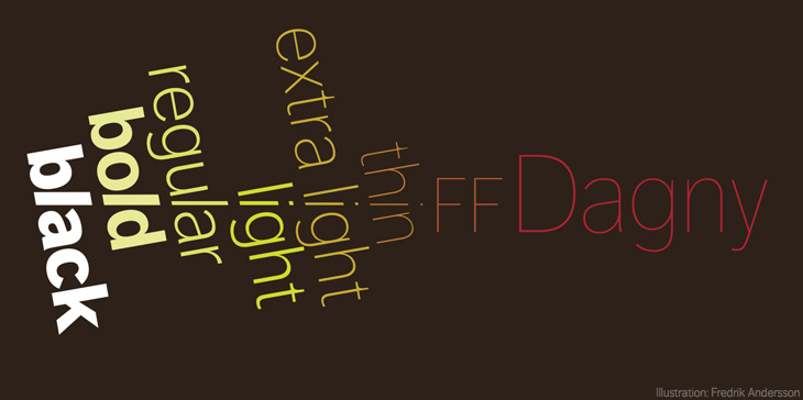
Yves Peters wrote recently on the history and origins of the FontShop-released FF Dagny, worth reading in full, especially for the interesting discussion at the end on how to categorise the face. I must admit though to being drawn in by the beautiful illustration by Fredrik Andersson, reproduced below. One of the key features in the development of Dagny was to create a true italic for it, rather than the obliques of its ‘parent’ face, DN Grotesk, so it’s especially pleasing to align italic characters across the illustration like this.
Illustration by Fredrik Andersson for the FF Dagny spec sheet.
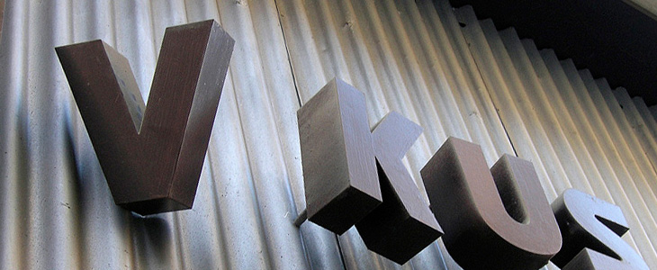
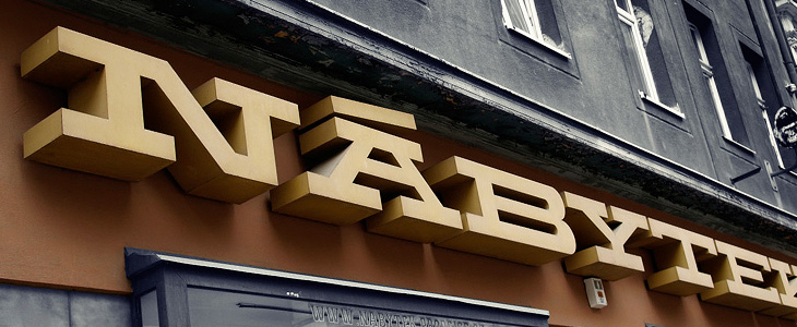
I’m loving these examples of signage and lettering in this Flickr set, linked from City of Sound. Most of them seem to be from Prague, but there are a fair few from various other places in Central and Eastern Europe, and as far as I can tell a lot of them are fading or at risk of being scrapped in gentrification projects. Well, I say scrapped, but since you can expect to pay as much as £50 per letter for old signs just here in Brighton, I expect there’ll be lots of architectural salvage types schlepping round the old Warsaw Pact countries buying up this stuff as we speak.
I hope some of them are kept though - I was reminded of this shop in Paris that has been left empty since the 1980s and has been opened as a new Paul Smith store, with all its original signage and internal fittings intact. I read about it on It’s Nice That, and the history of the place is interesting:
The walls are unpainted for many years, the floor tiles are the original, 80 year old shelves, everything dates back to the 1930’s when La Tourrette was opened by Monsieur Tourrette as a ‘Bougnat’; the left side of the shop selling coal, the right side selling wine.It’s Nice That
I love the Nábytek one above - it’s such a powerful block of lettering, so monumental and such a strong sense of horizontal motion, it’s like a freight train of type. It did remind me of a few things I’ve seen - this t-shirt for example, or Dispatch Extended Bold, but none really have that strength and density, nor some of the nice features the sign has. The A on the sign has those serifs and that incredible accent - why you wouldn’t want to include diacritics like that in your display face I don’t know - the offset diagonal on the N is just great too.
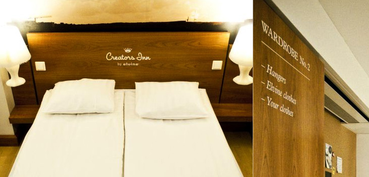
I’m often saving links from the Contemporist, but this hotel, Creators Inn by Elvine (and others), caught my eye for the nice labelling of the wardrobes and the printed history of Elvine on the shower screen. It’s a nice touch, but I wonder if it doesn’t seem a little incomplete as an implementation - things like this are best left subtle or taken to the extremes; if every item in the room was labelled in the same way, with usage notes perhaps, it would be quite the thing. Also, as one of the commenters pointed out, it’s hard not to notice the similarities between the hotel logo and that of a rather large hotel chain. Still, it does look rather nice, and if you’re a creative person visiting the city, you can get free accommodation there. Now that’s a nice touch.
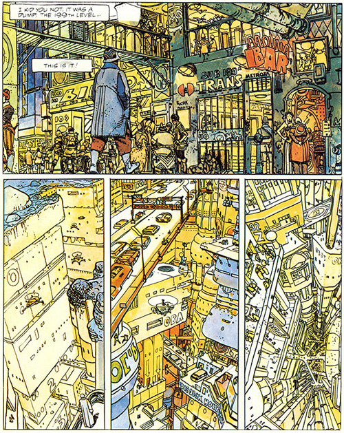
This has been hanging around in my browser tabs for a little while - it’s right up my street too, The Top 10 Comic Book Cities on the Architect’s Journal. A few people have linked to it (I have no idea where I first found it), so you may have already seen it, or even have the books listed. I’ve got a couple, and I think I’ve tracked down a copy of The Long Tomorrow, with Moebius’ fantastic visualisations. I’m quite fond of the idea of megacities, maps (especially of the builtenvironments) and really crowded, dense architecture. It’s not type related, but I imagine such things tend to appeal to the typographically-inclined, if only for the recognition of the similarly detail-obsessed personalities that created them. Anyway, I got the picture below from a regular read of mine, Sci-Fi-O-Rama, which feeatures sci-fi related art and book covers:
Adrian Giddings just linked to this on Twitter, a linocut map of Paris by Mark Andrew Webber. It reminds me a little bit of these typographic maps of London and Portsmouth, and of course the ORK ones of various places, but because it’s hand-done (and a linocut at that) when it’s printed it’ll have a very different effect. There’s one of Amsterdam (and London, and New York) on Webber’s site which shows how it might look.
The Paris one looks to be made of a combination of face and lettering styles, I assume to reflect the character of each place being represented, and from that I was wondering at the idea of doing that for whole cities, if you could. It could never be a perfect representation for everyone - I’m sure that for many people a typographic representation of London would involve Johnston Sans, whereas I tend to think of Caslon types. For others, who knows?
The linocut itself has a gorgeous sculptural quality, shown up beautifully in Webber’s photos; I would quite fancy a copy of that rather than a print (oh, OK, as well as a print) - to run your fingers over it would be a real pleasure. Lovely stuff:
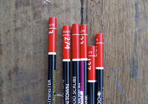
Richard of AceJet 170 posted some great pictures of Pencil Talk’s collection of Routemaster-inspired pencils. I’ve nabbed one of them below, but go and have a look at the article for more, and a link to the source - for the real pencil lover.
Routemaster pencils! Could you ever bear to sharpen them?An Eberhard Faber Scale pencil, picture from Pencil Talk
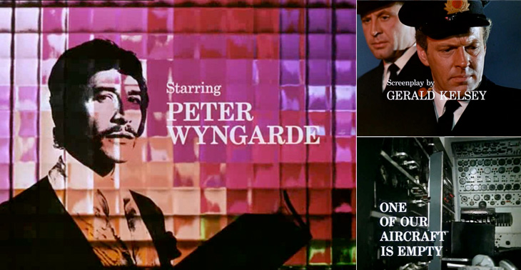
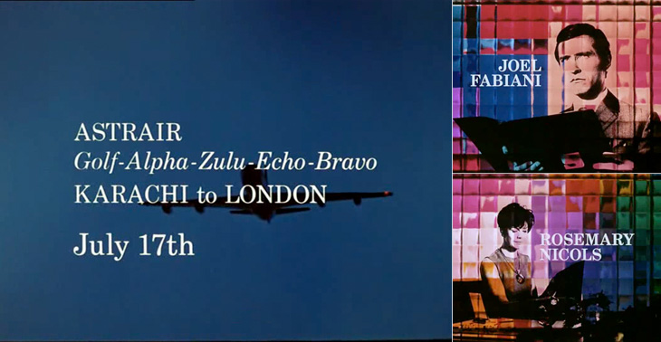
I first watched some episodes of Department S on the UK channel Bravo a few years ago, and I remember thinking at the time how great it was - the Jason King character is ace (there was a spinoff series based just on him). However, what really got my attention and had me making screenshots from the DVDs is the typography of the titles and scene-setting panels. They’re very nicely done, and highly unusually are set in a fairly fine and delicate (for low-resolution TV!) serif face - in this case Century Schoolbook. The titles were done by Chambers and Partners, who did a lot of the titles for TV series in the 1960s, and I wonder whether this was a bit of an experiment for them, an attempt to break the mould somewhat. Their experience shows though; it’s all very well done and brings a lovely printerly quality to the screen. I’m glad they did it.
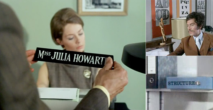
There are other nice bits of lettering in the series too - lots of traditional signwriting, some big typeface samplers used as decoration, and the odd bit of Letraset. Overall the show seems designed, there’s a real touch of quality to the whole thing - I guess that’s why it’s one of those cult classics. If you ever see any of it, pay attention to the cuts between scenes, there’s a very nice alternating set in Six Days especially (the bit with the phone calls and the photos being taken of secret documents, if you want to know). Very nice.
Some of the titles and scene-setting panels.A few other bits of lettering and type in the show.
I’ve had this care label sat around on my desk for a couple of weeks, I was going to throw it out but I just like the lettering on it. Care labels are usually just printed bits of scratchy nylon and polyester, so even though this one was just as scratchy, it’s at least embroidered and has nice lettering. I especially love how the reverse looks too, with the lettered parts all tight and neatly stitched and the rest of it all fuzzy and loose.
Notice the obvious similarities between this lettering and those tiny pixel fonts you can get.
I saw this linked from ISO50 this morning: The Dollar Redesign Project is a competition (Campaign? Bit of fun?) to promote the idea of fully redesigning the US banknotes, possibly on a regular basis, like many banknotes the world over:
The American Dollar has not truly been redesigned since about the 1930s. The Dollar ReDe$ign Project is your opportunity to theoretically ‘change’ that. Yes, technically there are many limitations and complications when it comes to bank note design, but if the Swiss can do it on a regular basis, why can’t we North Americans too?The Dollar Redesign Project
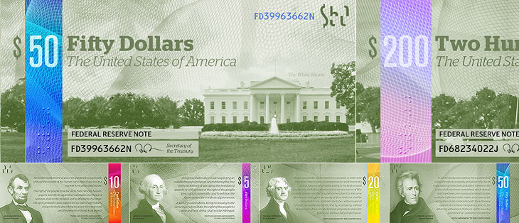
There are only a few designs on there at the moment, some a bit jokey, but of the serious ideas I quite like the ones in the first set below. I can’t see any notes that deviate too far from the originals being successful, as there are so many cultural and linguistic associations with the ol’ greenback; it may seem tediously conservative, but notes that aren’t predominantly green just won’t feel like dollars. I hope the designs go further than the ‘stick a guilloche on it and call it a banknote’ idea - guilloches are beautiful things - I wrote about them before, here - but it takes more than a few of those to make a successful banknote.
Perhaps a little too reliant on that colour bar to tell them apart, but I like these.I like the return of the original US motto, translated and updated as 'E pluribus unum' on this one.Relative sizes of UK notes
One usability feature common to many banknote systems, and I’m surprised the designs so far haven’t addressed it, is to have different denominations in different sizes. UK banknotes do this (see right) and it’s reasonably easy to feel whether you’ve a £5 or a $20 note in your pocket because of it. £50 notes, while far from the tablecloth-sized notes of old, seem positively enormous compared to a fiver. I wonder how many mistakes are made every year from having all the notes the same size?
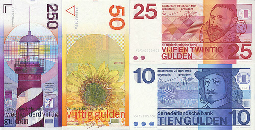
Of course, no article about banknote design would be complete without a mention of Ootje Oxenaar’s designs for the banknotes of the Netherlands below, now sadly replaced by the rather dull Euro notes. At the risk of seemingly terribly shallow for a moment, to my mind the design of the Euro is a pretty good reason for the UK to keep the pound. Banknotes are like little works of art, and to squander the opportunity to produce a remarkable and beautiful design for them is a sad thing. I shall be watching what comes out of the Dollar Redesign Project with interest. I may even have a go myself.
A few of Ootje Oxenaar’s designs for the Netherlands banknotes. More here.
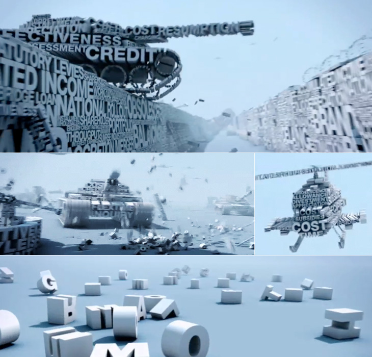
Yves posted on Friday on the FontFeed about a couple of campaigns by Inlingua promoting their business English courses. One of them is this brilliantly animated advert, creating a battlefield scenario out of words set all in Helvetica caps. As Yves says:
The video looks and feels like a first-person shooter war game, with excellent POV camera work and sound design. The camera runs and ducks through the environment, hiding behind walls and in trenches, while being assailed from all sides by helicopters, fighter jets, tanks, and explosions made of type.Yves Peters, The FontFeed.
The thing I like especially, and it’s one of those great detail things, is the sound of voices mingled with the explosions, gunfire and engine noises. It’s not overt, but it’s a really nice touch. Go and take a look (and listen).