Banknote patterns fascinate me. I can get lost for hours in all the details, seeing how the patterns fit together, how the lettering works, the tiny security ‘flaws’ - they’re amazing. Central to banknote designs are Guilloche patterns, which can be created mechanically with a geometric lathe, or more likely these days, mathematically. The mathematical process attracted me immediately as I don’t have a geometric lathe and nor do I have anywhere to put one. I do, however, have a computer, and at the point I first started playing with the designs (mid-2004) Illustrator and Photoshop had gained the ability to be scripted. So off I went, using the hypotrochoid equations on Mathworld to create rather rough and ready patterns - scripting at this point didn’t have a very usable set of functions for creating beziers, so I had to use crummy line segments. The process took ages and served just to prove to me that I could do it, but the results were too poor to go much further.
Then, a couple of years later I discovered Grapher on the Mac. Aha! Now here was a program that could create the patterns I was after and export to EPS. Well, kind of. It could create the patterns, most of the time, and export to EPS, though not always. I got a couple of patterns out of it and had a look round for other options. Again, not much - not much that I could afford, that is.
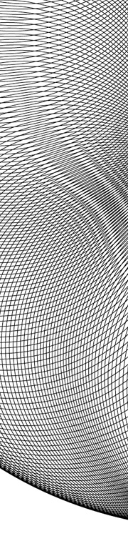
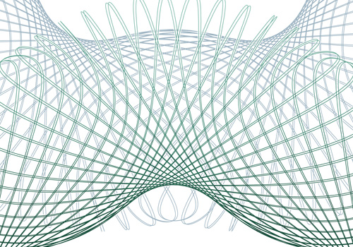
The basic hypertrochoid equation. This makes a nice rosette.
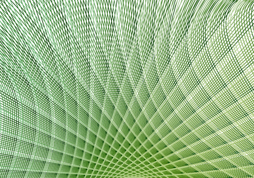
Then we get to now. I give Grapher another go, and at last, I can create and export patterns:
There are still some extremely frustrating limitations though. First of these is the resolution of drawing the graph. I’m sure for most graphs the default resolution is fine, but when creating these patterns you need tiny increments. Tiny tiny ones. If the line is going from one side of the graph to the other and back again a thousand times in a couple of radians, you don’t want the graph program to start dropping line segments, or corners, or anything really. Grapher does allow you to increase the resolution, but it’s not sticky - change anything in the equation and it pops right back to the default. Every. Single. Time. The same thing seems to happen with the line thickness too - I wanted all the designs to be at 0.1, but it kept changing it back to 1.0. Frustrating! There are a couple of other UI things I’d change, like having an option to keep axes at 1:1 ratio to each other, even when you resize the window.
Another, deeply irritating frustration with the whole process is to do with Illustrator. Try and open an exported EPS in it, and you get “An unknown error occurred”. Photoshop can accept the EPSs as placed objects, and InkScape can (eventually) open them, so Grapher seems to be outputting valid EPS files. I suspect that the number of lines in the graph is causing the premier vector editing app in the industry to fall over. Oh dear.
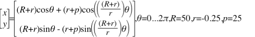
Still, after all this, I can still get the patterns made, and get them into an image editing program, which is quite something. Now I just need to find the magic numbers to create just the right patterns I want.
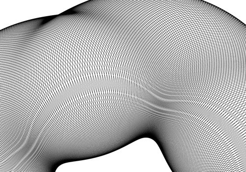
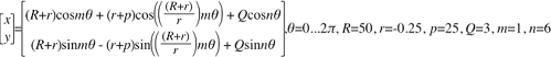
This beast creates the pattern above. The 'm' is not strictly necessary for this one, but varying it is good for experimentation.
I (re)discovered PSDTUTS today, with this rather nice grass effect. I must admit to having a certain soft spot for tutorials like these - a lot of them are just fun to play with and are usually too limited for any kind of professional use in themselves, but there’s always something useful to be discovered. Take this lighting effect for example, I’ve created similar things to this before and they’ve been very effective - some subjects (and clients) demand near photo-realism like this. Be sure to have a play around with the grass, fire and the lighting tutorials. If nothing else you can make a nice vanity desktop for yourself.
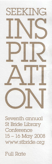
I went to the Seeking Inspiration conference at the St Bride Foundation last week, and it was excellent. I was glad to find that I left many of the talks feeling genuinely inspired and encouraged in my work - such a concentration of good ideas, interesting personal histories and genuinely fantastic examples of work is rare to find in everyday life, so I was exhausted after it all. But yes, the conference highlights, according to me.
George Hardie: Noticing things and getting things noticed.
This was a great start to the conference - Hardie promises to deliver a new ‘truth’ in each of the talks he does, letting us know something new (and secret) about his past works or methods. I won’t reveal them here, but his talk set the theme of the day, in that collections (hoarding, perhaps) are central to much of the inspiration of the designer. I certainly have a vast collection of found images, and it was the problems of keeping track of, and categorising them, that led to me creating this site. Collections are good, provided you know what you have and you can find it all easily.
Susanna Edwards: Curious.
I was fascinated by this one. Edwards is another avid collector, and had acquired a collection of antique microscope slides which she wanted to find out more about. Interestingly, this led to a project where the slides became only a secondary interest, and where the techniques and equipment of microscopy over the last three centuries were the main focus. Apparently this was largely due to funding constraints - Edwards spent many months on the project and got funding from The Arts Council (if I remember correctly). I was fascinated by the techniques of taking photographs through the variety of ancient microscopes, and by the people who are involved in microscopy and restoring and caring for microscopic samples. It’s a shame the talk couldn’t have been longer, as there was clearly a lot of material and not all of it could be given full justice. I was extremely disappointed that some of the attendees thought fit to laugh at some of the people who’ve devoted their lives to the niche, often neglected subjects and professions Edwards introduced. It is perhaps obvious to say (but I’ll say it anyway) that typography, letterpress and such arcane topics as type design are considered laughable by some members of the public, so to ape their reaction to yet more esoteric disciplines seems ignorant and at best hypocritical. Edwards dealt with the reaction graciously, but I got a hint that she was disappointed too.
Lizzie Ridout: An exercise in collecting beginnings.
Um. Well. This wasn’t a highlight. I’m not sure what this was about to be honest. I think Ridout would do well to drop the whole eccentric act and just speak normally. This was one of those talks that could have been fascinating, considering it was about the British Library’s vast collection of ephemera, but in the end came across as a bit twee and pointless.
Karel Martens (with Robin Kinross): An error occurred.
This is where the limitations of the St Bride sound system really made themselves felt, and hard. For the whole conference we were instructed to make sure that our mobile phones were switched off, in order not to interfere with the radio mikes. Unfortunately the radio mikes interfered with themselves quite well to the extent I nearly had my ears driven six feet into my skull by the noises they made. It made the talk incredibly hard to follow.
Jake Tilson: Cooking the book
It’s funny how some of the more interesting talks don’t lend themselves to discussion. Jake Tilson’s talk felt very short, but that was because he explained his ideas and inspiration so very well - you’re just left thinking, “Well, yes”. I have in my memory a collection of images of his books and his sketches. Probably best to buy some of his books really.
Antonije Baturan: Linear application of lateral thinking.
Normally, when the topic of linearity is introduced you’d expect something linear, such as a clear narrative. There’d be maybe a few branches here and there, but in the end it would provide useful support for a theme. Not so with this talk. There were so many tangents and diversions, and so few conclusions or even complete sentences that it was nigh on impossible to follow what Baturan was trying to say. I got the impression he was trying to say that different cultures have different words for ‘inspiration’ and that this gives some clue to whether those cultures place value on the initial idea, the process of implementing it, or the end result. Which cultures do what, and the relative value of each of the different approaches are, you’d be hard-pressed to discover them from this talk.
William Hall: Inspiration kills design.
The premise of this talk: that the drive to always come up with something new and suprising is contrary to producing good design, was in itself compelling and interesting. Hall started with this topic, and did a good job of criticising some of the ways a creatively-blocked designer might seek ideas, but then carried on to recommend many of the other, equivalent and quite usual ways designers seek inspiration. It was rather odd. Hall came across as the kind of design manager that might appeal to readers of The Economist but would be universally loathed by any designer who had to work with, or for, him. An illustrative point during an anecdote he gave of reviewing the work of one of his designers; first the stabbing pointed finger, then, “That’s the design we’re going to use! Now, come up with something better!” Inspirational for any design manager of how not to behave.
Erik Spiekermann: Typography: from brain to media.
Well, it’s Spiekermann, so, you know. Bloody marvellous, though I was waiting for the Fire Brigade logo at the end of the talk, because there are few stronger arguments for installing a fire alarm and having lots of fire extinguishers than Spiekermann’s tales of losing pretty much all his early work (and his letterpress!) in a fire after he first moved to London.
Tyler Moorehead: From A2B
I had a lot of hope for this talk, and battled a dodgy delay-ridden Underground to get there on time. The first part of the talk was rather pointless PR flackery (though amusing) but the second apparently unpolished part was utterly fascinating, and got the greatest number of questions and comments of any talk in the whole conference. Basically, A2B is switching the size of paper you generally use from A4 to B5. This would save 30% of the actual amount of paper - assuming you shrunk-to-fit everything you printed. Recycling paper apparently ends up costing more in terms of energy and resources than creating brand new paper, so while it may reduce the amount of virgin forest sacrificed to invoices and the like, it is always better to use less, far less. I can’t remember the exact number (I did ask Moorehead to mail me the presentation) but as a rule of thumb, for every tonne of any end product, five tonnes are wasted in the supply chain (retail) and twenty tonnes in the manufacturing. Applied to paper, this leads to many trillion tonnes of waste per year. I think we would do well to encourage people to use less paper, and to just damn well get used to reading stuff off screen - I mean for crying out loud, you’re not reading a damn novel - you don’t need to print it! One of the questions near the end was about printing web pages, and how a plugin should be developed to save wasted pages (you know the ones, the pages with nothing on them but a full stop or two pixels of a banner ad). I was offended by the complete abdication of personal responsibility this question represented. When I suggested that you don’t print the web page, there were objections that “not everyone has internet on their phone” and therefore needs to print the page sometimes. If I want to print something on a web page, I use print preview, or I copy the text to a word processor or a simple text editor and print that, or (I admit this isn’t available to everyone) I print to PDF and tell Acrobat to only print the page I’m interested in. If you actually care about not wasting resources, put some effort in.
Emily Luce: Clearcut to paper.
One of the best descriptions of this talk (from another attendee) was that it was “earnest”. And indeed it was. Luce lives on Vancouver Island, and highlighted a number of problems with the timber and paper industries there (and elsewhere). About 50% of Vancouver Island has been logged, and now the more inaccessible parts are being logged with the help of helicopters. Luce explained how much this all costs, giving an impression that logging and paper production is very much Big Business, and that there is often scant regard from mill owners for local economies, ecologies or communities. The example she gave of Cathedral Grove was instructive - in that this region of old-growth forest is protected, but just beyond the boundaries are large areas of clearcut and monoculture areas of genetically modified cultivars. Whatever your politics, it’s clear that this new growth is unfortunately not quite the restoration and ‘forest management’ we are told is helping preserve our environment. This, and Moorehead’s talk before it, really make you want to reduce your paper usage to the absolute minimum necessary.
Jeremy Tankard: Emotive inspiration
Again, another one that was so good there’s comparatively little to write about. I left this talk genuinely inspired to get cracking designing some new typefaces and that despite the thousands of faces out there, there’s massive scope to create something genuinely new, and yes, inspired. Fantastic. Buy his stuff. Go on. Buyyyy.
Rian Hughes: Vintage custom lettering
This was reminiscent of the first day of the conference, as Hughes showed his collecting instincts with a display of some excellent examples of vintage lettering. I was a bit miffed that he was going through the examples a bit quickly - I wanted to really absorb some of them - but he had nearly 300 samples to show. He’s producing books of his collections soon, so I’ll be ordering those as soon as they’re out.
Paul Antonio: From manuscript to Mosley
I can’t believe this was half an hour, it went so quickly. Antonio described his upbringing and discovery of calligraphy in Trinidad, explaining some of the limitations of learning a niche subject in a developing country. He finished by demonstrating the relationship between calligraphy and the musical rhythm of the period the style of writing is from, and this is where he showed what an astounding singing voice he has. Bloody marvellous.
So yes. I missed the last few talks, which is a shame, but the whole conference was exhausting, and I wanted to go and look at the books and the stone carving demonstration downstairs.
Would I recommend the conference? Most definitely. The only improvement I’d suggest is to the venue itself - the sound system needs some serious attention, if only to allow better Q&A sessions. Oh, and sort out the wifi! It’s one of those “login and minimise this webpage” systems that completely fails on mobile devices.
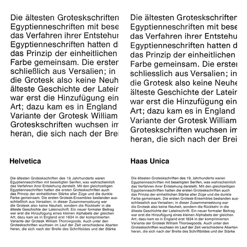
Bauldoff linked to some scans he’d done of the 1980 promo for the typeface Haas Unica, by Team’77. I’d seen a copy of this back in the 90s but then forgot about it until seeing these scans - back then I was only a callow youth so the idea of improving Helvetica didn’t seem so remarkable or interesting as it does now.
Essentially, Haas Unica came about as a result of analysing the original version of Helvetica, its variants (as they were in 1980) and similar faces and seeking to improve them - to produce the ultimate archetypal sans serif face. A single face to unite them all, if you like. Looking at the comparitive settings of both faces at text size shows how subtle the differences are, with a detail closeup first:
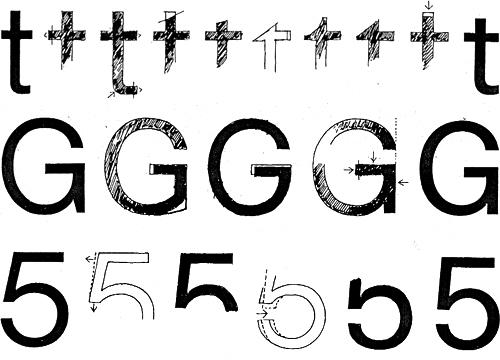
You can get an idea of the kind of analysis they did from this little snippet:
The character width of Haas Helvetica appears to us to be generally somewhat narrow, so that the rhythm of the typeface is rather uneasy in its effect. The same applies to Akzidenz Book. Linotype Helvetica is wider than the Haas version in relation to its character area and appears to us to be generally more balanced. Its character width corresponds basically to that of Univers.
And the results, based on improvements and adjustments to the stroke thicknesses, relationships of the capital letter widths, numerals and the basic forms of the letters:
The differentiation of capital letter widths leads to a tighter rhythm in upper case composition. A slightly more open form in the Haas Unica specimen setting, compared with the original version, together with the individual corrections to characters, improves the readability of the typeface, especially for continuous text.
Unfortunately when the face was released there were some legal problems as Linotype and Scangraphic both claim ownership. As a result it is no longer available commercially, which is a huge shame. Perhaps a petition for the conflicting parties to get over themselves and perhaps release the face jointly? I mean, making some money from it is surely better than making none at all - especially when ‘ownership’ is being judged from contract and the shifting seas of corporate ownership. Meanwhile, some people are taking matters into their own hands by redrawing the letterforms for their own use.
On the left is the original Haas Helvetica, on the right the new Haas Unica, and in between some transitory and experimental forms.
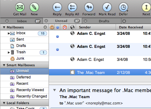
There’s a nice article on Cocoia Blog about the ‘pollution’ of various Mac OS X user interfaces by Helvetica. It’s worth a read, though I can’t resist excerpting this little bit, as it made me laugh:
Speaking of iCal, which proudly boasts Helvetica in miniature point sizes on the screen, it has the utterly mind boggling feature that it shows you calendar information on a computer screen with everyone’s favorite 1950 typeface for print, and prints these exact calendars on paper in Lucida Grande, a computer display font from this milennium. “Utterly backwards” might be an apt term for such misfit typography.
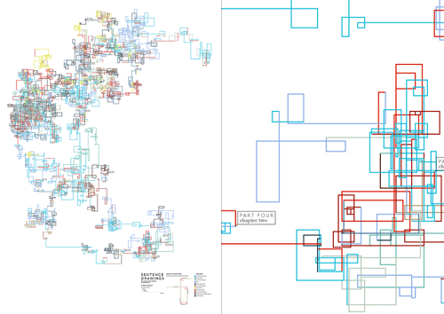
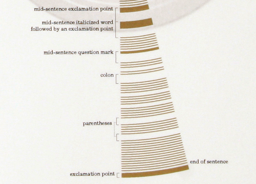
There are some interesting-looking infographics here on NOTCOT, apparently providing some sort of analysis of various literary works. I’ve had a look through them, and while they’re certainly attractive, they don’t seem to provide any insight at all. The one immediately below, for example, might suggest how shorter sentences bunch up together in the narrative flow, but there’s no guarantee that several groups of small sentences, separated by (say) many long sentences, a short sentence and more long sentences might overlap, giving an illusion of a single bunch of terse, active prose. The rotation of the line by 90 degrees with each sentence is an arbitrary insertion in the ‘analysis’, and in itself provides no valuable meaning - it doesn’t even serve as a neutral carrier for information, rather it distracts the reader and confuses the data.
Some of the other illustrations provide a little more promise, but with having to refer to an (again) arbitrary key, any insight a graphical representation could provide is quickly lost. But, they’re beautiful. It’s as if the designer flipped through Tufte’s books without reading anything in them, and decided to create something that ‘looks like that’. OK, I’m being harsh; I’m sure that after a fair bit of reading and working out how the diagrams were made, there’s some vague possibility of gleaning some tiny hint of insight into the literary style of various authors, but you have to get past the fact that they seem to be primarily designed to be pretty* rather than useful. You can see more of the works on the designer’s site, apparently called “Untitled Document” (at the time of writing), here.
As for the ones attempting to depict sentence structure, they certainly leave a massive amount to be desired - in order to work out the difference between a colon and a parenthesis you’d have to get out your micrometer and be prepared to annotate like crazy. Or you could just read the original text. After all, there’s this amazing set of symbols and conventions that have been used for years to convey meaning and sentence structure. It’s called written language. Heard of it?
* And to appeal to people with more money than design sense, looking at the prices.
This is interesting, the Bunch design agency got a whole bunch (geddit?) of designers and illustrators they admired to ‘respond’ to their identity. As a result they got a whole load of variations on their logo which they’re now using as part of their identity. Very clever indeed, as commissioning all that work conventionally would be very expensive indeed.
A few of the results are shown on the CR blog page, but I picked my two favourites here. The blackletter style one is very interesting, as the negative spaces aren’t simply a reversed image of the implied continuation of the stroke, but an additional shape on the outer edge of that stroke. Very nice.
Another great article on pingmag: VEB Typoart: The East German Type Betriebsstätte. Go and read it, it’s got a good history of the organisation and on Karl-Heinz Lange, designer of Minima (both pictured at the end of this article). I’m thinking of ordering the limited edition Freundschaftpacket.
I’m particularly fascinated by these two bits from the article. The second being from the interview with four members of Typoart Freunde:
At Typoart, the principle “frugality and effectiveness” lead us to work with representatives from the printing enterprises to develop a type program that met all the important requirements: a Renaissance roman for literature, like Garamond, a classical, like Bodoni or Didot, then a slab-serif, for example Clarendon. There had to be something from each major style. Naturally also sans-serif, in different styles, like Helvetica and Futura. The “Zentrag” would even request imitations of specific western-made typefaces they couldn’t afford to license.
It’s the history of VEB Typoart, as an example of the fate that many GDR businesses met after the German reunification. Also, to the very end, their working methods were so modern and advanced. Unlike in West Germany, type design in the GDR wasn’t subject to the pressure of business competition. So, typefaces could be created with more care and craftmanship. You could truly call it Schriftkunst [typographic art]: No effort was spared in order to stay on the cutting edge.
So this is fascinating. They had to copy western designs (the article makes mention of Times New Roman) and yet the work they were producing themselves was of a higher quality than those western ones. They were working at the cutting edge, producing the best work, and yet when the business was taken over after reunification, it was run by someone not interested in type, and the place went under and the typefaces were all nearly lost. It reminds me of other businesses producing excellent products, most notably Adobe, which are now run by accountants and managers rather than by the engineers and designers who develop and use the products. Of course a business must have managers and accountants, but why must they be placed at the very pinnacle of the organisation? Their motivations can only be to profit and organisational efficiency, rather than to creativity and excellence. VEB Typoart avoided this for much of its life by operating under a soviet system where profit was not a motivation (and organisational efficiency came about through a scarcity of resources, rather than SMART objectives and the like) and collapsed under a new system with a rush for profits as an advertising agency. I guess it proves to me once again that placing managers, accountants and administrators in control of creative professionals always seems like a good idea to managers, accountants and administrators, and almost never works to improve productivity and creativity.
When I had first decided I wanted to design typefaces I looked around for books on the subject, and yet could never find any book that worked as a primer, a beginner’s how-to manual*. If I’d have come across Letters & Lettering back then I’d have found a very good book from which to learn about constructing letterforms. The examples you can see here (and lots more on the page on Liam’s site) are lovely and clear and show the construction of, say, Trajan-esque forms. There are other examples in the book, blackletter and modern type forms, but it’s the large outlines that interest me here. This site will definitely go in the bookmarks.