I saw this linked from ISO50 this morning: The Dollar Redesign Project is a competition (Campaign? Bit of fun?) to promote the idea of fully redesigning the US banknotes, possibly on a regular basis, like many banknotes the world over:
The American Dollar has not truly been redesigned since about the 1930s. The Dollar ReDe$ign Project is your opportunity to theoretically ‘change’ that. Yes, technically there are many limitations and complications when it comes to bank note design, but if the Swiss can do it on a regular basis, why can’t we North Americans too?The Dollar Redesign Project
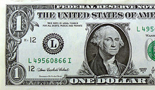
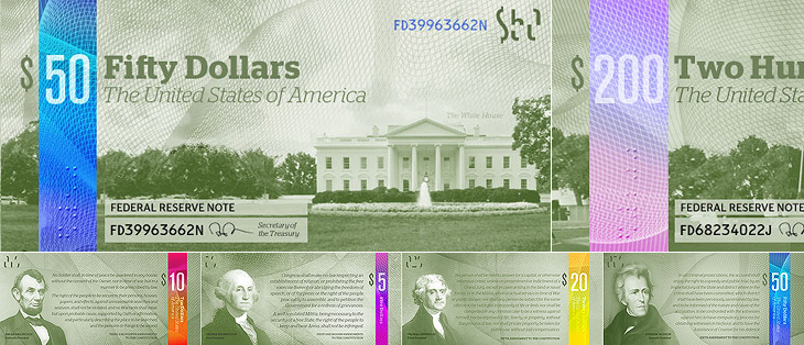
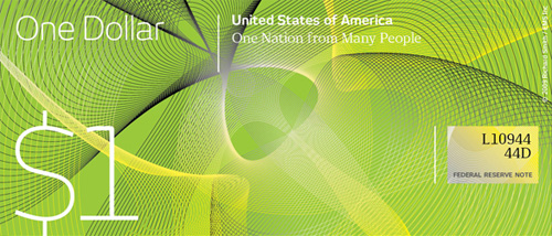
There are only a few designs on there at the moment, some a bit jokey, but of the serious ideas I quite like the ones in the first set below. I can’t see any notes that deviate too far from the originals being successful, as there are so many cultural and linguistic associations with the ol’ greenback; it may seem tediously conservative, but notes that aren’t predominantly green just won’t feel like dollars. I hope the designs go further than the ‘stick a guilloche on it and call it a banknote’ idea - guilloches are beautiful things - I wrote about them before, here - but it takes more than a few of those to make a successful banknote.
Perhaps a little too reliant on that colour bar to tell them apart, but I like these.I like the return of the original US motto, translated and updated as 'E pluribus unum' on this one.Relative sizes of UK notes
One usability feature common to many banknote systems, and I’m surprised the designs so far haven’t addressed it, is to have different denominations in different sizes. UK banknotes do this (see right) and it’s reasonably easy to feel whether you’ve a £5 or a $20 note in your pocket because of it. £50 notes, while far from the tablecloth-sized notes of old, seem positively enormous compared to a fiver. I wonder how many mistakes are made every year from having all the notes the same size?
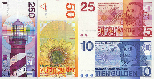
Of course, no article about banknote design would be complete without a mention of Ootje Oxenaar’s designs for the banknotes of the Netherlands below, now sadly replaced by the rather dull Euro notes. At the risk of seemingly terribly shallow for a moment, to my mind the design of the Euro is a pretty good reason for the UK to keep the pound. Banknotes are like little works of art, and to squander the opportunity to produce a remarkable and beautiful design for them is a sad thing. I shall be watching what comes out of the Dollar Redesign Project with interest. I may even have a go myself.
A few of Ootje Oxenaar’s designs for the Netherlands banknotes. More here.
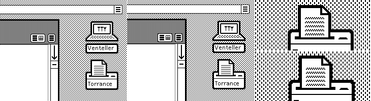
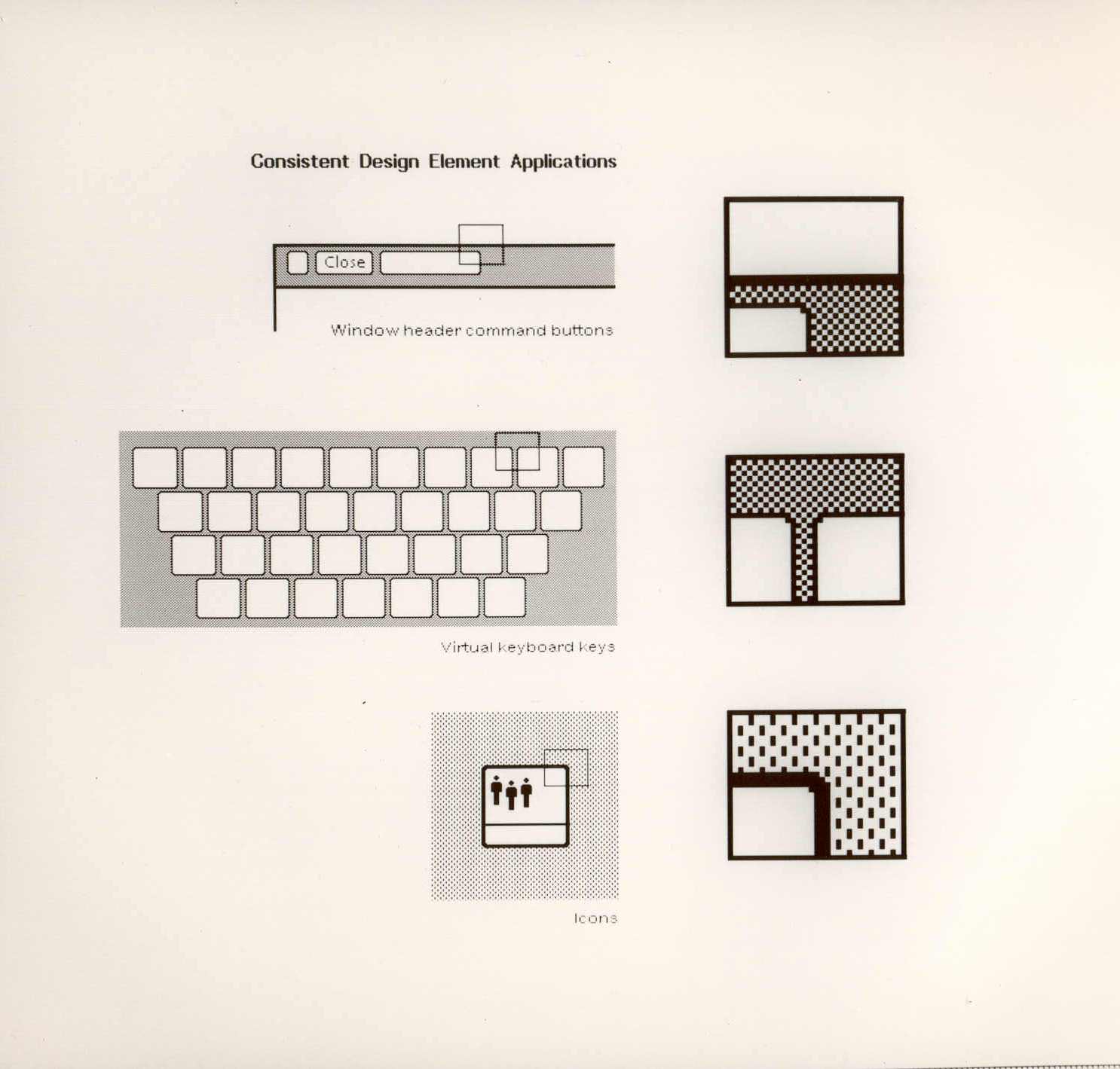
A couple of weeks ago ISO50 linked to this set of polaroids of the Xerox Star user interface on Digibarn, and I’ve been looking back at them on and off since. The UI has some interesting little details; it was designed for a two-colour display, so used a couple of dithered patterns to create the grey shading on the desktop background and window titles, which in turn created a few problems for the designers. To get a neat, crisp interface, icons and windows have to be sized and positioned on the background so that the black and white dots don’t interfere with the outlines and create a kind of blur or eye dirt effect. The polaroids show some of the design notes and instructions for doing this; it’s a lovely illustration of the attention to detail they employed to make the best of a technological limitation. Rather than recreate them directly (you can see the originals here, and here) I’ve redrawn a bit of the UI here, with ideal alignment on the left and detail top right:
The difference a pixel makes.
If I’m to get preachy (and ranty) for a moment, I think it’s a task any designer should attempt as part of their education - what you learn from designing for such a restricted display helps with all sorts of design tasks later; you learn what causes a lot of those visual disruptions and artifacts that you catch from a quick glance or out of the corner of your eye. It may be subtle, but it’s the kind of thing that reduces the overall apparent quality of your work, the stuff that marks out your work as being standard (read: mediocre) or exceptional. If you feel you shouldn’t get precious about such things, perhaps graphic design isn’t your thing.
How the icons are laid out on the desktop. The big flaw I see in this design, still not fully solved in desktop UIs today, is the display of longer filenames when displaying icons in a grid. They’re either truncated or hideously force-wrapped. Ouch.
As others have noted, the UI at first seems remarkable for its apparent modernity, the conventions it uses are still ones we use today; with a graphical update to it you’d get a reasonable facsimile of any windowed GUI of the past few decades. The designers at Xerox clearly did a remarkable job, addressing so many design problems at once, with solutions so good that almost three decades of development haven’t significantly improved on them. We could throw up our hands as a result and say that this is clearly it, that nothing new can be done, but apart from being depressing, this would miss a couple of important (to me) points:
The hardware configuration of a desktop computer has barely changed - we still use a mouse (or equivalent), a keyboard (however fancy and bristling with hotkeys it is) and a screen (whatever the technology, it’s still a 2D array of pixels)
We haven’t changed - we’re still human beings.
Essentially, we are still the same configuration of limbs and sensory organs using the same configuration of display and input devices. It’s when we change either of those configurations that we see where all the real innovation has been. Adaptive and assistive technologies are developing faster and faster as component prices fall and previously isolated innovators are connected and share information online, and in tandem with this we see the spread of input technologies that enable methods such as touch, voice and gesture. We can hope that these technologies become widespread enough to change the design of the traditional desktop, or even make it obsolete, and that leads me nicely onto…
A futurist digression
Heading off into the realms of the futurist for a moment, I think a lot of attention has been given to display-related technologies such as 3D/holograms, but not even sci-fi has come up with anything really remarkable with the idea - oh sure, you can create a hologram of a keyboard, or a touch screen, but those merely address matters of convenience: you don’t have to store the thing when it’s switched off. The interfaces we see in films are mostly still all about manipulating pictograms. What I’m really interested in are the kinds of interface that use our other senses, interfaces that seem less flashy and appear almost mundane such as vibration (as in mobile phones), things like the sleep indicator on Apple computers and potentially most importantly, speech.
Forget flying cars, we’ll know it’s the future when we can talk to our computers, just like in Star Trek, but hopefully not quite like in 2001: A Space Odyssey.
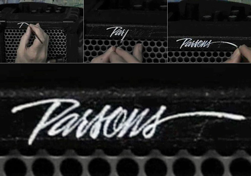
I found this nice little video on YouTube earlier. It’s simple enough, but fascinating to watch; Bob Parsons hand lettering his name in a beautiful style on an amplifier.
I’ve had the basic kernel for this article sitting around since 2007, when I was sat around recovering from an injury and needed regular doses of painkillers to make it comfortable. I was surrounded by the empty boxes of these painkillers (hey, who thinks of cleaning when injured?) and started thinking about the ‘brand space’ of consumer drugs. Writing about the Arabic logos and brands reminded me that I’d not finished the article, so here goes.
Years ago I’d read how there’s a great deal of conservatism in various industries, and especially the Fast Moving Consumer Goods (FMCG) sector when it comes to designing packaging and logos. The basic idea is that when your Average Punter goes into a shop to buy, say, bathroom cleaner, he will span the shelves for the specific and familiar constellation of bright colours, dramatic lettering and packaging shape that would identify the product type. It is the combination of all these things, taken in at a glance, that helps us quickly identify bathroom cleaner from, say, furniture polish even though they may share some aspects (in this case, packaging type and lettering, but not the colour range). For the designer of such packaging, coming up with something new and different enough to get noticed without being so different as to move it out of the visual category entirely is the difficult job, rewarding to some and incredibly constraining to others. I follow The Dieline regularly, and while there’s a steady flow of new and often beautiful products and rebrands, FMCG packaging design seemingly only evolves through a glacially-slow process; any slight innovations that improve the success of one product are adopted by them all until they’re all exactly the same again.
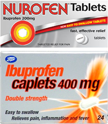
Returning to the design of pharmaceutical packaging, it seems that for branded consumer drugs, the category has a checklist that all packaging must follow. It must scream from the shelf with bold and oblique sans-serif type, bright oranges and reds against dark blues and greens (or silver metallic, if you have the budget) and have at least one swoosh, arrow or starburst, but preferably all three. If you can squeeze an airbrushed diagram of the body in there, then so much the better, especially if you can put a warm orange glow on the medicine’s intended body part. Before you know it you’ll have something perfect for any discerning pharmacy shelf, and there’s no chance someone will mistake your box of headache pills for ground coffee. That’s your brand-name drugs anyway.
Similar enoough
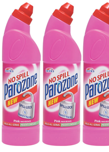
Most supermarkets have a range of common remedies with deliberately plain and understated packaging, and like any range of products identifies itself to the consumer from the shelves with its own signature characteristic; usually a blaze of unadorned white semigloss cardboard. Own-brand stuff can be gloriously simple and often highly compelling, especially when some real thought has been put into it, as in Target’s ClearRx packaging system for example. Other times, own-brand stuff just looks like the brand-name product, type styles, layout, colours and all. In the UK, Boots had a beautifully simple and clear packaging style for its range of own-brand medicines, but recently its ibuprofen has taken on the red-on-silver-with-a-swoosh look, very similar to the brand-name version, Nurofen. From a designer’s point of view it’s disappointing, but there is a very good reason for it in that for most people branded products simply work better. In making their ibuprofen look like the brand-name version, they’re actually boosting the analgesic effect:
In a British study, 835 women who regularly used analgesics for headache were randomly assigned to one of four groups. One group received aspirin labeled with a widely advertised brand name (“one of the most popular” analgesics in the United Kingdom that had been “widely available for many years and supported by extensive advertising”). The other groups received the same aspirin in a plain package, placebo marked with the same widely advertised brand name, or unmarked placebo. In this study, branded aspirin worked better than unbranded aspirin, which worked better than branded placebo, which worked better than unbranded placebo. Among 435 headaches reported by branded placebo users, 64% were reported as improved 1 hour after pill administration compared with only 45% of the 410 headaches reported as improved among the unbranded placebo users. Aspirin relieves headaches, but so does the knowledge that the pills you are taking are “good” ones.Annals of Internal Medicine
And, to make it clearer that this is a more of a symptom of being human rather than a modern result of sophisticated marketing practices, how about this quote (from the same page) from Socrates:
[The cure for the headache] was a kind of leaf, which required to be accompanied by a charm, and if a person would repeat the charm at the same time that he used the cure, he would be made whole; but that without the charm the leaf would be of no avail.Socrates, according to Plato
Returning to the original example of bathroom cleaner, could this cultural placebo effect apply to more than just pharmaceuticals? I think it most certainly does, and that we usually suspect it when we compare the prices of brand-name and own-brand products on the supermarket shelf, and yet, and I include myself in this too, we so often end up buying the big brands. If a style of packaging, labelling and use of colour identifies the product category, then surely the one that is most identifiable, most familiar, has the best marketing, is the acme of that category, the best one? So unless we have a strong reason not to, and reasoning implies some analytical thought, we buy it.
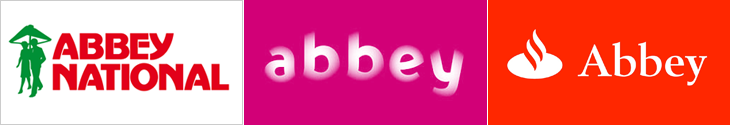
Extending beyond groceries, we can see this culturally-imposed brand conformity in almost any market sector. Something that I had in mind when thinking of this article in 2007 were the Abbey National rebrands of 2003 and 2005. In September 2003, Abbey National adopted a soft, squishy, pastel-coloured brand identity created by Wolf Olins, and started trading under the all-lowercase moniker ‘abbey’. The new tagline, “Turning banking on its head” signalled the intent of the dramatic change in the brand, and the whole process certainly got Abbey a lot of media attention, but:
In marketing terms, however, the rebrand was a clear disaster. Last year, pre-tax profits in Abbey’s core retail business shrank by 20% to £814m compared with 2003 and there was another big slump in market share. New mortgage lending is also down year on year from 9.9% to 3.1%, reducing its overall mortgage share from 10.7% to 8.6%.Ian Fraser
Of course, it is unlikely that the rebrand caused all of that. The rebranding itself came about to a large extent because the bank was already in trouble, but it’s pretty clear that it didn’t turn banking on its head, and more importantly it didn’t bring them any of the kind of success they needed. In fact, it was only a year and a half later that Abbey was bought by Spain’s largest bank, Santander, and the whole brand identity was unceremoniously ditched. The Abbey name is now set in Santander’s typeface and style, placed next to Santander’s flame logo, with Santander’s colours, and soon, I suspect, will be itself replaced with Santander’s own name too. For various reasons, Abbey did a lot better after being bought out, but the thing about the Santander brand is that it looks like a bank, and that’s important. If a bank looks like a bank, we treat it like a bank. I would say we trust it like a bank, but this is early 2009 and the word ‘trust’ and ‘bank’ don’t seem to go together very well anymore. But still, the principle holds - things need to look like what we expect them to look like; there’s a contract of trust associated with brands and you break that contract at your peril.
This article on writing by James Patrick Kelly should be required reading for anyone involved in any creative activity. I read it years ago, and though I forgot the exact phrase, I’ve followed its basic principles ever since; whenever I’m stuck on a design I remove the thing I like the most and continue to develop the design without it. Almost every time it’s that thing, that darling, that is holding me back, distracting me from the design. I find that what I’m doing is trying to adapt the rest of the design to fit with this thing, rather than than developing the design as a whole. Even if it wasn’t that thing, the act of removing something from the design, that act of subtraction is what frees up my thinking again. The article addresses this nicely, and you can see how it applies to more than writing:
Some writers like to fix problems by addition rather than subtraction. First they layer in just a little more complexity to develop a rounder Aunt Penelope. And then they expand the garage scene, so it will foreshadow the car chase. Last they have Biff’s lawyer explain the rules of evidence to his secretary after the trial so that slow readers will get the end. If these writers worry about wordiness at all, they might tighten a few lines here and there. Drop a “he said,” on page two. Major surgery is for beginners, right?
Nowadays it’s become (almost) a natural process and I find myself peering suspiciously at something that’s just too shiny, too perfect, too lovely, too early in the process. This isn’t to say I remove everything that’s nice from my designs, far from it, but what I tend to do is to move through versions very quickly. Version 1 of a design might have some text treatment I’m fond of, version 2 might have some aspect of a layout I like, version 3 something else, until I think I’ve got the ideas recorded and I can develop the design without them distracting me. Since I’m moving to a new version whenever I get stuck, these early versions are rarely complete designs; they’re more like rough sketches. While I’m working I’ll return to these sketches and use the ideas from them if they’re suitable, which is a far more pleasing way to work, and ends up being much more successful. Usually, of course, after I’ve got the final design (or a clientworthy version) I’ll look back at the ‘darlings’ I’ve saved and decide that they’re not all that special anymore, that they’ve been surpassed by what I’ve done while free from distractions. The ones that I still like I keep around for future inspiration. Sometimes, I even remember to look at them.
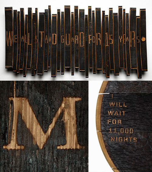
I’ve been following this series of articles by Johnson Banks about their Art from Barrels project for Glenfiddich. The aim of the project was to get across the length of time it takes to make a barrel of Glenfiddich Single Malt, and the end results are pretty interesting. I haven’t got all that much to say about it, especially as the articles explain it all pretty well, other than to say I’ve discovered I like sandblasted letters in charred wood:
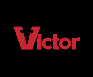
I came across these two logos recently, the Guild of Food Writers one via NOTCOT, and the Victor one via an Engadget link to this deadly device. The Food Writers one is beautiful; simple, clean and clever - something any organisation would be proud to call its own. The Victor one has a few issues, like the strangely discordant ct, but the V is entertaining and nicely done. So there we go, two nice logos.
So what’s the problem? Well, to look at the websites of these two organisations you’d think they were ashamed of them.
On the Food Writers site I didn’t immediately recognise the logo as being the same one - it’s disguised with that nasty gradient, the cheap glow and the atrocious lettering next to it. I can’t quite reconcile the motivation that commissioned such a great logo from 300million with that of allowing the website to end up looking (and working) like that. Maybe it’s a supplier issue. Maybe they’re working on a new site? Maybe I should pitch a new site to them.
The Victor logo isn’t treated quite as badly, so while it has completely unnecessary bevels and shadows applied at various sizes and angles on the site and other materials, on the product itself it’s used cleanly and simply. If you look closely at the Victor® Multi-Kill™ Electronic Mouse Trap (!) the power indicator is a glowing green version of the V from the logo, so there’s hope. It’s such a shame that in every other application, it’s smothered with cheap, lazy effects.
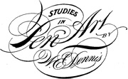
Drawn linked to this fantastic PDF, “Studies in Pen Art”, a scan of a 1914 pamphlet by William Dennis. It has loads of examples of penmanship and advice on techniques and equipment which is pretty much all relevant today - although not perhaps the emphasis on speed; even a commercial letterer today wouldn’t have to produce work as quickly - producing this kind of lettering by hand would be a project in itself these days and so more time would be devoted to it. Still, we all have deadlines and knowing how to work quickly is never a bad idea. The PDF is available for download from the Drawn page - worth a look.
There’s some lovely identity and online design work here. I found it via Graphic Exchange, who commented that the presentation style adds to the visual appeal. I have to agree. Identity work is often about the feel and weight of the physical artifacts - the headed paper, folders, envelopes - and a good way to document them is with good macro photography. You can’t feel the paper, but you can see how it might feel.
Anyway, here are some of my favourites - it’s only a very small sample and they’re scaled down quite a bit, so take a look at the full site. The UI of the site is all flash, but it’s a pretty good example of the genre. I like the way the colours change as you move through the work.
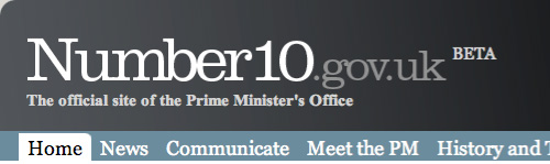
Steve sent me a link to the all-new official site for the Prime Minister of the UK, which, incredibly, is in beta. Get that: The official online presence for the leader of (allegedly) the fifth richest country in the world is a crummy beta site with dodgy kerning, inconsistent use of typefaces, colours, rounded corners, spacing, and, well everything apart from general crumminess. Look at the masthead. It’s in Clarendon, Times New Roman Bold and Georgia. The typographic soup continues with the addition of Arial for body text (and oddly, some headlines too), and on a graphic, Copperplate. There are boxes with rounded corners at the top but not the bottom, containing images that also have rounded corners but where the curvature doesn’t match the container (and appears to be damaged by JPEG artifacting on most images). The site is a mess.
The masthead at the time of writing.
The idea of adding features to the site such as YouTube, Twitter and Flickr feeds is a good one, and yes, these things can be a bit messy to integrate at first, but it’s not hard to get those things up and running in any design. The hard bits, especially for a site as prominent as this, is to ensure security, that the background infrastructure can handle the traffic and (importantly) all your content is written and entered into the site. Is this a site that got designed and implemented by several groups who never communicated? It looks like there may have been a design done at pitch stage, but largely ignored throughout development. A good, consistent design is vital for any site, and sticking to it is a must throughout all stages of development.
Still. All these things can be fixed. The design can be clarified, the layout can be rationalised, attention can be paid to consistency and quality, the HTML and CSS can be cleaned up, but it beggars the question, why did they launch an unfinished site and call it a beta? This is not what betas are about. This is arguably one of the most important sites representing the UK and should be implemented to the highest of standards, and yet they launched a crap blog and tried to cover their arses by calling it a beta. Very poor show indeed.
