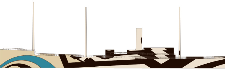
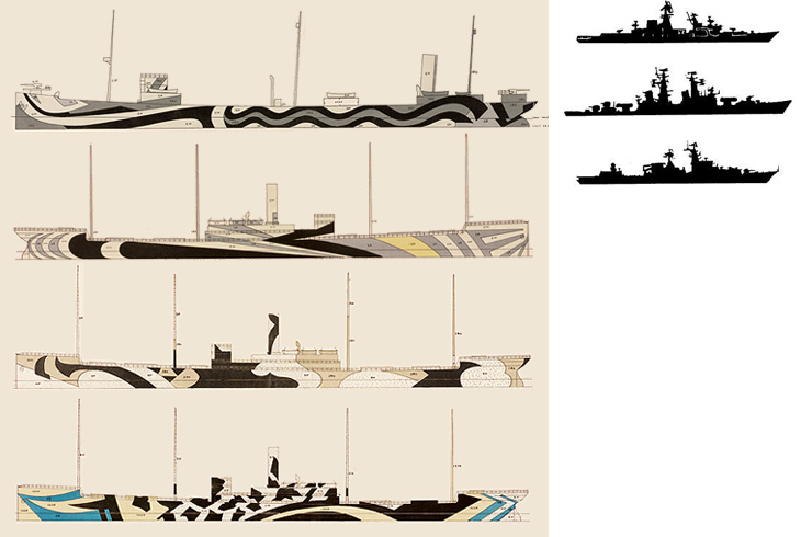
Coudal (I think) linked to this the other day. It’s a collection of designs for dazzle camouflage applied to ships during the First and Second World War to confuse the silhouette of the ship and make it less likely to be targetted by enemy subs. I got a few silhouette images (from this rather odd and boastful page) and put them next to some of the designs, and you can see why the technique gained a lot of support. The designs would at least make it hard to identify what kind of ship it is, which might help if everyone did it…
So yes, that raises the question of effectiveness. I imagine in full sun it would be quite good - literally dazzling the eye, but in an overcast, at dawn or dusk, the ship would still be silhouetted quite clearly against the sky. So what were the results? From the site:
Did it work? Dazzle and the convoy system were implemented about the same time, so it is hard to say. However, crews on dazzle ships were very proud of the bedazzled camouflage. It was definitely a morale booster. The British and the Americans fully adopted dazzle because at the time they found it to be effective and inexpensive.RISD
Tests should be done! Still, however well they worked, they’re pretty fabulous. More ships should be painted like this, just, you know, because.
Annoyingly, the RISD only has these tiny images, and I can’t find anywhere to buy prints either. There is, however, a poster from Transport for London advertising the Imperial War Museum that shows an illustration of a freshly bedazzled warship, here.
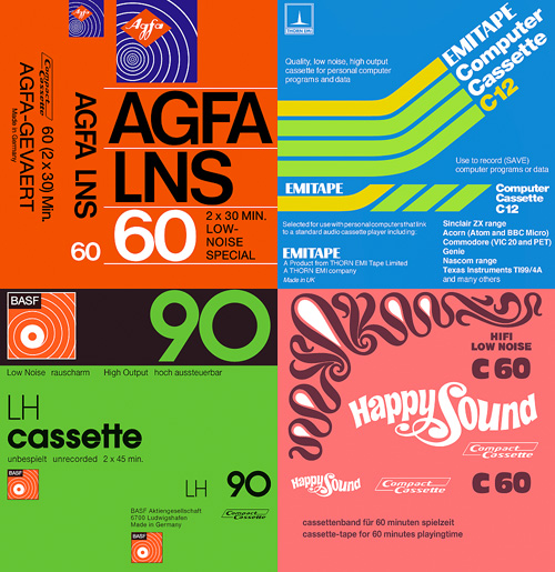
I was mailed a link to these scans of tape cassette inlays the other day. It’s fascinating seeing some of the designs again - most of them look like they’re late 70s and early 80s, but I’m sure I had a few of these in my late-80s “taping things” phase.
I have of course traced a few of my favourites, though there’s plenty more than these four worth looking at. The EMITAPE one is lovely - I recall friends of mine with flashy computers had a few of these. The AGFA one is interesting - I naturally assumed the type would be Helvetica or Univers, but closer inspection (the reason why I trace) reveals a rather different balance to the letterforms. The ‘6’ is rather odd - it looks like it’s about to topple over backwards. The positively psychedelic Happy Sound one was incredibly pleasurable to trace; I think only four points in the whole of that funky set of curves is not at extrema - it’s lovely when that happens. I’ve put a closeup of the patterns on the right (or above, if you’re reading this on RSS).
I’ve had the basic kernel for this article sitting around since 2007, when I was sat around recovering from an injury and needed regular doses of painkillers to make it comfortable. I was surrounded by the empty boxes of these painkillers (hey, who thinks of cleaning when injured?) and started thinking about the ‘brand space’ of consumer drugs. Writing about the Arabic logos and brands reminded me that I’d not finished the article, so here goes.
Years ago I’d read how there’s a great deal of conservatism in various industries, and especially the Fast Moving Consumer Goods (FMCG) sector when it comes to designing packaging and logos. The basic idea is that when your Average Punter goes into a shop to buy, say, bathroom cleaner, he will span the shelves for the specific and familiar constellation of bright colours, dramatic lettering and packaging shape that would identify the product type. It is the combination of all these things, taken in at a glance, that helps us quickly identify bathroom cleaner from, say, furniture polish even though they may share some aspects (in this case, packaging type and lettering, but not the colour range). For the designer of such packaging, coming up with something new and different enough to get noticed without being so different as to move it out of the visual category entirely is the difficult job, rewarding to some and incredibly constraining to others. I follow The Dieline regularly, and while there’s a steady flow of new and often beautiful products and rebrands, FMCG packaging design seemingly only evolves through a glacially-slow process; any slight innovations that improve the success of one product are adopted by them all until they’re all exactly the same again.
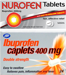
Returning to the design of pharmaceutical packaging, it seems that for branded consumer drugs, the category has a checklist that all packaging must follow. It must scream from the shelf with bold and oblique sans-serif type, bright oranges and reds against dark blues and greens (or silver metallic, if you have the budget) and have at least one swoosh, arrow or starburst, but preferably all three. If you can squeeze an airbrushed diagram of the body in there, then so much the better, especially if you can put a warm orange glow on the medicine’s intended body part. Before you know it you’ll have something perfect for any discerning pharmacy shelf, and there’s no chance someone will mistake your box of headache pills for ground coffee. That’s your brand-name drugs anyway.
Similar enoough
Most supermarkets have a range of common remedies with deliberately plain and understated packaging, and like any range of products identifies itself to the consumer from the shelves with its own signature characteristic; usually a blaze of unadorned white semigloss cardboard. Own-brand stuff can be gloriously simple and often highly compelling, especially when some real thought has been put into it, as in Target’s ClearRx packaging system for example. Other times, own-brand stuff just looks like the brand-name product, type styles, layout, colours and all. In the UK, Boots had a beautifully simple and clear packaging style for its range of own-brand medicines, but recently its ibuprofen has taken on the red-on-silver-with-a-swoosh look, very similar to the brand-name version, Nurofen. From a designer’s point of view it’s disappointing, but there is a very good reason for it in that for most people branded products simply work better. In making their ibuprofen look like the brand-name version, they’re actually boosting the analgesic effect:
In a British study, 835 women who regularly used analgesics for headache were randomly assigned to one of four groups. One group received aspirin labeled with a widely advertised brand name (“one of the most popular” analgesics in the United Kingdom that had been “widely available for many years and supported by extensive advertising”). The other groups received the same aspirin in a plain package, placebo marked with the same widely advertised brand name, or unmarked placebo. In this study, branded aspirin worked better than unbranded aspirin, which worked better than branded placebo, which worked better than unbranded placebo. Among 435 headaches reported by branded placebo users, 64% were reported as improved 1 hour after pill administration compared with only 45% of the 410 headaches reported as improved among the unbranded placebo users. Aspirin relieves headaches, but so does the knowledge that the pills you are taking are “good” ones.Annals of Internal Medicine
And, to make it clearer that this is a more of a symptom of being human rather than a modern result of sophisticated marketing practices, how about this quote (from the same page) from Socrates:
[The cure for the headache] was a kind of leaf, which required to be accompanied by a charm, and if a person would repeat the charm at the same time that he used the cure, he would be made whole; but that without the charm the leaf would be of no avail.Socrates, according to Plato
Returning to the original example of bathroom cleaner, could this cultural placebo effect apply to more than just pharmaceuticals? I think it most certainly does, and that we usually suspect it when we compare the prices of brand-name and own-brand products on the supermarket shelf, and yet, and I include myself in this too, we so often end up buying the big brands. If a style of packaging, labelling and use of colour identifies the product category, then surely the one that is most identifiable, most familiar, has the best marketing, is the acme of that category, the best one? So unless we have a strong reason not to, and reasoning implies some analytical thought, we buy it.
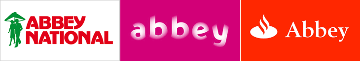
Extending beyond groceries, we can see this culturally-imposed brand conformity in almost any market sector. Something that I had in mind when thinking of this article in 2007 were the Abbey National rebrands of 2003 and 2005. In September 2003, Abbey National adopted a soft, squishy, pastel-coloured brand identity created by Wolf Olins, and started trading under the all-lowercase moniker ‘abbey’. The new tagline, “Turning banking on its head” signalled the intent of the dramatic change in the brand, and the whole process certainly got Abbey a lot of media attention, but:
In marketing terms, however, the rebrand was a clear disaster. Last year, pre-tax profits in Abbey’s core retail business shrank by 20% to £814m compared with 2003 and there was another big slump in market share. New mortgage lending is also down year on year from 9.9% to 3.1%, reducing its overall mortgage share from 10.7% to 8.6%.Ian Fraser
Of course, it is unlikely that the rebrand caused all of that. The rebranding itself came about to a large extent because the bank was already in trouble, but it’s pretty clear that it didn’t turn banking on its head, and more importantly it didn’t bring them any of the kind of success they needed. In fact, it was only a year and a half later that Abbey was bought by Spain’s largest bank, Santander, and the whole brand identity was unceremoniously ditched. The Abbey name is now set in Santander’s typeface and style, placed next to Santander’s flame logo, with Santander’s colours, and soon, I suspect, will be itself replaced with Santander’s own name too. For various reasons, Abbey did a lot better after being bought out, but the thing about the Santander brand is that it looks like a bank, and that’s important. If a bank looks like a bank, we treat it like a bank. I would say we trust it like a bank, but this is early 2009 and the word ‘trust’ and ‘bank’ don’t seem to go together very well anymore. But still, the principle holds - things need to look like what we expect them to look like; there’s a contract of trust associated with brands and you break that contract at your peril.
What does the McDonald’s logo look like in Arabic? Or Yves Saint Laurent? Burger King? Rolex? Baskin Robbins? Well, now you can find out because Brand New linked to these two articles by Jason of Graphicology showing Arabic language versions of international brands: one for logos and another for packaging.
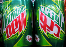
The ones that are really faithful interpretations are fascinating, they really highlight what it is about the logo and packaging that identifies the brand - the Mountain Dew, Dunkin’ Donuts and Baskin Robbins ones are particularly successful in this regard. The Subway one is so close to the original that at a glance you could miss the fact that it’s in Arabic. Others bear no apparent relation to the original logo, even though you’d think they could be easily redone in Arabic. The Calvin Klein one in particular is baffling - surely it would be a straightforward exercise to letter a short name in Arabic to look like Futura Book? Indeed, there is a version of the face called Bukra, which so far only exists in an extra bold weight, but still, it shows it can be done, and very well too. The Yves Saint Laurent one is a little closer to the parent, but again, not so much.
Comparing the originals to the Arabic versions, it’s the luxury clothing brands where the logos diverge the most, and fast moving consumer goods (FMCG) that are the most faithful. This might be because the luxury brand customers are nearer the top of the social scale, are more international and therefore more likely to recognise the Latin logo than those who buy washing powder and groceries. With that assumption, it would therefore be more important to accurately translate the brand image for the FMCG market than for luxuries. Perhaps. Having said that, it’s the Tide packaging that got my attention, and given that Brand New also used a picture of it I’m not alone in thinking that it’s one of the best, design-wise. It’s great in English, but I don’t think I’ve ever seen Arabic lettering quite so exuberant; artistic, inspiring, beautiful, yes, but this is pure teeth-jarring kitsch. Fab. I have of course redrawn my own version of it. Click the image for a wallpaper-sized version.
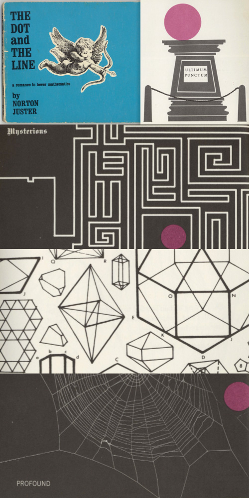
After I wrote about The Dot and the Line animation, Nigel Brachi contacted me to tell me about the book which came out a few years before the film. He kindly sent me some scans of the pages, which show just how faithfully the animators followed the drawing style. The typography of the text is often rather nice too:
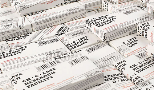
This caught my eye a while back, on NOTCOT, and it turns out there’s a whole range of packaging with it which is all pretty nice. I prefer these ones though, they’re like some cross between newspaper wrap and utilitarian shopkeeping units - it reminds me of how supermarkets sometimes design their own-brand ‘basics’ ranges, which (almost) always end up looking far better than the non-basics stuff. I’m not sure about the treatment of the two Os though, the counters look more like funky bullets somehow. Have a look at the rest of the Asylum site too, there’s plenty of interesting stuff on there.
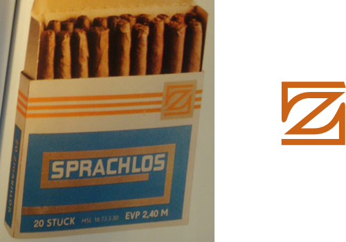
ISO 50 posted about the Taschen book, “East German Design from 1949 - 1989”, with some photos of the inside. There’s a fantastic ‘z’ logo on the cigar box, which of course I had to trace. I’m thinking of getting the book, as East German design shows how creativity can flourish even when resources are limited, and as I found when writing this piece, the resources were often very limited indeed.
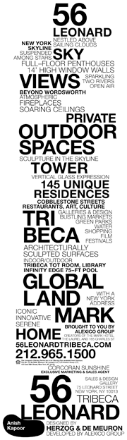
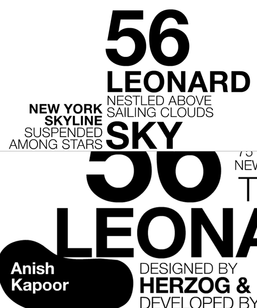
I was clearing up a load of saved links on my desktop and rediscovered this site about 56 Leonard. I saved it last week because of the rather nice typographic representation of the building on the site, which unfortunately flies past pretty fast and doesn’t appear to exist in any of the literature. Still, a few screengrabs and many refreshes later (horribly distorting their stats I’ve no doubt) I put together a decent resolution image of the whole thing. It’s not the prettiest building out there, but it does look like a fun, futuristic place to live, some of the apartments have remarkably large outdoor spaces, and it has an Anish Kapoor sculpture wedged under a corner of the building too. It’s a nice idea, and something that the initial animation does explain very well (the rendered videos on the site explain it too).
The FontFeed linked last week to The Dieline’s exclusive on the Pentawards competition results. There are some lovely examples of packaging in there, with some really innovative packaging shapes and structures too, rather than just nice labels on standard packs.
I often wonder when looking at things like this where the incentive came from - it can be hard persuading a client to go with something custom, with all the implications of cost and lead-in times that implies. It (obviously) happens, though I wonder whether any of these agencies might have been simply lucky to have a client bounding in, scattering wads of cash hither and yon, full of enthusiasm for creating something new, exciting and different. I’d like a client like that. Or two. Or three.
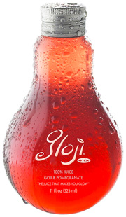
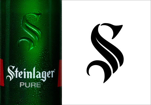
Back to the awards: The Gloji bottle at right is lovely, and different, and I imagine it would feel nice in the hand, like a cognac glass. I don’t care for the logo very much though, unlike the Steinlager logo below. More specifically, the ‘S’ in the Steinlager logo. Looking on the company’s site, I see that the version used on their other products is more traditional, and it’s just on this bottle that the blackletter has been pared down, trimmed and shaved to give it that clean, sleek, modern simplicity. I love it. Hard to trace from a picture of a bottle though, but I think I have it about right.
A beautiful name, and a beautiful concept for a game. The idea feels rather illustrative - finding your way across a blank white world with a load of black ink to delineate edges and discover hidden objects, it’s like creating the world of a graphic novel on the fly. To add to the effect, the game seems to have some reversed areas too, and the white paint on black really reminds me of Sin City.