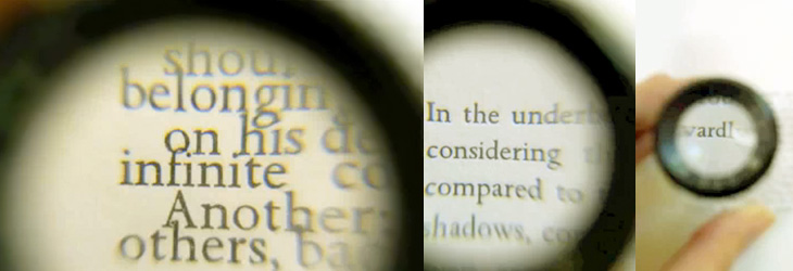
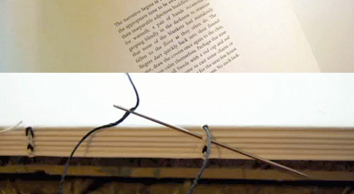
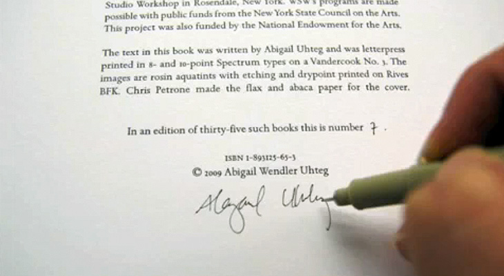
I got the link to this video on YouTube via Jason Santa-Maria on Twitter. It’s compiled from around 3000 images taken over 2 months documenting the creation of 35 hand-made books at the Women’s Studio Workshop in Rosendale, NY. There’s a website with more info and clearer photos here. The whole thing is lovely and worth watching — note especially the attention to detail with the thread colour for the binding and the creation of the headband. These images are all from the video:
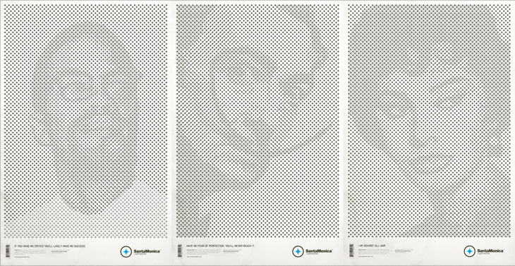
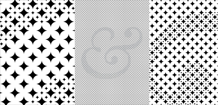
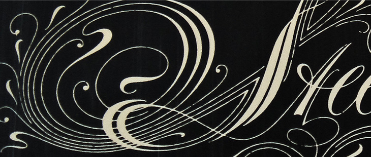
These posters by Mark Brooks for Santa Monica are great. I’ve had the page on ISO50 open in a tab for a while — The idea here is interesting and worth looking at; using the Santa Monica logo to create the halftone pattern, but using a two and three-layer effect using different sizes and treatments of the star. I wanted to have a closer look and see whether it was hard to create the effect. Turns out it’s not really, it’s just a bit time consuming and needs some concentration. It also makes your eyes go squiffy so best to work with low contrast colours until you’re done. I did my own little version using a Baskerville Italic ampersand, below the posters by Brooks here. There’s some more images on Mark Brooks’ Behance portfolio.
BibliOdyssey put up this great collection of Dutch picture-book covers from 1810 to 1950. There are some lovely illustrations, examples of lettering and type treatments on the covers, one of which I’ve traced below. I was thinking about tracing the illustration on this one, mainly for the overall effect it gives than for anything else, but I figure I’ll save that for a rainy day. Go and look at the rest of the covers, here.
‘Wat Hansje Zag’ by Dick Poortvliet, illustrated by van Douwe Nieuwenhuis, 1948
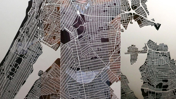
Just a little heads-up on these cutout maps by Karen O’Leary — I think they’re lovely. There’s more info on her Etsy page and here on The Jailbreak, where I found the link. O’Leary has done Paris and New York, and is planning to do London. She says she’ll take commissions for other cities too, so get in there fast if you want one as they obviously take a while to do and I think she’ll be quite busy for a while.
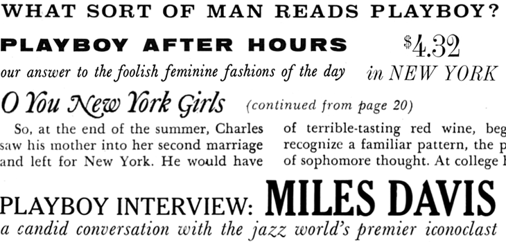
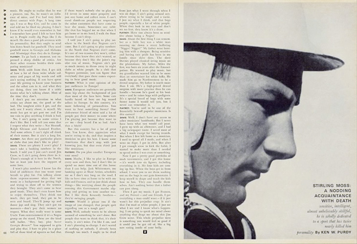
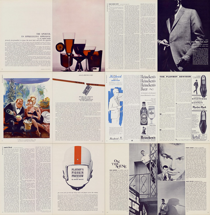
Entirely coincidentally, I get to post about another archive of a long-running and well-known magazine; this time, Playboy. John of I Love Typography tweeted a link to this, just over 50 issues of Playboy from 1954 to 2006. The site will require you to install Silverlight, but is fairly well put together and easy to use, with a nice contents feature that also lists the ads and a search function that works well. To be clear, Playboy is a pornographic magazine that used to use good journalism and good design as a fig-leaf (as it were) to try to get some respectability. It's still a magazine for pornography, objectifying women. Of course, the images and type I’ve included below are not pornographic.
I’ve never looked at Playboy magazine before — its reputation preceded it and there are many better ways to read good journalism. There are some interesting-sounding articles in the earlier editions though; just a quick look through reveals interviews with Fidel Castro, Miles Davis, Sterling Moss, loads of fiction, journalism, pages and pages of dense, dense text. Then, so randomly you almost ask “What’s that doing there?” a picture of a young woman with not much on. I must admit I didn’t really look at the newer issues, as after the logotype changes in 1972 the whole thing looks a whole lot less appealing, and makes me think perhaps the magazine becomes a bit more straightforwardly pornographic from this point. The bits of type and spreads below are mostly from the late ’50s and early ’60s, and are just an example of some of the lovely bits of type and layouts in the magazine. So yes, go and have a look at the Playboy magazine archive, but keep in mind the attitudes and harms it represents.
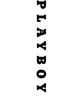
The ‘$4.32’ bit is from an advert, all the rest is from editorial content. I haven’t verified these forensically, but the editorial text looks like a mix of Clarendon, Nimbus Sans, Caslon, Caslon Italic and Cheltenham.I love the use of the rabbit device to end an article, and that it’s still in use today. Note also that the Playboy wordmark at the top left of the page has a serif on the A, which is missing on all other uses of it. I’ve reproduced it larger at the top of this article.
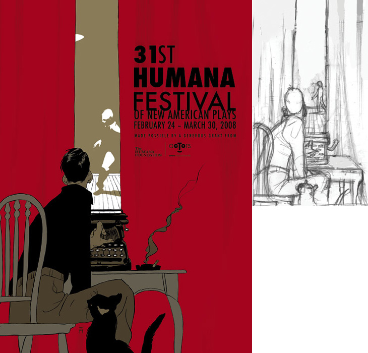
Drawn linked to this set of posters by Noma Bar that make clever use of negative space, and they reminded me of an image I’ve had saved on my computer since last year, this poster for the Humana Festival by Tomer Hanuka, below. It doesn’t need any explanation, I just love it — the image is beautifully conceived and rendered. You can read more about its development on Hanuka’s site, Tropical Toxic.
I would tweak the type a little bit thought, especially the ‘31st’ — for some reason the height of the 3 hasn’t been optically adjusted, making it look much smaller than the 1. It’s rather odd that was done like that.
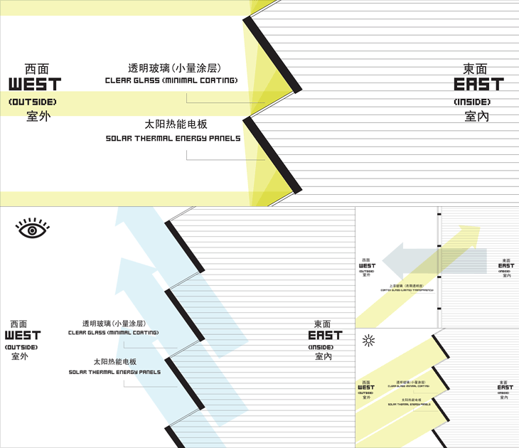
At first glance, The Shenzhen International Energy Mansion looks worth posting about only for the name alone, it sounds like some Metropolis-style sci-fi update of a concierge-equipped apartment block of the early 20th century. It looks, however, like any other office tower found anywhere in the world. Its rather standard shape is in fact deliberate and it does have some interesting features, explained in a way by these remarkable infographics on this Arch Daily article. I say in a way because they’re clearly made to be as much decorative as informational - with that huge pixellated type and simple iconography they bring to mind 8-bit game interfaces and thanks to the West/East labelling, recent revivals of the style like that in DEFCON. Anyway, have a closer look, and you can see how the building is designed to at least try and reduce energy use.
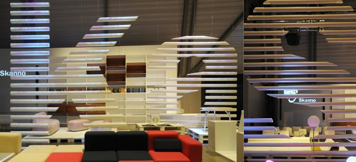
This feels more like a found type entry than anything else, even if I didn’t strictly find it, and that it’s more lettering than type. The Contemporist posted an article and series of photos of Habitare ’09, Finland’s largest furniture and interior design fair. Buried deep in the photos were these two, of Finnish store Skanno‘s stand, showing large letters (presumably spelling the name of the store) made out of plastic tubes and suspended like venetian blinds as dividers. It’s a simple technique, well done. I want some letters like that.
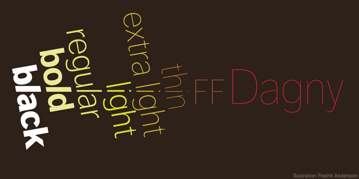
Yves Peters wrote recently on the history and origins of the FontShop-released FF Dagny, worth reading in full, especially for the interesting discussion at the end on how to categorise the face. I must admit though to being drawn in by the beautiful illustration by Fredrik Andersson, reproduced below. One of the key features in the development of Dagny was to create a true italic for it, rather than the obliques of its ‘parent’ face, DN Grotesk, so it’s especially pleasing to align italic characters across the illustration like this.
Illustration by Fredrik Andersson for the FF Dagny spec sheet.