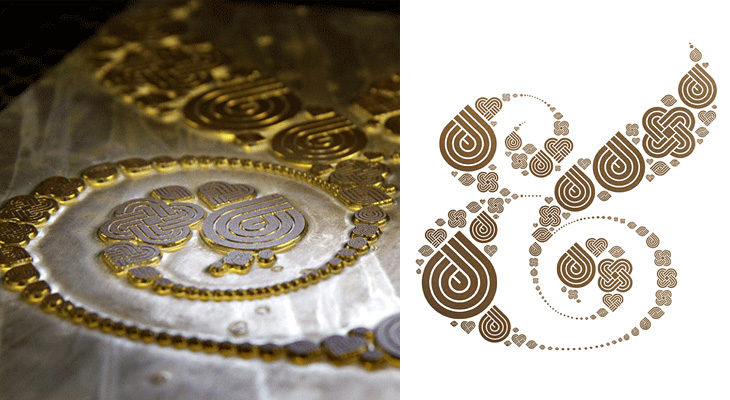
Well with a title like “Ampersand Print” this post could refer to any number of things, but this time it’s this rather pleasant letterpress print by Colorcubic. It’s a limited edition of 250, but as I type they have some in stock — I just bought one in fact. The image is a recreation of Herb Lubalin’s ampersand made of Inksie’s four icons and what with the tiny symbols tracing the thin lines it reminds me of fractal patterns. However, unlike most fractals this looks good and it’ll go great on my wall.
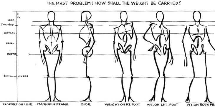
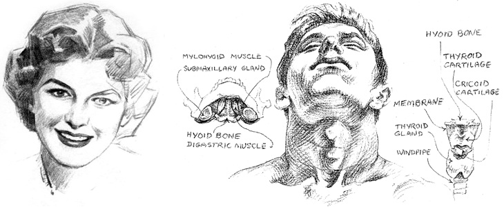
Escape from Illustration Island has put together a set of links to download Andrew Loomis books on illustration and drawing. The books are all out of print and free to distribute because they’re now in the public domain, though for the illustrator and artist they’re as relevant as ever. I realised I’d not seen these books since school — I think we had a copy of The Eye of the Painter and a very tattered Figure Drawing For All It’s Worth (I notice even on these scans that this one doesn’t have a cover) and thinking of other useful books on the subject, I found a few links to Stephen Rogers Peck’s Atlas of Human Anatomy for the Artist. Pretty much everything I learned about anatomy I learned from this book (and much of the rest from this one) so I can wholeheartedly recommend it — it’s not so good for posing and whole-figure drawing, but it’s great for adding detail and character to your figures.
From Figure Drawing For All It’s Worth, I love these mannequin sketches. They remind me of this.
A detail from Drawing the Head and Hands by Loomis, and one from Atlas of Human Anatomy for the Artist by Stephen Rogers Peck, available here.
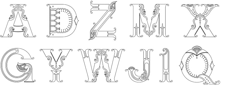
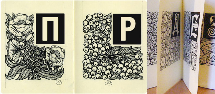
Beth Shirrell has produced this attractive all-caps ornamental alphabet, inspired by Indian (and specifically Hindi) decorative culture. It’s nicely produced and has some fascinating little details, but I wish there were some higher resolution examples to look at. Putting up low resolution images for something as detailed as this feels frustrating, though I understand why it’s done. Anyway, a few characters below — see the rest on her site.
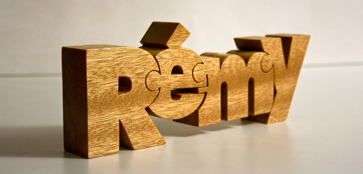
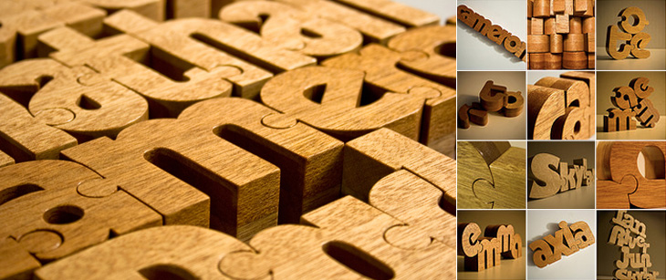
These wooden name puzzles by John Christenson are great. Grain Edit posted about them recently and I kept the link — one part of me really wants one of my own name, but the sensible part of me warns that I’ve got more than enough stuff and I’m supposed to be minimising clutter, but still, they are very nice. Seeing the photo of a number of them together makes me wonder whether a poem or short piece of prose would be a good subject, then it’d go on the wall and it’d be art and it wouldn’t be clutter at all, oh no. Rationalisations, rationalisations…
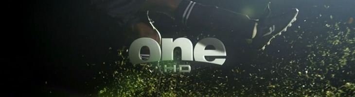
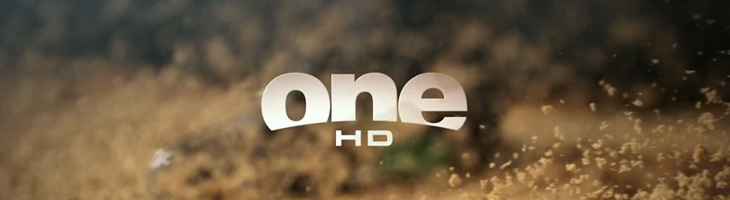
John Beohm of Idents.tv posted the six new idents for Australia’s ONE HD tv channel — I don’t have much to say on them other than they’re lovely and simple and I really like the logo. As John points out, it’s good that they avoid the crass overdone clichés of floodlit stadia and huge billboards, generally I don’t find myself watching sports channels but of what I’ve seen their idents (and identities) are all pretty much of a muchness. Lots of glassy, glossy, glittery effects, dramatic perspectives across giant dystopian stadia-cities shrouded in perpetual night; the impression you’re supposed to get is that this is epic, this is a clash of titans, a great battle to end all battles, an extraordinary experience that will resonate through time and space, this is it, and then, just as you’re (theoretically) driven to the very peak of excitement and anticipation, here’s the golf. Woo.
So yes, it’s nice to have a set of idents that have some of the actual sporting action in them. The logo looks to be a very slightly tweaked Helvetica Black — the version I have has a slightly wider aperture in the lowercase e (but it could just be the 3D rendering creating the illusion). The curve cut out of the bottom hints slightly of the epic view-over-the-horizon style of usual sports channel logos, but it’s subtly executed and provides a perfect frame for the HD suffix. Anyway, slightly more than I was intending to write on this one. It’s nice. Go and watch the videos on Idents.tv.
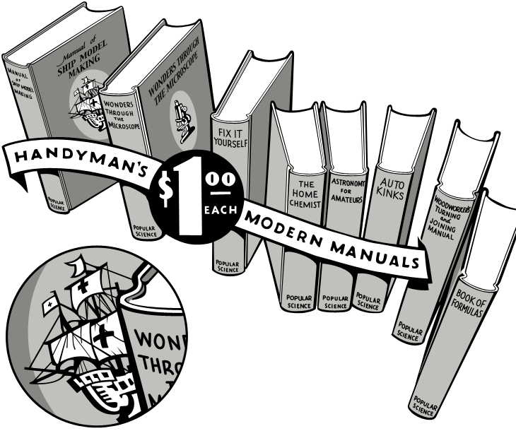
I was having a look through this collection of Popular Science editions on Google Books, and saw this beautiful advertising illustration. Naturally I’ve traced it, but the original ticks so many boxes — it’s hand-drawn, it has a strong sense of dimension, leaping out of the page at you, and the lettering on the banner and especially the price roundel is, like the illustration as a whole, beautifully composed.
My tracing — the detail circle is my own addition, I’d love to see the front of this book properly.
The arrangement of books creates a lovely dance across the page — it’s a shame the type composition of the rest of the advert, while competently done, doesn’t have as much flair. I’d like to know who the illustrator was, and what the front of the books really looked like — I’m fascinated by that little ship illustration and would love to see the whole thing properly. In fact, what are the books like? In an earlier advert there was a hint at some of the cover illustrations, but I’d like to see the ‘real thing’. Anyone out there got some?
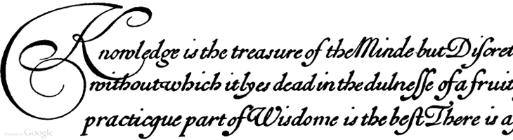
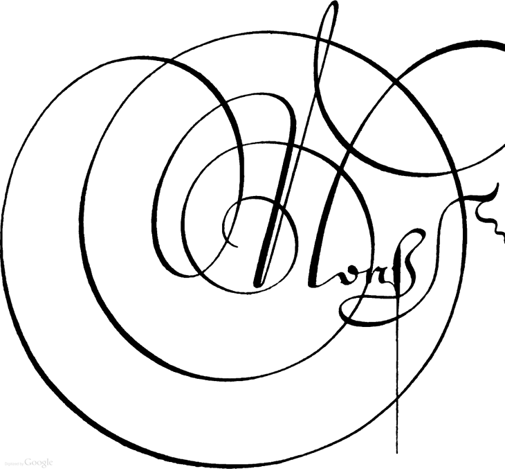
I’m sure this set of Google Books scans has gone round the design sites and twitter before, but I’ve only just recently come across it. Pretty much everything in here is beautiful and wonderful to just browse through, but if you’re a student of lettering and calligraphy (and of course, of type) then you’ll find it pretty useful too.
Personally I’ve mixed feelings about swashes and decorative initials, they look gorgeous but rarely seem appropriate to anything except for, well, historical contexts like the ones in this book. Often when I see them I think they look forced — shoved in there because they exist rather than because they add to the design or layout — It’s a real shame because I guess I’m not alone in really wanting to have a project that just calls out for a damn good swash, and yet when I do I start to fret that it’s just starry-eyed wishful thinking overruling good sense (and taste). It could be that I worry too much and should just get the pen out and start slashing away at the page with ink for the hell of it. Well, maybe not slashing as such, but when you look at some of these you get a real sense of the possibilities of drama and enthusiasm; the chance to create some really playful and exciting stuff. Wonderful:
I was looking through this particularly linkbaity article and found the beautiful piece below, Alphabet, by Irina Vinnik. It really reminds me of a couple of books of fables and fairytales I had as a kid — they all had beautifully ornamented capitals at the start of each story and I was completely fascinated by them. I did trace quite a few and spent rather a lot of time trying to draw my own. Sadly I’ve not got any of those early attempts so I can’t see if they were any good or not, but it did get me into a long and happy habit of tracing and redrawing letters and lettering which has been incredibly useful throughout my career. Funny thing with kids, I’ve noticed with friends of mine who have children that shovelling tons and tons of information at them and seeing what sticks seems to be a pretty good strategy. Your mileage may vary, of course.
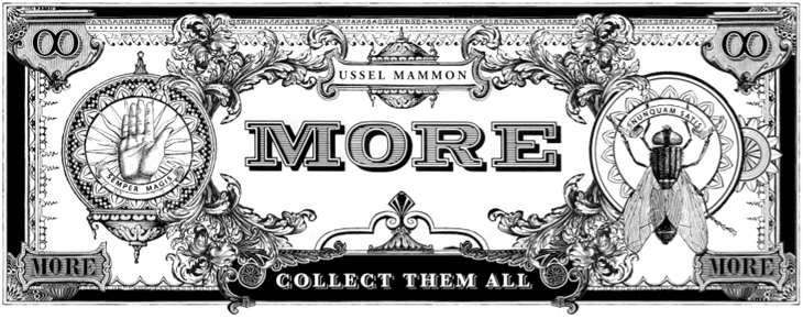
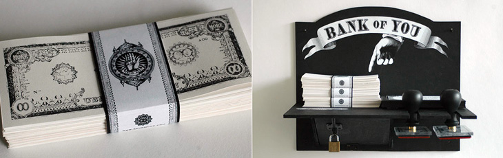
I saw this a couple of weeks ago and I reminded myself of it with my look-at-me post, then didn’t get around to finish writing about it. I really like Kenn Munk‘s designs, they’ve got a real historical feel to them, and remind me of Civil War-era state and privately-issued money in the US. I like the idea of using stamps to print money yourself — I’d love to have a go. I think the only thing I’d suggest adding is a bit of red somewhere, like a serial number or something, but that might just be because I like black and red in print.
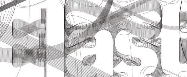
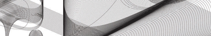
I was browsing through the AIGA Design Archives and was attracted right away to this book cover for Design and the Elastic Mind. Irma Boom designed the cover and the beautiful lettering was done by Daniël Maarleveld, you can see more of his lettering and some background info here (thanks to Sean Kelly for the info). I’ve been experimenting with creating letters from guilloches, so I wanted to look a bit closer at how the designer had done these. It’s pretty interesting, though I’m guessing it’s software filling paths with a basic guilloche than any kind of mathematical derivation of the letters themselves. It’s still very attractive and effective, and I’m wondering what software was used to make it — exploring Excentro I’ve not seen any path-filling options — so I shall ask.
I had a look round for more info on the book, and found that it’s supporting an exhibition of the same name at MOMA. There’s a website devoted to it including this Flash ‘interactive’thing, which grandly introduces itself thus:
The exhibition highlights designers’ ability to grasp momentous changes in technology, science, and history—changes that demand or reflect major adjustments in human behavior—and translate them into objects that people can actually understand and use.
Now, after a while poking around on the site I can say that it’s somewhat lacking in that regard. The typography is unremittingly dreary; a set of very long lists set in microscopic low-contrast text with odd arrows that imply function but give none, bullets all over the place and thoroughly opaque labelling of everything. There’s an animated overlay that briefly shows images from the extended info for each of the list entries (which of course obscures the title and brief intro to it), and traces lines to other things that it’s apparently related to. You can click each of the things and find some actual interesting information in there, and some really nice imagery, but the sense of confusion never really goes away, you’re left with questions — where am I in the site, what is this, what are these connections for and about? If the intention is to show that there’s loads of stuff out there, that it’s hard to read and that finding out about any of it is an onerous task and that following the connections between things is baffling and involves you having to do work to even find out what it is and is connected to, then the site is a blinding success. And what is it with those arrows?
Shame really, because the book cover is quite lovely.