Notgeld

I’ve been merrily tracing some of these Notgeld that Design Observer linked to last week. I could quite happily spend months tracing all these, they’re so beautiful. But what, I hear you cry, are Notgeld? Well to answer that, I’m going to quote from Wikipedia:

Notgeld (German for “Emergency Money” or “necessity money”) was special money issued primarily in Germany and Austria to deal with economic crisis situations such as a shortage of small change or hyperinflation. It was not issued by the central bank (Reichsbank) but by various other institutions, e.g. town savings banks, municipalities, private and state-owned firms. It was therefore not legal tender, but rather a mutually-accepted means of payment in a particular locale or site.Wikipedia

I knew about the money issued during the hyperinflation period (and posted about it too), but not about these ones. The big giveaway that this isn’t hyperinflation currency is the small denomination of the notes - 25 Pfennigs! On a banknote! The fifty pfennig one I had to trace because of that F, and unsurprisingly it’s taken me rather a lot longer that many other tracings I’ve done. The lettering was originally hand done, with all the interesting variations that implies, so no copy’n'paste shortcuts for me!

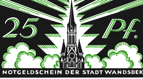
Wandsbek 25 Pfennig note, traced from this original. Click the image above for a larger version.

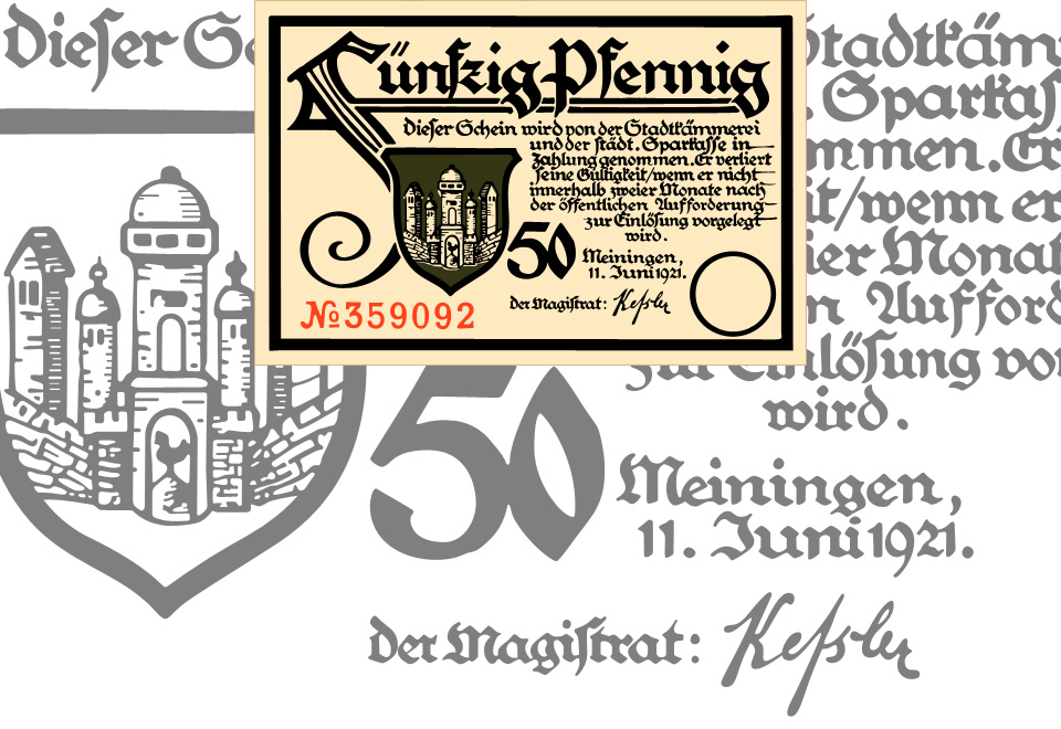
I love that F so much. Click the image for a larger version, or see the original here.

The local currency idea reminds me a little of a project near me, The Lewes Pound, designed to encourage local commerce in and around (you guessed it) Lewes, in East Sussex. The Lewes Pound notes are rather nice things, but I think a lot of these old German notes are actually beautiful. Indeed (and I’m basing this on Wikipedia again) Notgeld were issued for a few years after the need for them had subsided because people liked to collect them so much. I suppose having a lot of people collecting and framing your notes instead of spending it must affect the money flow a bit, so perhaps making money too beautiful isn’t a good idea. I guess that explains the designs of the US dollar and the Euro then. Ahem.

Tape Cassette Inlays

I was mailed a link to these scans of tape cassette inlays the other day. It’s fascinating seeing some of the designs again - most of them look like they’re late 70s and early 80s, but I’m sure I had a few of these in my late-80s “taping things” phase.

I have of course traced a few of my favourites, though there’s plenty more than these four worth looking at. The EMITAPE one is lovely - I recall friends of mine with flashy computers had a few of these. The AGFA one is interesting - I naturally assumed the type would be Helvetica or Univers, but closer inspection (the reason why I trace) reveals a rather different balance to the letterforms. The ‘6’ is rather odd - it looks like it’s about to topple over backwards. The positively psychedelic Happy Sound one was incredibly pleasurable to trace; I think only four points in the whole of that funky set of curves is not at extrema - it’s lovely when that happens. I’ve put a closeup of the patterns on the right (or above, if you’re reading this on RSS).

Arabic Retail

What does the McDonald’s logo look like in Arabic? Or Yves Saint Laurent? Burger King? Rolex? Baskin Robbins? Well, now you can find out because Brand New linked to these two articles by Jason of Graphicology showing Arabic language versions of international brands: one for logos and another for packaging.

The ones that are really faithful interpretations are fascinating, they really highlight what it is about the logo and packaging that identifies the brand - the Mountain Dew, Dunkin’ Donuts and Baskin Robbins ones are particularly successful in this regard. The Subway one is so close to the original that at a glance you could miss the fact that it’s in Arabic. Others bear no apparent relation to the original logo, even though you’d think they could be easily redone in Arabic. The Calvin Klein one in particular is baffling - surely it would be a straightforward exercise to letter a short name in Arabic to look like Futura Book? Indeed, there is a version of the face called Bukra, which so far only exists in an extra bold weight, but still, it shows it can be done, and very well too. The Yves Saint Laurent one is a little closer to the parent, but again, not so much.

Comparing the originals to the Arabic versions, it’s the luxury clothing brands where the logos diverge the most, and fast moving consumer goods (FMCG) that are the most faithful. This might be because the luxury brand customers are nearer the top of the social scale, are more international and therefore more likely to recognise the Latin logo than those who buy washing powder and groceries. With that assumption, it would therefore be more important to accurately translate the brand image for the FMCG market than for luxuries. Perhaps. Having said that, it’s the Tide packaging that got my attention, and given that Brand New also used a picture of it I’m not alone in thinking that it’s one of the best, design-wise. It’s great in English, but I don’t think I’ve ever seen Arabic lettering quite so exuberant; artistic, inspiring, beautiful, yes, but this is pure teeth-jarring kitsch. Fab. I have of course redrawn my own version of it. Click the image for a wallpaper-sized version.

Travel Brochures

One of these days I’ll write about this tracing things compulsion I seem to have. A few people have asked me to elaborate on it, and I will. Thing is, I fear it’ll end up being a mammoth article and I want to give it proper attention, so until then, I procrastinate, by tracing more things. One thing that I’m sure I’ll write about is the temptation to ‘improve’ the original design and lettering. I normally avoid it just so that I can understand the original more clearly, but as I describe below, sometimes I have the impulse to re-imagine the design.

Coudal (I think) linked to this great collection of travel-related designs, which is full of beautiful and inspiring examples of lettering and illustration. I’m still working on a couple more, but I’ve just completed these two. The first is a brochure in Czech advertising Vienna. The text, very loosely interpreted, comes across as, “Vienna, for any season” (you could also say “Visit Vienna, in any season”, perhaps).

“Travel brochure to Vienna (Vídnĕ in Czech), circa 1934.  Signed Steyrermühl, Wien.  Published by the Foreign Tourism Bureau, City of Vienna”. Description and original courtesy of David Levine, from here, my tracing on the right.

The re-imagined design, for a possible poster.

I love the atmosphere of the image; the street shaded and dark, with St Stephen’s Cathedral bathed in warm evening sunlight. It’s just the kind of scene that would enthrall any tourist, and because it’s an illustration it can be happily idealised and stylised to perfection. I love also the way that the heavy traffic is shown too, perhaps as an indication that this is a up-to-date bustling city with all the conveniences the modern tourist of yesterday would require? Tourist brochures today avoid showing traffic at all if they can help it, instead you see ancient buildings connected by gardens, or, say, an open pedestrianised plaza. Funnily enough, this is exactly what is in front of the cathedral today.

After I traced the brochure, I realised that I would like to modify it a bit to create a poster, or at least something less like a brochure, while keeping the same sense of the era and original intention of the design. I trimmed the red border and rearranged the type, being careful not to ‘over-perfect’ it - there is something special and arresting about the slight wonkiness of the type on these old prints, something I’m trying to keep. The new design is just to the right here. Click it for a larger version.

The second one I’ve traced is this odd, but appealing, brochure for the Deutsche Luftpost. It shows three planes in front of the German heraldic eagle against a strangely flat but stormy-looking sky. The planes interest me by having no apparent means of propulsion - normally in illustrations there is a sketchy circle to show where the propellors are, but here, nothing. The eagle is also interesting by having such a prominent tongue. I looked up other examples of the emblem, and unsurprisingly I ended up with a set of images very similar to the ones I saw while researching the coat of arms of Vienna (at the top of this article). None had such a dramatically large tongue though…

“Brochure for ‘Deutsche Luftpost Das Schnellste Verkehrsmittel auf Weite Entfernungen’, circa 1930”. Description and original courtesy of David Levine, from here, my tracing on the right.

Book Design Review’s Favourite Covers

Joseph at the Book Design Review posted his favourite book cover designs of 2008. There’s some good ones in there, and makes me think I don’t read nearly enough long-form writing. I particularly like the one for “Abraham Lincoln: Great American Historians on Our Sixteenth President”, but that might just be because it’s from the five dollar note and I like banknotes… As for the others, I want to see the original of that aerial view of Manhattan, and the other two are just nice images. Go and look at the others.

Sprachlos

ISO 50 posted about the Taschen book, “East German Design from 1949 - 1989”, with some photos of the inside. There’s a fantastic ‘z’ logo on the cigar box, which of course I had to trace. I’m thinking of getting the book, as East German design shows how creativity can flourish even when resources are limited, and as I found when writing this piece, the resources were often very limited indeed.

Our Friend The Atom

Found on ffffound a little while ago, this beautiful book cover. It reminds me of some books I used to have from the same era - I had a National Geographic book about all the massive engineering works being done in America in the early/mid 20th Century, from straightening and deepening the Mississippi to the building of the Hoover Dam. It was a bronze-coloured hardback with a big cross-section of the dam in white, and a plan of a canal cut across a loop of a river, in black, both embossed into the surface. I wish I still had it. Still, I’d only trace it as a vector like Our Friend The Atom, here:

The Lubalin VA Logo

Phillip Niemeyer of Double Triple kindly wrote to explain who that VA logo was for:

I checked my own photo archive of the archive and found the VA business card. VA stands for “Ike Vern & Associates, Photography”. Much of Lubalin’s great graphic work seems to have been simple jobs for small clients. I love that.I posted the VA image, a tissue in Lubalin’s handwriting specing a logo, and a unique logo for the World Trade Center.http://www.doubletriple.net/lubalinPhillip Niemeyer

Technically this is an update to this earlier post, but I wanted to create a new one because I rather like the Double Triple logo, at right - a mirrored ‘3’ in ITC Baskerville.