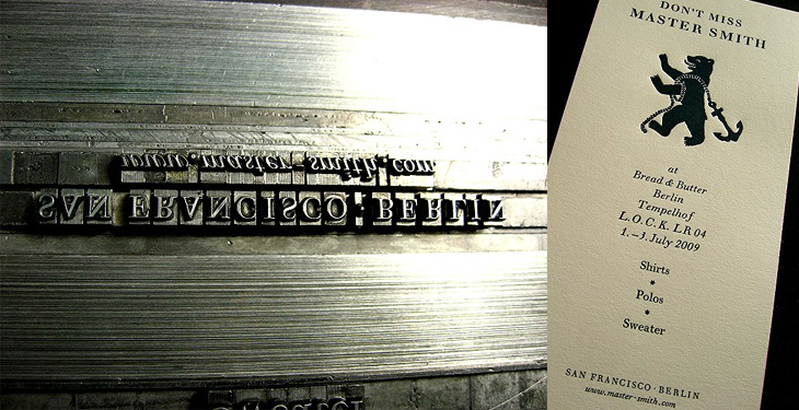
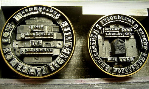
I’ve been following the RSS Feed of Martin Schröder’s blog for a while now; he’s a printer using traditional letterpress techniques in Berlin and posts a lot of interesting and beautiful work on his site. Mostly, I will admit, I just look at the pictures as Schröder usually includes a good set that tells the story of the process quite well. Sometimes though, despite my rusty German, I will work my way through the text as (of course) there’s a lot more interesting detail there. Well worth a look, even if you do just look at the pictures. I love these:
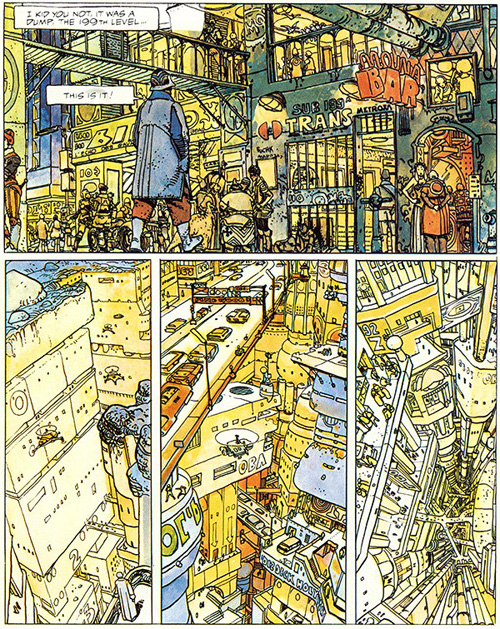
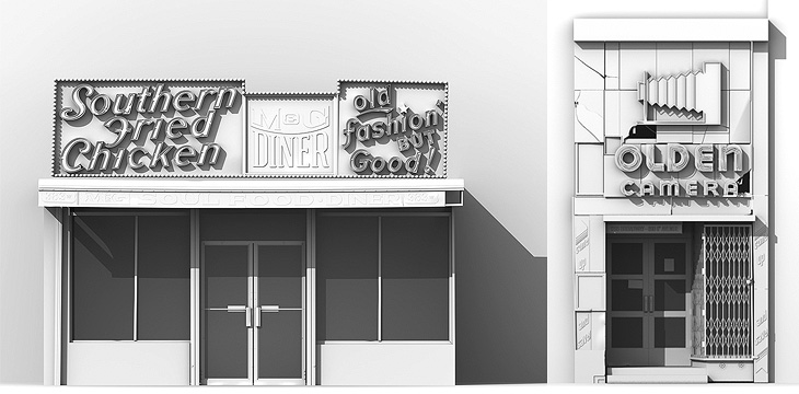
This has been hanging around in my browser tabs for a little while - it’s right up my street too, The Top 10 Comic Book Cities on the Architect’s Journal. A few people have linked to it (I have no idea where I first found it), so you may have already seen it, or even have the books listed. I’ve got a couple, and I think I’ve tracked down a copy of The Long Tomorrow, with Moebius’ fantastic visualisations. I’m quite fond of the idea of megacities, maps (especially of the builtenvironments) and really crowded, dense architecture. It’s not type related, but I imagine such things tend to appeal to the typographically-inclined, if only for the recognition of the similarly detail-obsessed personalities that created them. Anyway, I got the picture below from a regular read of mine, Sci-Fi-O-Rama, which feeatures sci-fi related art and book covers:
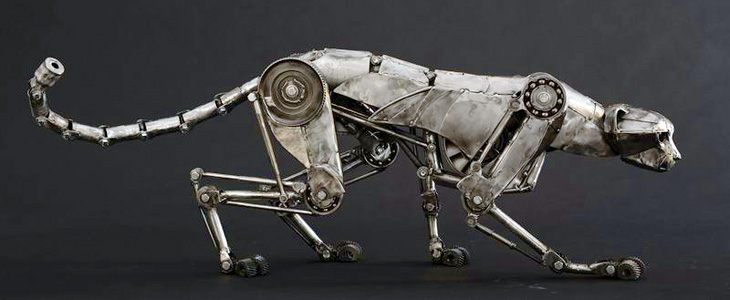
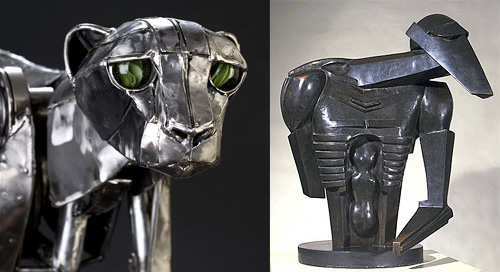
Nothing type related, this, but it’s still lovely. Andrew Chase is a photographer and all-round multi-skilled artist. I came across some pictures of his mechanical cheetah on NOTCOT, which linked to bookofjoe. There are more images of his sculptures on his own portfolio site, including a fantastic giraffe. The cheetah reminded me instantly of Jacob Epstein’s Rock Drill, perhaps not the current form of it so much, but a replica of it in its original state I saw years ago at Tate Liverpool. There’s a picture here (from this page on Art New Zealand) of it before Epstein modified it. It’s the upper part of the face that does it, I think.
Such a beautiful sculpture
Something about the eyes… this links to the original page about The Rock Drill on the Tate site. Go and take a look for more information and pictures.
Adrian Giddings just linked to this on Twitter, a linocut map of Paris by Mark Andrew Webber. It reminds me a little bit of these typographic maps of London and Portsmouth, and of course the ORK ones of various places, but because it’s hand-done (and a linocut at that) when it’s printed it’ll have a very different effect. There’s one of Amsterdam (and London, and New York) on Webber’s site which shows how it might look.
The Paris one looks to be made of a combination of face and lettering styles, I assume to reflect the character of each place being represented, and from that I was wondering at the idea of doing that for whole cities, if you could. It could never be a perfect representation for everyone - I’m sure that for many people a typographic representation of London would involve Johnston Sans, whereas I tend to think of Caslon types. For others, who knows?
The linocut itself has a gorgeous sculptural quality, shown up beautifully in Webber’s photos; I would quite fancy a copy of that rather than a print (oh, OK, as well as a print) - to run your fingers over it would be a real pleasure. Lovely stuff:
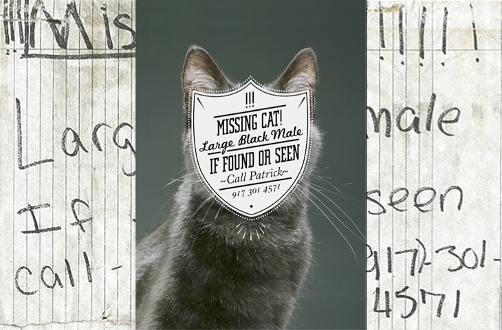
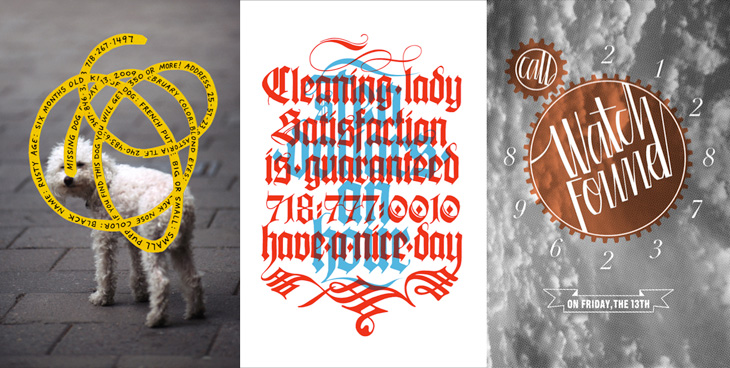
One for the ‘what a nice idea’ pile, this. Cardon Webb goes round upgrading notices pinned up in the streets - you know the ones, ‘Lost Cat’ and the like. There’s one I saw the other day near me that was pleading for the return of a lost plush bunny. I hope they found it; the tone of desperation told a whole story in itself, a wailing inconsolable child, pushchair left unfolded in the hall, coat fallen to the floor, scattered attempts to make-it-all-better: a melted bowl of ice cream, other toys, the Teletubbies DVD and so on, and still the sobbing.
Anyway, back to the nice things. I found this on idsgn, who had created a nice header graphic out of the ‘before’ and ‘after’ images of one of them, and I found that such an appealing presentation I’ve recreated it myself. Still, the original works are the stars of the show, so have a look round on Cardon Copy at the others. I initially thought that the idea was to simply improve the original notices but found a few of them rather hard to read, reading the Cardon Mission reveals all:
Cardon copy takes the vernacular of self-distributed fliers and tear-offs we have all seen in our neighborhoods. It involves hijacking these unconsidered fliers and redesigning them, overpowering their message with a new visual language. I then replace the original with the redesign in its authentic environment.Cardon Copy
So there you go, the key phrase is ‘overpowering their message’. Explains some of them. The others, like the one below, are far more appealing. You’d keep an eye out for that cat:
This is my favourite one.Harder to read at a glance, but probably more likely to make you stop and look than the originals.
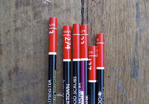
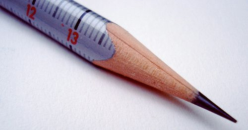
Richard of AceJet 170 posted some great pictures of Pencil Talk’s collection of Routemaster-inspired pencils. I’ve nabbed one of them below, but go and have a look at the article for more, and a link to the source - for the real pencil lover.
Routemaster pencils! Could you ever bear to sharpen them?An Eberhard Faber Scale pencil, picture from Pencil Talk
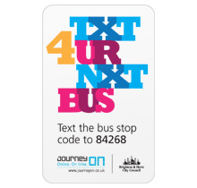
Here’s something I’ve been meaning to post about for a while, and happily it’s a local project, right here in Brighton and Hove. There’s a new service, just launched, which lets you text a code for a particular bus stop to a number and get an SMS back telling you the next five buses to go from that stop. It’s quite a neat idea and pretty fast (I tried it), and a nice complement to the other ways of getting bus information*.
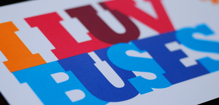
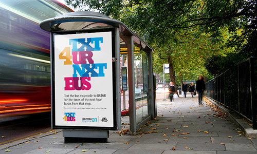
So that’s the back-story. What is good, and particularly appealing to me, is the advertising campaign and the various materials to help people keep a track of the bus stop codes, designed by David Earls of Typographer.org, for Brighton & Hove City Council. I saw a fair bit of the development work on this and I’m glad that this design was chosen and made it through to print unscathed. It’s a beautiful arrangement of type and colour, designed to appeal mainly to teenagers and young adults (and, incidentally, typographers) and adapts well to a wide variety of applications. The typeface (Rockwell Extra Bold) lends itself well to this kind of extreme kerning, with the nicely balanced word shapes the alternating colours and tones ensuring the message remains perfectly readable. The campaign included billboards, bus-stop adshels, A4 posters, information stickers, leaflets with punch-out cards, and a competition to win a new mobile phone:
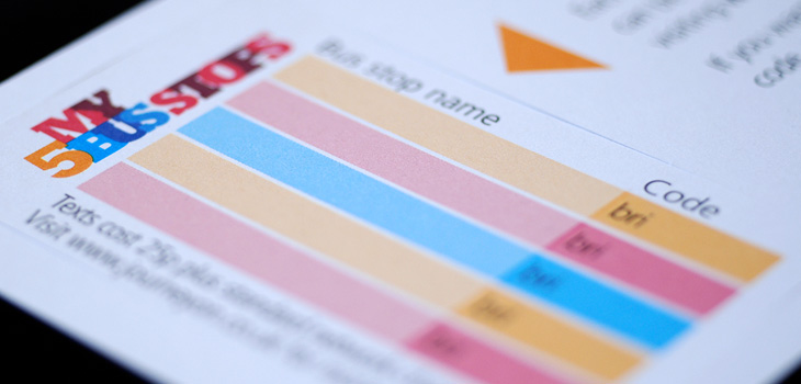
Available for pick up from buses, local ticket and travel agencies and council offices, these cardstock leaflets publicised the scheme, and……they have a wallet-sized card you can pop out for you to record bus stop codes on. The card stock is only glossy on one side to make it easier to write on the reverse.A mockup of the bus stop adverts.
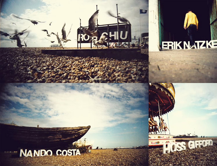
Monoscope linked to the showreel of Rob Chiu the other day, it’s definitely worth a look, but one thing that particularly caught my eye was this piece for Flash on the Beach. It’s a conference that happens every year in Brighton, and these days is more about everything Adobe and everything design than Flash specifically. I think a big part of the appeal is seeing the nicely composed shots of the Brighton seafront with the letters arranged in the scene (and frequently getting blown over). It’s nice to see some of the reactions of people walking past too. That’s it really. It’s nice. Go and look.
This Thursday just gone, Matthew Carter presented the fourth annual Justin Howes Memorial Lecture for the St Bride Library, Genuine Imitations, a type designer’s view of revivals, and I was lucky enough to get a ticket for it. All the tickets went in two hours, and St Bride moved the event to Conway Hall to allow more people to go, yet even after that there was a waiting list!
I’ve written up the talk for I Love Typography, so head on over there to read all about it - it’s quite long, but Carter made some good points that I found rather inspirational, and I hope you will too.
