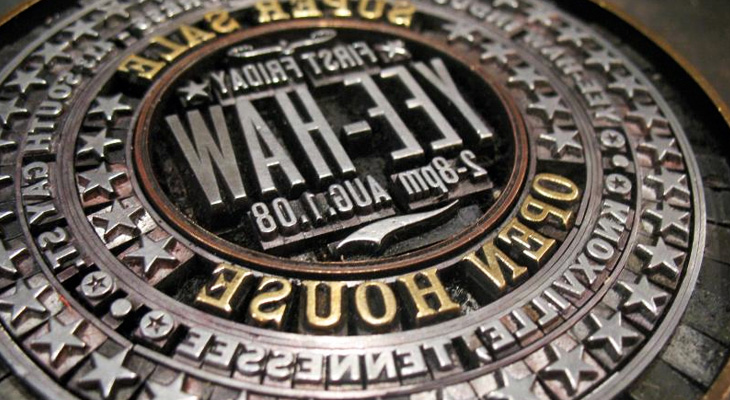
I found a link to this little beauty by Yee-Haw Industries on Coudal today. The linked article on Northcoast Zeitgeist says, “Now that’s a lockup”. Indeed. It’s quite something. It reminds me a bit of the round ones Reden ist Silber posted up a while back.
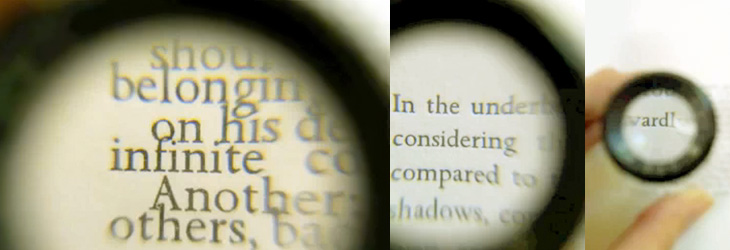
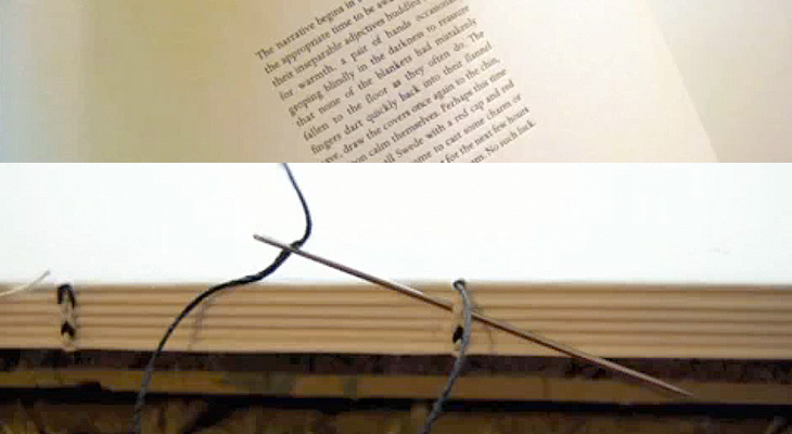
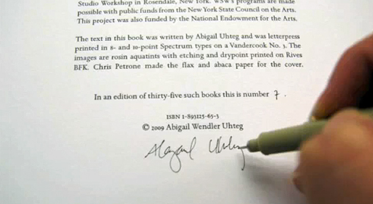
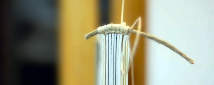
I got the link to this video on YouTube via Jason Santa-Maria on Twitter. It’s compiled from around 3000 images taken over 2 months documenting the creation of 35 hand-made books at the Women’s Studio Workshop in Rosendale, NY. There’s a website with more info and clearer photos here. The whole thing is lovely and worth watching — note especially the attention to detail with the thread colour for the binding and the creation of the headband. These images are all from the video:
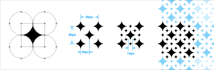
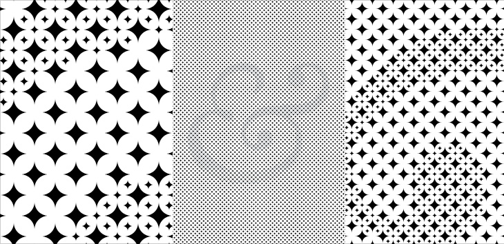
I’ve had a few emails (so soon!) asking how I created my version of the star posters in an earlier article. I created mine using Photoshop vectors (out of habit) but Illustrator, or indeed any app that supports vectors, would be fine — just adapt the processes to your app.
So, without further ado…
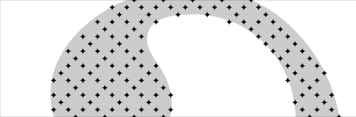
You need to create two sizes of star. Mark Brooks used an additional star shape that was an outline, so you can create one of those as well if you want. The simplest way is to draw a square (mine was 40px × 40px) then create four circles of the same dimensions, offset them to the corners, then set them to subtract from the square, like above. I normally expand the shapes just to leave a nice clean star. Then it’s a process of duplicating and offsetting, like above. Create the large stars on one layer, and the small ones on another.
Keep going until you’ve filled whatever size you need.
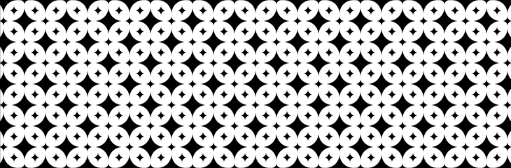
Then, turn off the layer with the big stars and create a new one with your shape on it. If you’re using a photo, posterise it into black and white using whatever method you prefer, then put it below all the other layers — fiddle with the opacity so it doesn’t hurt your eyes.
Then it’s quite simple. Delete all the small stars that aren’t mostly on the black areas of your shape — zoom out now and again if unsure and use your judgement.
Then turn the other layer back on, and turn off or delete the one with your shape on it. You’ll end up with two layers - one completely covered in a pattern of big stars, and another with a pattern of small stars on the area of your shape. Print, and savour.
Of course there are tools available to simplify the process of creating patterns from images, and some of them seem to be good. However, I’m rather more than a bit obsessive about the fine details, and something like this really needs accuracy — doing it manually means I can make sure it’s just right.
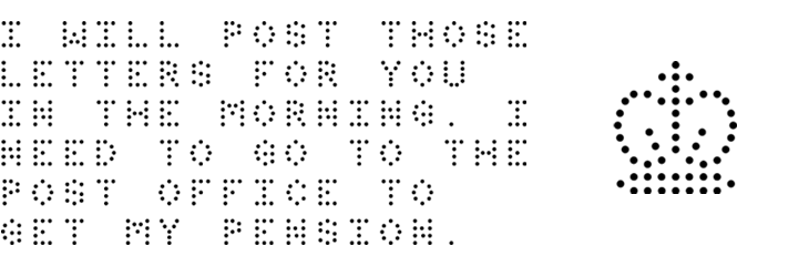
Some time ago I quietly redid the logo for The Ministry of Type, recreating the crown image out of little dots. I didn’t make an announcement out of it at the time, but I was (and am) pleased with it — it’s a lot more me now. I had a number of reasons for wanting to redo it, mainly that even though I drew the original crown image, it was very close to the official ones, and related to that, those Keep Calm and Carry On posters have become so incredibly popular that I’ve had more than one person ask whether there was a link between them and my site. Short and long answer: no, there isn’t.
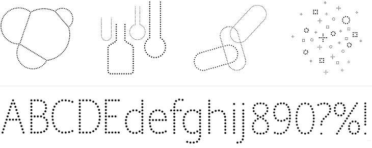
So, it was time to redo it, and with the dots I was feeling very pleased with myself indeed, until the very next day when I saw a link on TypeNeu (I think) to the recent work of Brighton’s own Colophon foundry, specifically their typeface Perfin, which has a crown made of dots in it. Consternation! Had I unwittingly ripped them off? But no, their crown is very different from mine, and I’m pretty sure I had my idea without seeing theirs, and more importantly, there’s plenty of room in the world for lots of things made of dots. Still, it did provide a nice excuse to get in touch and I can confirm they’re an extremely talented and nice bunch of people. Here’s a bit of Perfin, designed by Alison Haigh for Colophon, you can see their inspiration for the face: the perforations and dot-matrix printing Royal Mail use to identify post in their systems.
Perfin, designed by Alison Haigh for Colophon. Images courtesy of Colophon.
That was some time ago, and I was reminded that I’d meant to make a post on this when I read on Brand New about the new Pfizer branding. Ignoring for a moment the regrettable update to their logo, I was drawn to the other brand assets that Siegel+Gale produced for them — the dotted illustrations and typeface, below.
I can imagine that there were all sorts of discussions that likened the dots to pills or something or other, but to me, thinking of Pfizer as one of those old 20th Century companies like ICI, IBM and all that, I had images of mid-century computer displays, specifically a type of nixie tube called (I think) a pixie tube. I’ve got a picture of some basic nixie tubes below, as it seems that the type I’m familiar with—where the letters are formed from individual points of light — are quite rare. Indeed, this is the closest I could find online to the type I saw in my father’s and grandfather’s workshops. They’re really rather beautiful things:
A couple of nixie tubes. Image courtesy of Adam Greig on Flickr.
So yes, that Pfizer logo change. Overall, it’s good, but it’s just that P. It seems so disconnected from the rest of the name now — I really think they should have kept the serif in it, it provided a visual ‘push’ of the P into the F. Just my opinion, mind.
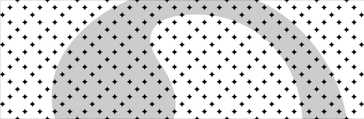
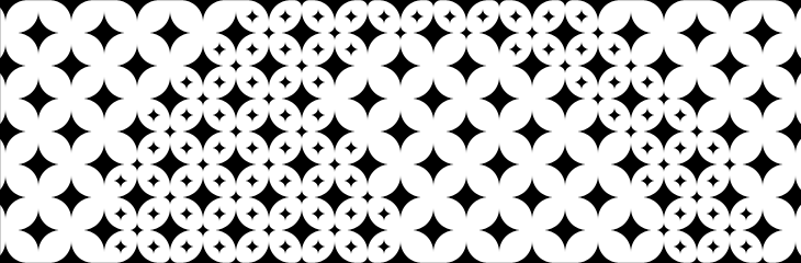
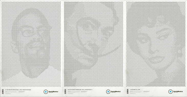
These posters by Mark Brooks for Santa Monica are great. I’ve had the page on ISO50 open in a tab for a while — The idea here is interesting and worth looking at; using the Santa Monica logo to create the halftone pattern, but using a two and three-layer effect using different sizes and treatments of the star. I wanted to have a closer look and see whether it was hard to create the effect. Turns out it’s not really, it’s just a bit time consuming and needs some concentration. It also makes your eyes go squiffy so best to work with low contrast colours until you’re done. I did my own little version using a Baskerville Italic ampersand, below the posters by Brooks here. There’s some more images on Mark Brooks’ Behance portfolio.
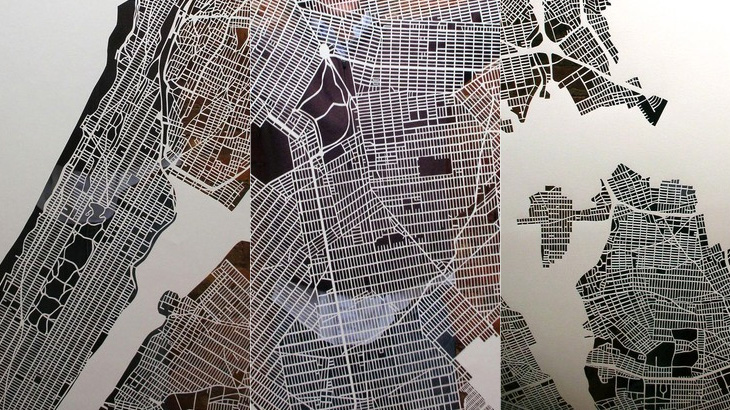
Just a little heads-up on these cutout maps by Karen O’Leary — I think they’re lovely. There’s more info on her Etsy page and here on The Jailbreak, where I found the link. O’Leary has done Paris and New York, and is planning to do London. She says she’ll take commissions for other cities too, so get in there fast if you want one as they obviously take a while to do and I think she’ll be quite busy for a while.
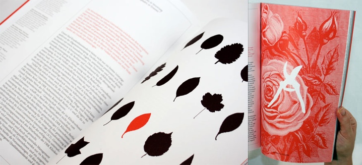
I’ve been marking so many things in my RSS feed either to read later or ‘post about this’ lately, and yet it seems I’ve had no time to do either of these things. This is one I’ve had marked for a while, from the ever-inspiring For Print Only, and perfectly demonstrates why red and black is such a great combination in print. I love the spreads in this report, and I’ll definitely be referring to this as inspiration for a while. Lovely stuff, go and take a look at the other images — a couple of my favourites are below.
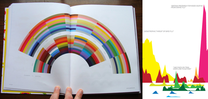
A quick heads-up on a book project I had the honour of being involved with. If you’re a regular visitor to Information is Beautiful you’ll of course already be aware of this, but just in case you aren’t, The Visual Miscellaneum by David McCandless is available for pre-order on Amazon. Sadly, I only had time to do one image for the project, but I see from the back that it looks like it made it into the book, so hurrah! Pre-order on Amazon UK here, and Amazon US here. It’ll most likely be available elsewhere too.
No, these aren’t mine. I just like them. I’m worried mine isn’t colourful enough now I’ve seen these.
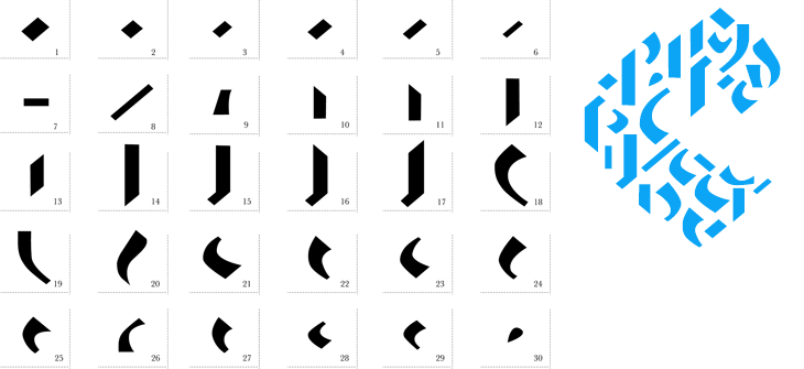
I came across this a week or so ago - another thing found on Behance if I remember correctly, and I’ve had a bit of a play around with it. I like the idea of a Fontstruct-style system for Blackletter, and I can see that Jan Schöttler has created some quite lovely things with it, but without looking at the PDF in Illustrator I would find it far, far easier to draw the letters with a pen and brush than make them with this kit. It reminds me of a Tangram puzzle game in a way. I had a play around with it and created the word below, which is tending a bit too much towards the death-metal band logo for my tastes, but hey, it has a bit of charm. Maybe you will have a better experience with it (warning, Flash site).
Ho hum. It would look more at home scratched in biro on a schoolbag, I think.The parts.The parts, assembled.