On Maps Made of Words

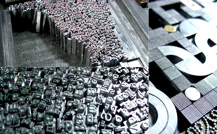
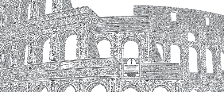
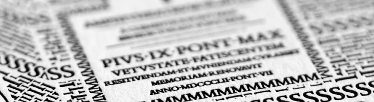
The last time I posted about a set of maps made of words I was a bit hesitant about it. The map itself was attractive, and I liked a lot of things about it (I wouldn’t have posted it otherwise) but I did wonder how much of it was automatically generated, and how much of it was done by hand.

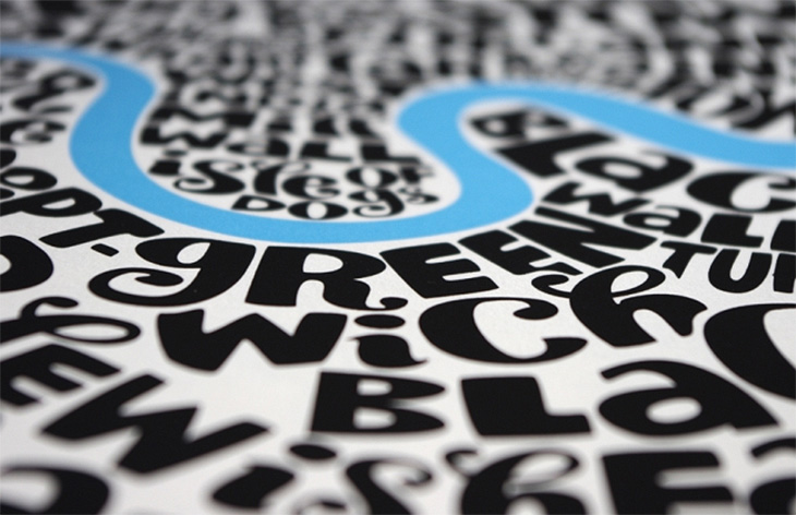
Not that there’s any problem with generating things automatically, as it takes just as much (if not more, sometimes) craft and creative energy to design, program and build something to do that, but sometimes with the computer generated stuff there’s a question of, “How much of this did you do?” Is it a plugin or script you downloaded? Should we be crediting someone else with the creativity and diligence to program the thing, and you with the idea to use it like this? Does it actually matter? It’s not like effort is ever any measure of quality, but of course we naturally associate a premium with something made in a way that doesn’t scale (through difficulty, moods, inspiration, randomness and so on), so that it becomes a unique object, or at least a rare one — this is the premium of the handmade, the crafted object. So this is what I was wondering about when I saw these maps by Seagull’s Hut, not made of type but hand-lettered, and then printed as limited editions:

I’m reminded of Jeremy Tankard’s Shire Types. Know what I mean?

It’s not like you can buy the original artwork, but it is in itself is unique, and the prints from it can only be copies of it; you can’t make new originals, which is something you can’t say for anything algorithmically produced. Well, unless you create AIs and they become conscious and develop an artistic sensibility that is. I’ve raised that issue before and had quite the flood of crazy comments from the internet’s vibrant and vocal apocalyptic tendency, including the gloriously and perhaps unwittingly eloquent, “humans will be instinct”.

So yes, don’t get me wrong, I do like the maps from Seagull’s Hut. Shame I can’t link to them directly, but go and take a look at their store. I don’t think I’ll be posting about any more maps made from lettering or type though. The inspiration has become a meme, and is ever more dulled by the transformation.

Word Harvesting, or Carefully Selected Feathers

I’m fascinated and delighted by the idea of word harvesting, a term invented by local Brighton copywriter Ellen de Vries and described on her blog, here. I love the collection of phrases she’s listed, especially Carefully Selected Feathers, which I’ve nabbed as the name of my laptop. Stripped of their original context they remind me of the pangrams we use for type samplers, and they do work rather well:

Folio Medium, Light, Extra Bold, Condensed Light, Condensed Bold and Extra Condensed Bold.

The Ames Lettering Guide

It’s so good to see Drawn (sort of) back again, I’d sorely missed its regular supply of illustrations and tutorials and feared it would never come back. But no, thankfully it’s back (as a Tumblr blog) with a beautiful new logo lettered by Chris Gardner. The grammar wonk in me is glad they’ve dropped the exclamation mark from their name too — makes referring to it a little easier, no?

So yes, the Ames Lettering Guide — Drawn linked to a nice tutorial on using one by Dustin Harbin, which brought back some memories of school for me. I remember we were shown how to use one and set some exercises, but since then the hand lettering I’ve done hasn’t had quite the constraints (or the volume) to need anything more than a ruler and a bit of patience, so I’d completely forgotten the thing existed. I’m sure there’s one back at my parents’ in a box somewhere. Maybe I’ll dig it out, because now it seems like a useful thing to have around.

Pink Ribbon Lettering

This has been around for a while, but I’ve only just seen it. Niels Meulman of Calligraffiti (AKA Shoe) was commissioned to customise a Mercedes-Benz B-Class by the Pink Ribbon Foundation in the Netherlands. The work consists of hundreds of women’s names, representing the Dutch women the foundation works to help, and is a product of Mercedes’ sponsorship of the foundation. Whatever you think of corporate sponsorship, the end result is pretty spectacular. I especially like the excess ink running down the side of the car, it enriches the flamboyance of the hand lettering and is a welcome contrast to the usual corporate image of Mercedes — and is a badge of honour to confound the cynics, that yes, this was done by hand, live, as it were. Go and look at the video, but I warn you, this is YouTube, so the usual vile trolls have infested the comments.

Armenian Type

I’ve noticed a fair bit of interest on Twitter and the like recently on the subject of Armenian script, perhaps inspired by Carolyn Puzzovio’s talk on the subject at ATypI 2010. I’ve been meaning to have a look into the subject since then, so I’m glad Nina Stössinger and Hrant Papazian have created armenotype.com, a great new site devoted to the subject of the Armenian script and alphabet. It was only launched a few hours ago and the content is still being added to. In the words of Hrant:

We’d love to see anybody and everybody with even a remote curiosity about the Armenian script check it out, register for the mailing list, and post comments.Hrant on Typophile

It’s a beautiful alphabet. Look on the site for the full gallery, but here are a couple of my favourites so far:

The Royal Opera House

Definitely catching up with old news with this one; I’ve had this Brand New article on the new Royal Opera House identity by Someone bookmarked for a while. If you’ve not seen it already, the new identity centres on a fantastic new cut of the royal crest by Christopher Wormell and is supported by new type and image guidelines. The new typeface is Gotham Light, which is lovely and works wonderfully with the new brand, but I can’t help but feel a little sad to see the Caslon-esque old wordmark go. Still, if it had to go, it had to go, and given how Covent Garden looks and feels nowadays Gotham is a good choice — it’s a fresh clean and light companion to the dense complexity of the crest, and works perfectly with the more modern layouts and imagery they’re using, but was Gill really just too much of a cliché?

The new crest and logo

The new crest itself is wonderful. The old one had a certain old-time charm to it, but next to the new one it looks distinctly shabby. Like Armin Vit, I’m especially impressed that they produced two versions for use on light and dark backgrounds, rather than simply inverting the image. The work is so well done that it’s hard to work out what’s actually different between the two images — they’re not just outlined or trimmed, the thickness, detail and density of each image is different, but designed to give the impression they’re the same. Clever and skillful work by a true master of engraving:

Fun With Pencils

Escape from Illustration Island has put together a set of links to download Andrew Loomis books on illustration and drawing. The books are all out of print and free to distribute because they’re now in the public domain, though for the illustrator and artist they’re as relevant as ever. I realised I’d not seen these books since school — I think we had a copy of The Eye of the Painter and a very tattered Figure Drawing For All It’s Worth (I notice even on these scans that this one doesn’t have a cover) and thinking of other useful books on the subject, I found a few links to Stephen Rogers Peck’s Atlas of Human Anatomy for the Artist. Pretty much everything I learned about anatomy I learned from this book (and much of the rest from this one) so I can wholeheartedly recommend it — it’s not so good for posing and whole-figure drawing, but it’s great for adding detail and character to your figures.

From Figure Drawing For All It’s Worth, I love these mannequin sketches. They remind me of this.

A detail from Drawing the Head and Hands by Loomis, and one from Atlas of Human Anatomy for the Artist by Stephen Rogers Peck, available here.

Via Pica + Pixel

Colosseo

This is a very belated post, but one I’ve been meaning to do for a while. Cameron Moll’s Colosseo Type poster is a joy to behold. The level of detail in it is astounding, using type to create textures, patterns and outlines to illustrate the Colosseum. The piece is letterpress, and took over 250 hours to create; it’s set in Goudy Trajan and Bembo Pro, and interestingly, some glyphs recreated using tracing and redrawing:

Additionally, glyphs have been recreated based on the work of master Italian calligrapher M. Giovambattista Palatino, as featured in Libro di M. Giovambattista Palatino Cittadino Romano, published in Rome around 1550 AD.Cameron Moll

Belated or not, it turns out now is a good time to post this as Moll is having a sale of not just this, but the Salt Lake Temple poster and the EPS of the traced glyphs from the Palatino book (one of which is up at the top right). So yes, 25% off, and you get a free glyphs poster with one of the larger posters. Excuse the sales-y tone, but I think these posters are worth every penny; they’re lovely on screen, but as physical objects they’re quite beautiful.

Shoe

I was convinced I’d written about Shoe before, but it turns out I haven’t. Shoe, or Niels Shoe Meulman, is the master of calligraphic graffiti, creating the label for the artform of calligraffiti - also the name of his site. I must have seen examples of his work in books and photos hundreds of times, yet sadly not in real life. I don’t think I have anyway. I’d have hoped I’d have noticed. So yes, go and look at his site, there are more pictures of his work, a rather impressive bio, and a nice story on the nature of creative work too.