The Ludlow Project

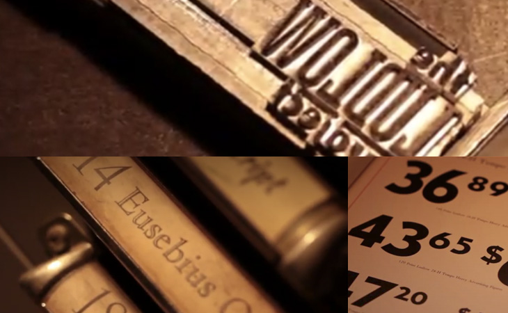
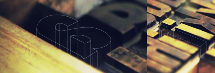
A bit of a campaigning post, this one. The International Printing Museum is running a Kickstarter campaign to expand their collection of matrices for the Ludlow Typograph. It’s a worthy project, to keep an example of fairly democratic technology in use and in people’s awareness, to keep rare typefaces in use and to let people around the world use them – and, well, just because. The Ludlow is similar to the Linotype, but excels at producing slugs for very large type - over 200pt. In the words of British Letterpress:

The principles behind the Ludlow are simple — the operator collects a small brass mould for each character needed in the line.  These are assembled into a ‘stick’, a small frame, and the moulds are clamped together to form a line of moulds.  This stick and moulds are then clamped in to a machine which injects hot metal into the moulds.  A line of type is cast and ejected from the front of the machine.  The moulds have to be distributed back into the relevant cases by hand. Unusually, the Ludlow can cast between 6pt and 228pt type on slugs without changes to the machine.  Other systems have to be modified with each size change. British Letterpress

If you’re interested in helping keep some printing technology alive and not just a piece of history, you can back the project here (there are some nice rewards on offer too).

Geometric Batman

OK, nothing to do with type or lettering, but I do like to post a bit of illustration from time to time. This caught my eye yesterday on this isn’t happiness, an illustration by Liam Brazier. He’s done a load of other geometric illustrations (including this rather nice Superman one), but the colours and balance of this one appeals to me the most. Lovely stuff. I should mention that you can buy prints of his work from his site, and there’s a short Q&A with him here, on My Modern Met.

Suzy Lelièvre

I’ve been buried in bezier-land for the past few weeks these chairs by Suzy Lelièvre, though they’re not type, illustration or lettering, appeal to my appreciation of curves; a physical world instance of beziers. They look like what you get when you try and drag a point in Illustrator and miss, dragging the line itself into some crazed loopy explosion. So yes, noted here for their appeal to all vector designers, and of course their wit.

Nice Hat! Or, Mad Brew Productions

As I catch up with things I’ve marked to ‘look at later’, I see a recent post on Graphic Exchange about the new identity for Mad Brew Productions, by Adam Hill. It’s not really a type related thing but I’m very much partial to a nicely executed bit of engraving and linework, so here it is. The premise of the identity is that of ‘wearing many hats’, in that the company does ‘media’ and ‘interiors’ as well as its music production business.

I would link to the page on Graphic Exchange, but to my frequent frustration it’s a site without unique pages, if you can imagine such a bizarre thing.

Letterpress, by Naomi Ross

I’ve seen this video by Naomi Ross linked a few times on various sites and on Twitter, but have only just got around to watching it. It’s a beautifully filmed and edited short video showing the process of creating a letterpress poster. It’s not a technical manual or anything, it’s just nice to watch and enjoy the process of creating something, lots of narrow depth of field shots, with warm, gentle grading and pleasant gently-animated labels for things. If the music were a little gentler it’d be one of those things to watch when you’re sleepy or hungover. Nice. Go and watch it here.

A Sourcebook of Scripts

I’ve been sent a book by Thames & Hudson that I think is worth putting on here. The (slightly contentious) title is Scripts: Elegant Lettering from Design’s Golden Age*, and shows the collection by the authors, Steven Heller and Louise Fili, of handbills, flyers, posters, photos of signs, type samples, you name it, as long as it’s got script lettering or type on it. I’ve linked to a few big online collections of ephemera before, but never seen one in book form before. The photos are clear and detailed, and while I regret some (all) of the arty cropping, it’s a pretty good resource if you want to research scripts. The collection is broken down by country of origin (rather than by era or style, say) so there are chapters for French, British, German, Italian and American scripts. Thankfully, each chapter has at the end a listing of the origins of each of the pictured pieces, which provides some much needed context; however, I think I’d prefer to have had each image captioned, even if that might have reduced the impact of some of the spreads. A personal preference, I think; your mileage may vary. It’s definitely a book to enjoy browsing through, which is what I’ve been doing, funnily enough.

Interestingly, the book design is by Jessica Hische — I immediately thought of her lettering when I saw the cover, above left.

Charting Information

I just read this well-written and clearly-argued piece by Stephen Few on the work of David McCandless. It expresses many of the thoughts I’ve had on the kind of ‘popular infographic’ going round, though I wouldn’t restrict my criticism to McCandless, nor would I be quite so critical of him personally. The style of work he produces is popular because it presents correlations (and sometimes, coincidences) in data in an accessible, attractive and entertaining way — the error is to assume that this represents the best of graphical analysis or that it’s intended to be viewed as such. As many commenters on this Flowingdata piece have pointed out, there’s a difference between graphical analysis and infographics, and while I disagree with the apparent thrust of their collective argument (that Stephen Few is wrong) it is an important distinction to make.

McCandless’ pieces are often beautiful, and they are indeed based on information, hence the title of his book and site, Information is Beautiful, but they rarely offer deep insight into the data. What I would like to see is the equivalent for graphical charts representing actual analysis. Time for an Analysis is Beautiful perhaps?

I Am The Coin

Another serendipitous find, this time via Font Bureau on Twitter. The linked image, of a piece by Micah Lexier and Christian Bok, got me looking for some background on it, and more info on the artist himself, and through that I found this wonderful installation: I Am The Coin, a story from the viewpoint (apparently) of a coin, told in 20,000 coins attached in a grid to a wall, with no spacing or punctuation. The bottom half of the grid has the story in a conventional readable form, while the top half has the mirror image of the text. Wonderful stuff — I’m off to have a look for more of his work.

Below is the image that Font Bureau linked to, followed by a few from the I Am The Coin website. Lexier’s site is mostly ‘under construction’ but there are a few links to further information, and of course there’s always Google.

Update: The original image is by Jacklyn Atlas from this article by Booooooom.

Linked image from Font Bureau’s tweet.

Some ‘making of’ images from the I Am The Coin installation

Sports Illustrated Book of Bridge

Found via Drawn, this post by Javier Garcia on his blog about the 1961 Sports Illustrated Book of Bridge. The book is illustrated with work by Jerome Snyder, whose work I’ve apparently often admired in the past, even though I didn’t know they were his. His pieces are dense with detail and (when printing allows) rich with colour — that he illustrated a book about bridge with playing-card inspired designs is pretty exciting; how did I not know about this before? I’ve managed to order a copy, so hopefully that’ll arrive soon in all its inspirational splendour and I’ll be able to take my own pictures — these I’ve nabbed from Garcia’s blog post:

Interestingly, Garcia has also featured a set of cards designed by the ceramicist Stig Lindberg that’s worth a look at, and also links to the Grain Edit article about those Jean David El Al cards (which inspired me to buy a set and post about it here).