Waggon and Horses

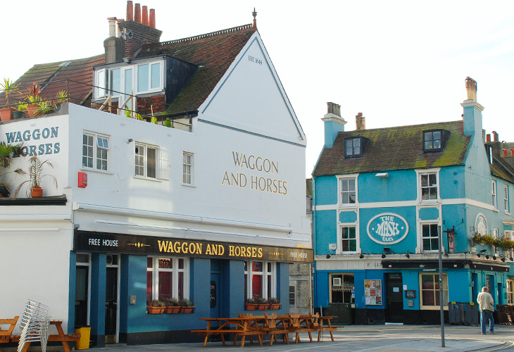
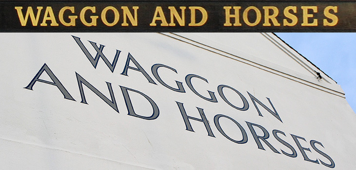
I thought I’d mentioned pub signs before here, but clearly not. For anyone interested in typography and lettering, pub signs are a great source of inspiration and ideas. I remember noticing the lettering on the side of the Waggon and Horses back in 2003 or so - the picture at the bottom was taken about then at least - and thinking how nice it was. Since then we’ve had a smoking ban in the UK, meaning outside seating is a pretty good thing for a pub to have, and there’ve been some great pedestrian-friendly developments here in Brighton, so any pub with one and near the other should be doing quite well. I hope.

So anyway, the Waggon and Horses has recently spruced up their seating area and repainted the outside and the fascia boards, which means new lettering, which I like very much, and which is why I’m putting a picture of it here. I was struggling a little bit to remember what it looked like before but Flickr came to the rescue; this one is probably the prettiest (nicely showing the front of the Brighton Dome there) but this one is probably the clearest. That café in the second Flickr pic is now a Japanese restaurant. Times change…

And no, that’s not a misspelling. Waggon is an older British spelling, but still perfectly fine.

Serene Infoboards

I was on a train from Guildford to Gatwick the other day, on some ancient First Great Western carriages, which had these beautifully simple infoboards at each end. Photos can’t quite capture the charm of these things, as the transition between messages was so languid, so gentle and fluid. It looks like there’s one light source behind the display and whatever power levels they’ve used for the LCD means that it changes slowly, line by line from top to bottom over the course of maybe just under a second, with the liquid crystal fading slowly between states. I got a few pictures, ignoring the funny looks from everyone else in the carriage (hey, I’m not a terrorist) and recreated the matrix used for the letters as an Illustrator file. I did think of how to create diacritics, so I added another row of boxes on the downloadable EPS - you can create all the characters here and, to a great or lesser degree of fidelity, quite a lot of diacritics - the common Western European ones at least.

I’ve mocked this up into an alphabet with a few punctuation marks, and while I had to guess at quite a few of the characters, I think it’s about right. The only reason I could see for the odd triangular bit at the bottom middle was to make a ‘V’ (and possibly a comma) — I guess using the downward-pointing triangle from the four part ‘x’ matrix would mean the letter wouldn’t sit on the baseline properly — a nice bit of attention to detail. The system is quite flexible and fairly high resolution; I like the way it extends the basic 3×5 grid, but only where necessary, and it supports a large range of characters. Lovely stuff.

The New York Times in Turkish

This week sees the launch of a new Turkish-language edition of the New York Times’ International Weekly, distributed for free with the Sunday edition of Turkey’s Sabah newspaper. To advertise the launch, the newspapers commissioned this incredible animation - a typographic tour starting from Liberty Island, across various bits of Manhattan, very nearly making it over to Brooklyn before arriving on the Bosphorus with a gorgeous view of Istanbul rendered in type.

I’ve seen a fair few animations of the places-rendered-as-words variety, and more than plenty of the ‘kinetic typography’ kind, but this one is very nicely done — it hangs together beautifully, and the level of subtle detail rewards re-watching. The waves, rippling banners and flags are a lovely touch, just noticeable enough to add to the sense of place without distracting you from the overall theme.

I’d love a desktop-resolution still of this scene. This is taken from the downloadable movie.

There’s one especially lovely bit when the camera turns to show you the Brooklyn Bridge being created from type — definitely go and watch this one. It’s quite lovely, and thanks to @typographerorg (of Typographer.org, naturally) for sending me it.

Not the scene I mention, I won’t spoil that for you.

Negative Space

Drawn linked to this set of posters by Noma Bar that make clever use of negative space, and they reminded me of an image I’ve had saved on my computer since last year, this poster for the Humana Festival by Tomer Hanuka, below. It doesn’t need any explanation, I just love it — the image is beautifully conceived and rendered. You can read more about its development on Hanuka’s site, Tropical Toxic.

I would tweak the type a little bit thought, especially the ‘31st’ — for some reason the height of the 3 hasn’t been optically adjusted, making it look much smaller than the 1. It’s rather odd that was done like that.

Third and Seventh

This has nothing to do with type (well, not much) but I found it so remarkable I want to post about it anyway. Alex Roman has created a series of CG images and short films, based on real places, with a remarkable level of realism and beauty. At first I thought they’d been filmed and photographed with some high quality HD SLR, and wondered at the air of hyper-realism some of them have, especially the second one in this set. The sound design and visuals are great, but the use of type in the videos is rather odd and to my eye adds a small, if jarring, discordant note to the whole project: I’ve come across people mixing upper- and lower-case and using extreme kerning before (not so much kerning as tangling in this case) and it’s rarely successful. Still, to harp on about that would seem churlish as the rest of the project is so good. Some stills below to whet your appetite, and the project website is here.

Skanno

This feels more like a found type entry than anything else, even if I didn’t strictly find it, and that it’s more lettering than type. The Contemporist posted an article and series of photos of Habitare ’09, Finland’s largest furniture and interior design fair. Buried deep in the photos were these two, of Finnish store Skanno‘s stand, showing large letters (presumably spelling the name of the store) made out of plastic tubes and suspended like venetian blinds as dividers. It’s a simple technique, well done. I want some letters like that.

FF Dagny

Yves Peters wrote recently on the history and origins of the FontShop-released FF Dagny, worth reading in full, especially for the interesting discussion at the end on how to categorise the face. I must admit though to being drawn in by the beautiful illustration by Fredrik Andersson, reproduced below. One of the key features in the development of Dagny was to create a true italic for it, rather than the obliques of its ‘parent’ face, DN Grotesk, so it’s especially pleasing to align italic characters across the illustration like this.

Illustration by Fredrik Andersson for the FF Dagny spec sheet.

Carnivalesque

Whenever I’ve seen this car around Brighton it’s either been very dark or I’ve not had a (decent) camera with me, so it was good the other day to see it sat there in full sunshine, and me with a proper camera too. Too few people decorate their cars, fearing perhaps for the resale value, but seeing this car I can’t help but wish more people would have a go. Whoever you are who did this, thanks!

Fabric Type

Whenever I’m playing around with guilloches, I often think it’d be nice to make an alphabet - to actually generate letterforms with them. It’d mean loads of eye-wateringly complex formulæ, but I think it’d be worth it. Well, Tania Alvarez has created some beautiful letters called Fabric Type that convey some much of the appeal and intricacy of guilloche patterns and reminded me instantly of that idea. If ever I needed reminding that the products of inspiration are infinitely variable, then it’s this; these are beautiful and I love them, but I’m happy to see that they’re different from what I was thinking of doing. This list of things that I want to get done isn’t getting any shorter. Found via the ever-inspirational Fubiz.

Andrew van der Merwe

Browsing Behance the other day I came across the portfolio of Andrew van der Merwe, a calligrapher and letterer from Cape Town. These sand lettering pieces he’s done are really beautiful - the edges of the letters are so clean and the forms so precise, there’s definitely a technique going on here, which he confirms:

Scratching in the sand with a stick, however, has proved less than satisfactory because it makes more of a mess than a mark. This has led me, over the past seven years, to develop various instruments which mark the sand in less messy ways, and ultimately to a kind of scoop which leaves neat V-cut letters of the sort one gets in stone carving.Andrew van der Merwe

Lovely stuff. Go and have a look. There’s his Behance portfolio here, and a site which desperately needs some attention here.