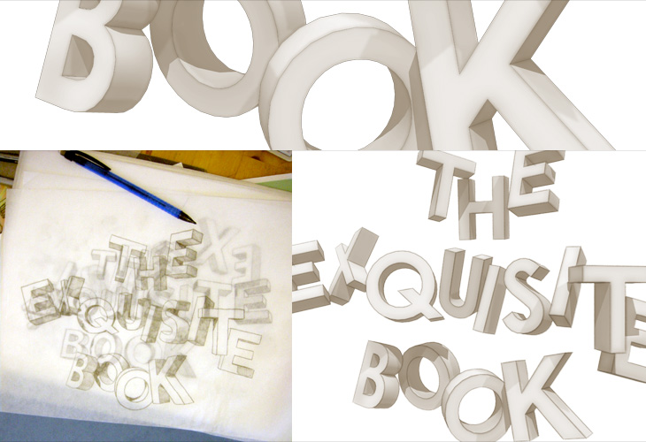
Browsing earlier, I came across this blog post for The Exquisite Book. It’s a book project involving ten groups of ten artists, including fine artists, illustrators, designers and comic artists, where each artist creates one page having only seen the previous page. It’s roughly the same idea as a game you may have played as a child, which I’ve only just learned was invented by the Surrealists and was called The Exquisite Corpse. I can’t remember what we called it, but certainly not that.
Anyway, the book project looks like one worth following, and the blog post has a few sample pages. I’ll be interested to see how it ends up looking as a collection, and what the binding will be. I was especially interested in the sketch for the book title page (below left) and had a play with the idea in Sketchup.
Some output from Sketchup, from me playing with the ideas in the sketch from The Exquisite Book site at bottom left. To match the sketch I used a mix of Century Gothic and Helvetica - and some hand lettering naturally.
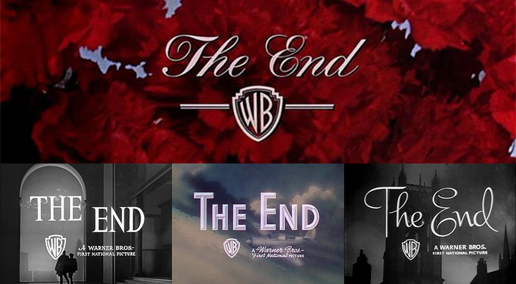
For all that I’ve heard and read from friends, colleagues and associates, it seems that the end of 2009 can’t come soon enough. I’ve not had a bad year at all — it’s been full of good things, both professional and personal — but somehow I’ve picked up the excitement and promise of a new year and I’m looking forward to 2010. It’s going to be a good year, I think. So, without further ado, I’ll bring your attention to a fantastic collection of ‘The End’ title stills from Warner Bros on The Movie Title Stills Collection, perfectly timed to commemorate the end of the year. Go and take a look!
Have a very happy and prosperous new year, and thank you for your visits, your kind, interesting and useful emails — I read every one and even if I can’t reply I appreciate and enjoy all of them. Here’s to two thousand and ten!
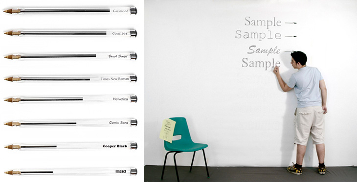
I’ve just seen this project on Swiss Miss and I really like the idea. Matt Robinson and Tom Wrigglesworth compared how much ink different common typefaces use at the same point size by drawing them out on a wall using biros. It’s not a scientific analysis or anything but it is a gloriously fun thing to do. I like the way they ended up with a graph made out of biros at the end of it, showing how much ink is left — the resulting evidence is its own data. It’s a great way of explaining typographic colour too. Love it.
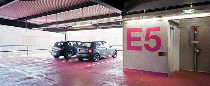
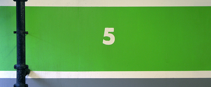
One of the sites I visit regularly (or at least, read the RSS feed of) is Arch Daily. I’ve always had a strong interest in architecture and I enjoy looking through the pictures of new building designs — even if they do often look unrealistically neat and perfect. It’s nice, then, to find actual photos of an actual built structure, and this one caught my eye for the rather predictable reason that it’s got giant floor numbers painted in bright pink Helvetica Neue on it. As so often happens I was reminded of something, this time another set of car park numbers that also caught my eye, the Futura-esque ones on the Brighton Marina car park just down the road from me. I also think I have a bit of a thing for the number5.
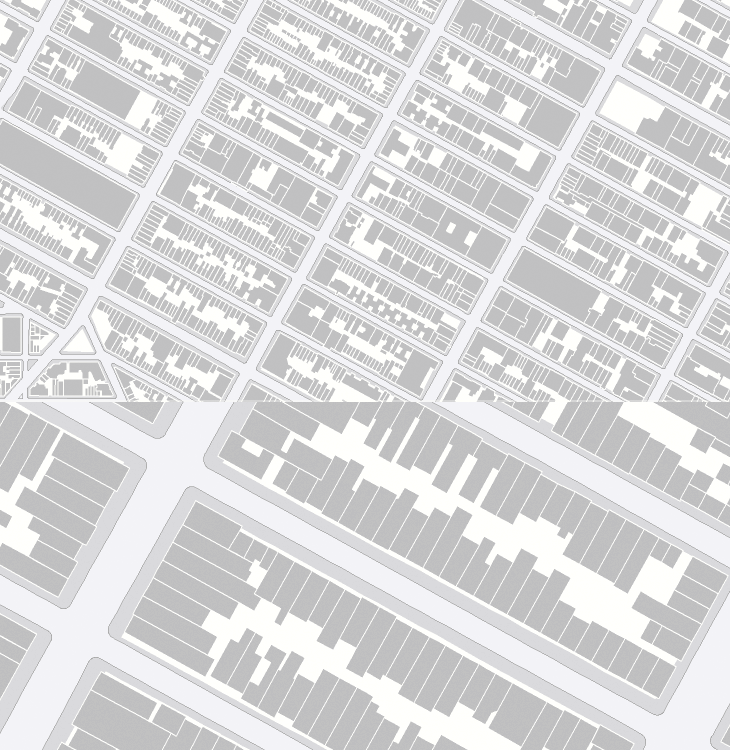
Now I really have been meaning to post about this for ages. So long in fact I really can’t remember where I found it. I don’t even have a link to it anymore and it’s only because it’s easily Googled* that I could find it again. As far as I understand it, OASIS is a map-based system for New Yorkers to see how open space is used in the city - the page about it describes this as enhancing the stewardship of said open space, whatever that means. Still, the new maps they’ve got are really quite lovely, and astonishingly detailed. I know our very own Ordnance Survey has maps this detailed, but the data is jealously guarded and even with recent changes in the right direction, detail at this level is not something for we mere taxpayers (who pay for it) to see and use without paying for it again. I hope the Ordnance Survey will see sense soon and we’ll see some fun applications with UK data like this.
Hey, I just like the maps without anything on them.
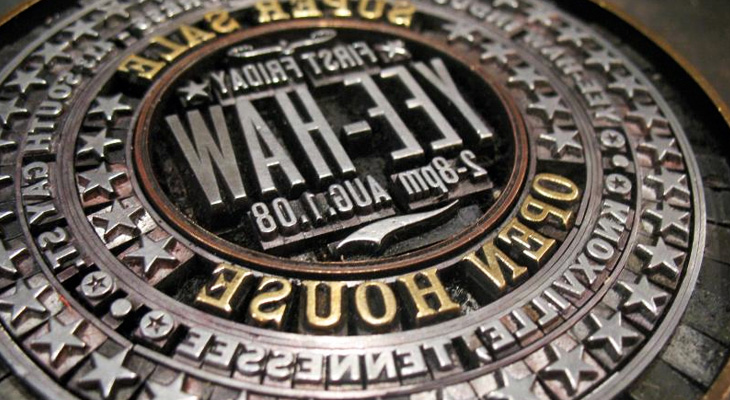
I found a link to this little beauty by Yee-Haw Industries on Coudal today. The linked article on Northcoast Zeitgeist says, “Now that’s a lockup”. Indeed. It’s quite something. It reminds me a bit of the round ones Reden ist Silber posted up a while back.
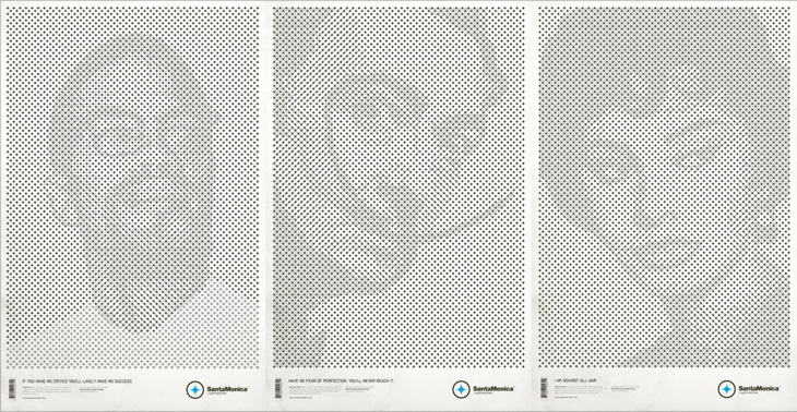
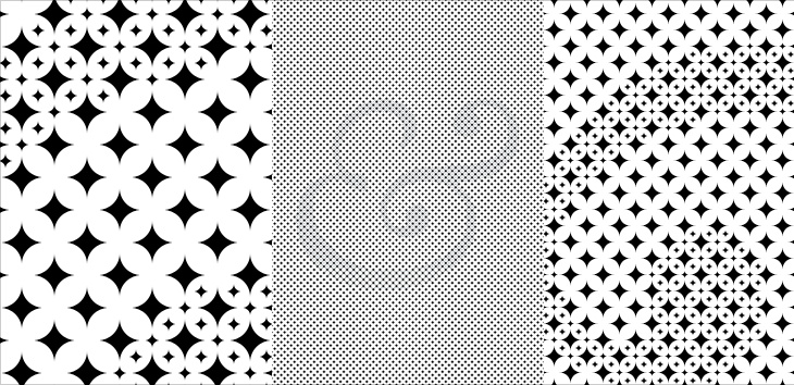
These posters by Mark Brooks for Santa Monica are great. I’ve had the page on ISO50 open in a tab for a while — The idea here is interesting and worth looking at; using the Santa Monica logo to create the halftone pattern, but using a two and three-layer effect using different sizes and treatments of the star. I wanted to have a closer look and see whether it was hard to create the effect. Turns out it’s not really, it’s just a bit time consuming and needs some concentration. It also makes your eyes go squiffy so best to work with low contrast colours until you’re done. I did my own little version using a Baskerville Italic ampersand, below the posters by Brooks here. There’s some more images on Mark Brooks’ Behance portfolio.
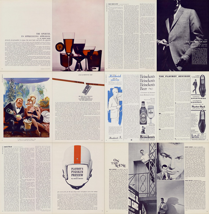
Entirely coincidentally, I get to post about another archive of a long-running and well-known magazine; this time, Playboy. John of I Love Typography tweeted a link to this, just over 50 issues of Playboy from 1954 to 2006. The site will require you to install Silverlight, but is fairly well put together and easy to use, with a nice contents feature that also lists the ads and a search function that works well. To be clear, Playboy is a pornographic magazine that used to use good journalism and good design as a fig-leaf (as it were) to try to get some respectability. It's still a magazine for pornography, objectifying women. Of course, the images and type I’ve included below are not pornographic.
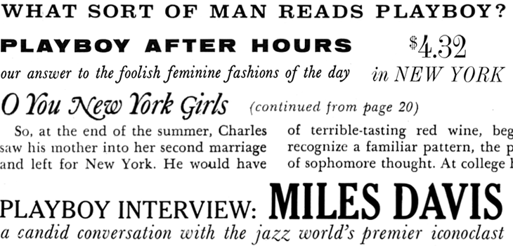
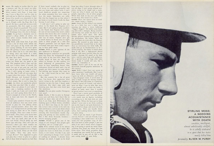
I’ve never looked at Playboy magazine before — its reputation preceded it and there are many better ways to read good journalism. There are some interesting-sounding articles in the earlier editions though; just a quick look through reveals interviews with Fidel Castro, Miles Davis, Sterling Moss, loads of fiction, journalism, pages and pages of dense, dense text. Then, so randomly you almost ask “What’s that doing there?” a picture of a young woman with not much on. I must admit I didn’t really look at the newer issues, as after the logotype changes in 1972 the whole thing looks a whole lot less appealing, and makes me think perhaps the magazine becomes a bit more straightforwardly pornographic from this point. The bits of type and spreads below are mostly from the late ’50s and early ’60s, and are just an example of some of the lovely bits of type and layouts in the magazine. So yes, go and have a look at the Playboy magazine archive, but keep in mind the attitudes and harms it represents.
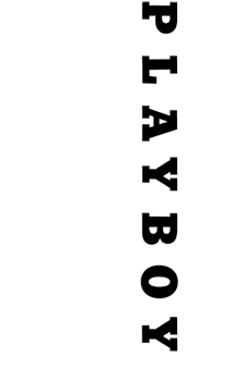
The ‘$4.32’ bit is from an advert, all the rest is from editorial content. I haven’t verified these forensically, but the editorial text looks like a mix of Clarendon, Nimbus Sans, Caslon, Caslon Italic and Cheltenham.I love the use of the rabbit device to end an article, and that it’s still in use today. Note also that the Playboy wordmark at the top left of the page has a serif on the A, which is missing on all other uses of it. I’ve reproduced it larger at the top of this article.
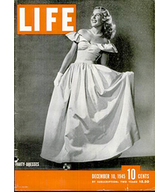
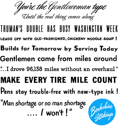
I’ve been browsing through some of the copies of LIFE magazine in this wonderful archive on Google Books, and as well as the photography and journalism I’ve found some real type treasures, especially in the advertisments. Some of the slogans and phrases read just like bits of pangrams or the beautiful mini-stories that Font Bureau create for their type samplers, and some of the type and lettering is quite lovely. The ones below are mostly from this issue from May 1945. A few are also from this one, which also has a short article and some photos (from page 43) of the first Lewes Bonfire night after the end of World War Ⅱ - something of local interest at least to me (and other Sussex people).
I’m sure you could make many amusing stories with a bit of patient searching through the archive.
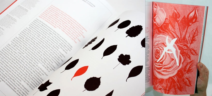
I’ve been marking so many things in my RSS feed either to read later or ‘post about this’ lately, and yet it seems I’ve had no time to do either of these things. This is one I’ve had marked for a while, from the ever-inspiring For Print Only, and perfectly demonstrates why red and black is such a great combination in print. I love the spreads in this report, and I’ll definitely be referring to this as inspiration for a while. Lovely stuff, go and take a look at the other images — a couple of my favourites are below.