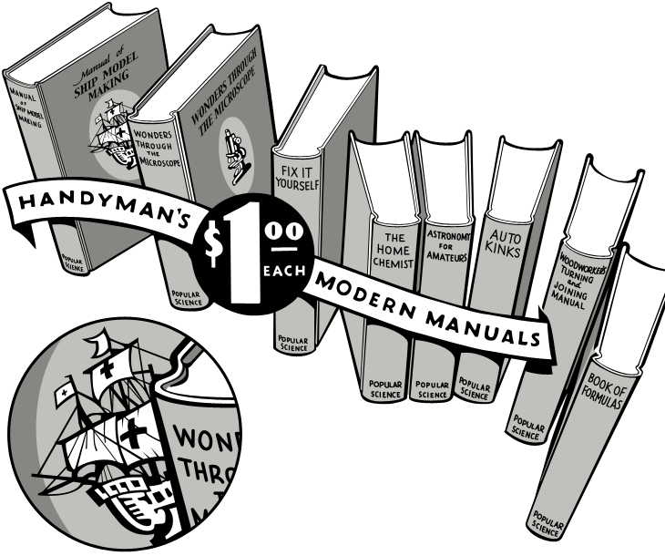
I was having a look through this collection of Popular Science editions on Google Books, and saw this beautiful advertising illustration. Naturally I’ve traced it, but the original ticks so many boxes — it’s hand-drawn, it has a strong sense of dimension, leaping out of the page at you, and the lettering on the banner and especially the price roundel is, like the illustration as a whole, beautifully composed.
My tracing — the detail circle is my own addition, I’d love to see the front of this book properly.
The arrangement of books creates a lovely dance across the page — it’s a shame the type composition of the rest of the advert, while competently done, doesn’t have as much flair. I’d like to know who the illustrator was, and what the front of the books really looked like — I’m fascinated by that little ship illustration and would love to see the whole thing properly. In fact, what are the books like? In an earlier advert there was a hint at some of the cover illustrations, but I’d like to see the ‘real thing’. Anyone out there got some?
I’m sure this set of Google Books scans has gone round the design sites and twitter before, but I’ve only just recently come across it. Pretty much everything in here is beautiful and wonderful to just browse through, but if you’re a student of lettering and calligraphy (and of course, of type) then you’ll find it pretty useful too.
Personally I’ve mixed feelings about swashes and decorative initials, they look gorgeous but rarely seem appropriate to anything except for, well, historical contexts like the ones in this book. Often when I see them I think they look forced — shoved in there because they exist rather than because they add to the design or layout — It’s a real shame because I guess I’m not alone in really wanting to have a project that just calls out for a damn good swash, and yet when I do I start to fret that it’s just starry-eyed wishful thinking overruling good sense (and taste). It could be that I worry too much and should just get the pen out and start slashing away at the page with ink for the hell of it. Well, maybe not slashing as such, but when you look at some of these you get a real sense of the possibilities of drama and enthusiasm; the chance to create some really playful and exciting stuff. Wonderful:
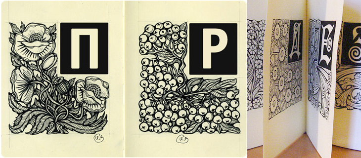
I was looking through this particularly linkbaity article and found the beautiful piece below, Alphabet, by Irina Vinnik. It really reminds me of a couple of books of fables and fairytales I had as a kid — they all had beautifully ornamented capitals at the start of each story and I was completely fascinated by them. I did trace quite a few and spent rather a lot of time trying to draw my own. Sadly I’ve not got any of those early attempts so I can’t see if they were any good or not, but it did get me into a long and happy habit of tracing and redrawing letters and lettering which has been incredibly useful throughout my career. Funny thing with kids, I’ve noticed with friends of mine who have children that shovelling tons and tons of information at them and seeing what sticks seems to be a pretty good strategy. Your mileage may vary, of course.
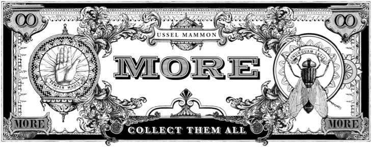
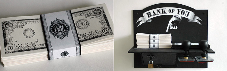
I saw this a couple of weeks ago and I reminded myself of it with my look-at-me post, then didn’t get around to finish writing about it. I really like Kenn Munk‘s designs, they’ve got a real historical feel to them, and remind me of Civil War-era state and privately-issued money in the US. I like the idea of using stamps to print money yourself — I’d love to have a go. I think the only thing I’d suggest adding is a bit of red somewhere, like a serial number or something, but that might just be because I like black and red in print.
Here’s a nice topical post for St. Valentine’s Day. I just read about this fun project over on Brand New: Redesigning Valentine’s Day. Studio 360 came up with the idea, following on from previous ‘challenges’ to redesign Christmas Day and the Gay Freedom Flag. I normally like reading things like this because of the fresh thinking and the usually interesting return to first principles as a place to start, but this feels a bit flat. Brand New give a list of positives and negative aspects of Valentine’s Day, and they have some interesting ideas, but if this was a branding brief, I’d start with a list of brand aims, what we want to achieve:
Accessible—Whatever symbols you use, they have to be recognisable. At some level it’s a similar task to designing a national flag; a child must be able to draw it recognisably.
Obvious—Love may not actually be blind, but it’s certainly not thinking at full capacity, so whatever you use to characterise it has to work on an emotional, intuitive level. If you have to think about it too much, it’s failed.
Fun—It really can’t be serious. Romantic love is mad, illogical, impulsive and emotional — there’s no tedious routine here, no worries about bills or ailments or whatever, it’s about life, and it’s exciting.
Optimistic—It has to speak of unbounded promise, of potential, of positivity, happiness and, not to put too fine a point on it, the fruits of love — kids, basically, assuming reproduction is possible with one’s intended. It has to lift our spirits and make us feel good.
To go with the brand aims, you want to see what’s wrong with the existing brand:
Commercialisation—Money (or the exchange of valuable/useful items) has been part of love, marriage and romance for however long we care to look back into human history: dowries, bride prices, dynastic unions, etc. Negative? Perhaps. Just part of life. I say deal with it.
Waste—An increasingly valid point. If you value something, you keep it safe, dry and clean. Otherwise, you’re going to discard it, right? You’d want it to be biodegradable and recyclable — and surely you wouldn’t want the symbols of your unending love to have poisoned a river with its manufacturing byproducts?
Taste—Ah, it’s all so crass, isn’t it? The schmalzy, glittering gifts, the plush, the fluff, the overly decorated crap that fills the shops, the low-quality chocolate, the forced roses, the sheer lowbrow nature of it all. Yes, if I admit it, this is the main problem I have with it all.
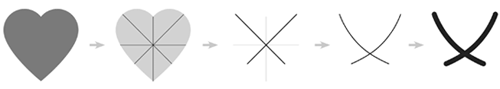
So what did Brand New come up with? A cross, essentially, a cross that sort of looks like a V. Made from the diagonal axes of the heart symbol, curved a bit to soften them up, and vertically orientable to indicate availability, it’s iconic and reasonably flexible, and the suggested application on Facebook and the like is pretty nice. The thing is, with those colours it really reminds me of the brands for the Pink Ribbon Campaign and Breakthrough Breast Cancer. If I saw this symbol without knowing its origins, I’d assume it was part of the branding for one of these two charities, and given that Valentine’s isn’t serious, and breast cancer is, this is a problem. Also, it’s too reliant on accurate reproduction of those gentle curves. In most people’s hands it’ll just be a plain ‘X’, a symbol of affection certainly, but not quite the heartfelt romantic love you’re trying to get across. So as much as I respect Armin and Bryony, I think this symbol is a dud. It’s too serious, too cold, too (sorry) dull. It’s based on diagonals across a heart, so it’s based on a heart. Why not use a heart symbol then?
What defines the new curves on the cross? Where do they come from? It’s all a bit arbitrary.
And this is the root of it. We already have a set of well-recognised, simple, straightforward symbols we use to indicate romance and love, and we have a very flexible brand palette, ranging from rose pink to carmine red. The biological (and anatomical) associations with the colour are pretty obvious, and happily elicit a strong emotional response of exactly the sort we’re looking for with Valentine’s Day. No other colour does the job; for example even if Tiffany Blue is a welcome sight for some on Valentine’s Day, it’s not the colour that people will ever associate with love, just merely one of the benefits of it.
So, let’s look at the symbols of love and Valentine’s Day, then. What do we have?
The Heart
Hearts on everything! This surely is the main thing everyone associates with Valentine’s Day. It’s simple, obvious, easy to draw, recognisable, and even has a kind of logic to it. It may not be a perfect image of a human heart, but it’s close enough — the way it’s usually drawn, it’s round, plump, healthy, it’s a symbol of fullness, of comfort, of abundance. It’s even the symbol Armin and Bryony started with to create their cross, so why gild the lily?
Cupid
The god of erotic love, we all recognise Cupid; the winged, plump little boy carrying a bow and arrow. These days he’s pretty much interchangeable with the legions of generic winged babies floating around with ribbons, hearts, garlands of flowers and the rest. They’re often called cherubs, but these aren’t the four-winged, four-faced, ninth-rank angels from the Bible at all, so while there’s not going to be much confusion, you can call them putti. Whatever you call them, they’re often depicted doing something slightly mischievous; Cupid represents the impulsive and childish nature of love. He is anything but serious, he is newborn love personified. In a literal sense too, he represents that ultimate product and beneficiary of love - the child.
Roses
What better symbol of romantic love than the genitals of a plant? I guess a picture of our own organs would be considered a little forward and might embarrass the waiter at that nice restaurant you’re at. People give all sorts of flowers on Valentine’s Day, but it’s the rose, the red rose that’s become the ultimate gift of love. It’s the richness of colour, the fullness of the shape of the flower, the heady scent, they’re beautiful and inspire our senses. They’re also a bit pricey around Valentine’s Day, so to be cynical for a moment, they say, “Look, you’re worth me shelling out for these things, even if they are going to be dead tomorrow”.
Food
Chocolates, sweets, a nice meal – a gift of food has been a tangible sign of love for as long as we can tell. It has to be something rich and indulgent, preferably sweet, uncommon and yes, expensive. In the past, honey was the acme of sweets, to get at it you usually had to kill the hive (and face the angry bees), and that made it much, much more expensive. It’s no accident that we have a honeymoon (not exactly an everyday occurrence) and that the promised land was described as a land of milk and honey. Giving a gift of honey to your beloved showed that you were willing to spend money on them, and that you had it to spend. Commercialisation is hardly new when it comes to love.
The Brand
I think the branding of St Valentine’s Day is pretty much perfect. It fulfils everything it needs to do. Sure, it can be tasteless and crass, but it can be refined and beautiful too. You’ve four symbols with which to express your love, the abstract heart, the figurative cupid, the symbolic flowers and the tangible gifts of food, and you have a colour scheme you can use to brand any additional gifts and accessories, lingerie, wines, foods, lighting, and so on — you can simply do whatever you want with them.
Valentine’s Day is an incredibly democratic event; the barriers are low, the incentive to be creative high, and the rewards of success extraordinary.
And, of course, you can refuse to have anything to do with it and grumble about all these grinning idiots facehugging all over the damn place and upsetting the horses. Clearly, that’s the sensible opinion, held by all right-thinking people, which, I guess, is the point.
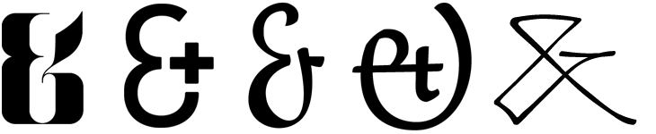
There seems to be a lot of ampersand-related activity about at the moment. Ampersands are of course beautiful things, and occupy a special place in most designers hearts, so you’d expect there to be a constant low-level hum of ampersand appreciation online, but two projects came up recently that are particularly interesting.
The first is a straightforward commercial venture, by Haäfe and Haph, who have designed a set of 10 display ampersands, on sale for $9.99. That’s less than seven quid! Of course I bought the set, how could I not, for I am weak:
The second project is Font Aid IV, organised by the Society for Typographic Aficionados to raise money for the earthquake rescue and reconstruction in Haiti. The idea is to get submissions for ampersand designs from loads of designers, assemble them together into a font and sell it, giving all the profits to Doctors Without Borders. Yves Peters wrote a bit more about the project on the FontFeed here, and there’s a good selection of submissions on this Typophile thread. Some of them are really rather lovely — a few of my favourites are below — I look forward to the font being available to buy:
From left to right, submissions by Sulekha Rajkumar, Jos Buivenga, Victor Zuniga, Oleg Macujev and Anderson Maschio. I curse my own talents for procrastination for not doing one myself.
Another recent post is this one by Alex on ISO50, showing some of his favourite ampersands and talking of the variations in the ampersand and the challenges in drawing the symbol. There’s also a calendar project showing a different ampersand every day, 300&65 and a whole blog about ampersands, called (you guessed it) Ampersand.
Then of course there’s Hoefler & Frere-Jones’ middle name, with historical information on the various forms of ampersands and how they appear in H&FJ fonts.
I can end this post with an appropriate quote from Bringhurst, “In heads and titles, use the best available ampersand”. You’ve a lot of choice, even online — even more if you use a font service, or some other method for showing type online.
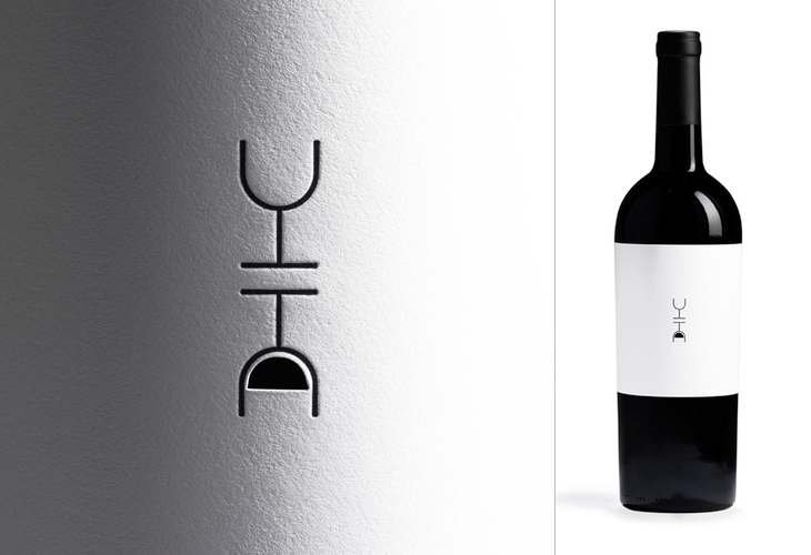
There’s quite a few things I’ve been meaning to post about lately. One of them is this post by FPO on Siquis’ annual gift to their clients — a bottle of wine — but more specifically, the label. It’s a nice idea, every year a different designer gets to design the wine label, and this year’s designer, Greg Bennett, focussed on optimism — the old question, is the glass half full or half empty? Of course, with the ‘full’ side of the glass being a cutout that you can (theoretically) see the wine through, and reversed, if you want to see it you’ll end up pouring out some wine, thereby filling your glass. Of course, that assumes you’ve opened the bottle (and have a glass), which I guess is the point — it’s a subtle way of saying, “drink me”.
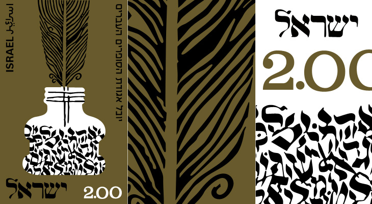
Related to the previous post, I’ve also found this collection of stamp designs. There are a lot here from the Mid Century Modern aesthetic too, including this beautiful Israeli stamp celebrating the Hebrew Writers Guild. I love the irregularity of the numerals, the complex detail in the design, and the pleasing visual metaphor:
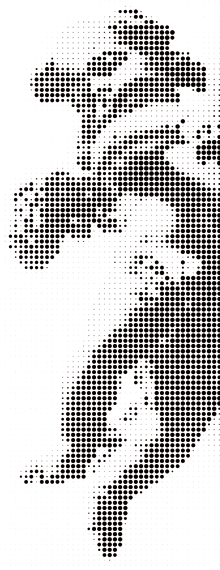
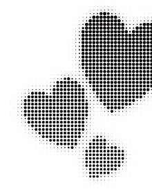
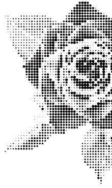
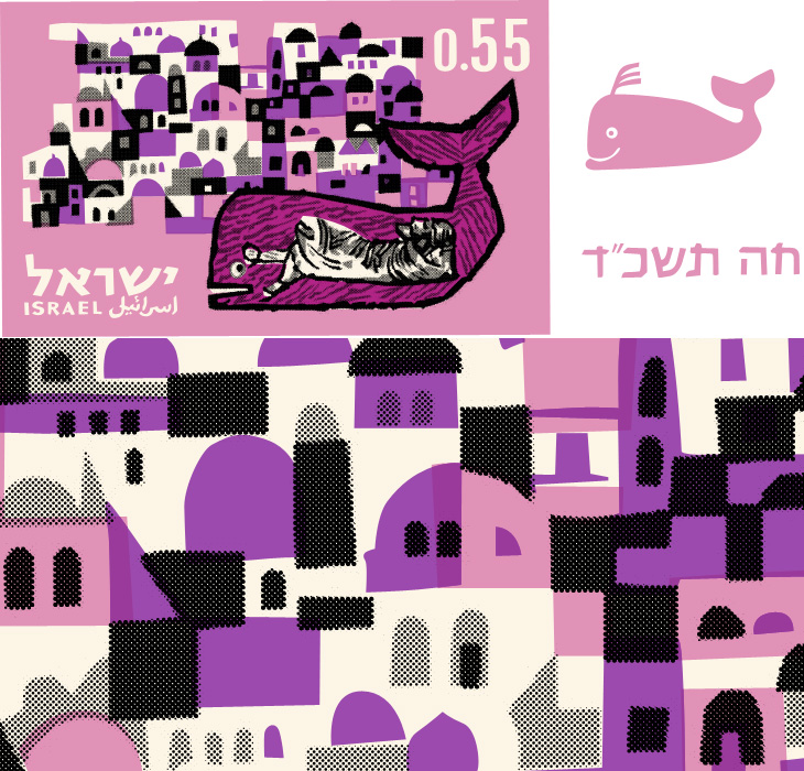
Browsing Grain Edit earlier I saw a sidebar link to the Mid Century Modern - Sticker, Label + Stamp Club on Flickr. The title describes it pretty well, but with 1804 items (as of writing) the scope of the collection is pretty breathtaking. I sometimes wonder at all the collections of mid-century stuff online, there’s a hell of a lot of it out there and I enjoy finding new collections like this, but will I tire of it at some point? Perhaps it’s old enough now so that most of the crap to have been edited out — long composted in landfills or left to crumble in attics and the backs of garages — and what we’re seeing is genuinely timeless, quality design. I certainly hope that’s what it is. For now, I’m happy to have found this collection, and even happier to have the time to spend tracing a few things, like this Israeli stamp illustrating the story of Jonah and The Whale:
The pattern of buildings reminds me of the illustrations from books of biblical stories I was given to read as a kid. The pink whale on the right is from the detachable tab that comes with the stamp.
I didn’t fancy leaving it all as flat colour — much of the appeal here comes from the simplicity of the printing, especially the visible halftoning — so I took the shapes I’d made for the two tones of black and used Vectoraster* to create the halftones, and I’m quite pleased with the result. Illustrator wasn’t though; my attempt at doing halftones for the pinks crashed it pretty comprehensively.
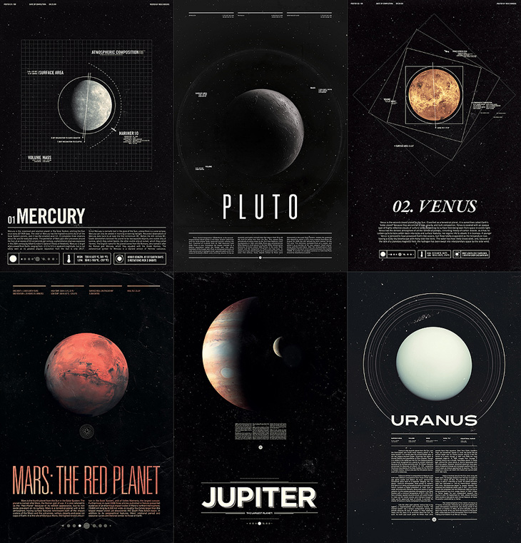
These posters by Ross Berens are beautiful. I’d love to see them higher resolution, and on nice paper, printed with archival inks, and yes, pretty much on my wall. They’re of all nine of the planets and their moons we knew before 2006*, with various details of their atmospheres, orbits and other features displayed using a range of infographic styles. They remind me of the posters and books I had as a child, but of far higher quality — these look like something you’d get from NASA itself, or today, the Science Museum. Lovely things.