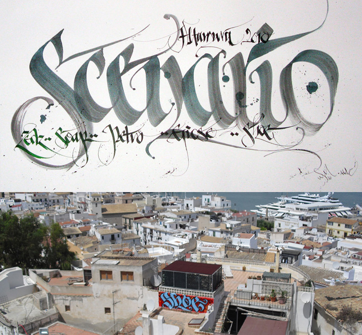
I was convinced I’d written about Shoe before, but it turns out I haven’t. Shoe, or Niels Shoe Meulman, is the master of calligraphic graffiti, creating the label for the artform of calligraffiti - also the name of his site. I must have seen examples of his work in books and photos hundreds of times, yet sadly not in real life. I don’t think I have anyway. I’d have hoped I’d have noticed. So yes, go and look at his site, there are more pictures of his work, a rather impressive bio, and a nice story on the nature of creative work too.
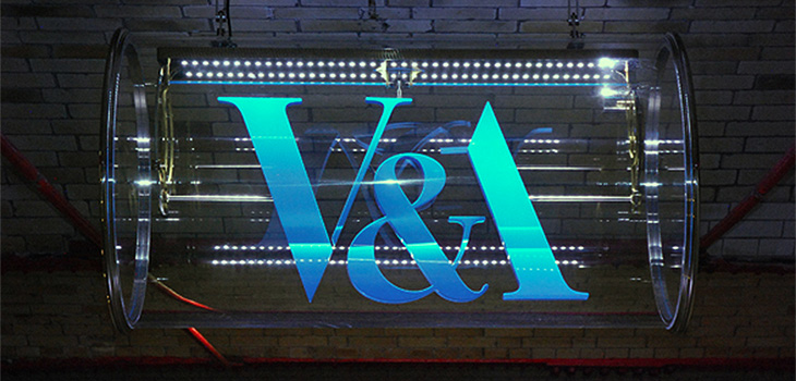
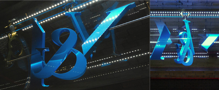
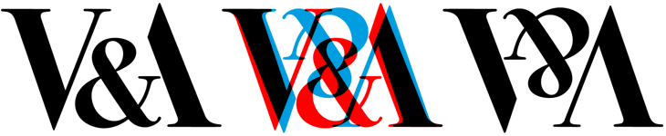
This new sign for the V&A is wonderful. The museum commissioned Troika to make a sign for the tunnel connecting the museum and South Kensington tube station, and it’s bloody gorgeous. It’s a kinetic sculpture, rotating parts of the museum’s logo (in itself a wonderful thing, by Alan Fletcher in 1989) so that it reads at first from one side, and then from the other. I did wonder at first whether the V and A on Fletcher’s original logo were actually rotationally symmetric, and no, of course they aren’t, but for a sculpture like this the alteration to make them work like that isn’t at all noticeable. Go and watch the video (or of course, visit the museum) to see it in action. It’s so simple and yet so clever, whoever came up with the idea must have been quite pleased with themselves, and justifiably so.
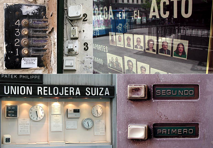
Me Design Magazine highlighted this fascinating project, While Stocks Last by designer Leandro Lattes; a massive collection of photos of Madrid, across two books, documenting the incidental details of the city; shop signs, intercom buzzers, bars, cafés and the like. I’m normally pretty wary of ‘found type’ collections as they tend to lack any kind of context, analysis or insight — or indeed any sense that they are curated, but what makes this different is the restriction to the one city, and the intent to document things that are likely to disappear without record. There’s very much the power of the collection going on with projects like this; individually the objects and scenes may have some interest, but all together like this they draw you in — the similarities and differences become compelling and before you know it you’ve lost an hour or two. Go and take a look.
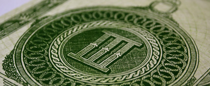
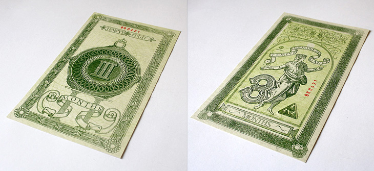
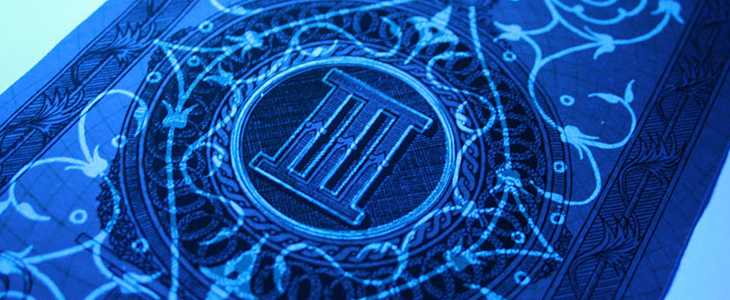
Xavi García is a student at Central St. Martins, and recently produced this banknote-inspired piece, which I find quite beautiful. It’s entirely hand-drawn and has an impressive array of security features: watermarks, UV-responsive inks and see-through images — the attention to detail here is absolutely perfect. There’s a few images here, but go and look at Xavi’s site for more. Interestingly, he’s also a student of Kenn Munk, who I wrote about before here.
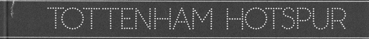
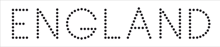
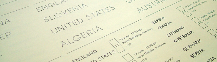
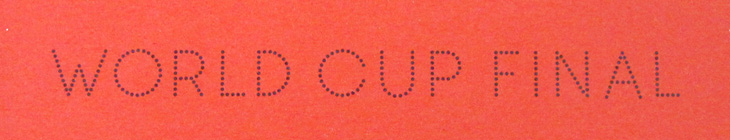
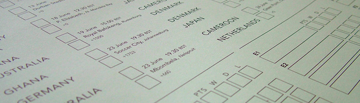
I wasn’t expecting to have anything to write about that was football-related, even during such a big event as the World Cup, but wonders never cease. When Benjamin Prescott mailed me about a personal project to create and sell limited edition World Cup wall charts he’d designed I had a big of trouble thinking what it was for — I’m so out of touch with such things. I mean, yes, I’ve a theoretical knowledge of the offside rule (something that’s talked about as if it’s one of the Great Mysteries of the Ancients) and yes, I played it at school, but the whole yelling-at-the-tv, wearing team colours and flying the flag kind of thing always passed me by. Still, I know enough people who like it all (so I can ask), and as it turned out I was just re-reading the email when I noticed I was sat right next to one of the wall charts, and a lovely thing it is too! What really interested me in it was the recreation of the typeface from Subbuteo scoreboard references — I like lettering and illustrations made from dots anyway so this was a nice find, and it works well with the Avenir used on the rest of the chart too. The wallcharts are limited edition, so I hope I’m not too late in writing about them and you can still get one if you want one.
An original Subbuteo reference and a sample of Prescott’s redrawing.
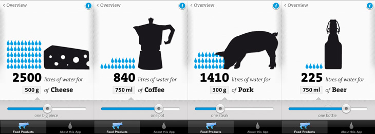
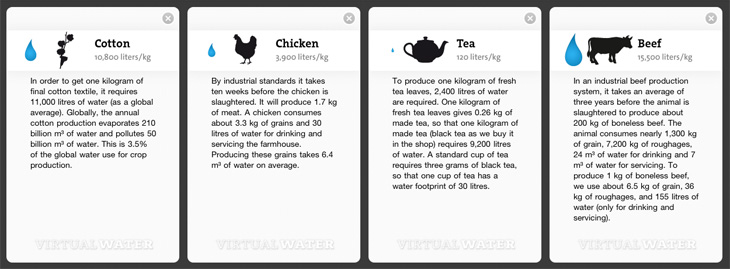
I remember seeing, and liking, the first edition of the Virtual Water poster, and I see now there’s not only a new version but an iPhone app, which has even more information in it. I particularly like the visual style of the project — the simple black silhouettes and the blue accent colour work beautifully (a combo you may notice I rather like already), and the bold, slab-serif typeface (see below) just looks perfect. The little info cards behind each item are nicely laid out too, reminding me of classic recipe cards (or cocktail bar cards), and the short sharp explanations and consistent use of units back up the infographics nicely.
Some screens from the app. I like the indicator of the ‘usual’ amounts on the slider.The background info cards.
I’m guessing the face is TheSerif Classic by Luc de Groot), though for unknown reasons I’ve never used it, it looks so incredibly familiar that I was convinced I must have. But, I hadn’t. How very odd! I may have to remedy the situation soon.
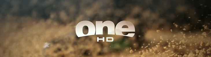
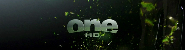
John Beohm of Idents.tv posted the six new idents for Australia’s ONE HD tv channel — I don’t have much to say on them other than they’re lovely and simple and I really like the logo. As John points out, it’s good that they avoid the crass overdone clichés of floodlit stadia and huge billboards, generally I don’t find myself watching sports channels but of what I’ve seen their idents (and identities) are all pretty much of a muchness. Lots of glassy, glossy, glittery effects, dramatic perspectives across giant dystopian stadia-cities shrouded in perpetual night; the impression you’re supposed to get is that this is epic, this is a clash of titans, a great battle to end all battles, an extraordinary experience that will resonate through time and space, this is it, and then, just as you’re (theoretically) driven to the very peak of excitement and anticipation, here’s the golf. Woo.
So yes, it’s nice to have a set of idents that have some of the actual sporting action in them. The logo looks to be a very slightly tweaked Helvetica Black — the version I have has a slightly wider aperture in the lowercase e (but it could just be the 3D rendering creating the illusion). The curve cut out of the bottom hints slightly of the epic view-over-the-horizon style of usual sports channel logos, but it’s subtly executed and provides a perfect frame for the HD suffix. Anyway, slightly more than I was intending to write on this one. It’s nice. Go and watch the videos on Idents.tv.
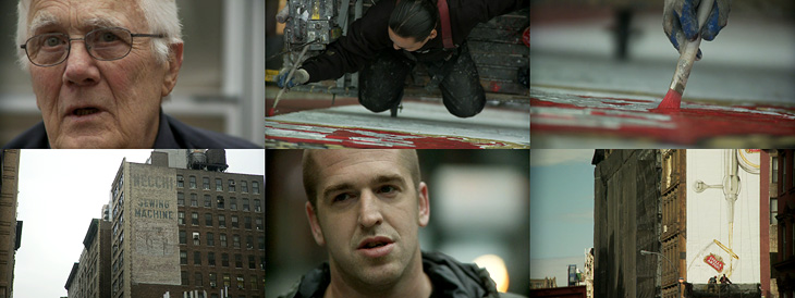
Up There is one of those things that’s been linked to like crazy across Twitter and most of the sites I read, but I’d not got around to watching it. I find that with a lot of online video, I mark it to watch later when I’ve a bit of time to devote to it and then, well, don’t get around to it. So, if you’re like me and haven’t seen this yet, I do recommend watching it. It’s only 12 minutes, very well composed and edited and really gives you an insight into the work of people who hand paint signs and adverts on the sides of buildings. It’s a craft that (not surprisingly) is dying out, but one that can be kept alive by commissions from a few enlightened companies and agencies. The film was sponsored by Stella Artois who, as JJ from Graphicology points out, are producing more narrative-based advertising lately. Kudos to them for this, I’ve a lot more respect for Stella Artois the company now. Less said about the lager.
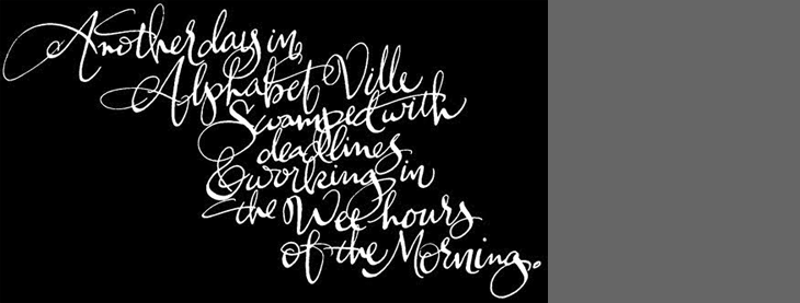
Another link to the ever-inspiring The Art of Hand Lettering, this script is beautiful. I love the composition and the flow of the letterforms, the even colour across the lettering takes my breath away, and it was all done by hand, late at night. I guess that’s the sign of an expert, no? Lovely. Go and take a look at more of his work.
It’s been around for millennia, but concrete is a building material that pretty much defines the architecture of the modern era. The reconstruction efforts after the second world war really got the world interested in concrete in a big way — it allowed for rapid, economical construction of vast numbers of apartments, factories, malls, roads and more, and made tall buildings commonplace.
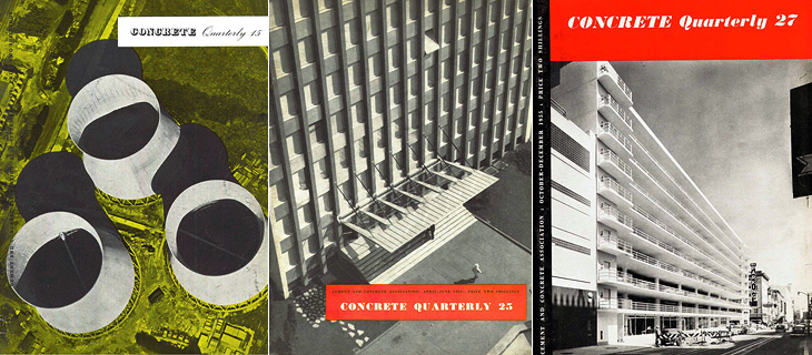
Of course, while not exactly a new building material, the uses we put it to often were. We know all too well the grey, crumbling monoliths, the remains of ill-conceived and badly built projects blighting our cities and towns, but too rarely do people celebrate the truly wonderful concrete buildings we have — from cathedrals to offices, shops and homes to soaring bridges, roads and basic utilitarian buildings, it’s an incredibly flexible and often beautiful building material. This is, I guess, what the Concrete Quarterly was designed to highlight. I’ve only read some of the earlier editions, but right from the first issue it talks of the diversity of uses of concrete; bridges, home developments and motorways all built with the stuff. Perhaps this variety is what’s influenced the design of the magazine over the years. Not until the 60s does it gain any kind of design consistency — in the 50s barely three or four editions are alike. Not that that’s really a bad thing, as some of the early covers are just gorgeous:
Incredibly lovely
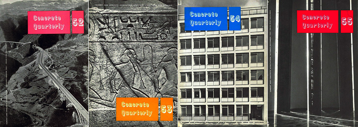
I was browsing through wondering if I could spot any familiar projects, and lo, in the Winter 1962 issue there’s a cover article on Coventry Cathedral, one of my favourite buildings, which I’ve written about before here.
I think this was the first year with all four issues alike. That’s Coventry Cathedral on Issue 55.
Even within the same issue the headline styles vary considerably, and sometimes even the body type too. It makes for a slightly odd effect, but on the whole I think it works — it all ends up being rather charming. This one is wonderful on so many levels. Belgian Roads! What a subject!
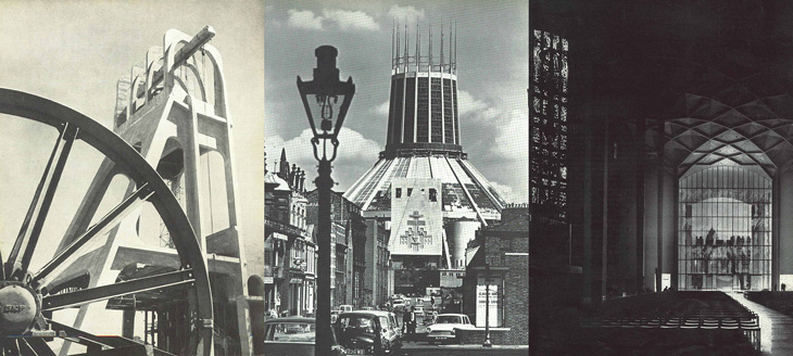
It’s worth having a look through the archives as there are many beautiful photos in there. I was delighted to see some photos of Liverpool Cathedral, which I visited many years ago and loved right away — I gather it’s not really all that popular locally but I think it’s great. Perhaps I just like anything with lots of stained glass in it.
The Stilfontein Mine in 1952, Liverpool Cathedral in 1967; and Coventry Cathedral in 1962