The rebranding of UKTV’s channel lineup has been going on for a while now; every couple of months another of their channels gets a new name and identity, and the original, extraordinarily pleasant and consistent network branding (at right) takes another step closer to oblivion. One of the recent rebrands was for UKTV Style, which got a pretty dreadful implementation of a reasonably nice idea - David Earls wrote more about that on Typographer.org. Next to go is UKTV Food, which will get a logo more suited to a free supermarket magazine (it really reminds me of the old Sainsbury’s one).
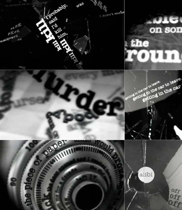
I guess you could say I’m not much of a fan of the overall quality of the rebrand, but there are a few good bits in there - Dave, Blighty and Eden are quite pleasant, with some nice ident work. My favourite by far though is Alibi, previously UKTV Drama. They’ve gone for a treatment reminiscent of your fashionable dynamic typography, but incorporated imagery of escape, fear, crime and violence. The typewriter typeface is perhaps a little cliché for the genre, done to death in countless private investigator made-for-tv stuff, but the stylish animation rescues it, keeping the familiar associations while providing some originality and freshness. There’s a montage of the channel idents here, and I’ve a few screenshots below.
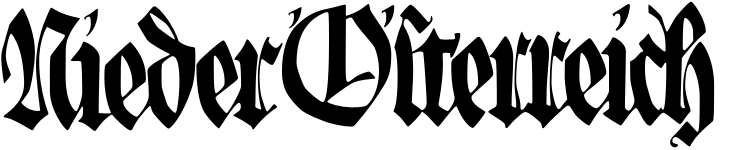
A while back Jo at Languste Fonts sent me a link to the collection of the Austrian Museum of Applied and Contemporary Arts. Their collections site is pretty huge, with sections for ornamental and woodblock prints, textiles, drawings, and posters. Lots and lots of posters. They’re arranged in categories, but the best thing is just to keep clicking through them and enjoy the variety - there’s some pretty gorgeous lettering, type and illustration in there. I’ve (of course) traced some of it, and I love the blackletter calligraphy below. I’d link to the page, but it’s one of those sites that doesn’t have unique URLs for things. Just search for Nieder Österreich and it’ll be in there somewhere.
The lettering on this one is beautiful; it’s so expressive and playful! Shame the illustration wasn’t finished to the same quality, even though the overall effect is still rather attractive.
While I liked the lettering on this, it was the illustration that caught my eye - it’d make a good poster in its own right.
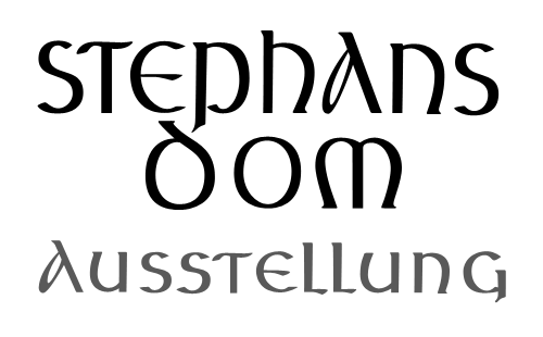
This beautiful uncial lettering is from this poster, showing the tower and spire of St Stephen’s Cathedral in Vienna, which I traced on another poster here.
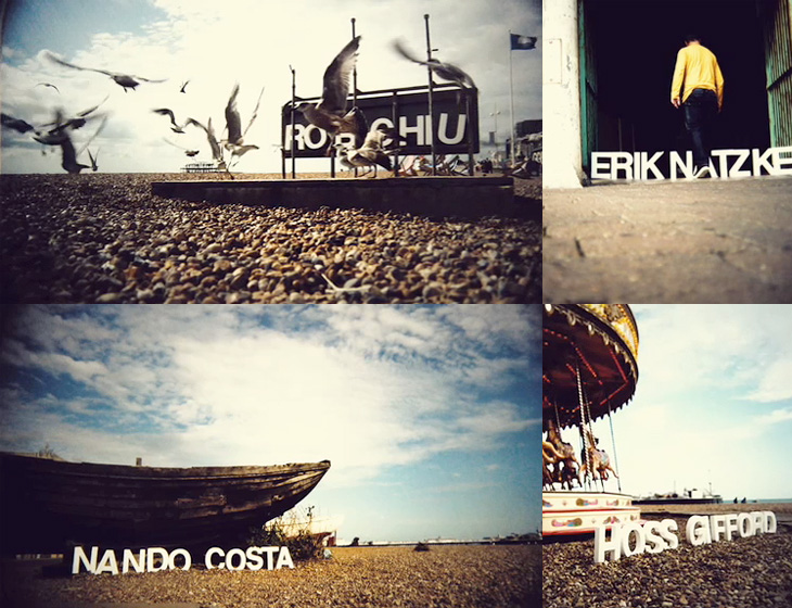
Monoscope linked to the showreel of Rob Chiu the other day, it’s definitely worth a look, but one thing that particularly caught my eye was this piece for Flash on the Beach. It’s a conference that happens every year in Brighton, and these days is more about everything Adobe and everything design than Flash specifically. I think a big part of the appeal is seeing the nicely composed shots of the Brighton seafront with the letters arranged in the scene (and frequently getting blown over). It’s nice to see some of the reactions of people walking past too. That’s it really. It’s nice. Go and look.
This Thursday just gone, Matthew Carter presented the fourth annual Justin Howes Memorial Lecture for the St Bride Library, Genuine Imitations, a type designer’s view of revivals, and I was lucky enough to get a ticket for it. All the tickets went in two hours, and St Bride moved the event to Conway Hall to allow more people to go, yet even after that there was a waiting list!
I’ve written up the talk for I Love Typography, so head on over there to read all about it - it’s quite long, but Carter made some good points that I found rather inspirational, and I hope you will too.
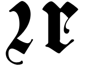
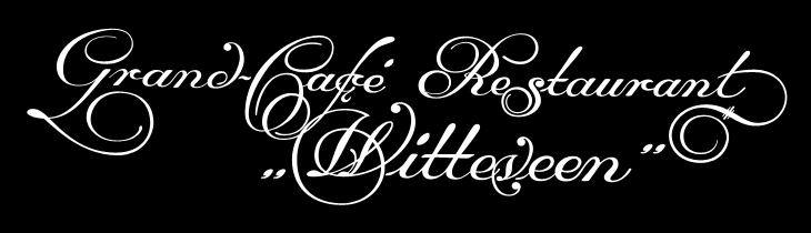
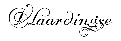
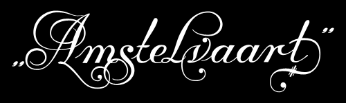
Another gem found through Coudal, this. Re-Type posted an article about the beautiful lettering by Leo Beukeboom on the windows of bars and cafes in Amsterdam (with a nice appreciation of decent, old-style, non-trendy bars in there too). There’s a series of photos with the article, which I’ve traced the lettering from (below), and as a bonus Re-Type themselves are working on interpreting the lettering into an Opentype face, which so far looks great - can’t wait to see it finished.
I did a bit of hunting around for more information on Beukeboom, and found this article on David Quay’s site, containing a lot of background information and an interview, which is fascinating and well worth a read. I’m particularly taken by this:
The letter you use on a pub window depends on the type of pub. If you have a traditional brown café, with lace curtains on copper curtain rods, with stained glass windows, you choose a nice, ornamental curly letter, because it fits in with the environment. It is not the information that counts, because everyone can tell it’s a café, but it’s about decoration, about creating an atmosphere. For the lettering on the traditional brown cafés I developed my own script based on the calligraphy of Jan van den Velde.Leo Beukeboom, from David Quay Design
I love that. The words themselves become secondary to the style in conveying information - without knowing what it says, you know what it says. Certainly not an infallible system, but most types of place (and many things) have their signature look, and as I’ve posted before (warning, extremely wordy article) you should know what you’re doing before you mess with it. They’re the design patterns of urban existence, if you will, though in the case of Beukeboom’s lettering, this is one that is slowly fading - unless anyone wants to become his apprentice that is. If he still wants one.
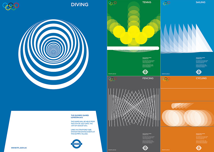
I am indebted to Adrian Giddings for finding the originals of these images. I saw them on Design Crush, and from there to ffffound and from there… a blank. Blogger really needs some kind of reverse lookup for their dreadful impenetrable image URLs, and ffffound needs to better record the URL of the page containing the image. Still, I now know where these posters are from. They’re clever, simple, and have a graphic elegance reminiscent of Otl Aicher’s work for the 1972 Munich Olympics, with typography that is pure London. If Wolf Olins had gone down this route I’m sure there would have been far less controversy about the branding for London 2012.
Of course, these are proposals designed to work with the Transport for London branding, not for the Olympics, and I think work perfectly in that context. For the Olympics itself, for all their cleverness and simplicity, they’d be a bit too classic Olympics, a little too safe. Perhaps.
As for the actual 2012 logo/brand, it’s has been out for quite a while now, but I’m still not entirely sure yet what I think of it - I don’t like it, but it may be exactly right for the event. We won’t really know until after the Olympics, and then, no doubt, we’ll have plenty of learned analyses about it to tell us what to think. I wonder how agnostic I’ll be able to be.
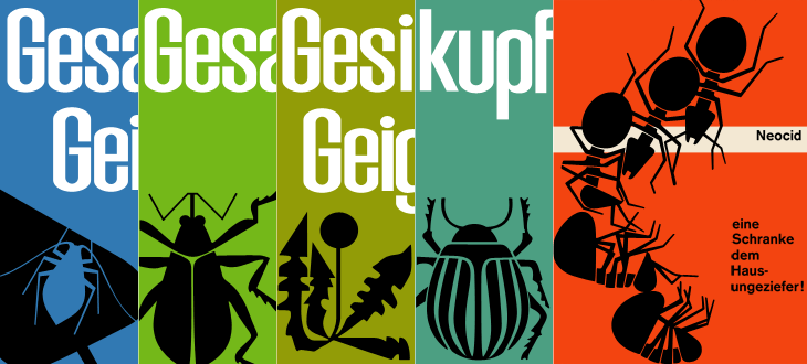
While browsing Ffffound I, er, found a few of the images from this article on Things To Look At on a new book about Geigy’s design and advertising. Some of the examples just call out to be traced - especially the bugs on the pesticide packaging. The illustration for Neocid is quite gloriously morbid - there’s no doubt at all what this stuff is designed to do, even without reading the tagline, “A barrier to house vermin”. The thin white barrier - of death.
Organic this isn’t. I have of course re-composed the elements for the four left-most tracings.
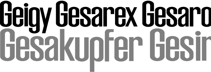
The examples make pretty consistent use of (I would guess) Berthold’s Akzidenz Grotesk, with a few other bits of interesting lettering on things like the herbicide and pesticide packaging above. I traced as best I could the letters from the photos, and though I’m not sure what typeface it is (if it is even a typeface) because of the flat curves and how closed the letterforms are, it reminds me just a little bit of House Gothic 23.
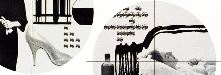
One thing that interests me on some of the examples is the Geigy roundel logo (at right). It’s so at odds with the simple wordmark used elsewhere, and with this other logo on Grain Edit, that I’m wondering where it came from - and where it went. I’m not saying it’s any great loss - I find it rather ugly - but it is very curious, and I will admit the treatment of it in one of the examples (detail below) is rather appealing. Does it have historical relevance I wonder?
The roundel works better as a design element than as a logo.
It’s a logo that works best in multiples, which might explain why it went. Perhaps the book has the answer. And on that note, I would link directly to the book on the publisher’s site, but they don’t have individual pages for them so I can’t. It’s in this list. Look for dolphins.
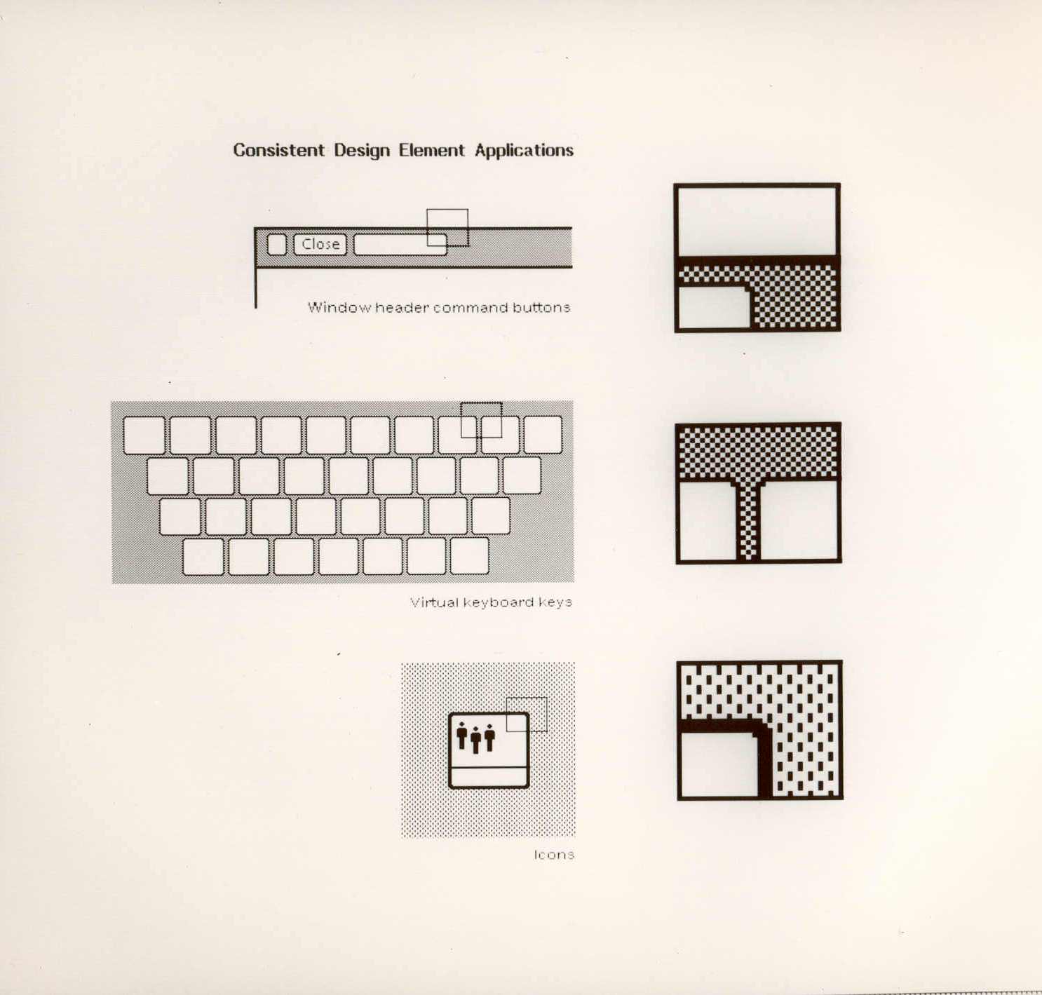
A couple of weeks ago ISO50 linked to this set of polaroids of the Xerox Star user interface on Digibarn, and I’ve been looking back at them on and off since. The UI has some interesting little details; it was designed for a two-colour display, so used a couple of dithered patterns to create the grey shading on the desktop background and window titles, which in turn created a few problems for the designers. To get a neat, crisp interface, icons and windows have to be sized and positioned on the background so that the black and white dots don’t interfere with the outlines and create a kind of blur or eye dirt effect. The polaroids show some of the design notes and instructions for doing this; it’s a lovely illustration of the attention to detail they employed to make the best of a technological limitation. Rather than recreate them directly (you can see the originals here, and here) I’ve redrawn a bit of the UI here, with ideal alignment on the left and detail top right:
The difference a pixel makes.
If I’m to get preachy (and ranty) for a moment, I think it’s a task any designer should attempt as part of their education - what you learn from designing for such a restricted display helps with all sorts of design tasks later; you learn what causes a lot of those visual disruptions and artifacts that you catch from a quick glance or out of the corner of your eye. It may be subtle, but it’s the kind of thing that reduces the overall apparent quality of your work, the stuff that marks out your work as being standard (read: mediocre) or exceptional. If you feel you shouldn’t get precious about such things, perhaps graphic design isn’t your thing.
How the icons are laid out on the desktop. The big flaw I see in this design, still not fully solved in desktop UIs today, is the display of longer filenames when displaying icons in a grid. They’re either truncated or hideously force-wrapped. Ouch.
As others have noted, the UI at first seems remarkable for its apparent modernity, the conventions it uses are still ones we use today; with a graphical update to it you’d get a reasonable facsimile of any windowed GUI of the past few decades. The designers at Xerox clearly did a remarkable job, addressing so many design problems at once, with solutions so good that almost three decades of development haven’t significantly improved on them. We could throw up our hands as a result and say that this is clearly it, that nothing new can be done, but apart from being depressing, this would miss a couple of important (to me) points:
The hardware configuration of a desktop computer has barely changed - we still use a mouse (or equivalent), a keyboard (however fancy and bristling with hotkeys it is) and a screen (whatever the technology, it’s still a 2D array of pixels)
We haven’t changed - we’re still human beings.
Essentially, we are still the same configuration of limbs and sensory organs using the same configuration of display and input devices. It’s when we change either of those configurations that we see where all the real innovation has been. Adaptive and assistive technologies are developing faster and faster as component prices fall and previously isolated innovators are connected and share information online, and in tandem with this we see the spread of input technologies that enable methods such as touch, voice and gesture. We can hope that these technologies become widespread enough to change the design of the traditional desktop, or even make it obsolete, and that leads me nicely onto…
A futurist digression
Heading off into the realms of the futurist for a moment, I think a lot of attention has been given to display-related technologies such as 3D/holograms, but not even sci-fi has come up with anything really remarkable with the idea - oh sure, you can create a hologram of a keyboard, or a touch screen, but those merely address matters of convenience: you don’t have to store the thing when it’s switched off. The interfaces we see in films are mostly still all about manipulating pictograms. What I’m really interested in are the kinds of interface that use our other senses, interfaces that seem less flashy and appear almost mundane such as vibration (as in mobile phones), things like the sleep indicator on Apple computers and potentially most importantly, speech.
Forget flying cars, we’ll know it’s the future when we can talk to our computers, just like in Star Trek, but hopefully not quite like in 2001: A Space Odyssey.
I keep meaning to post about Preserve. I had the image ready and everything, then Mark tells me about a big update to the site. It’s a project to record the painted signs on old buildings and other parts of the urban fabric before they fade completely, are painted over or are destroyed by demolition. Most of the pictures are of New Zealand buildings, but there are a few from elsewhere, including a great Bovril one in Brixton below.
The project also invites contributions, so you can help expand the scope of the site. I think something the site does need is a bit more context - it’s a general complaint I have about the subject of “found type” in general: the lack of context or place in the images. They are nice to look at though, so perhaps I shouldn’t complain too much.
On the topic of found type, you may also be interested in the archive of Found Type Friday posts on Ace Jet 170. There’s some beautiful examples in there, so take a look. There are several pages of it, the pagination link is the little ‘»’ at the bottom.
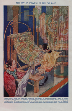
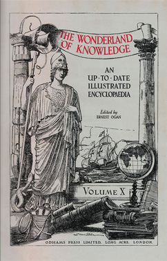
About 25 years ago I was given a full set of 1930s-era encyclopædias, The Wonderland of Knowledge, and I’m glad to still have them in good condition, countless house moves and two burglaries later. They’re fascinating things, with lots of illustrations and an engaging conversational style written to appeal (I guess) to older children. The illustrations are remarkable and are frequently quite beautiful. Each volume has a full colour frontispiece, colour and monochrome inserts throughout and many photos and diagrams in the text.
The beautiful frontispiece for Volume Ⅰ, painted by Charles Robinson.
Left: A sample of one of the rotary photogravure inserts. Centre and right: The frontispiece and title page for Volume Ⅹ. You can click each image for a larger version on Flickr.
The content, however, is very much of its time, with antiquated attitudes to race, nationality, gender and so on, and some interesting attitudes to the portrayal of history itself; this account of Oliver Cromwell, for example, shows how anything negative or critical is delicately avoided. Perhaps youngsters weren’t to be troubled with such complexities?
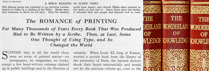
On the less-contentious subjects of science and technology there are some good articles, and some of them stand as being pretty informative and relevant today, including the one I’ve taken the title from for this post, The Romance of Printing. It’s a pretty good primer on the history and techniques of printing, covering ancient origins through Gutenberg and Caxton up to linotype and monotype machines, braille printing, etching, lithography and photogravure. I’ve put it up on Flickr in quite high resolution so you can have a read and see it in all its glory. I’ve also got a lower-resolution PDF here.
A detail of the type styles used, and of the gold blocking on the spine.
When the article gets to a description of the monotype process, there’s a little clue to the typeface used in the books. I did wonder what it was, but never got around to looking it up; it always seemed such a characteristic part of the books that I’d never really thought of it being something used elsewhere too:
So yes indeedy, from that little snippet it’s not a great mental leap to assume the typeface is the original of this Monotype Old Style, with optical weights for the captions and the indices that aren’t included in the digitised version.
The main reason I’d wondered about the typeface was because I did once have a completely mad plan to scan in the whole encyclopædia, do some OCR on it and have it online in some format, but I quickly realised that I’d need something like this to even start the job. Scanning in just the pages for this post took several hours, and considering that without the inserts there are 6144 pages, so the chances of seeing it all online are pretty slim.


