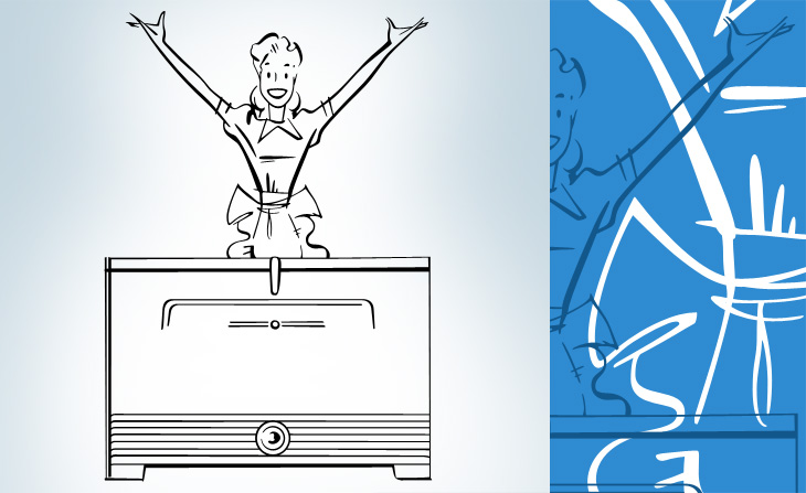
If you like mid-20th Century print advertising, and like a lot of it, then this page on diskursdisko may well be just for you. It’s a collection of links to various pools on Flickr containing hundreds of scans of old adverts and promotional materials (mostly, but not all, from the mid-20th Century), and is quite a trove of old type, lettering and illustration. I’ve found quite a few inspirational things on there, including this great General Electric illustration. It reminds me a bit of The Stepford Wives (the 1975 film, not the 2004 one) - they’re not selling freezers, they’re selling exultant joy here. I mean, if getting a GE freezer really made you that happy, wouldn’t you want one?
Gosh, doesn’t she look happy? I love the beautiful brush strokes, they’re so satisfying to trace.
I’ve linked each image to the photo page on Flickr - some have large originals, others not.
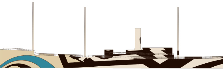
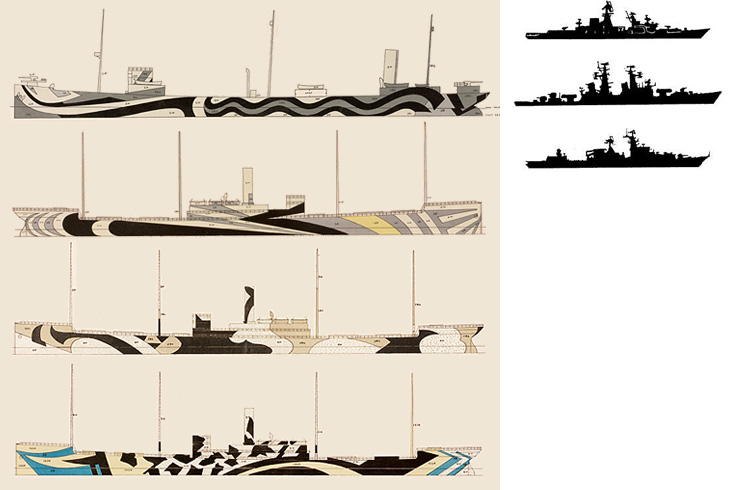
Coudal (I think) linked to this the other day. It’s a collection of designs for dazzle camouflage applied to ships during the First and Second World War to confuse the silhouette of the ship and make it less likely to be targetted by enemy subs. I got a few silhouette images (from this rather odd and boastful page) and put them next to some of the designs, and you can see why the technique gained a lot of support. The designs would at least make it hard to identify what kind of ship it is, which might help if everyone did it…
So yes, that raises the question of effectiveness. I imagine in full sun it would be quite good - literally dazzling the eye, but in an overcast, at dawn or dusk, the ship would still be silhouetted quite clearly against the sky. So what were the results? From the site:
Did it work? Dazzle and the convoy system were implemented about the same time, so it is hard to say. However, crews on dazzle ships were very proud of the bedazzled camouflage. It was definitely a morale booster. The British and the Americans fully adopted dazzle because at the time they found it to be effective and inexpensive.RISD
Tests should be done! Still, however well they worked, they’re pretty fabulous. More ships should be painted like this, just, you know, because.
Annoyingly, the RISD only has these tiny images, and I can’t find anywhere to buy prints either. There is, however, a poster from Transport for London advertising the Imperial War Museum that shows an illustration of a freshly bedazzled warship, here.
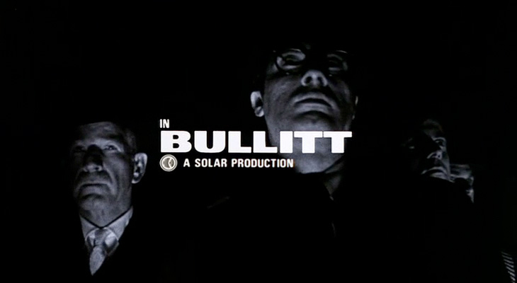
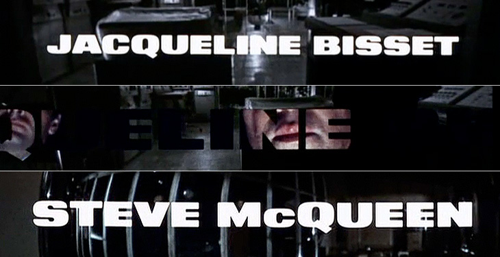
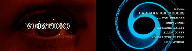
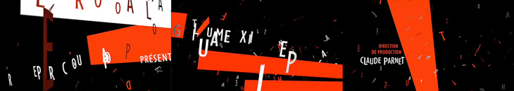
I recently rediscovered The Art of the Title Sequence site, which is a goldmine of inspiration for anyone who needs to animate type, and I’m surprised I’ve not posted about it before. Title sequences are remarkable in that they have to fulfil some important roles in a film - they’ve got to tell you who made it, who’s in it, who paid for it, in a way that complements and introduces the film (but is clearly not the film itself, so you can get all your arrangements with popcorn/noisy snacks/coughing/sneezing, etc. out of the way), and all in a short a time as possible. Those requirements provide a fertile ground for all sorts of creativity, to the extent that the title sequence becomes a genre in itself: a very specific kind of animated short; an animated infographic if you like. So we have sites like this one for people like me to trawl through and drool over lovely examples of typography, lettering and iconography. First up, one of my favourite films, Bullitt.
Isn’t that just perfect? See it as part of the full sequence, here.
When I first saw this sequence I was scrabbling for my camera to try and get some shots of the lettering, but didn’t manage to get much worthwhile. The typeface is just beautiful, and I’ve always wanted a copy of it, but after a lot of investigation it turns out there isn’t an exact digital version of it. There’s a very, very similar one called XXII Black Block, but you’ll notice that it has slanted terminals on the E and T - almost there, but not quite.
I love the way the lettering leaves a ‘hole’ in the current scene, which expands to show the next one.
Next up is Stranger Than Fiction, a film I’ve never seen but might get around to watching one day just because the title sequence is interesting. It looks like it could be great or dreadful, and nowhere in between. Either way, the title sequnce is great and makes playful use of type, instructional iconography and labelling to enhance the story. I like the way the labels for everything definitely feel like part of the main character’s world, his obsessions, so real to him, made visible (and real) in the world for us to see.
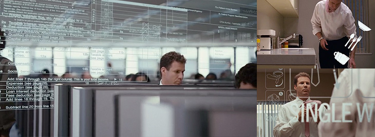
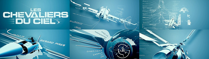
This next one is not so much about the type. It’s not really about the type at all. In fact, I hate the type in this one. The exploded diagrams are lovely and the way they tie in with the live footage of the Farnborough Air Show is highly compelling, so to have this clumsy uninspired type stuck over it is a real disappointment and a wasted opportunity. I’m including it in my favourites because you can imagine how nice it could be if a typographer had been given a chance to polish it up before delivery:
Nice graphics, shame about the type. Full sequence here.
Gradually coming back to nice type with this one - I remember, years ago, playing around with analogue electronics to draw letters and simple shapes on oscilloscope screens and though it was pretty painful it was satisfying when it worked. The animations in Tron were done this way, with the flat surfaces coloured in later by hand. The end sequence for Iron Man deliberately references these very first vector graphics with these CAD-style animations, with the type done perfectly to match:
A still from the Iron Man end sequence. Full animation here.
Next I’ve got this one which is just good solid no-frills typesetting, enlivened with great use of a close-up and, again, those vector graphics:
And last of all, a very satisfying and clever use of 3D to form the names and titles by constantly changing the camera angle. I imagine it would be a nice way to tell a short story, as I found myself watching it and reading the words quite comfortably. It’s paced very well, and the fascination you develop for how the letters come together makes it an entrancing experience:
I’ve been merrily tracing some of these Notgeld that Design Observer linked to last week. I could quite happily spend months tracing all these, they’re so beautiful. But what, I hear you cry, are Notgeld? Well to answer that, I’m going to quote from Wikipedia:
Notgeld (German for “Emergency Money” or “necessity money”) was special money issued primarily in Germany and Austria to deal with economic crisis situations such as a shortage of small change or hyperinflation. It was not issued by the central bank (Reichsbank) but by various other institutions, e.g. town savings banks, municipalities, private and state-owned firms. It was therefore not legal tender, but rather a mutually-accepted means of payment in a particular locale or site.Wikipedia
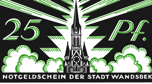
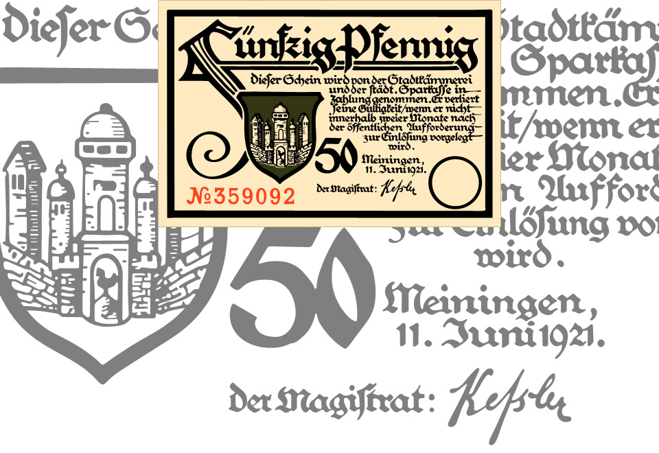
I knew about the money issued during the hyperinflation period (and posted about it too), but not about these ones. The big giveaway that this isn’t hyperinflation currency is the small denomination of the notes - 25 Pfennigs! On a banknote! The fifty pfennig one I had to trace because of that F, and unsurprisingly it’s taken me rather a lot longer that many other tracings I’ve done. The lettering was originally hand done, with all the interesting variations that implies, so no copy’n'paste shortcuts for me!
Wandsbek 25 Pfennig note, traced from this original. Click the image above for a larger version.
I love that F so much. Click the image for a larger version, or see the original here.
The local currency idea reminds me a little of a project near me, The Lewes Pound, designed to encourage local commerce in and around (you guessed it) Lewes, in East Sussex. The Lewes Pound notes are rather nice things, but I think a lot of these old German notes are actually beautiful. Indeed (and I’m basing this on Wikipedia again) Notgeld were issued for a few years after the need for them had subsided because people liked to collect them so much. I suppose having a lot of people collecting and framing your notes instead of spending it must affect the money flow a bit, so perhaps making money too beautiful isn’t a good idea. I guess that explains the designs of the US dollar and the Euro then. Ahem.
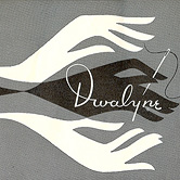
I got sent a link to Spacesick’s photostream this morning, mainly for these fantastic ‘novelisation’ covers of movies. I especially love the Close Encounters one. That, and the Temple of Doom one I want as posters. It’s the attention to detail that makes them special, the scuffmarks on the covers, the ‘repairs’ with yellowed Sellotape, as well as the quality of illustration. Great stuff. Make sure you have a look further back in the photostream too, as there’s plenty of great work in there, like this, and this. Delicate souls, easily offended by sketches of partial nudity, might not want to click that last one.
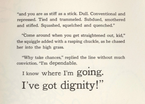
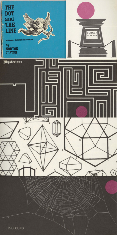
After I wrote about The Dot and the Line animation, Nigel Brachi contacted me to tell me about the book which came out a few years before the film. He kindly sent me some scans of the pages, which show just how faithfully the animators followed the drawing style. The typography of the text is often rather nice too:
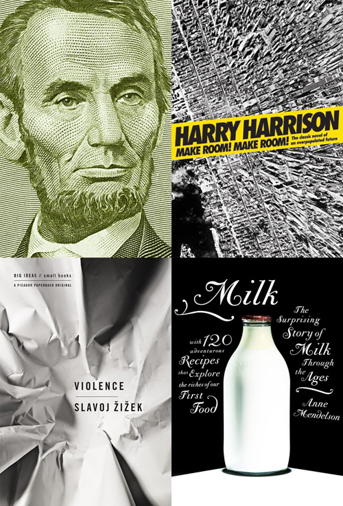
Joseph at the Book Design Review posted his favourite book cover designs of 2008. There’s some good ones in there, and makes me think I don’t read nearly enough long-form writing. I particularly like the one for “Abraham Lincoln: Great American Historians on Our Sixteenth President”, but that might just be because it’s from the five dollar note and I like banknotes… As for the others, I want to see the original of that aerial view of Manhattan, and the other two are just nice images. Go and look at the others.
This is a fantastic piece of illustration and lettering. Well worth watching. It’s all good, but some of the illustrations that I find noteworthy are the pavement-level view of walking feet (0:27), the yellow and black spread (1:04) and the multiple mouths (1:54).
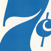
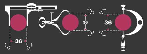
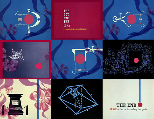
This is fantastic. I think I saw it here, linked from Design Observer first, though quite a few sites have linked to it too, but that’s no reason not to link to it again. It’s got some beautiful touches in it, with a gentle kind of humour and some reasonably groan-worthy puns. I love the little joke about the perfect proportions of the dot, playing off the classic ‘36-24-36’ hourglass proportions supposedly ideal at the time for women. The calipers are great, with the little hearts instead of arrows for the dimensions, and just demanded to be redrawn:
A few sites I’ve seen it on have lamented that things like this aren’t made anymore because it wouldn’t be popular, that people would be afraid of anything that mentions ‘hard stuff’ like mathematics. Perhaps they’re right, and maybe it is really anti-intellectualism preventing stuff like this being made today, but the animation is hardly a mathematical treatise. The only mentions of anything mathematical are the title and a few puns scattered here and there, ending in the rather nice, “To the vector go the spoils”.
The real point of this animation is the animation itself. It’s certainly not the story: a simple morality tale on the importance of hard work and discipline (and also, avoiding narrow thinking) to achieve your desire; in this case, a remarkably shallow and feckless sounding creature who is easily wowed by flashy glitz and glamour. Perhaps these days we might wonder whether that was worth all the poor line’s effort; “You can do better than that” we might say.
So the animation seems like a kind of showreel, a portfolio piece, beautifully done of course, but more remarkable in that it was released by the studio commercially. I have a little theory that it might have been released with the new technology of colour TV in mind - the audience at the time was very small and would have consisted of those who could afford it; professional, college-educated people? That might explain the choice of story too.
Pascal Blanchet has some great illustrations and artworks on his site, well worth a look. Follow a few links and you get to Drawn & Quarterly, with more of his (and many others) graphic novel work, which is definitely worth a look.