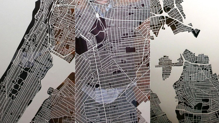
Just a little heads-up on these cutout maps by Karen O’Leary — I think they’re lovely. There’s more info on her Etsy page and here on The Jailbreak, where I found the link. O’Leary has done Paris and New York, and is planning to do London. She says she’ll take commissions for other cities too, so get in there fast if you want one as they obviously take a while to do and I think she’ll be quite busy for a while.
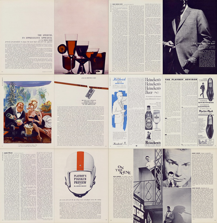
Entirely coincidentally, I get to post about another archive of a long-running and well-known magazine; this time, Playboy. John of I Love Typography tweeted a link to this, just over 50 issues of Playboy from 1954 to 2006. The site will require you to install Silverlight, but is fairly well put together and easy to use, with a nice contents feature that also lists the ads and a search function that works well. To be clear, Playboy is a pornographic magazine that used to use good journalism and good design as a fig-leaf (as it were) to try to get some respectability. It's still a magazine for pornography, objectifying women. Of course, the images and type I’ve included below are not pornographic.
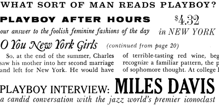
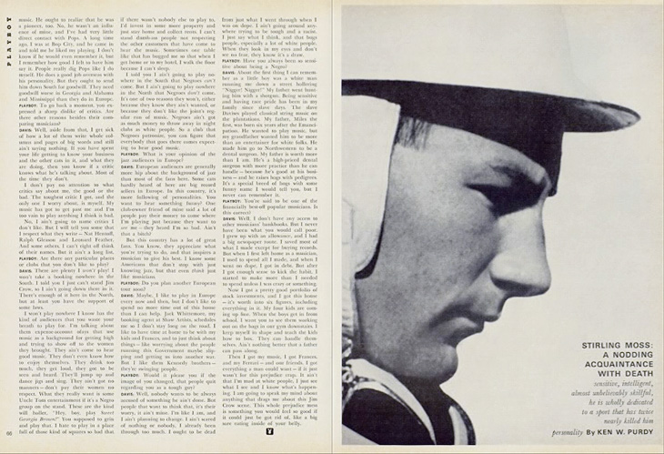
I’ve never looked at Playboy magazine before — its reputation preceded it and there are many better ways to read good journalism. There are some interesting-sounding articles in the earlier editions though; just a quick look through reveals interviews with Fidel Castro, Miles Davis, Sterling Moss, loads of fiction, journalism, pages and pages of dense, dense text. Then, so randomly you almost ask “What’s that doing there?” a picture of a young woman with not much on. I must admit I didn’t really look at the newer issues, as after the logotype changes in 1972 the whole thing looks a whole lot less appealing, and makes me think perhaps the magazine becomes a bit more straightforwardly pornographic from this point. The bits of type and spreads below are mostly from the late ’50s and early ’60s, and are just an example of some of the lovely bits of type and layouts in the magazine. So yes, go and have a look at the Playboy magazine archive, but keep in mind the attitudes and harms it represents.
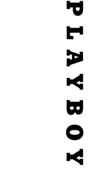
The ‘$4.32’ bit is from an advert, all the rest is from editorial content. I haven’t verified these forensically, but the editorial text looks like a mix of Clarendon, Nimbus Sans, Caslon, Caslon Italic and Cheltenham.I love the use of the rabbit device to end an article, and that it’s still in use today. Note also that the Playboy wordmark at the top left of the page has a serif on the A, which is missing on all other uses of it. I’ve reproduced it larger at the top of this article.
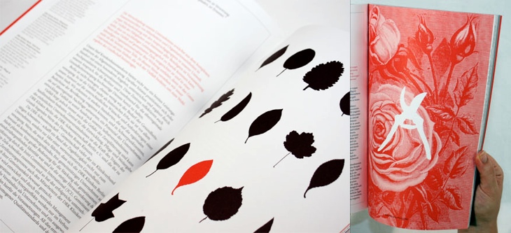
I’ve been marking so many things in my RSS feed either to read later or ‘post about this’ lately, and yet it seems I’ve had no time to do either of these things. This is one I’ve had marked for a while, from the ever-inspiring For Print Only, and perfectly demonstrates why red and black is such a great combination in print. I love the spreads in this report, and I’ll definitely be referring to this as inspiration for a while. Lovely stuff, go and take a look at the other images — a couple of my favourites are below.
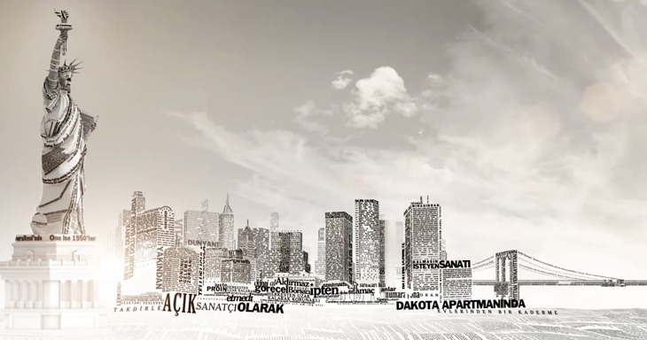
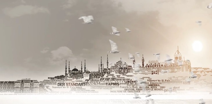
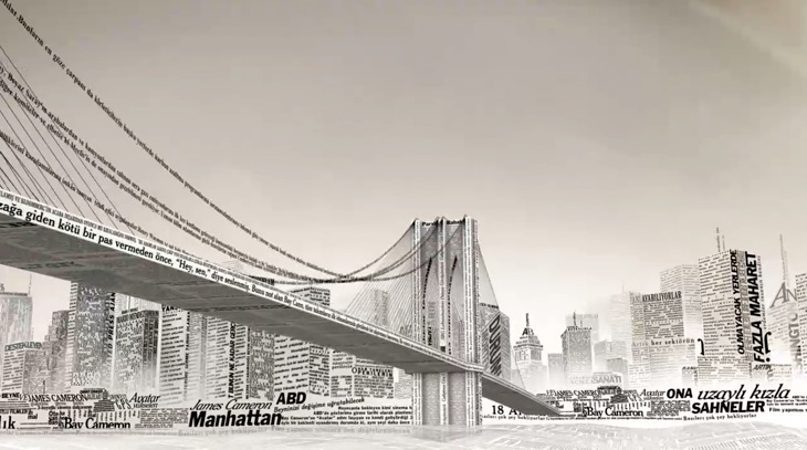
This week sees the launch of a new Turkish-language edition of the New York Times’International Weekly, distributed for free with the Sunday edition of Turkey’s Sabah newspaper. To advertise the launch, the newspapers commissioned this incredible animation - a typographic tour starting from Liberty Island, across various bits of Manhattan, very nearly making it over to Brooklyn before arriving on the Bosphorus with a gorgeous view of Istanbul rendered in type.
I’ve seen a fair few animations of the places-rendered-as-words variety, and more than plenty of the ‘kinetic typography’ kind, but this one is very nicely done — it hangs together beautifully, and the level of subtle detail rewards re-watching. The waves, rippling banners and flags are a lovely touch, just noticeable enough to add to the sense of place without distracting you from the overall theme.
I’d love a desktop-resolution still of this scene. This is taken from the downloadable movie.
There’s one especially lovely bit when the camera turns to show you the Brooklyn Bridge being created from type — definitely go and watch this one. It’s quite lovely, and thanks to @typographerorg (of Typographer.org, naturally) for sending me it.
Not the scene I mention, I won’t spoil that for you.
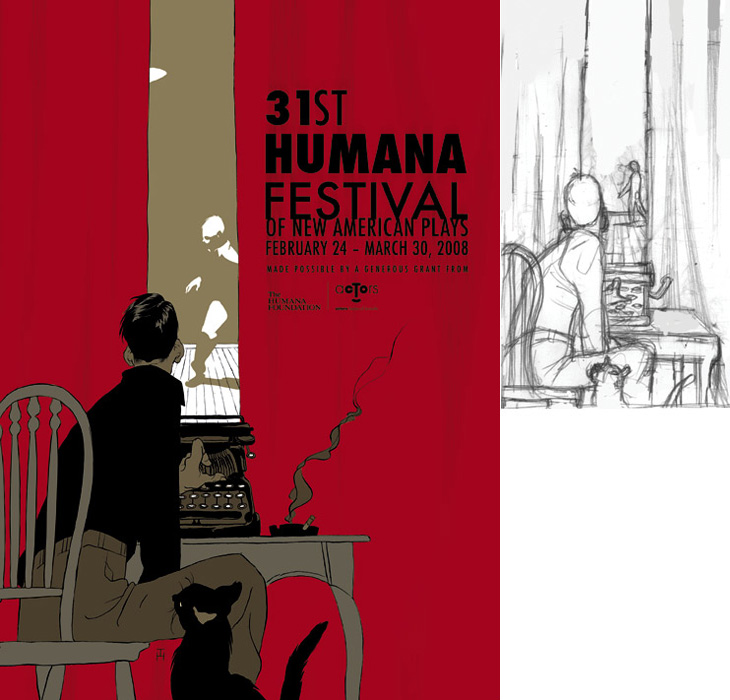
Drawn linked to this set of posters by Noma Bar that make clever use of negative space, and they reminded me of an image I’ve had saved on my computer since last year, this poster for the Humana Festival by Tomer Hanuka, below. It doesn’t need any explanation, I just love it — the image is beautifully conceived and rendered. You can read more about its development on Hanuka’s site, Tropical Toxic.
I would tweak the type a little bit thought, especially the ‘31st’ — for some reason the height of the 3 hasn’t been optically adjusted, making it look much smaller than the 1. It’s rather odd that was done like that.
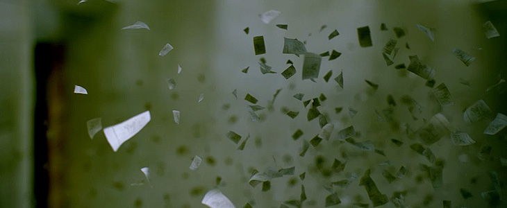
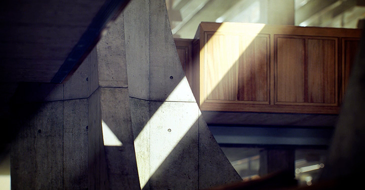
This has nothing to do with type (well, not much) but I found it so remarkable I want to post about it anyway. Alex Roman has created a series of CG images and short films, based on real places, with a remarkable level of realism and beauty. At first I thought they’d been filmed and photographed with some high quality HD SLR, and wondered at the air of hyper-realism some of them have, especially the second one in this set. The sound design and visuals are great, but the use of type in the videos is rather odd and to my eye adds a small, if jarring, discordant note to the whole project: I’ve come across people mixing upper- and lower-case and using extreme kerning before (not so much kerning as tangling in this case) and it’s rarely successful. Still, to harp on about that would seem churlish as the rest of the project is so good. Some stills below to whet your appetite, and the project website is here.
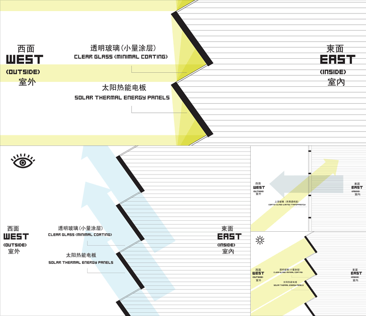
At first glance, The Shenzhen International Energy Mansion looks worth posting about only for the name alone, it sounds like some Metropolis-style sci-fi update of a concierge-equipped apartment block of the early 20th century. It looks, however, like any other office tower found anywhere in the world. Its rather standard shape is in fact deliberate and it does have some interesting features, explained in a way by these remarkable infographics on this Arch Daily article. I say in a way because they’re clearly made to be as much decorative as informational - with that huge pixellated type and simple iconography they bring to mind 8-bit game interfaces and thanks to the West/East labelling, recent revivals of the style like that in DEFCON. Anyway, have a closer look, and you can see how the building is designed to at least try and reduce energy use.
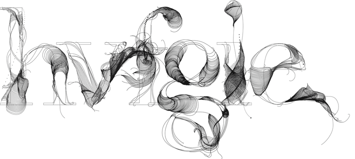
Whenever I’m playing around with guilloches, I often think it’d be nice to make an alphabet - to actually generate letterforms with them. It’d mean loads of eye-wateringly complex formulæ, but I think it’d be worth it. Well, Tania Alvarez has created some beautiful letters called Fabric Type that convey some much of the appeal and intricacy of guilloche patterns and reminded me instantly of that idea. If ever I needed reminding that the products of inspiration are infinitely variable, then it’s this; these are beautiful and I love them, but I’m happy to see that they’re different from what I was thinking of doing. This list of things that I want to get done isn’t getting any shorter. Found via the ever-inspirational Fubiz.
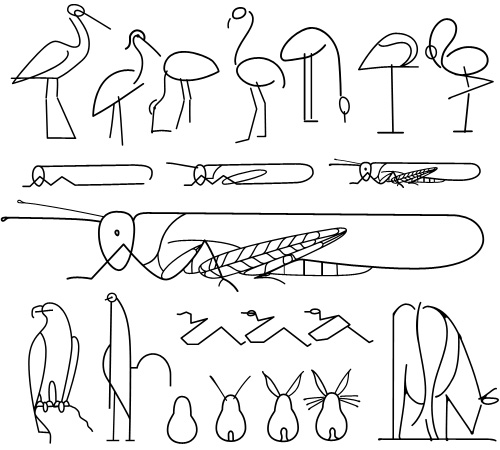
This is a great little instruction book on drawing animals - Les Animaux Tels Qu’ils Sont, full of beautiful little illustrations and diagrams - you can see it on this Flickr set, posted by Agence Eureka. The illustrations are all great, but I find that for most of them I prefer the intermediate stages in the instructions, they’re constructed from spare, sinuous lines and create a beautiful abstraction of the animal - capturing something of the spirit of it rather than an explicit diagram of what it looks like. The ‘final’ drawings seem a bit too obvious, perhaps. So once I’d drawn copies of my favourites, I noticed that they reminded me of hieroglyphs, hence my choice of title - judge for yourself below.
How to draw a cricket, or modern hieroglyphs?
As an aside, I was interested by the authors listed on the book, R & L Lambry. The ‘R’ would be Robert Lambry and, well, there’s nothing definitive on who the ‘L’ is, but I suspect it might be Leon Lambry. That’s the only ‘L Lambry’ that I could find involved with illustration from around the right time. Anyone know for sure?
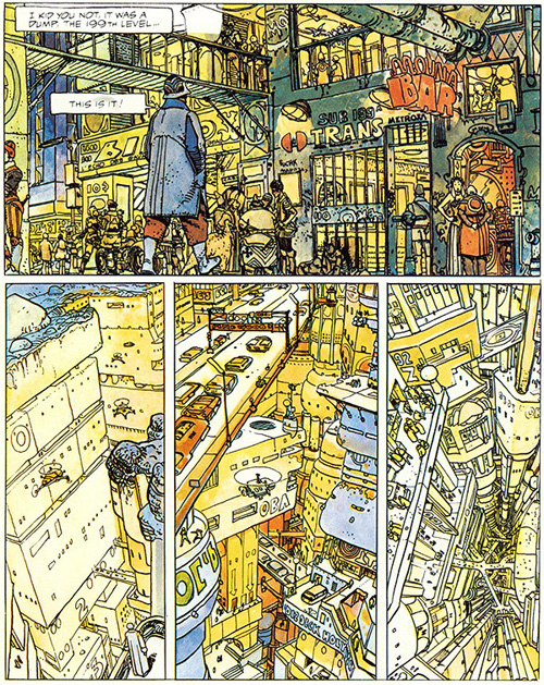
This has been hanging around in my browser tabs for a little while - it’s right up my street too, The Top 10 Comic Book Cities on the Architect’s Journal. A few people have linked to it (I have no idea where I first found it), so you may have already seen it, or even have the books listed. I’ve got a couple, and I think I’ve tracked down a copy of The Long Tomorrow, with Moebius’ fantastic visualisations. I’m quite fond of the idea of megacities, maps (especially of the builtenvironments) and really crowded, dense architecture. It’s not type related, but I imagine such things tend to appeal to the typographically-inclined, if only for the recognition of the similarly detail-obsessed personalities that created them. Anyway, I got the picture below from a regular read of mine, Sci-Fi-O-Rama, which feeatures sci-fi related art and book covers: