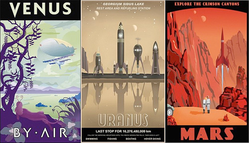
Again, some other things that have been doing the rounds but got stuck in my pile of ‘things to look at’. These travel posters by Steve Thomas, Amy Martin and Adam Levermore-Rich promote travel to exotic eras and destinations, such as the Crimson Canyons of Mars, Tranquil Miranda, or the Winter Wonderland of the Ice Age.
I like the ones for destinations in the solar system by Steve Thomas. Aside from their obvious fantasy, I find them a little poignant though. They evoke the ideas of the early 20th Century when we were going to colonise space pretty soon and it was going to be amazing. Except we didn’t, and space is pretty expensive and we’re only just starting to get space tourism, and even that barely above our atmosphere. Still, perhaps looking at these posters we can live in hope! Well, not for Uranus, what with it not having a solid surface and all, oh, and Venus needing some hefty terraforming… but Mars is about right! Oh, except it’s brown, not red. Ho hum:
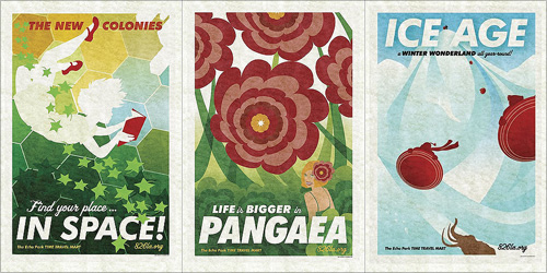
Then the Amy Martin ones, which are simply beautiful. The colours are lovely, and these are the ones that to me more closely resemble travel posters:
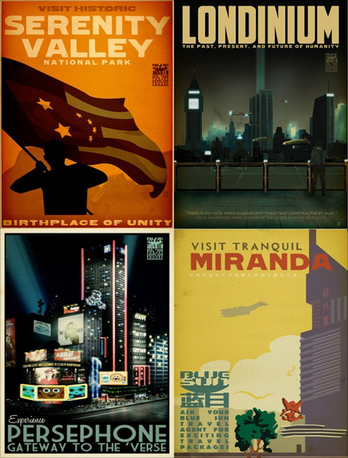
Lastly, the ones that are from the universe of Firefly and Serenity. I have to admit I’ve not watched either so I can’t really comment other than to say they’re rather attractive. You can buy them here though.
Found via Blue Tea, and via the visits to 826LA I made for the Robot Milk post.
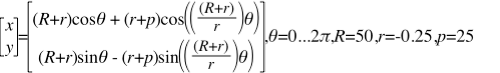
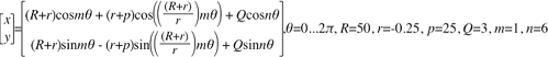
Banknote patterns fascinate me. I can get lost for hours in all the details, seeing how the patterns fit together, how the lettering works, the tiny security ‘flaws’ - they’re amazing. Central to banknote designs are Guilloche patterns, which can be created mechanically with a geometric lathe, or more likely these days, mathematically. The mathematical process attracted me immediately as I don’t have a geometric lathe and nor do I have anywhere to put one. I do, however, have a computer, and at the point I first started playing with the designs (mid-2004) Illustrator and Photoshop had gained the ability to be scripted. So off I went, using the hypotrochoid equations on Mathworld to create rather rough and ready patterns - scripting at this point didn’t have a very usable set of functions for creating beziers, so I had to use crummy line segments. The process took ages and served just to prove to me that I could do it, but the results were too poor to go much further.
Then, a couple of years later I discovered Grapher on the Mac. Aha! Now here was a program that could create the patterns I was after and export to EPS. Well, kind of. It could create the patterns, most of the time, and export to EPS, though not always. I got a couple of patterns out of it and had a look round for other options. Again, not much - not much that I could afford, that is.
The basic hypertrochoid equation. This makes a nice rosette.
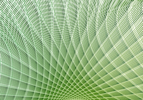
Then we get to now. I give Grapher another go, and at last, I can create and export patterns:
There are still some extremely frustrating limitations though. First of these is the resolution of drawing the graph. I’m sure for most graphs the default resolution is fine, but when creating these patterns you need tiny increments. Tiny tiny ones. If the line is going from one side of the graph to the other and back again a thousand times in a couple of radians, you don’t want the graph program to start dropping line segments, or corners, or anything really. Grapher does allow you to increase the resolution, but it’s not sticky - change anything in the equation and it pops right back to the default. Every. Single. Time. The same thing seems to happen with the line thickness too - I wanted all the designs to be at 0.1, but it kept changing it back to 1.0. Frustrating! There are a couple of other UI things I’d change, like having an option to keep axes at 1:1 ratio to each other, even when you resize the window.
Another, deeply irritating frustration with the whole process is to do with Illustrator. Try and open an exported EPS in it, and you get “An unknown error occurred”. Photoshop can accept the EPSs as placed objects, and InkScape can (eventually) open them, so Grapher seems to be outputting valid EPS files. I suspect that the number of lines in the graph is causing the premier vector editing app in the industry to fall over. Oh dear.
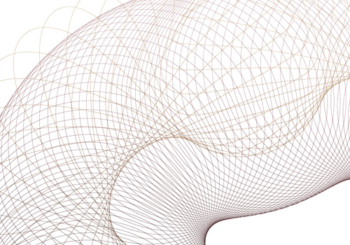
Still, after all this, I can still get the patterns made, and get them into an image editing program, which is quite something. Now I just need to find the magic numbers to create just the right patterns I want.
This beast creates the pattern above. The 'm' is not strictly necessary for this one, but varying it is good for experimentation.
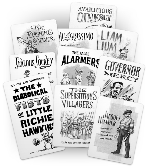
I’ve been enjoying The Superest for a while now (since it started I think) after following a link from Chris Glass (I think), and while every post on it is good, it’s the ones by Kevin Cornell that I look forward to the most. Apart from the fantastic illustration, there’s often gorgeous lettering to look at. His site, Bearskinrug, is a joy to visit as well.
I’ve nabbed some of his work from The Superest to illustrate the point - I put them on a cards for my own amusement, as the site reminds me of Top Trumps (and because I think you need to visit the site to see the full ones). Go and visit this, and his main site.
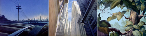
This site is astounding. I’ve been browsing through it for, oh, an hour now, and there are more and more amazing images. Some of them (my favourites) look like they inspired, or were inspired by, Edward Hopper, and others seem right from Ladybird books I had at junior school. They’re quite inspiring and evocative - looking at the first one here, I’m taken right back to visiting my grandparents when I was a child:
John Gruber (Daring Fireball) linked to this interesting article on Android, which is worth a read, but stop a moment and admire the illustration by Christian Montenegro. It’s quite something - the flat slab of technology and this glorious fountain of swirling colour coming out of the sharp-edged screen - if only real phones were nearly as exciting, with 3D display technology like that and everything. I’d go for an interface that launched out of the phone like that.
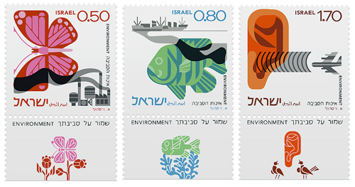
Yes, more stamps! This time courtesy of Richard at Ace Jet 170 who posted this article about a set of Israeli stamps he bought. They depict three environmental concerns, air pollution, water pollution and noise pollution, and were apparently designed by Eliezer Weishoff (thanks to Yotam for the info). The stamp itself shows the problem situation with an additional detachable design depicting (iconographically) the ideal; butterflies visit flowers, fish swim among seaweeds and ears hear birdsong. Yes, that is an ear - the least successful image of the three I think - though I do like the birds in the tear-off.
I was asked for prints of the Polish stamp designs and I’d certainly like to, but I need to research the copyright. I traced the designs for my own understanding, and I’d love it for more people to see these designs at large scale and up close, but I’m not going to violate anyone’s copyright - I am a designer after all! Of course, if anyone’s a copyright lawyer in the UK/EU and fancies offering some tips, I’d greatly appreciate it.
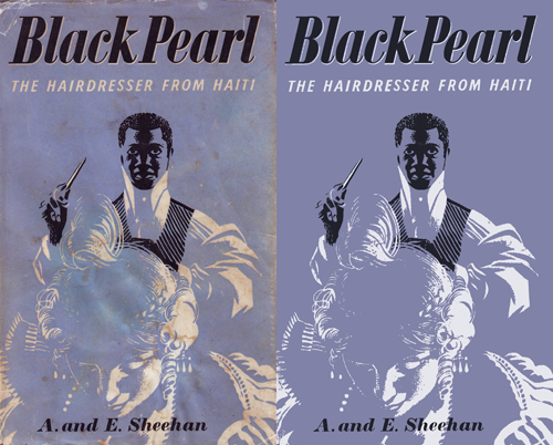
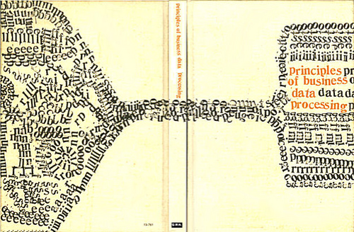
Drawn! the other day had a link to this treasure trove of retro illustrations, posters, books, covers, and pretty much everything else committed to print, and an on-link to the Mid-Century Illustrated Flickr pool. Looking through these is a bit like browsing ffffound, you keep finding things you want to keep links to… or just keep. I tend to want to redraw things, as I find it helps me understand how it was done a bit better and I often learn some new technique or style, or get inspiration for something else. I particularly liked the Black Pearl cover - it’s an engaging and compelling image, but made with just three colours. No halftones or tints either. I didn’t redraw this, I just used clean-up techniques to recreate it:
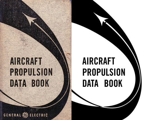
The Aircraft Propulsion Data Book is interesting as the curve appears smooth and aerodynamic, but under close examination it seems a bit… well, clumsy. Still, that’s the kind of thing that interests me - for example, when doing things like icons the details can seem crude and ugly up close but at their intended size provide useful (and subtle) clues on how to interpret the whole image.
Also in the sets of images are various examples of very nice typography, these two caught my eye in particular:
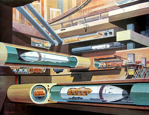
Then, finally, no collection of mid-century illustrations would be complete without at least one retro-futurist image, so here’s a fabulous subway illustration by Klaus Bürgle:
This advert for the Zurich Chamber Orchestra has been linked from several design related sites (I can’t remember where I first saw it), but all of them were linking either to Zapp Internet or to YouTube, both of which only had low quality and low resolution versions. For animations with such fine detail as this has, you really need to see the clean, high-res version to appreciate it fully. So, a good few Google searches later, and I’ve found this article on Llámame Lola, which not only carries a link to the MPEG but appears to be the originator of the Zapp upload. My paraphrased translation of their description, which is, to be fair, a bit random:
Here’s a great commercial for the Zurich Chamber Orchestra made by the agency Euro RSCG Zürich. Recently the orchestra carried out a concert in Spain with the Swiss flautist Emmanuel Pahud, at the Palau de la Música in Valencia. For the opening night last week, Emmanuel Pahud performed with the ZKO under the direction of Giovanni Antonini, the Flute Concerto nº7 by Devienne.
Also, I was intrigued by the ZKO logo, and not immediately finding any PDFs containing a high-res version of that either, I decided to redraw it, as is my wont. It’s a beautiful logo, and probably is the subject of much jealousy by other orchestras.
You may need to download VLC to play the video from Llámame Lola as Quicktime claims it’s not a valid video file. Go figure.
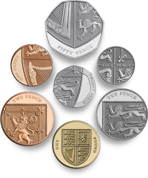
In 2005 The Royal Mint announced a competition to design six of the eight kinds of coin in circulation in Britain, the first full redesign of the coins since decimalisation in 1971. Open to everyone and with a top prize of £30,000, they received 4000 designs from 500 people, and I just saw on the news that the final designs have been completed and the first coins ready for issue. Not only that, but the £1 coin is now included in the redesign, and somewhat appropriately becomes the uniting element of the set.
You can tell they were done by a graphic designer; even with the complexity of the Royal Arms, the designs are clean and sparse, with pleasing variation in placement of the inscription, and on the 20p there is a sense of refraction through the thick border of the coin. Just take a look at them though, they’re fantastic, in fact, they’re astounding - I can hardly believe that these are actually official coins of the real United Kingdom, instead they look like they’re from some sleek, efficient, science-fiction alternate-universe version of the country.
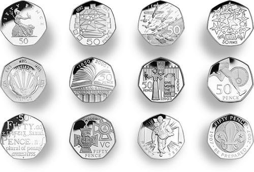
The one thing that gives me pause in the whole process is the thought that we won’t be seeing any more of the beautiful 50 pence designs*. I’m not exactly a numismatist but I do enjoy seeing the new designs every couple of years or so. I suspect that the one coin not included, the £2, will continue to have commemorative designs on it. I wonder when we’ll get a £5 coin actually in circulation?
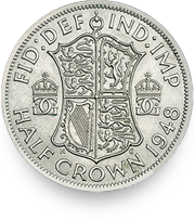
While researching this article, I was looking through earlier coin designs on the Royal Mint site, and I notice the 1948 Half Crown used the Royal Arms as well, but with a more elaborate shield design. I think it’s rather attractive, and I’m intrigued by the crowned GG ligature either side of the shield.
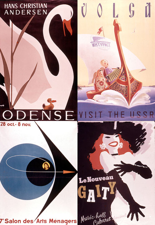
There are many collections of vintage posters on Flickr, most of them full of the mundane, rather than the classic. What makes an old poster a ‘classic’ anyway? Does it have to have inspired a whole style of advertising, or be an exemplar of a particular style, be well-executed or just be by someone famous? I guess it doesn’t really matter, it seems it just has to be old and have survived to be scanned in and shoved online. It’s nice though when you find some good examples in these collections. I particularly like some of the (depressingly low-resolution) scans on this collection, especially the lettering on the Volga one, which I nearly missed thanks to Flickr’s brutal it-must-be-square thumbnail cropping.