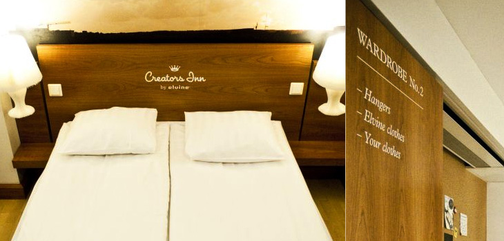
I’m often saving links from the Contemporist, but this hotel, Creators Inn by Elvine (and others), caught my eye for the nice labelling of the wardrobes and the printed history of Elvine on the shower screen. It’s a nice touch, but I wonder if it doesn’t seem a little incomplete as an implementation - things like this are best left subtle or taken to the extremes; if every item in the room was labelled in the same way, with usage notes perhaps, it would be quite the thing. Also, as one of the commenters pointed out, it’s hard not to notice the similarities between the hotel logo and that of a rather large hotel chain. Still, it does look rather nice, and if you’re a creative person visiting the city, you can get free accommodation there. Now that’s a nice touch.
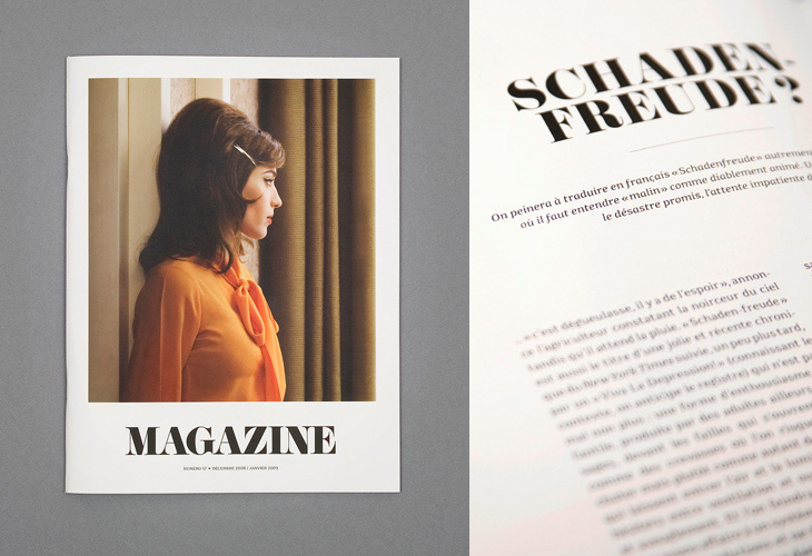
I saw the cover of this magazine, designed by Ill Studio, on ISO 50 and immediately saved the link; I love the type, the photo, the composition, everything. The rest of the magazine is beautiful, but it’s the cover I love - go and take a look at the rest of it. Now if only there was a link to the magazine’s site - with such a generic name it hardly pops right up on Google.
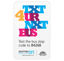
Here’s something I’ve been meaning to post about for a while, and happily it’s a local project, right here in Brighton and Hove. There’s a new service, just launched, which lets you text a code for a particular bus stop to a number and get an SMS back telling you the next five buses to go from that stop. It’s quite a neat idea and pretty fast (I tried it), and a nice complement to the other ways of getting bus information*.
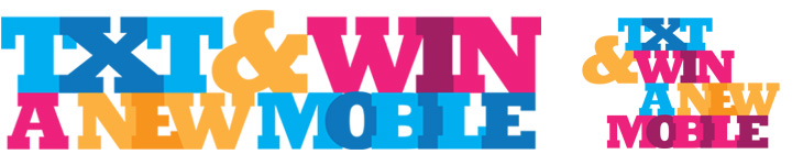
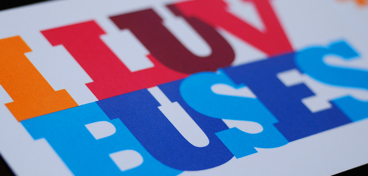
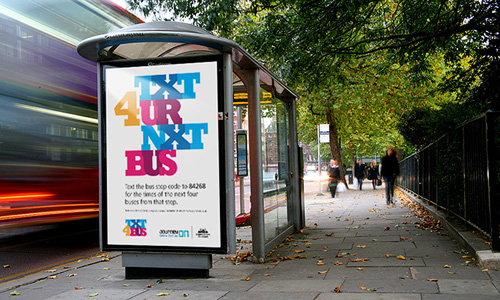
So that’s the back-story. What is good, and particularly appealing to me, is the advertising campaign and the various materials to help people keep a track of the bus stop codes, designed by David Earls of Typographer.org, for Brighton & Hove City Council. I saw a fair bit of the development work on this and I’m glad that this design was chosen and made it through to print unscathed. It’s a beautiful arrangement of type and colour, designed to appeal mainly to teenagers and young adults (and, incidentally, typographers) and adapts well to a wide variety of applications. The typeface (Rockwell Extra Bold) lends itself well to this kind of extreme kerning, with the nicely balanced word shapes the alternating colours and tones ensuring the message remains perfectly readable. The campaign included billboards, bus-stop adshels, A4 posters, information stickers, leaflets with punch-out cards, and a competition to win a new mobile phone:
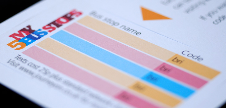
Available for pick up from buses, local ticket and travel agencies and council offices, these cardstock leaflets publicised the scheme, and……they have a wallet-sized card you can pop out for you to record bus stop codes on. The card stock is only glossy on one side to make it easier to write on the reverse.A mockup of the bus stop adverts.
The rebranding of UKTV’s channel lineup has been going on for a while now; every couple of months another of their channels gets a new name and identity, and the original, extraordinarily pleasant and consistent network branding (at right) takes another step closer to oblivion. One of the recent rebrands was for UKTV Style, which got a pretty dreadful implementation of a reasonably nice idea - David Earls wrote more about that on Typographer.org. Next to go is UKTV Food, which will get a logo more suited to a free supermarket magazine (it really reminds me of the old Sainsbury’s one).
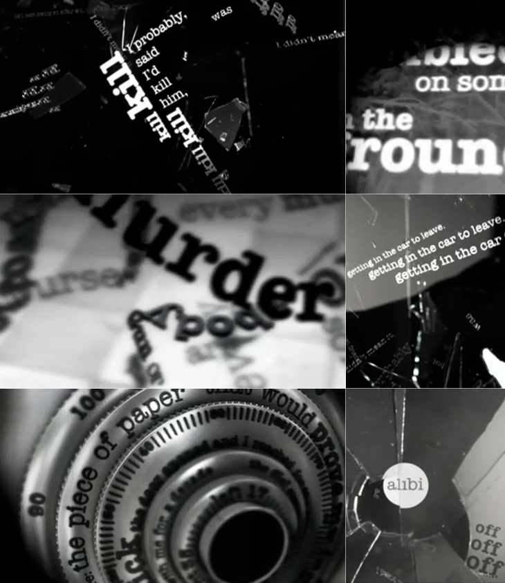
I guess you could say I’m not much of a fan of the overall quality of the rebrand, but there are a few good bits in there - Dave, Blighty and Eden are quite pleasant, with some nice ident work. My favourite by far though is Alibi, previously UKTV Drama. They’ve gone for a treatment reminiscent of your fashionable dynamic typography, but incorporated imagery of escape, fear, crime and violence. The typewriter typeface is perhaps a little cliché for the genre, done to death in countless private investigator made-for-tv stuff, but the stylish animation rescues it, keeping the familiar associations while providing some originality and freshness. There’s a montage of the channel idents here, and I’ve a few screenshots below.
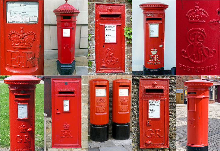
I love projects like this, a Flickr group purely for Royal Mail postboxes identified by postcode. There are currently 5679 photos in the group, so is getting to be a pretty good catalogue of the postboxes in the UK - though with 115,000 in total there’s still a way to go. One of the first ones I clicked was pretty close to where I’m from, and lo, a quick search reveals the one very close to where I grew up. Ah, memories.
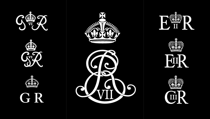
One of the interesting things about all these postboxes is the variety in the emblems of the reigning monarch - from Victoria to Elizabeth, they range from the florid and calligraphic to the frankly rather austere. Naturally, I’ve had a play around recreating some of the emblems, below. I wonder at the unnumbered George ones though; I’d guess they must be from during the Second World War, or directly afterwards - they suggest the Austerity period to me, but why no number? The extra metal and work required would be minimal, after all. As for the other later ones, the lettering looks to be inspired by Caslon types, though with plenty of variation from the hand-carved moulds, which has given them various profile styles from soft to sharp-edged, strengthening and highlighting the symbols - a kind of 3D hinting, if you like. I hope the effect was intentional, as it’s rather nice.
Some of the emblems - which I rather freely recreated rather than tracing them accurately. Show here are the rare Edward VII, variants on George VI, Elizabeth II and my very own wild speculation at Charles III (if that is indeed what he takes as his regnal name).
Perhaps controversially, I also had a bit of a play at creating a symbol for Prince Charles when (or if?) he becomes king. He may choose to reign as George VII, though from a design point of view I hope not - if he keeps his current first name he can have that ‘III’ fitting into the counter of the C, which I rather like the look of.
Another gem found through Coudal, this. Re-Type posted an article about the beautiful lettering by Leo Beukeboom on the windows of bars and cafes in Amsterdam (with a nice appreciation of decent, old-style, non-trendy bars in there too). There’s a series of photos with the article, which I’ve traced the lettering from (below), and as a bonus Re-Type themselves are working on interpreting the lettering into an Opentype face, which so far looks great - can’t wait to see it finished.
I did a bit of hunting around for more information on Beukeboom, and found this article on David Quay’s site, containing a lot of background information and an interview, which is fascinating and well worth a read. I’m particularly taken by this:
The letter you use on a pub window depends on the type of pub. If you have a traditional brown café, with lace curtains on copper curtain rods, with stained glass windows, you choose a nice, ornamental curly letter, because it fits in with the environment. It is not the information that counts, because everyone can tell it’s a café, but it’s about decoration, about creating an atmosphere. For the lettering on the traditional brown cafés I developed my own script based on the calligraphy of Jan van den Velde.Leo Beukeboom, from David Quay Design
I love that. The words themselves become secondary to the style in conveying information - without knowing what it says, you know what it says. Certainly not an infallible system, but most types of place (and many things) have their signature look, and as I’ve posted before (warning, extremely wordy article) you should know what you’re doing before you mess with it. They’re the design patterns of urban existence, if you will, though in the case of Beukeboom’s lettering, this is one that is slowly fading - unless anyone wants to become his apprentice that is. If he still wants one.
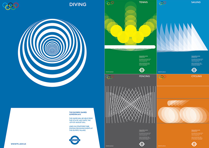
I am indebted to Adrian Giddings for finding the originals of these images. I saw them on Design Crush, and from there to ffffound and from there… a blank. Blogger really needs some kind of reverse lookup for their dreadful impenetrable image URLs, and ffffound needs to better record the URL of the page containing the image. Still, I now know where these posters are from. They’re clever, simple, and have a graphic elegance reminiscent of Otl Aicher’s work for the 1972 Munich Olympics, with typography that is pure London. If Wolf Olins had gone down this route I’m sure there would have been far less controversy about the branding for London 2012.
Of course, these are proposals designed to work with the Transport for London branding, not for the Olympics, and I think work perfectly in that context. For the Olympics itself, for all their cleverness and simplicity, they’d be a bit too classic Olympics, a little too safe. Perhaps.
As for the actual 2012 logo/brand, it’s has been out for quite a while now, but I’m still not entirely sure yet what I think of it - I don’t like it, but it may be exactly right for the event. We won’t really know until after the Olympics, and then, no doubt, we’ll have plenty of learned analyses about it to tell us what to think. I wonder how agnostic I’ll be able to be.
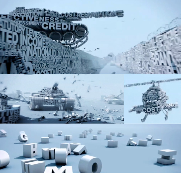
Yves posted on Friday on the FontFeed about a couple of campaigns by Inlingua promoting their business English courses. One of them is this brilliantly animated advert, creating a battlefield scenario out of words set all in Helvetica caps. As Yves says:
The video looks and feels like a first-person shooter war game, with excellent POV camera work and sound design. The camera runs and ducks through the environment, hiding behind walls and in trenches, while being assailed from all sides by helicopters, fighter jets, tanks, and explosions made of type.Yves Peters, The FontFeed.
The thing I like especially, and it’s one of those great detail things, is the sound of voices mingled with the explosions, gunfire and engine noises. It’s not overt, but it’s a really nice touch. Go and take a look (and listen).
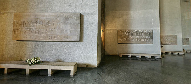
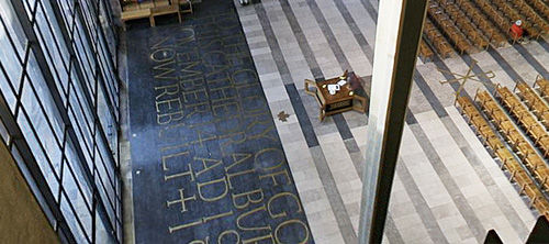
When I was writing about the St John’s Bible last week I was reminded of the typography of Coventry Cathedral and wanted to post a couple of pictures of it then, but I wasn’t immediately able to find decent pictures. I’ve had a proper look round, done some more research and found some pictures and I think given the history of the cathedral it’s an appropriate post for Easter Sunday, with themes of rebirth and all; Following the destruction of St Michael’s Cathedral (and much of the city) in a Luftwaffe attack on the 14th of November 1940:
…the then leaders of the Cathedral Community took the courageous step to build a new Cathedral and preserve the remains of the old Cathedral as a moving reminder of the folly and waste of war. From that point, Coventry Cathedral became the inspiration for a ministry of peace and reconciliation that has reached out across the entire world.Wikipedia: Coventry Cathedral
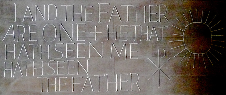
The new Cathedral was designed by Sir Basil Spence (who also designed my alma mater, Sussex University), with stained glass by John Piper and Keith New, the great tapestry by Graham Sutherland, sculptures by Jacob Epstein and John Bridgeman, the Great West Window by John Hutton and last, but absolutely not least, lettering and carvings by Ralph Beyer. It’s this lettering that fascinates me, and it’s strange that there are so very few pictures of it.
Some of the Tablets of the Word by Ralph Beyer. Picture from the QTVR movies in the Virtual Tour. There is also a picture from 1962 on the Time Life website here.
When I was looking for pictures I revisited the Cathedral’s website (which for some reason has no photo gallery) and realised that it’s possible to get some decent pictures out of the well-intentioned but bizzarely designed ‘Virtual Tour’. So with one exception (below), that’s where I got the pictures here. I don’t like being negative, but that virtual tour really could have a better user interface. It dominates and detracts from the movies, which are presented at a size that’s far, far too small - the content and the Cathedral deserves better than that.
Detail of one of the Tablets of the Word by Ralph Beyer. Picture by Herry Lawford on Flickr.
How Beyer came to be chosen for the Coventry Cathedral project is interesting, and includes a fair few other famous names and some remarkable coincidences. I have to quote fairly liberally from his obituary in the Times, or I’d just be rewriting it:
In 1937, aged 16, Beyer visited England where, on the recommendation of Mendelsohn, he spent six months as an apprentice to Eric Gill. Like Gill, and doubtless enthused by him, Beyer was fascinated by the qualities of carved stone, by simple sculptural forms and especially by letterform. Ralph then studied in London, at the Central School of Arts & Crafts and at Chelsea School of Art where he met Henry Moore, for whom he worked briefly before being interned as an enemy alien at the outbreak of the war.The Times
While in the internment camp, he met and befriended the young Nikolaus Pevsner, who had started work on An Outline of European Architecture and would later write the Pevsner Architectural Guides.
Encouraged by Henry Moore, Spence decided that, the Sutherland tapestry apart, the dominant decorative feature of the interior of the new Coventry Cathedral should be lettering rather than narrative sculpture. He knew he was looking not simply for a craftsman but for an artist capable of making a truly distinctive contribution. It was Pevsner who suggested that Spence should meet Beyer, to learn how he might approach a project which was to become the defining challenge of his life.The Times
The Independent has a more extensive obituary, and highlights a good point about the style of the modern Church of England being inspired by the early church, which I think is what reminded me of this work when looking at the St John’s Bible:
Although Spence’s cathedral was criticised for its conventional Latin cross plan, Beyer’s Tablets of the Word reflected post-war ecclesiastical interest in the early church and today they remain strikingly innovative examples of lapidary art.The Independent
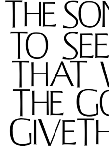
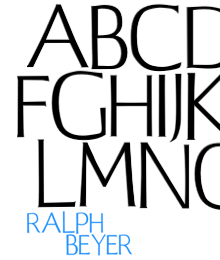
Beyer also designed a typeface for use on hymnals and other publications. The cathedral website makes good use of the typeface using Flash, and using browser zooming and screenshots I’ve assembled the text at right and top right. Of course that’s no substitute for the real typeface; I’d like to see if there’s a lowercase, other weights or styles, what the rest of the numerals look like, and how it’s kerned.
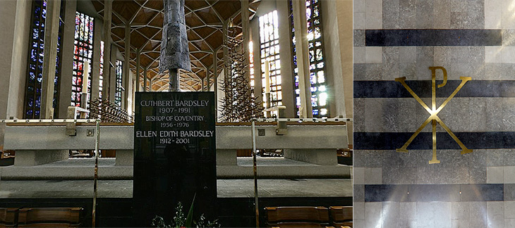
Further use of the Beyer face behind the altar, and at right more influences from the interest in the early Christian church, with the Chi Rho symbol, denoting Christ.
The inlaid lettering by the Great West Window. Finding clear pictures of this is nigh-on impossible, and I’m tempted to turn up with my camera and tripod and make my own. As it is, here’s a closeup.
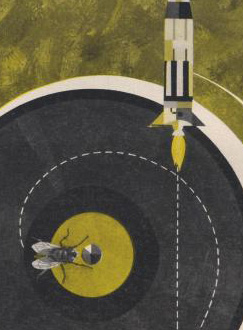
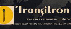
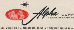
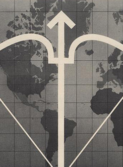
Here’s a great collection of science and techology adverts from the 50s and 60s, full of wonderful illustration, type treatments, vintage logos and some pretty inspirational layouts. I’ve got a few details of some of my favourites below, but be sure to have a good look through the set as there’s a load more in there that are great, such as this, and this. There are a few other interesting Flickr sets by bustbright too, including this collection of Bebrauchsgraphik covers which I’m going to have a look through. This one is great.
Click each image to go to the Flickr page for it.
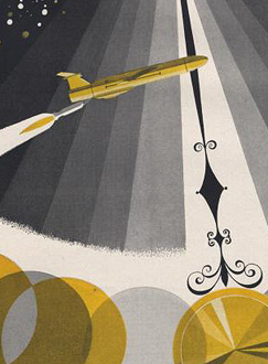
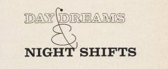
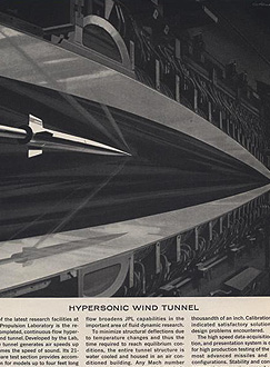
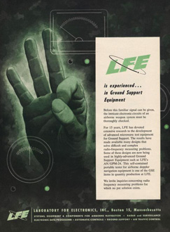
So there are some of my favourites. The top row is that combination of rough-textured painting and precise drawing that characterises mid-century graphic design. I love it. Below those are some nice type and logo treatments: that ampersand, for example, is made from an orbiting particle, yet sits halfway between the classic and commercial ampersands. Interesting! After that there’s six illustration styles: a dramatic JPL illustration which looks like a Victorian steampunk device for testing space-age technology; a cold-war classic world map with presumably The Crossbow of Progress overlaid on it; then a ghostly green hand of A-OK (don’t try this gesture in Turkey)
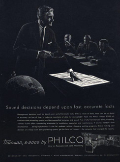
; a lovely space scene which I think could do without the little globe inset above the text; a spare and sharp layout and illustration for Philco - though the outline drawing of the computer looks like something demanded by the client rather than part of the original design; then an advert promising a level of defence from incoming missiles that even today we don’t have. Old adverts are great.