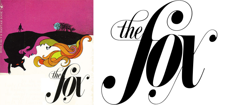
Just saw this book cover on Sci-Fi-O-Rama with some gorgeous lettering. If you’re interested in lots of great sci-fi and fantasy illustration the site is worth visiting, though type and lettering don’t feature there very often. I loved the exuberance of this script, it’s perfect late 60s stuff, and yes, of course I’ve traced it.
Joseph at the Book Design Review posted his favourite book cover designs of 2008. There’s some good ones in there, and makes me think I don’t read nearly enough long-form writing. I particularly like the one for “Abraham Lincoln: Great American Historians on Our Sixteenth President”, but that might just be because it’s from the five dollar note and I like banknotes… As for the others, I want to see the original of that aerial view of Manhattan, and the other two are just nice images. Go and look at the others.
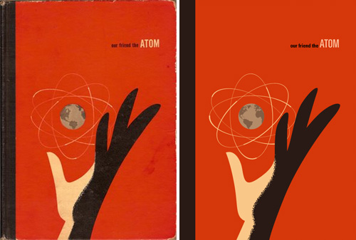
Found on ffffound a little while ago, this beautiful book cover. It reminds me of some books I used to have from the same era - I had a National Geographic book about all the massive engineering works being done in America in the early/mid 20th Century, from straightening and deepening the Mississippi to the building of the Hoover Dam. It was a bronze-coloured hardback with a big cross-section of the dam in white, and a plan of a canal cut across a loop of a river, in black, both embossed into the surface. I wish I still had it. Still, I’d only trace it as a vector like Our Friend The Atom, here:
I recently came across this review of the book Arabesque by Gestalten; while I’m probably going to buy it for myself as a present at some point, I couldn’t help but notice the visual similarity between this piece of brushwork and a Torii gate. Purely an irrelevant coincidence I’m sure, but a rather pleasing one nonetheless.
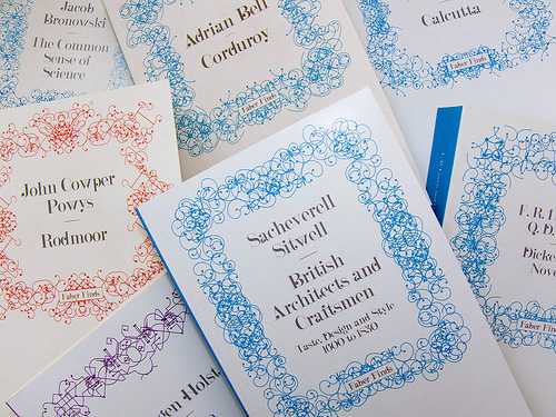
Looking back through CR Blog, I followed a link to this article about the Faber Finds service by the developers and designers, PostSpectacular. The whole thing is incredibly fascinating and quite exciting - taking its cue from the growth in low-volume self publishing services, the service goes further down the mass-customisation route so that each book is printed only when it’s ordered and with a unique, automatically-generated cover design. The cover designs are the most interesting bit, and while the Post Spectacular article doesn’t say whether Faber actually do generate a new one for each and every book (there are a couple of comments about that), the technology is definitely there to do it.
I actually did mean the latter too, every physical printed copy unique, leaving the era of mass production behind - the software was built for this exact context. Though having said this, I really can’t tell if Faber are following fully through with this plan.Karsten Schmidt
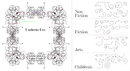
The patterns are based on sketches by Marian Bantjes, with four different types depending on the subject category of the book. The books are assembled on the fly as a web service using Processing, PHP and Java, and apparently while each cover takes only a second to generate, another automatic process weeds out ‘off brand’ ones. I’m often surprised by the almost casual way some really quite remarkable ideas and advances in artificial intelligence are used today - I’ve some knowledge of the subject from many years ago and such things as automatically detecting off brand designs would have been the stuff of futurists and science fiction back then. The description makes it sound simple and straightforward, which perhaps indicates how far things have developed.
Finding appropriate values to these design parameters required a phase of constant experimentation and conversations with Faber’s design team - these collaboratively agreed boundary values then became the encoded art direction within the software.
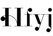
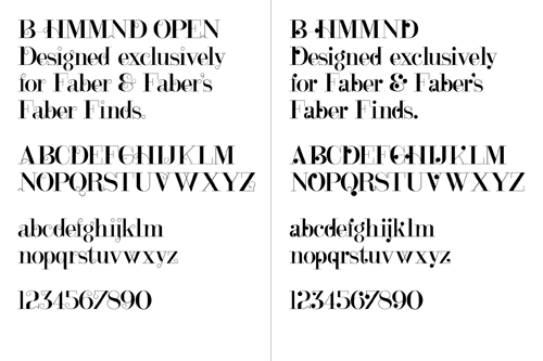
The typeface used for the covers, B HMMND, was designed specifically for the project by Michael C. Place, and while I can appreciate individual letterforms (some at left that I find rather beautiful) and see that they work well with the Bantjes’ patterns (and the Faber logo), they just don’t read very well all together. Some of the titles end up with extraordinarily uneven colour, with great dark patches of ink at one end of a word while the other end is a sketchy ghost of hair-thin lines. Maybe that ‘kookiness’ was the intention but I find it disappointing - the covers are far less appealing as a result; they just look messy and badly typeset. To my mind this typeface would be very successful as-is when manually typeset, or needs a whole bunch of alternates and Opentype rules to allow for a more readable result when set automatically.
I love the idea and how this service has been implemented (the cover titles aside); we definitely need to see more of this kind of thing so that we can get new copies of any out of print book in future. I know that there’ve been old books I’ve wanted to buy only to find that they’re out of print and that second, third and fourth hand copies are incredibly rare - sometimes impossible to find at all. I didn’t want a special first edition or something to squirrel away in an atmosphere-controlled book collection, I just wanted to read the book. For law-abiding, copyright-respecting people like me what options are there? Perhaps one day the whole idea of ‘out of print’ will fade away to be replaced by the very longest of Long Tail economics. I hope so.
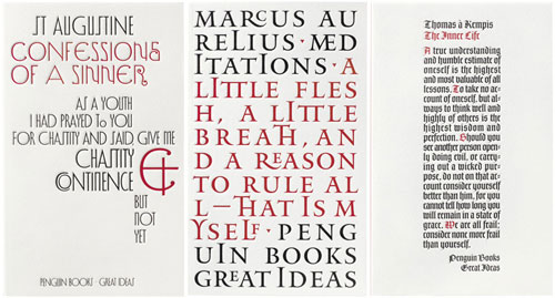
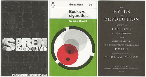
I’ve had these covers saved on my desktop for a while now, and I keep meaning to link to them. I saw the first set of Great Ideas books when visiting family last year, and was struck by the variety, creativity and humour of the cover designs. It turns out that there are two more sets, all done to the same standard. You can find the first set here, and the second set here. The third set seems only to be viewable on Flickr for now. I tried to find links to the boxed sets on Amazon but they appear to be unavailable - seems you can only buy the individual books. I like all the designs, but here are a few of my favourites:
These are from the first set. The ampersand on Confessions of a Sinner is quite special, the Meditations cover looks like it uses every ligature in Jupiter, and The Inner Life cover is just lovely - I’d like it as a large print.
English may not be Chinese, but when using monospace type, and with the right subject, you can get away with columnar type. There are some very nice typographic designs in the second set.
I have a couple of other favourites from the third set too, but these three are great.
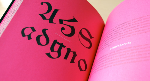
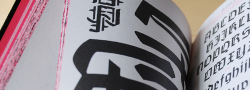
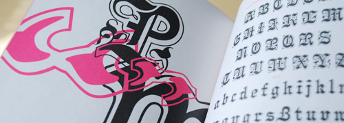
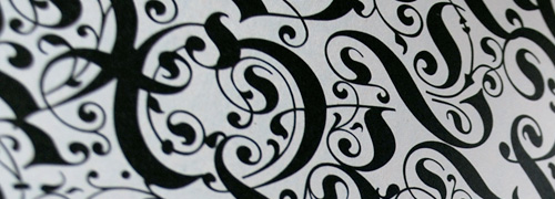
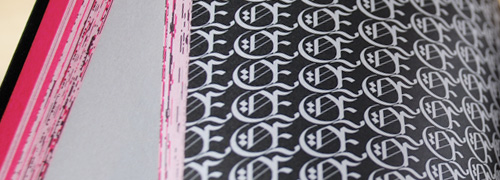
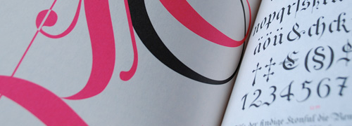
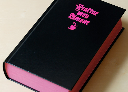
I mentioned this (obliquely) a while back, and I’m not sure why but I only ordered the book for myself recently (it’s also available on Amazon.de). It’s a beautiful book, full of blackletter samples, and for each face in the book there’s a wonderful abstract design created using it which would make fantastic posters in their own right. When closed, from the size and shape of it you’d be forgiven for thinking that it’s an old bible, though the glorious pink perhaps gives it away that it isn’t. I love that pink.
I’ve been checking this site periodically for quite a white now, it’s great to look through the updates when you’re in need of a bit of inspiration. Unusually for any site anywhere, many of the comments are good too, sometimes providing links to similar works and some good opinions. Either they moderate heavily or the site content means it doesn’t attract too many idiots.
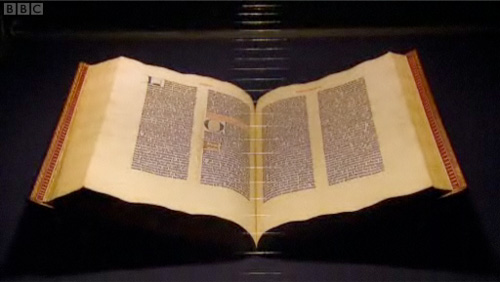
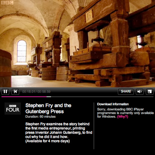
A fair few sites have linked to this recently, but I’ve only just got around to watching it and I can’t recommend it enough. As well as Fry’s flawless presentation of the story of Gutenberg and his invention, there are a few examples of nice lettering to pause the video for too. Mention of the Gutenberg Bible reminds me of this article, from a while back.
It’s the first time I’ve used iPlayer, as it’s the first time my internet connection has worked at a reasonable speed (thank you Virgin Media, it only took you years). I rather like the way its laid out, it’s a bit like my other site, which has looked like that for years, I hasten to add.
Also, for those of you who’ve ever watched the original TV series of Hitchhiker’s Guide to the Galaxy, having Fry present this is just perfect; it’s like a chapter from the Guide itself.
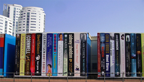
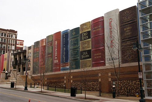
In 1997 the British Library moved to its new building in St Pancras, which I remember reading was designed to roughly resemble a stack of books. Very roughly. It seems that other libraries had a similar idea but decided to be less abstract, much less abstract.
First off, Cardiff Public Library, which has built this (unfortunately) temporary covering for the building until it’s completed. I partly agree with the sentiments here (where I got the images) that the installation should be permanent, but that the books should change. I’m sure book publishers could provide the panels, both advertising the book (should people want to buy it) and the library (if they want to borrow it). It’s interesting how the books are all modern bestsellers, I’ll get to that later.
Then there’s the Kansas City Public Library, where the installation is permanent, on a much larger scale, and is designed to conceal the library’s car park. Here the public were asked to nominate books that they felt represented Kansas City. I’m not sure how Lord of the Rings meets that criteria, and I’m sure the last time I read Romeo and Juliet it wasn’t set in the mid-west, but there’s a hell of a lot I don’t know about Kansas City so I’m sure there’s a perfectly valid set of connections there. Mind you, notice here that all the books are great works, classics, high points of Western literature, which is a bit of a contrast with the Cardiff choices.
Now, I have some entirely unsubstantiated wild guesses about why this might be. I could suggest that the Cardiff Library is taking a deliberately populist stance, trying to make itself appear more relevant to “today’s busy Welshman and woman” and not as some ivory-tower isolated repository of dead knowledge. The British Press does tend to have a schizophrenic view of cultural establishments, either they’re lauding some wonderful new Establishment, preserving and restoring Great British Culture, or slagging off yet another white elephant, a waste of money, ignoring the sensible wishes of the Great British Public who Couldn’t Give A Toss.
The Kansas Library on the other hand, like other American city libraries, is likely to be regarded as an educational institution in its own right and an asset, worthy of city pride. Not forgetting that educational institutions in the US are big business, I would hazard a guess that city residents would have some pride invested in their city having a big library, it shows an educated population, and an educated population must have been able to afford college, so Kansas City must be a prosperous place indeed, well worth investing in. So they pick great works, because they represent learning and achievement better than books you could pick up at the checkout line at Wal-Mart.
Oh, and I’d just like to say that philosophical musings aside, I think both of these are bloody marvellous, and we should see more of this kind of thing.


