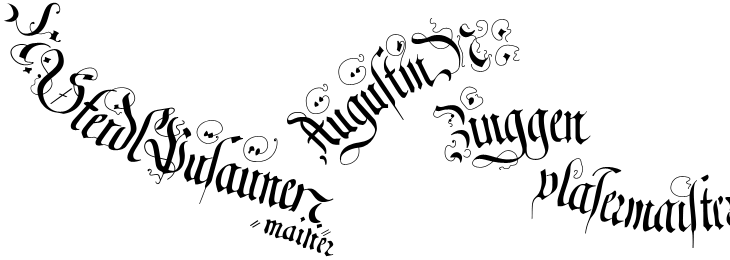
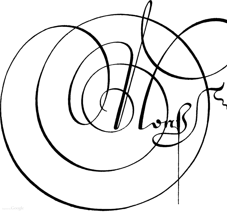
I’ve had some of these woodcuts of The Triumph of Emperor Maximilian open in various tabs for a couple of weeks now, daring me to trace some of the captions on them. It’s not the easiest of jobs, as even in the highest resolution some of the fine lines are too faint to make out clearly, and some of the strokes are hard to understand, so I figure I’d trace one of the banners and see how it worked out. Well, not so bad, but a good learning exercise — the extra flourishes and swashes seem particularly arbitrary (“When are they not?”, you might ask, but these especially so) and it’s interesting to see how this rather florid style is put together. I guess that makes it sound like I’m not fond of it; quite the contrary, I love it.
A couple of the captions from here, obviously not in the same relative positions.
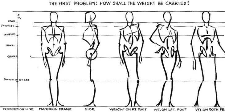
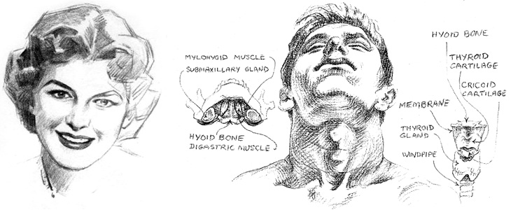
Escape from Illustration Island has put together a set of links to download Andrew Loomis books on illustration and drawing. The books are all out of print and free to distribute because they’re now in the public domain, though for the illustrator and artist they’re as relevant as ever. I realised I’d not seen these books since school — I think we had a copy of The Eye of the Painter and a very tattered Figure Drawing For All It’s Worth (I notice even on these scans that this one doesn’t have a cover) and thinking of other useful books on the subject, I found a few links to Stephen Rogers Peck’s Atlas of Human Anatomy for the Artist. Pretty much everything I learned about anatomy I learned from this book (and much of the rest from this one) so I can wholeheartedly recommend it — it’s not so good for posing and whole-figure drawing, but it’s great for adding detail and character to your figures.
From Figure Drawing For All It’s Worth, I love these mannequin sketches. They remind me of this.
A detail from Drawing the Head and Hands by Loomis, and one from Atlas of Human Anatomy for the Artist by Stephen Rogers Peck, available here.
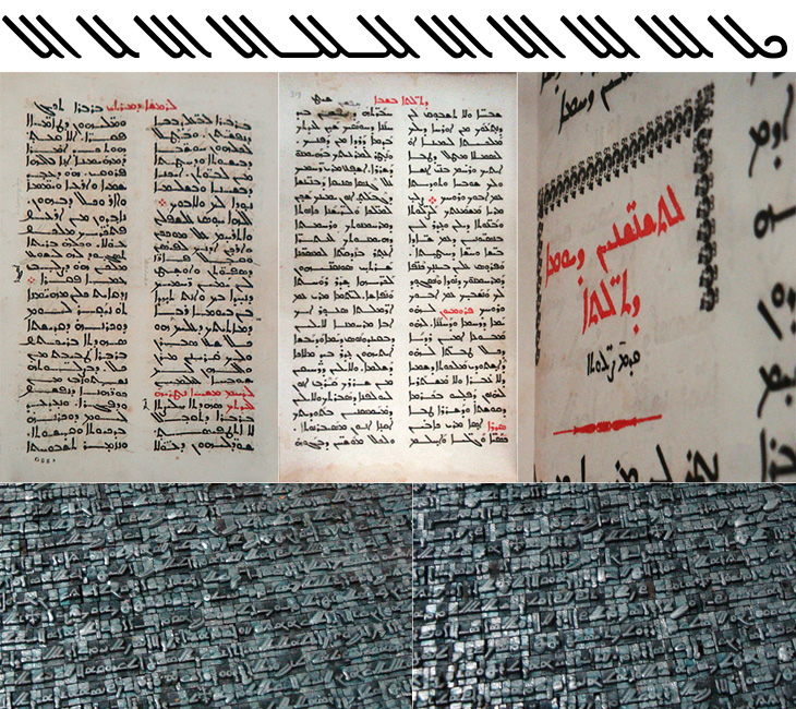
I was catching up on some reading recently and found this post on Pascal Zoghbi’s site, 29 letters, on the first printing press in the Middle East. There’s an interesting bit of history around its very existence in the Middle East at all. It was imported from England in 1585 to Saint Anthony’s Monastery in Qozhaya (a valley in modern day Lebanon) which was at the time part of the Ottoman Empire. Throughout the Empire, printing presses (and printed books) had been effectively banned following an edict by Bayezid Ⅱ in 1483. I’ve been reading up on the reasoning for the ban, and it seems that the public reason was that of piety; Arabic was the language of the Qu’ran and therefore was deemed a sacred language, so it was only allowed to be written by hand. The idea of the ‘Word of God’ being squeezed onto paper by a machine was supposedly anathema. There are of course other possible (and to my mind, rather more likely) reasons, in that the industry of copying out books and manuscripts was particularly lucrative and those who did it effectively used their considerable lobbying power to protect their interests. There’s no direct evidence for that, but, well, plus ça change and all that.
Some alternate glyphs from Serdo Mardin, and some photo details from 29 letters.
Anyway, regardless of the reason, the Monastery must have had a dispensation to be allowed to use a press at all, and I imagine as part of the deal they would have had to promise not to print Arabic, and here is where they stuck to the letter (literally) of the law, but not the spirit. Instead of the Arabic script, they used the Syriac. Syriac is a dialect of Aramaic, and was once dominant across the Middle East. By the time that printing press was delivered to the Monastery, it was in serious decline and replaced for most practical purposes by Arabic, except in the Christian liturgy (I freely admit that it was more complicated than that, but, moving on…). So the canny monks printed books in the Arabic language, but using the Syriac script. Sneaky. And here we get to the whole reason for this post, which is a wholehearted, will you look at that beautiful script! It’s really quite lovely. As before with a script I’m not familiar with, I’m not going to start trying to write stuff using a font that supports it, but I’ve taken some of the alternate glyphs from the font Serto Mardin that show the diagonal strokes the best. Beautiful stuff. I also traced a bit from one of the photos, which is up at the top of this post.
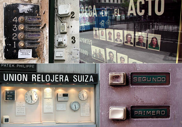
Me Design Magazine highlighted this fascinating project, While Stocks Last by designer Leandro Lattes; a massive collection of photos of Madrid, across two books, documenting the incidental details of the city; shop signs, intercom buzzers, bars, cafés and the like. I’m normally pretty wary of ‘found type’ collections as they tend to lack any kind of context, analysis or insight — or indeed any sense that they are curated, but what makes this different is the restriction to the one city, and the intent to document things that are likely to disappear without record. There’s very much the power of the collection going on with projects like this; individually the objects and scenes may have some interest, but all together like this they draw you in — the similarities and differences become compelling and before you know it you’ve lost an hour or two. Go and take a look.
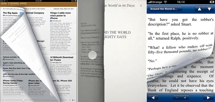
I’ve been following with some interest (especially after my e-reader post) the reaction to Wired’s iPad app. To say that it’s polarised opinion is an understatement and a half, and there have been a hell of a lot of confident-sounding assertions and assumptions about all aspects of how to take a magazine from print to screen, a few of which have got me thinking. The first of those things is:
Print designers vs. screen designers
There is this idea that there are print designers and screen designers — you are one or the other, you can’t be both, or neither, or some hybrid. This is a false dichotomy. I am a designer. I design for print, and I design for screen. I’ve also designed for ink on paper that wasn’t printed at all but applied with a pen. I’ve designed for paint on canvas (in a sense, it’s still designing). I design for a number of media, but it doesn’t mean my having skills with one precludes my having skills with another, and this is what gets me about this taking-magazines-online argument — it’s a form of ad hominem attack to begin with a dismissal of a piece of work for screen because the designer normally works in print. Ad hominem is a dreadful and ultimately sterile way to attempt to win an argument or ‘score points’. Focus on what has been made, first.
Some single pages from the Wired app.
You can’t bring print conventions to screen
I’m generalising with that title somewhat, as no-one is saying quite that. Oliver Reichenstein wrote an excellent piece on some of the print conventions that have been used in the Wired (and other) apps and how they don’t work. I agree with what he’s said, but perhaps not to the same degree. He presents many assertions as hard fact, as absolute truth, and I simply can’t accept them as such. Generally, yes, multi-column layouts can make a piece harder to read, and in the Wired app they rapidly become tiresome and distracting, but that’s not an effect limited to on-screen reading — I’ve found some newspapers and printed magazines hard to read for exactly this reason, but I’ve read stuff on screen just fine too, and the opposite (and conventional understanding) is true too. Wired’s use of multiple columns feels jarring, and in most cases throughout the magazine I’d like to just read the page as a single column of text. His other points on signalling, ornamentation and mixing fonts are largely true, but again, they’re not the entirety of the truth. It’s a matter of how skilled you are as a designer whether you make each thing work or not. Hard rules are true until you discover all the exceptions, and when dealing with human behaviour and preference I think it’s pretty much all exceptions.
Remember which magazine we’re talking about here
This is the kicker for me. I’ve read a lot of comments recently expressing the fear that the Wired app will not only start a trend for how they do things, but establish conventions. Possibly, but as pretty as it was, and as much of a wow-factor it had, the web today doesn’t look like Praystation (if you can remember that far back). Wired’s print magazine has always experimented with new ideas, from printing articles in spot varnishes, metallic and fluorescent inks, setting all the type on spiral paths and all sorts of fun, crazy things that make the damn thing impossible to read, but it was Wired. That’s a big part of what it’s always been about. To complain that the Wired app isn’t a paragon of usability is to complain about bears’ lavatorial habits spoiling your walk in the woods.
The future of magazines
I don’t know how magazines are going to develop and change for on-screen reading. The production values (and costs) of the Wired app are incredibly high — video, animations, complex interactive illustrations all cost a lot of money to make but don’t provide much ‘body’ to a magazine — you still have to produce a lot of editorial content as well. Most magazines will find such a high cost with such a low apparent return unsustainable, just as most print magazines aren’t full of expensive paper stocks and printing techniques. So don’t expect that to become a trend, instead they’ll be special features, just as a CD on the cover or a pull-out section is in the print world. No, I think most on-screen magazines will be dominated by long articles of fairly plain text interrupted with advertising, just as print ones are now. I’d like to see some better means of delivering advertising on-screen than we have now though — I find flickering and flashing adverts unbearably distracting and can’t imagine paying for any magazine that uses them in its articles, so I’d hope for something more respectful and dignified.
Whatever happens, and whatever conventions we end up with, I suspect that the reality will be at once quite wonderful if you stop to think about it, but disappointingly dull and prosaic on first impressions. I doubt we’ll have a wow moment from it, which is, I think, kind of the point.
I’ve been thinking about pages, print and scrolling for a while, mainly because I’m a designer and it’s part of my job, but also (I have to admit) because I quite fancy getting an e-reader of some kind. I’ll say right now I’m not going to write about any particular gadget, nor do I care which is best, which is more open, which is morally better, which one is approved by the People’s Front of Judea or the Judean People’s Front or whatever, right now I’m just thinking about one particular aspect of the technology: the page metaphor.
I’m writing this with full knowledge that there are some truly excellent articles out there about this very subject, this one in particular, which you might want to read too. Thing is, while people are talking about digital books, the talk is about the printing, transport and warehousing costs and trees it’ll save, and there’ve only been a few scant mentions of how the form of your everyday novel or reference book could change. Any discussion on form has been about the premium-quality books, the Alice for iPad style remakings, the ones that make new and playful uses of the page-as-screen, and there will be some truly wonderful digital books made, we know there will. However, it’s just taken as read that for all the other books that a bunch of text will be squeezed into an arbitrary set of pages of arbitrary size, like making sausages out of text. We’re not doing these books justice with this tired old page metaphor.
What’s so good about pages?
There are some functional and aesthetic reasons we might like to use pages for a long text. The main functional one that I can see is that we get a handy idea from pages where we are — they are numbered. To return to the book later we need only remember a single number and we can find that page again and carry on where we left off. That’s a great idea, but it breaks, and breaks badly if you were to change the text size, or to carry on reading on one device from where you left off on another. I think as these are two big advantages of digital books, we can’t easily ignore them. Fortunately placeholding is pretty easy on a digital book. It simply remembers where you were and loads the book up at that point.
Yes, I know my metaphor has holes in it, like a huge Hampton Court Palace shaped one. Just bear with me, OK?
So, what about aesthetic reasons? Well, here I like to compare it to architecture, specifically building materials. In years past, and here I’ll emphasise I’m assuming quite an early sensibility, if you built your house with cut and dressed stone, it marked you out as being a pretty wealthy and (presumably) classy individual. If you built your house out of brick, it just said you had a house made of brick. It might be a nice house, but it’s a house made of brick. Nothing wrong with that, you understand, but hey, it’s not stone, and brick was something associated with industry, with commerce and with houses built on a massive scale for factory workers. So houses were built out of brick and then given a coating of render which was then scored and moulded to look like stone. It didn’t really fool anyone, so while it didn’t mark you out as wealthy, you could at least appear to be classy, and that’s important to a lot of people.
And so to books. The equivalent in my metaphor of a stone house is an actual professionally set, printed and bound dead-tree book. They’re the kind of book that is made to store Great Works; the dictionaries, philosophies, histories, plays, religious texts, the physical manifestation of all human knowledge that can be set on a page. No wonder people place great store in the idea of a printed book, for the past couple of centuries they’ve been the acme of Stuff That’s Worth Keeping. Of course, now we have perfect-bound (ha!) books produced in the millions and I don’t think even I could be accused of snobbery in saying that most of them are from the category of Tedious Drivel than Great Work, but there you go, we still have this idea that printed books are so very special, better than any other medium.
So, what of the brick house in my belaboured Victorian metaphor? This, to me, is a scrolling page of text on a screen — pretty much the kind you’re reading right now, and do on any website. Yes, it’s called a web page but it is at least a true digital page in that it can be any length, any width and be as static or dynamic as you want. It is a product of the digital age, and while the code we use to describe its content may still be inadequate and subject to billion-dollar playground fights it does the job pretty well. The reason I liken it to the brick house is that there’s nothing really wrong with it but it hasn’t the cachet, it’s associated with the mass-produced red brick terraced house in some mill town somewhere — it’s commercial, it hasn’t the sense of permanence, it’s just a this’ll do commercial pragmatism about it. Of course, just as there are astoundingly beautiful brick buildings there are beautiful web pages, but it’s all about how these things are commonly associated in people’s minds.
And so to our prettified house. The brick one with the rendering on the outside made to look like stone. It can be built nearly as cheaply and quickly as a plain brick house, but it just looks so much better (well, more fashionable) and will sell for a load more cash. It’s got the association of quality in people’s minds but very little of the cost. And here we find the metaphorical equivalent of nearly every damn e-reader on the market right now. Loaded with serif fonts because printed books use serif fonts, sepia-toned backgrounds because printed books go a bit brown with age, with justified text because… and yes, here we get to it. Justified text! For crying out loud. They’re justifying text on a small screen with such an appallingly crap set of algorithms that sometimes it’s like looking at two lists of words against opposite margins — sometimes there might be a few words floating about in the middle somewhere but in all cases the reading experience is dreadful. I’ve only heard of one app that has a decent algorithm for hyphenation and justification, but even so I think the easiest (and given the size of the screen, the best) option for justification is a setting called OFF. For a particular erudite complaint about all this, check out Stephen Coles’ article for the FontFeed.
Then we get to the real fake-Georgian pediment over the front door, the overly-shiny brassy door furniture, the PVC window frames, something that infests reading software rather than dedicated e-reader hardware (but is no less annoying for it): yes, it’s the page turn animation. Oh how these software producers love their page turn animations. They might not make a big deal about their font selection, their crappy justification algorithms or even the number of books you can buy through their store, but they will always make a great big bloody feature of their sodding page turns, even the app I pointed to above. Even if an app doesn’t have these damn things, you get the impression they’re working on adding them. In a book, an actual dead-tree book, you don’t notice turning the page because it’s just part of what a book is. That’s how you get to the next bit of text. The whole idea of pages bound like that is an artifact of a particular printing technology — it’s the nature of the delivery medium, not the message. So when we have a digital book, we’re using technology that has its own set of conventions, its own restrictions and its own freedoms, and every bit of digital technology has some means of moving through any arbitrary content: a keyboard has cursor keys, page up and page down keys, a mouse has a scroll wheel, laptops have trackpads with scroll areas, and smartphones have touchscreens, joysticks or D-pads. But no. Those aren’t good enough. They’re not booky enough. You’re going to be reading Ullysses on this thing, War and Peace, The Illiad with this thing for crying out loud! You can’t sully things like that with a scroll wheel! You’re supposed to be imagining reverentially turning the thick, musty, ancient pages in some great national library somewhere, worshipping at the altar of Knowledge! Never mind the story! Never mind leaving you free to just read! No, every 250 words, perform the gesture, watch the animation!
Just let me scroll, please? I’ve been reading stuff off the screen seriously for what, 15 years? More? Scrolling is fine, you know.
I guess you could assume I’m not a fan of the current state of e-reading software. I hold out a lot of hope for it though. I think if the Instapaper (say) people went and made a full e-book reader I’d be very happy indeed. Of course, there may well be an absolutely blindingly-good bit of software out there that was made by someone who cares about simply reading but I don’t know of it — I assume someone will write one eventually. For iPad/iPhone please. If you know of one, please do let me know.
It’s been around for millennia, but concrete is a building material that pretty much defines the architecture of the modern era. The reconstruction efforts after the second world war really got the world interested in concrete in a big way — it allowed for rapid, economical construction of vast numbers of apartments, factories, malls, roads and more, and made tall buildings commonplace.
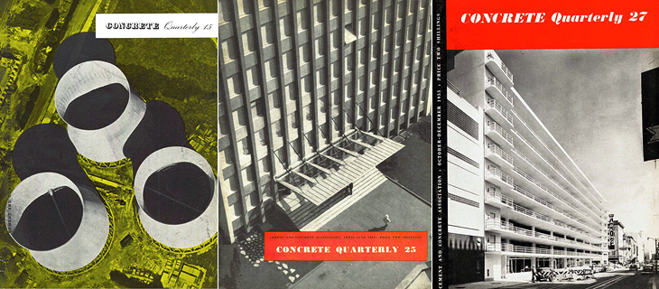
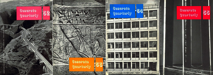
Of course, while not exactly a new building material, the uses we put it to often were. We know all too well the grey, crumbling monoliths, the remains of ill-conceived and badly built projects blighting our cities and towns, but too rarely do people celebrate the truly wonderful concrete buildings we have — from cathedrals to offices, shops and homes to soaring bridges, roads and basic utilitarian buildings, it’s an incredibly flexible and often beautiful building material. This is, I guess, what the Concrete Quarterly was designed to highlight. I’ve only read some of the earlier editions, but right from the first issue it talks of the diversity of uses of concrete; bridges, home developments and motorways all built with the stuff. Perhaps this variety is what’s influenced the design of the magazine over the years. Not until the 60s does it gain any kind of design consistency — in the 50s barely three or four editions are alike. Not that that’s really a bad thing, as some of the early covers are just gorgeous:
Incredibly lovely
I was browsing through wondering if I could spot any familiar projects, and lo, in the Winter 1962 issue there’s a cover article on Coventry Cathedral, one of my favourite buildings, which I’ve written about before here.
I think this was the first year with all four issues alike. That’s Coventry Cathedral on Issue 55.
Even within the same issue the headline styles vary considerably, and sometimes even the body type too. It makes for a slightly odd effect, but on the whole I think it works — it all ends up being rather charming. This one is wonderful on so many levels. Belgian Roads! What a subject!
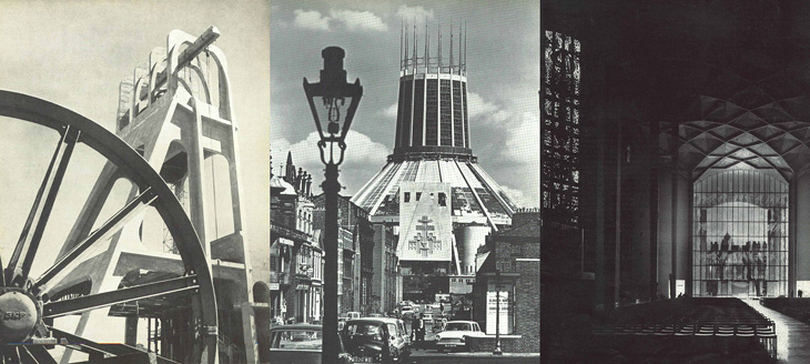
It’s worth having a look through the archives as there are many beautiful photos in there. I was delighted to see some photos of Liverpool Cathedral, which I visited many years ago and loved right away — I gather it’s not really all that popular locally but I think it’s great. Perhaps I just like anything with lots of stained glass in it.
The Stilfontein Mine in 1952, Liverpool Cathedral in 1967; and Coventry Cathedral in 1962
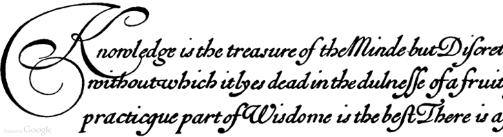
I’m sure this set of Google Books scans has gone round the design sites and twitter before, but I’ve only just recently come across it. Pretty much everything in here is beautiful and wonderful to just browse through, but if you’re a student of lettering and calligraphy (and of course, of type) then you’ll find it pretty useful too.
Personally I’ve mixed feelings about swashes and decorative initials, they look gorgeous but rarely seem appropriate to anything except for, well, historical contexts like the ones in this book. Often when I see them I think they look forced — shoved in there because they exist rather than because they add to the design or layout — It’s a real shame because I guess I’m not alone in really wanting to have a project that just calls out for a damn good swash, and yet when I do I start to fret that it’s just starry-eyed wishful thinking overruling good sense (and taste). It could be that I worry too much and should just get the pen out and start slashing away at the page with ink for the hell of it. Well, maybe not slashing as such, but when you look at some of these you get a real sense of the possibilities of drama and enthusiasm; the chance to create some really playful and exciting stuff. Wonderful:
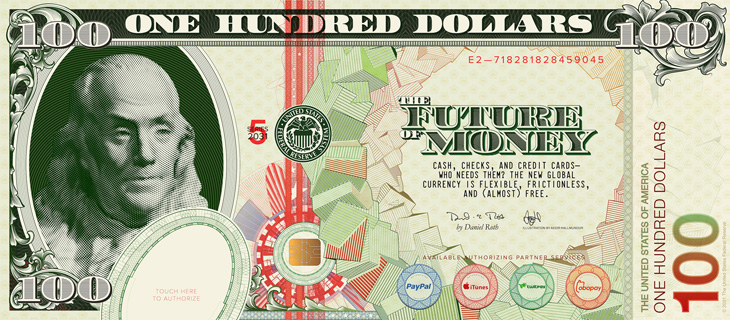
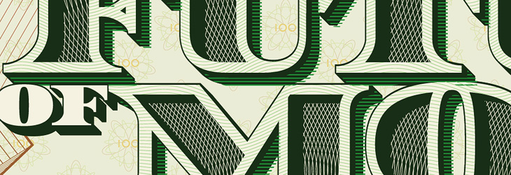
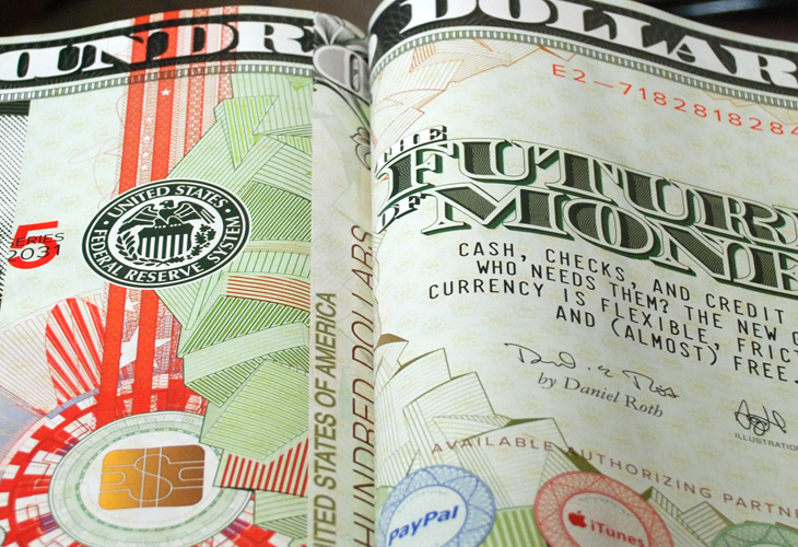
I guess now and again I can promote some of my own work — hey, it’s what keeps me from writing articles for Ministry of Type all the time, and this piece draws together a number of themes I’ve written about before here so it feels pretty relevant. This is an illustration piece I did for Wired Magazine for their US edition’s cover story, The Future of Money. It’s also appeared in the UK and Italian editions and in GQ magazine in Mexico and South Africa, which I’m pretty thrilled about.
The full illustration.
When creating, or even looking at, a banknote design, one of the first things you realise is their inherent and very deliberate imperfections. There’ll be an apparent mis-registration of colour, a strangely ragged line, a discontinuity in a pattern or an odd serif or ligature on a piece of lettering, but it’s exactly how it was designed. Without it, it wouldn’t be right. The design of banknotes represent something I find gloriously poetic — imperfect perfection — if it was perfect by our usual standards, it would be imperfect. Wonderful. So tried to capture some of that in my design, overlaying colours with an offset, adjusting the lettering a little bit to reflect the kind of oddities on real dollar notes and creating the odd layer of extra guilloche-work barely fine enough to see. I’m glad Wired is well printed and that it all came through.
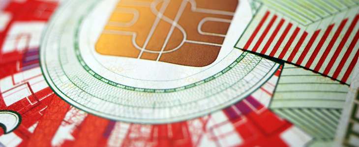
First off, my favourite, guilloches! Guilloches have an irresistable fascination for me, the finely detailed patterning building on top of itself, over and over, to create anything from complex shaded illustrations or subtle fields of colour, and all you need to do is to look a little closer to get drawn in… wonderful. Fractals have a similar kind of appeal, but there’s more of a craft to creating guilloche patterns, some idea of I made this rather than I discovered this. A subtle distinction for some, but it just gives one an edge over the other in my mind.
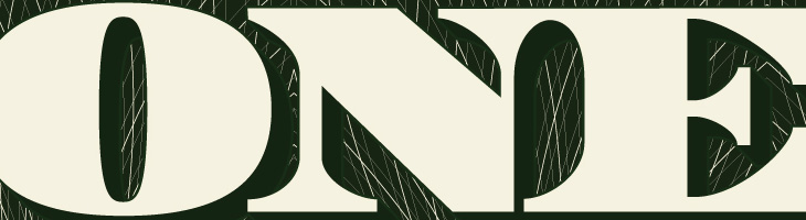
The lettering was actually the most time consuming part of the piece. The denomination took some time, but the big bit of work was the multi-layered title. The faces of the letters themselves are shaded with two sets of guilloche patterns, and the 3D effect was done mostly by hand — adjusting for optical clarity and to bring in a few of those all-so-important errors. I toyed with the offsetting on the faces (to create the pale outlines and shadowed cuts) especially as the “R” came out a little strange, with that square cut-off on the inner edge of the outline. I left that for a while and when I came back to it I decided I actually liked it, so it stayed.
The cropping out of the guilloche patterns to create the shading took time to set up and then quite a lot of time for the computer to do the necessary intersections. Anyone who was following my Twitter personal account at the time may have noticed a fair bit of bitching about Illustrator’s pathfinder tools, often spitting out “The filter produced no results” after 10 or so minutes of thinking, which generally drives me to use Photoshop’s vector tools for stuff: they have their deficiences, but they do the job without Illustrator’s tedious whining errors. It took 30 minutes of it thinking about it, but it got there in the end. It seemed a bit easier the second time around, when I did the localised title for Wired Italy, though sadly no quicker.
The circular pattern of cubes I did using Google Sketchup, which I’ve been using a fair bit to create another piece (which may be a poster one day), outputting it as an EPS and then going over it in Illustrator changing all the outlines to the right thicknesses and colours, then doing it again for the offset colour overlays. Fun times.
It was great to be able to use many of the ideas I’d explored before and have to make them work together in a full commercial piece. It’s fun when you’re given a brief like this, and pretty exciting seeing your work printed in a magazine.
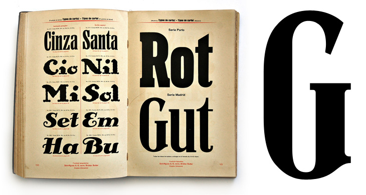
Kris Sowersby tweeted a link to this specimen page, and it’s quite lovely. I wonder how much whoever made it was intending it to be a play on words for English readers - gutrot being anything but good in English, and you’d certainly hope that you didn’t encounter anything red as a direct result of it. As it were. Possibly. Probably not though. It’s a lovely page, but all the others are worth having a look through - specimen books are always good for time travelling a few hours into the future. Shame there’s not more pages in the set, though I recalled (somehow) that Martin Schröder had posted up some pictures of a Schriftguss AG specimen book, amongst other things.