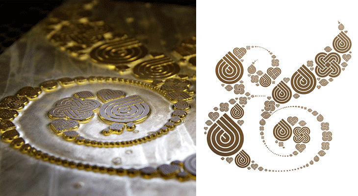
Well with a title like “Ampersand Print” this post could refer to any number of things, but this time it’s this rather pleasant letterpress print by Colorcubic. It’s a limited edition of 250, but as I type they have some in stock — I just bought one in fact. The image is a recreation of Herb Lubalin’s ampersand made of Inksie’s four icons and what with the tiny symbols tracing the thin lines it reminds me of fractal patterns. However, unlike most fractals this looks good and it’ll go great on my wall.
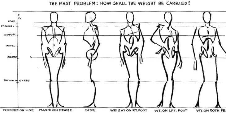
Escape from Illustration Island has put together a set of links to download Andrew Loomis books on illustration and drawing. The books are all out of print and free to distribute because they’re now in the public domain, though for the illustrator and artist they’re as relevant as ever. I realised I’d not seen these books since school — I think we had a copy of The Eye of the Painter and a very tattered Figure Drawing For All It’s Worth (I notice even on these scans that this one doesn’t have a cover) and thinking of other useful books on the subject, I found a few links to Stephen Rogers Peck’s Atlas of Human Anatomy for the Artist. Pretty much everything I learned about anatomy I learned from this book (and much of the rest from this one) so I can wholeheartedly recommend it — it’s not so good for posing and whole-figure drawing, but it’s great for adding detail and character to your figures.
From Figure Drawing For All It’s Worth, I love these mannequin sketches. They remind me of this.
A detail from Drawing the Head and Hands by Loomis, and one from Atlas of Human Anatomy for the Artist by Stephen Rogers Peck, available here.
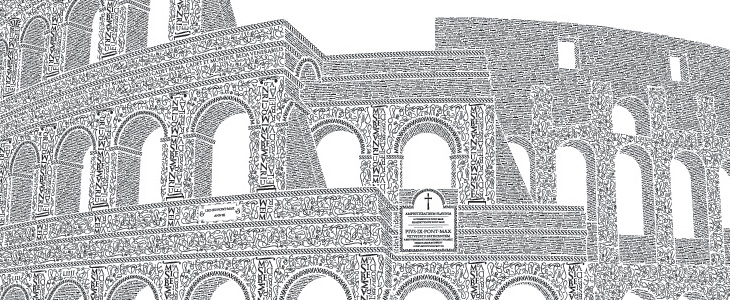
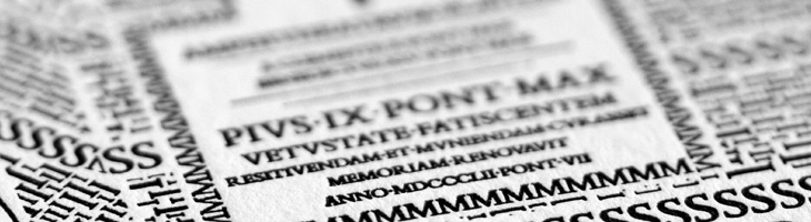
This is a very belated post, but one I’ve been meaning to do for a while. Cameron Moll’s Colosseo Type poster is a joy to behold. The level of detail in it is astounding, using type to create textures, patterns and outlines to illustrate the Colosseum. The piece is letterpress, and took over 250 hours to create; it’s set in Goudy Trajan and Bembo Pro, and interestingly, some glyphs recreated using tracing and redrawing:
Additionally, glyphs have been recreated based on the work of master Italian calligrapher M. Giovambattista Palatino, as featured in Libro di M. Giovambattista Palatino Cittadino Romano, published in Rome around 1550 AD.Cameron Moll
Belated or not, it turns out now is a good time to post this as Moll is having a sale of not just this, but the Salt Lake Temple poster and the EPS of the traced glyphs from the Palatino book (one of which is up at the top right). So yes, 25% off, and you get a free glyphs poster with one of the larger posters. Excuse the sales-y tone, but I think these posters are worth every penny; they’re lovely on screen, but as physical objects they’re quite beautiful.
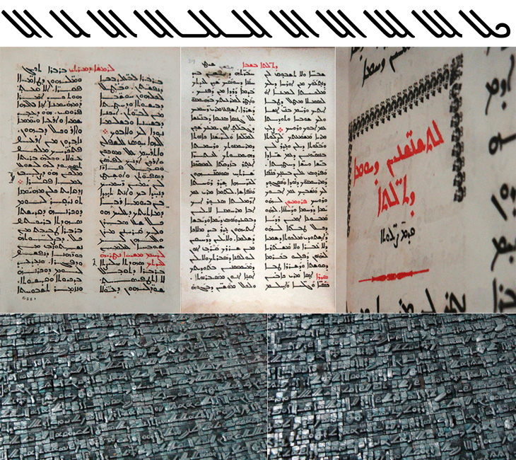
I was catching up on some reading recently and found this post on Pascal Zoghbi’s site, 29 letters, on the first printing press in the Middle East. There’s an interesting bit of history around its very existence in the Middle East at all. It was imported from England in 1585 to Saint Anthony’s Monastery in Qozhaya (a valley in modern day Lebanon) which was at the time part of the Ottoman Empire. Throughout the Empire, printing presses (and printed books) had been effectively banned following an edict by Bayezid Ⅱ in 1483. I’ve been reading up on the reasoning for the ban, and it seems that the public reason was that of piety; Arabic was the language of the Qu’ran and therefore was deemed a sacred language, so it was only allowed to be written by hand. The idea of the ‘Word of God’ being squeezed onto paper by a machine was supposedly anathema. There are of course other possible (and to my mind, rather more likely) reasons, in that the industry of copying out books and manuscripts was particularly lucrative and those who did it effectively used their considerable lobbying power to protect their interests. There’s no direct evidence for that, but, well, plus ça change and all that.
Some alternate glyphs from Serdo Mardin, and some photo details from 29 letters.
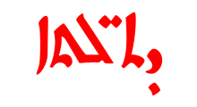
Anyway, regardless of the reason, the Monastery must have had a dispensation to be allowed to use a press at all, and I imagine as part of the deal they would have had to promise not to print Arabic, and here is where they stuck to the letter (literally) of the law, but not the spirit. Instead of the Arabic script, they used the Syriac. Syriac is a dialect of Aramaic, and was once dominant across the Middle East. By the time that printing press was delivered to the Monastery, it was in serious decline and replaced for most practical purposes by Arabic, except in the Christian liturgy (I freely admit that it was more complicated than that, but, moving on…). So the canny monks printed books in the Arabic language, but using the Syriac script. Sneaky. And here we get to the whole reason for this post, which is a wholehearted, will you look at that beautiful script! It’s really quite lovely. As before with a script I’m not familiar with, I’m not going to start trying to write stuff using a font that supports it, but I’ve taken some of the alternate glyphs from the font Serto Mardin that show the diagonal strokes the best. Beautiful stuff. I also traced a bit from one of the photos, which is up at the top of this post.
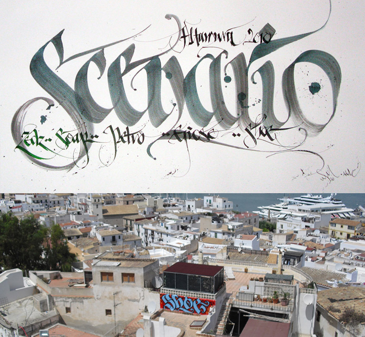
I was convinced I’d written about Shoe before, but it turns out I haven’t. Shoe, or Niels Shoe Meulman, is the master of calligraphic graffiti, creating the label for the artform of calligraffiti - also the name of his site. I must have seen examples of his work in books and photos hundreds of times, yet sadly not in real life. I don’t think I have anyway. I’d have hoped I’d have noticed. So yes, go and look at his site, there are more pictures of his work, a rather impressive bio, and a nice story on the nature of creative work too.
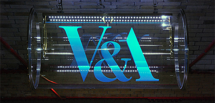
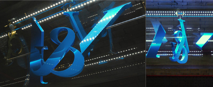
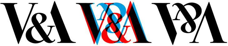
This new sign for the V&A is wonderful. The museum commissioned Troika to make a sign for the tunnel connecting the museum and South Kensington tube station, and it’s bloody gorgeous. It’s a kinetic sculpture, rotating parts of the museum’s logo (in itself a wonderful thing, by Alan Fletcher in 1989) so that it reads at first from one side, and then from the other. I did wonder at first whether the V and A on Fletcher’s original logo were actually rotationally symmetric, and no, of course they aren’t, but for a sculpture like this the alteration to make them work like that isn’t at all noticeable. Go and watch the video (or of course, visit the museum) to see it in action. It’s so simple and yet so clever, whoever came up with the idea must have been quite pleased with themselves, and justifiably so.
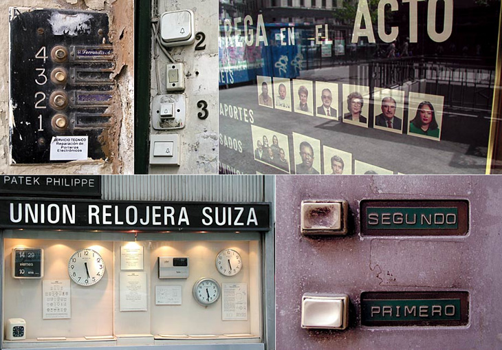
Me Design Magazine highlighted this fascinating project, While Stocks Last by designer Leandro Lattes; a massive collection of photos of Madrid, across two books, documenting the incidental details of the city; shop signs, intercom buzzers, bars, cafés and the like. I’m normally pretty wary of ‘found type’ collections as they tend to lack any kind of context, analysis or insight — or indeed any sense that they are curated, but what makes this different is the restriction to the one city, and the intent to document things that are likely to disappear without record. There’s very much the power of the collection going on with projects like this; individually the objects and scenes may have some interest, but all together like this they draw you in — the similarities and differences become compelling and before you know it you’ve lost an hour or two. Go and take a look.
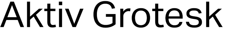
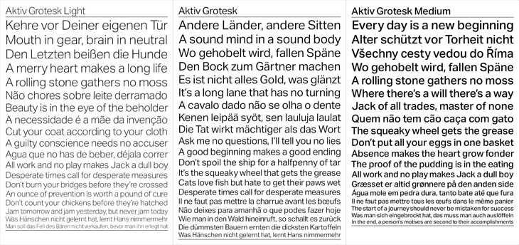
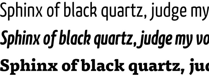
A few months ago I went to BrightType 2010 at Brighton University — two talks, one by Richard Rutter and another by Bruno Maag — which I meant to write up at the time but sadly never got around to. One thing that stuck with me was Bruno Maag’s 5 minute rant against Helvetica where he compared it unfavourably to Univers and decried its overuse and the unthinking adoration given to it. Apparently Maag likes to include a bit of a rant like this in all his talks, but it was new to me and quite refreshing. Basically, Bruno Maag detests Helvetica, and has designed a new face, Aktiv Grotesk, to kill it off.
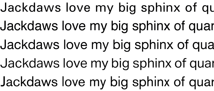
The new face is designed both to correct the apparent flaws in Helvetica and as a new, warmer, friendlier Univers. I guess I’d need to spend some time with it to know how it feels in use, but first impressions are pretty good. Univers is one of my all time favourites and Aktiv Grotesk has much of the same feel, though I’m not sure it really feels friendlier. I always thought Univers had a lot of character and was pretty friendly already, so I’m surprised Maag described it as ‘cold’. I guess it depends on your associations. Comparing Univers*, Helvetica, Helvetica Neue, Aktiv Grotesk and Akzidenz Grotesk is pretty interesting. You can immediately see that while there’s a connection, Aktiv Grotesk is is definitely an entirely new face — the counters are more open, possibly due to the squaring off Maag mentions; the strokes are sophisticated and refined, more like a display face; and the whole thing has a beautifully even colour:
* Admittedly my version of Univers is pretty crap, not that I’ve found much better available online.
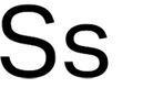
There are a few oddities in it though. In particular, that ‘s’ is just plain odd. In context, above, it fits in mostly OK, but it appears to lean backwards. It feels unstable. Both the Helveticas and Univers have S’s that come to a satisfactory finish at both ends, and Akzidenz Grotesk has that chunky flare at the ends of the stroke to balance it out, but Aktiv Grotesk just tails off a bit. It feels, dare I say it, a bit like Arial.
This statement surprised me a bit:
“Being a Swiss typographer, it’s always been Univers. Even in my apprenticeship we didn’t have Helvetica in the printshop. Then I went to Basel school of design and of course in Weingart’s workshop it was Univers, never Helvetica. Then I come to England and there’s all these designers using Helvetica! The Macintosh had just come out and Helvetica was on every single machine. Everyone was so fascinated with it … I never understood that.”Bruno Maag in Creative Review
Really? When I was growing up I remember that when there were sans serif faces they were either Univers or Folio. My uncle was a typesetter and designer and I remember the books of Lorem Ipsum set in Univers he used to chop up and paste into layout comps. It was never Helvetica. But then, these were the cold, damp provinces, so perhaps things were different in that London, you know, where they had computers and all that clever stuff. Maybe.
So for what it’s worth, I think Aktiv Grotesk is a real winner of a face (that ‘s’ notwithstanding) and will be pretty nice to play with and use professionally, but I doubt it’ll unseat Helvetica as the sans designers turn to. As a high quality font and with its Swiss typographic credentials, it does stand a chance of eclipsing Univers though, which would be a shame.
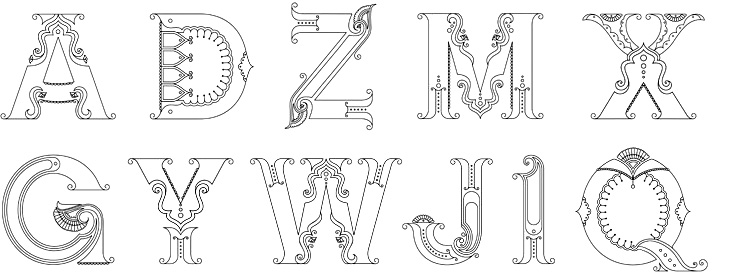
Beth Shirrell has produced this attractive all-caps ornamental alphabet, inspired by Indian (and specifically Hindi) decorative culture. It’s nicely produced and has some fascinating little details, but I wish there were some higher resolution examples to look at. Putting up low resolution images for something as detailed as this feels frustrating, though I understand why it’s done. Anyway, a few characters below — see the rest on her site.
Font licensing on the web just took another step forward. FontFont have released new web-optimised versions of 15 of their type families — over 300 individual fonts — which you can, if you like, use via Typekit’s service at (I gather) no extra cost, whether or not it’s listed in Typekit’s own library. At first glance it may not seem like so much of a massive deal, after all, you buy the font, you get to use the font, but it’s interesting in that it’s not just delivered in the ‘traditional’ manner by the foundry but you also get an additional service provided by a third party, and that the fonts aren’t available to license directly from that third party. It’s a subtle distinction, but it changes the nature of Typekit (and other such services) from being vendor outlets to being vendor outlets and service providers to foundries.
Illustrating the potential importance of this, I remember a talk by Bruno Maag last year where he was asking why he should offer his fonts through a service like Typekit — the potential revenue as a cut of subscriptions was so low, he said, that it just wasn’t worth it. Of course there are services offering different business models, such as Fontdeck*, but this adds yet another model to the mix, and a potentially very lucrative one at that. All very interesting.
Update:Jason Santa Maria emailed that Typekit have been offering this service since February, something that oddly passed me by at the time. Must have been the discount that got my attention this time around. Discounts on fonts, how could I not?